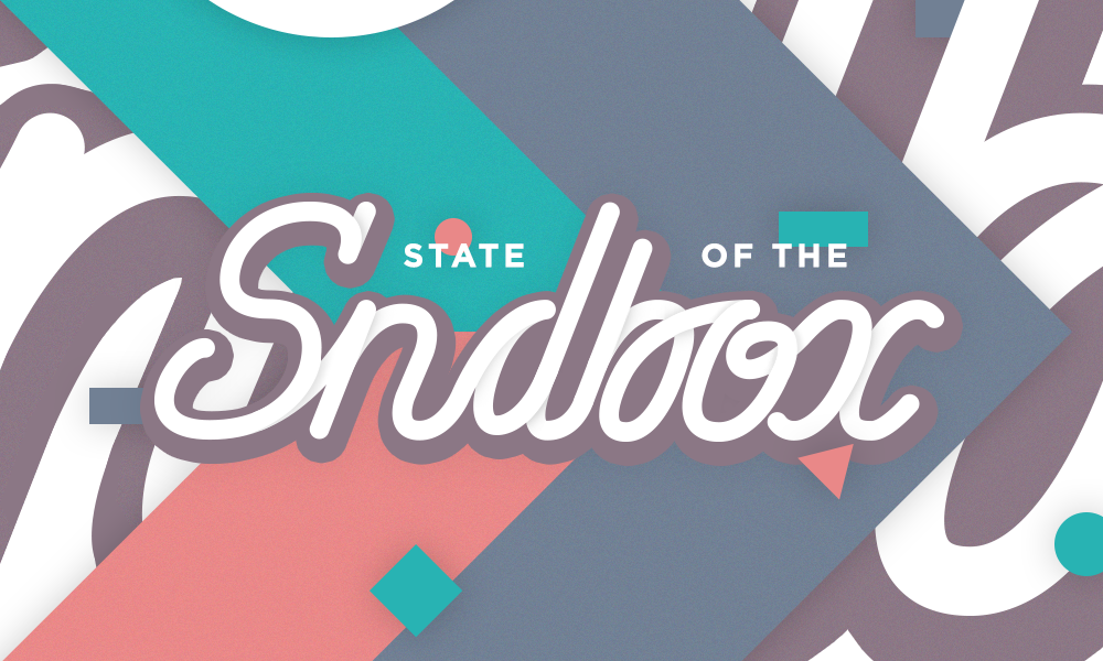
This is my "State of the Sndbox" Competition Entry!
Hi everyone !
Here is my entry for the State of the Sndbox
Monthly Thumbnail Competition #6

I'm not really good at hand lettering so I decided to challenge myself.
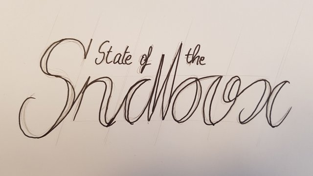
Here is my original sketch!

Yeah, I know, nothing spectacular. That was just to put my idea on paper and try to get a style with the shapes.
What, where, why?
I planned on doing a "serif" kind of lettering but I changed my mind during the digital process of the creation.
For space reasons, I also decided to move the "of" from left to right side of the B and put it next to the "the" (that sentence doesn't make any sense, does it?)
Gosh, I don't know how to say it, my English sucks. Sorry guys.
I also played a lot with noise and shadows to give the illustration a material style, and to add a little bit of depth.
I did use Illustrator & Photoshop to create this entry.
Anyway, hope you like it!
Maybe I could have... a little upvote you know? 😅
Have a great day, see you soon!
Love it ! Good job !
Thank you!
Congratulations @pierrerbn! You received a personal award!
Click here to view your Board
Congratulations @pierrerbn! You received a personal award!
You can view your badges on your Steem Board and compare to others on the Steem Ranking
Vote for @Steemitboard as a witness to get one more award and increased upvotes!