LOST! A POSTER FOR AN EVENT!
** HEY NET FRIENDS!**
Today, I'm going to show you how I make a Poster. This is for the poetry group (where I belong) that will have an event on June 23, 2018.
The theme of the event is "Lost" so I brainstormed on how to present the theme in the poster. Thank God I have my brilliant and beautiful girlfriend who once saw this picture of an astronaut losing his helmet in the middle of the outerspace and that was actually one of the characters in the mobile game, Dumb Ways to Die.
# CLOSE UP DETAILS
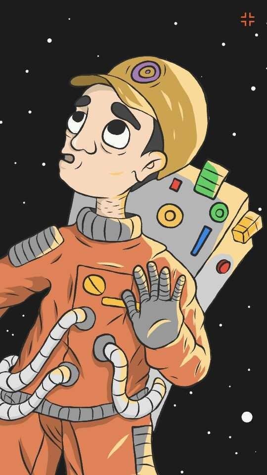
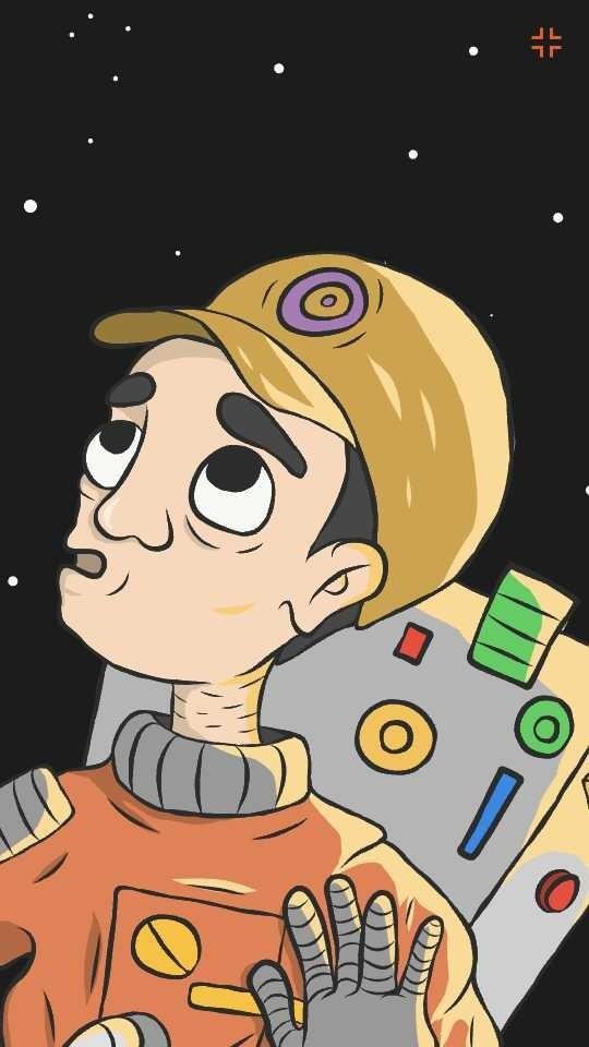
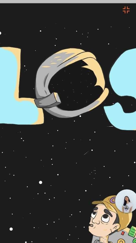
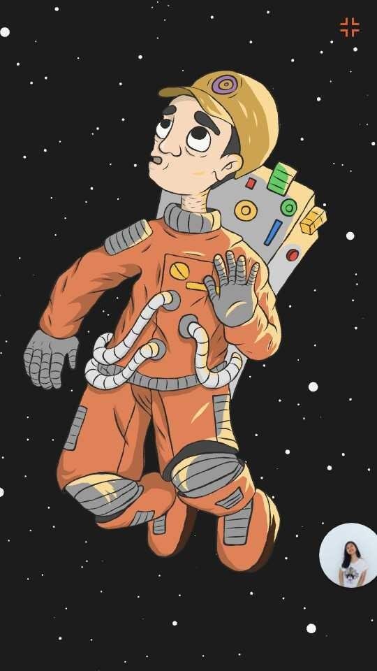
So as you can see, I did not copy everything from that poster of Dumb Ways to Die. I DID IT MY WAY. As a big fan of comics and a comic artist in our school publication, I created the astronaut to look like a comic character.
Step by step process
SKETCH
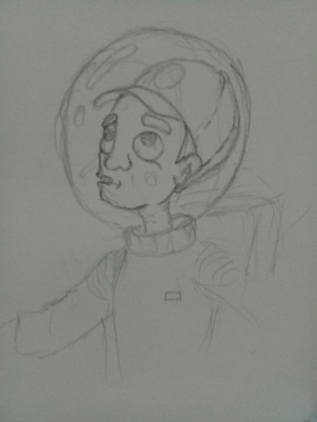
I started on paper. I think of a character that is original and easy to remember. Personally, I always wear a hat or a cap that's why I decided to put a cap on him as well and this is how it turned out:
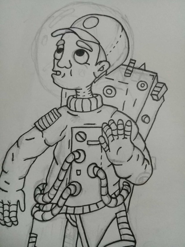
INKING
This step is the easiest one for me. It does not require any effort because you just need to trace the sketch and that's it:

TRACING (DIGITALLY)
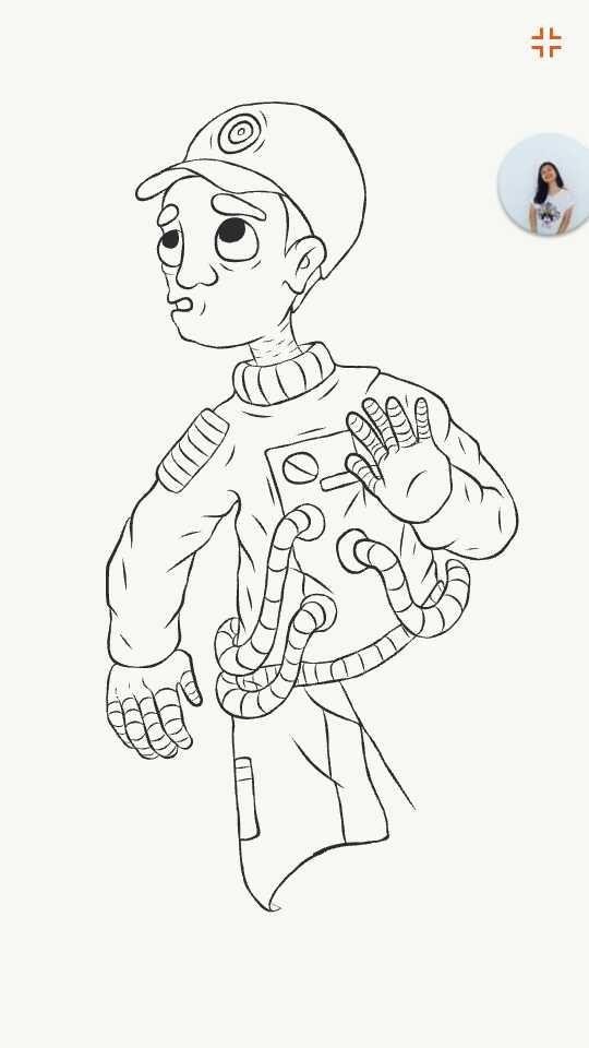
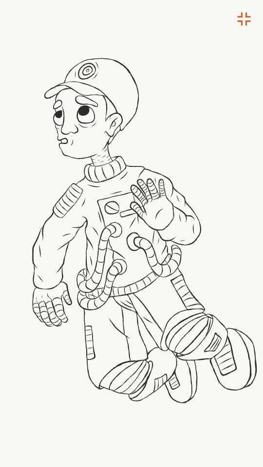
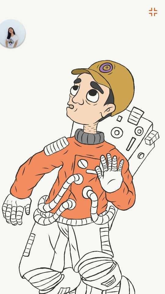
Now, this is the hardest part. It took me hours doing this step because although I am tracing it just like in the inking step, it is more challenging as I am doing it digitally:
COLORING (DIGITALLY)
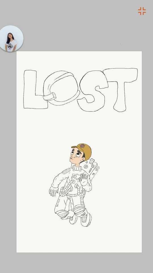
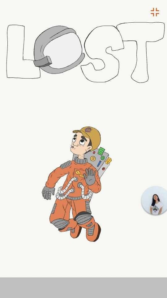
This step is what I enjoyed the most. Why? Because it is easy and I really enjoy playing with colors, doing trial and errors until I see what color fits in it. I'm not afraid of making mistakes because I believe that we learn from them:
BACKGROUND MAKING (DIGITALLY)
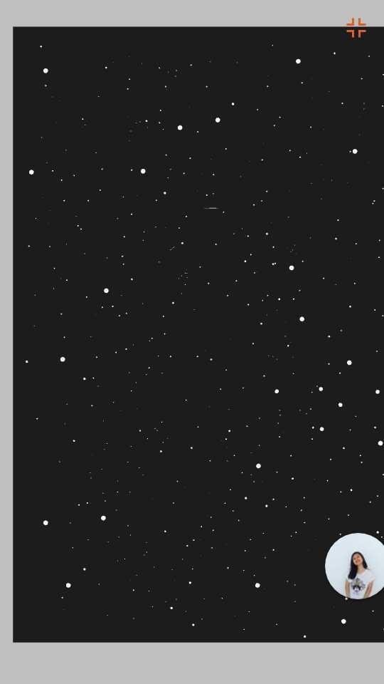
I tried finding a background from Google but my internet is too slow that's why I decided to just create my own background by putting some small dots and some bigger dots:
LOGO MAKING (DIGITALLY)
So after the long process for the character in the poster, now I'm here at the logo. I decided to make it simple but witty. My girlfriend and I decided that the "o" in the "lost" will be the astronaut's helmet. So that is what I did and this is what it looked like:

FINAL OUTPUT!
And now this is the moment that you've been waiting for. I present to you the FINAL OUTPUT
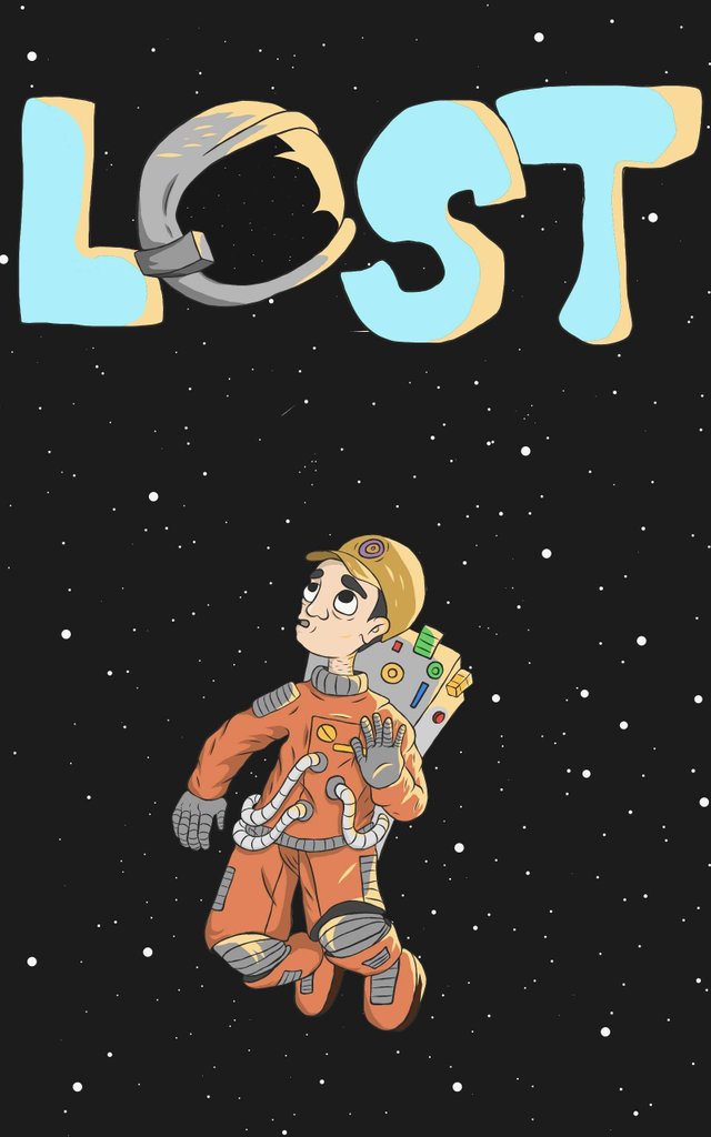
# **MY STEEMIT JOURNEY** So far so good! I enjoyed everything in this internet community and I am excited to know each of you deeper and to share more outputs that I hope can help everyone to have inspiration and to do more and create more.
THE APPLICATION I USED IS ADOBE ILLUSTRATOR DRAW
THAT'S IT! THANK YOU FOR READING THIS AND I HOPE YOU ENJOYED IT.
# GOOD DAY! GOD BLESS!
# KEEP ON CREATING GUYS!
lost the helmet and still breathing... that's poetic :D
THANK YOU FOR APPRECIATING IT! :)
You've received an upvote from @slothicorn! Click Here to Read our New Curation Policy And Updated Rules
(@justatouchfey) ((.)ω(.))