Arizona landscape photo and edits to catch the eye --- Includes a Black and White edit and the original to compare with

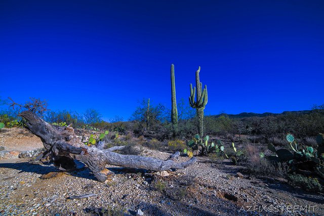
I made this first edit so it would really stand out in your photo feed and I think it pops when viewed in small format on the feed. Once you look at the larger photo the sky looks a little bit off but the old dried desert wood looks very detailed.

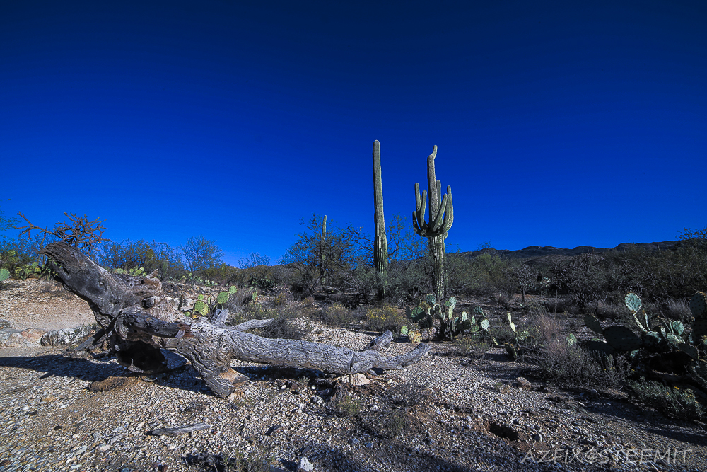
This second edit is a little duller and the details do not pop as much

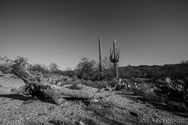
Here is the Black and White version for you to compare with the original below so you can decide color or Black and White for this photo.

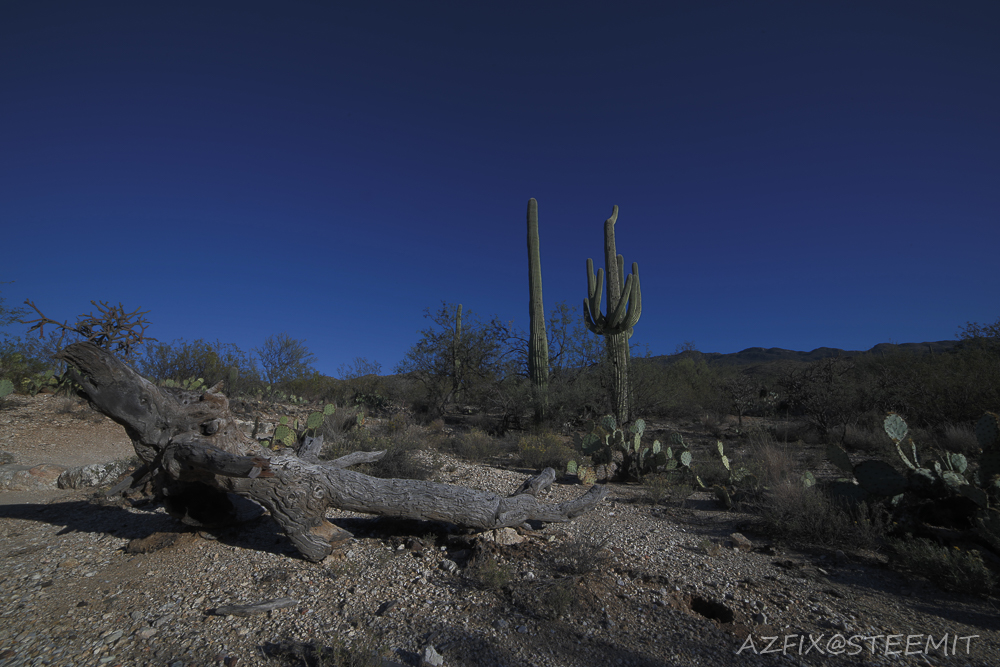
Finally here is the original with no edits other than watermarks and a resize, let me know which one you like best.
Thanks for the upvotes, comments and resteems
I prefere the second one. Looks the most natural. What a great scene, I love those cactuses.
Thanks, when those Saguaro Cactus reach that height they are in the 100+ year old range. They can get up to 40+ feet tall by the time they are 200 years old.
@azfix def the second one. You should check out pichaco peak. Practically a forest of cacti.
I have been meaning to get out to Pichaco to do some night photography, I usually hit up Sabino Canyon for the forest of Cactus.
The second one seems pretty cool, nature at it best. This log at the front looks like a crocodile.
Photography always catches my attention. These are some great pictures and quality edits. I invite you to check out my profile if you are interested in photography. Thanks
Thanks, will check out your page soon
Nice ,I liked first one.
Beautiful landscape photography.following you and upvoted. thanks a lot for sharing with us.....@azfix
awesome photography bro. black and white is looking awesome . I hope you will win the contest :)
Wow your post very amazing good job. Thanks for sharing
I like the first one. It looked so fresh.