[Python] Road to Finance #01 Draw CandleStick Chart
오늘의 예제: 캔들스틱 그림 그리기
이번에는 저번 시간에 읽은 가격 자료를 이용하여 Candle Stick 차트를 그려보도록 하겠습니다.
인터넷에서 검색해보니, 파이쏜의 그림그리는 모듈인 Matplotlib에서 Candle Stick을 그릴 수 있는 하부 모듈이 있다고 하는데, 문제는 그 모듈이 관리도 안되고 곧 없어진다 그래서 그거 안쓰고 그냥 제가 직접 그렸어요 ^^
Matplotlib에 대한 기본적인 사항은 예전에 제가 작성했던 글들 (목록은 밑에 있어요)을 참조하시기 바랍니다.
일단 코드부터 보시죠.
read_txt+plot_candle.py3.py
import sys
import numpy as np
from datetime import datetime, timedelta
import matplotlib.pyplot as plt
import matplotlib.dates as mdates
from matplotlib.ticker import AutoMinorLocator
def conv2date(mon_str,day_str,year_str):
"""
mon_str: Month Name Abbre. (3-letters)
day_str: Need to remove the last comma
year_str: 4-digit number
"""
return datetime.strptime(mon_str+day_str+year_str,'%b%d,%Y')
def draw_candlesticks(ax1,dates,prices):
### Increasing Price
pinc_idx= prices[3,:]>=prices[0,:]
pinc_prices=prices[:,pinc_idx]
pinc_dates=dates[pinc_idx]
#print(pinc_prices[0,:],pinc_prices[1,:])
pic1 = ax1.bar(pinc_dates,pinc_prices[3,:]-pinc_prices[0,:],width=width,bottom=pinc_prices[0,:],color='w',edgecolor=cc[0],linewidth=max(0.1,1/max(nt/80,0.8)))
pic1a= ax1.bar(pinc_dates,pinc_prices[1,:]-pinc_prices[3,:],width=width2,bottom=pinc_prices[3,:],color=cc[0],edgecolor=None)
pic1b= ax1.bar(pinc_dates,pinc_prices[0,:]-pinc_prices[2,:],width=width2,bottom=pinc_prices[2,:],color=cc[0],edgecolor=None)
### Decreasing Price
pdec_idx= np.logical_not(pinc_idx)
pdec_dates=dates[pdec_idx]; pdec_prices=prices[:,pdec_idx]
#print(pdec_prices[0,:],pdec_prices[1,:])
pic2 = ax1.bar(pdec_dates,pdec_prices[0,:]-pdec_prices[3,:],width=width,bottom=pdec_prices[3,:],color=cc[1],edgecolor=None)
pic2a= ax1.bar(pdec_dates,pdec_prices[1,:]-pdec_prices[0,:],width=width2,bottom=pdec_prices[0,:],color=cc[1],edgecolor=None)
pic2b= ax1.bar(pdec_dates,pdec_prices[3,:]-pdec_prices[2,:],width=width2,bottom=pdec_prices[2,:],color=cc[1],edgecolor=None)
def draw_candlesticks_misc(ax1,dates,datebuffer0=-5,datebuffer1=30):
### Decoration
ax1.xaxis_date()
myFmt = mdates.DateFormatter('%b\n%Y')
ax1.xaxis.set_major_formatter(myFmt)
ax1.set_xlim(dates[0]+timedelta(days=datebuffer0),dates[-1]+timedelta(days=datebuffer1))
ax1.set_ylim(pmin*0.8,pmax*1.1)
ax1.yaxis.set_minor_locator(AutoMinorLocator(2))
ax1.yaxis.set_ticks_position('both')
ax1.grid(which='major',axis='y',color='silver',lw=0.5,ls=':')
###--- Main ---###
## Parameters
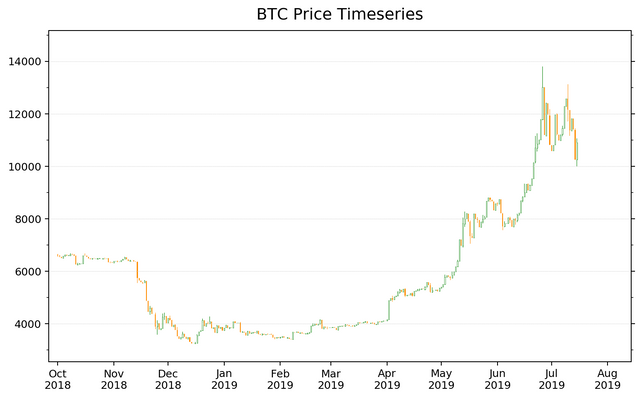
c_name="BTC"
## Input File
in_dir='./'
in_txt_fn=in_dir+c_name+'_daily_20130428-20190715.txt'
## Read Text File
dates=[]; prices=[]
with open(in_txt_fn,'r') as f:
for i,line in enumerate(f):
if i==0:
print(line)
else:
words=line.strip().split()
if i==1:
num=len(words)
print(num,words)
elif num!=len(words):
print(num,len(words),words)
sys.exit()
dates.append(conv2date(*words[:3]))
price_tmp=[]
for ww in words[3:7]:
if "," in ww:
ww=ww.replace(",","")
price_tmp.append(float(ww))
prices.append(price_tmp)
print(dates[-1],prices[-1])
## Convert list to numpy array
prices=np.asarray(prices).T
print(prices.shape) ### Now should be [4,time_steps]
## Make time reversed (old to new)
prices=prices[:,::-1]
dates=dates[::-1]
print(prices[:,0],dates[0])
ini_date= dates[0]
tgt_dates= [datetime(2018,10,1),dates[-1]] ### Target Dates to draw chart
it= (tgt_dates[0]-ini_date).days
nt= (tgt_dates[1]-tgt_dates[0]).days+1
prices= prices[:,it:it+nt]
dates= np.array(dates[it:it+nt])
pmin,pmax= prices.min(),prices.max()
print(pmin,pmax)
###--- Plotting
##-- Page Setup --##
fig = plt.figure()
fig.set_size_inches(8.5,5) # Physical page size in inches, (lx,ly)
fig.subplots_adjust(left=0.05,right=0.95,top=0.92,bottom=0.05,hspace=0.35,wspace=0.15) ### Margins, etc.
##-- Title for the page --##
suptit="{} Price Timeseries".format(c_name)
fig.suptitle(suptit,fontsize=15) #,ha='left',x=0.,y=0.98,stretch='semi-condensed')
width=0.8; width2=width/10
cc=['g', 'darkorange']
##-- Set up an axis --##
ax1 = fig.add_subplot(1,1,1) # (# of rows, # of columns, indicater from 1)
draw_candlesticks(ax1,dates,prices)
draw_candlesticks_misc(ax1,dates)
##-- Seeing or Saving Pic --##
#- If want to see on screen -#
#plt.show()
#- If want to save to file
outdir = "./Pics/"
outfnm = outdir+"{}_price_ex1.png".format(c_name)
#fig.savefig(outfnm,dpi=100) # dpi: pixels per inch
fig.savefig(outfnm,dpi=180,bbox_inches='tight') # dpi: pixels per inch
벌써 코드가 상당히 길어졌는데요, 사실 절반 정도는 저번 시간에 다룬, 텍스트 파일에서 데이타를 읽어오는 부분입니다. 이번에 추가된 부분은,
- 읽어들인 데이타를 Numpy Array로 변환
- 시가와 종가를 비교하여 상승하는 날과 하락하는 날로 구분
- 상승과 하락 각각에 맞는 그래프를 그림 (색이 다르니까요)
이렇게 되어있습니다. 별로 어렵지 않죠? ^^
몇 가지 설명
- 저번 시간에 다뤘던 함수 "conv2date"에 작은 수정이 있었습니다. 생각해보니 굳이 ","를 제거할 필요 없겠더라구요.
- Numpy Array의 경우, 크기가 [nn,mm,ll]로 정의되었을 경우 가장 오른쪽 축(axis), 즉 ll 부분이 가장 먼저 저장되고, ll이 한바퀴 돌면 그 다음에 mm이 바뀌고 하는 순으로 자료가 저장됩니다.
- Numpy Array의 경우 다양한 Slicing이 가능합니다. 예를 들어 어떤 한 축에 대하여 [10:20:3]라고 되어있으면, 10번 원소부터 20번 전 원소까지 3개마다 하나씩이라는 뜻입니다. [::3]이라고 숫자가 생략되면 처음부터 끝까지 3개당 하나씩이겠죠. 그리고 저 위에서 [::-1]이라는 표현이 나오는데, 이건 순서를 뒤집는다는 뜻입니다.
- Numpy Array에서 많이 쓰는 방법 중 하나가 "조건부 인덱싱"입니다. 상승날과 하락날을 구분하는 부분 (함수 draw_candlesticks)을 보시면, "C= A>=B" 이런 부분이 보이는데, 이것은 각각 원소에 대하여 A의 원소가 B의 원소보다 크면 True 아니면 False가 저장된다는 뜻입니다. 당연히 A와 B의 크기가 같아야겠죠.
- True와 False는 각각이 사실 1과 0으로 저장됩니다. 그래서 위의 C에 대하여 C.sum()을 구하면 True가 몇 개 인지 셀 수가 있죠.
- T/F로 구성된 C가 준비되면, D=A[C] 이런 형태가 가능합니다. 이렇게 되면 D에는 C가 True일 때의 A값만 들어가게 되죠.
- 그림을 그릴 때, "fig"를 정의하고 그 다음에 "ax"를 정의합니다. 쉽게 생각해 "fig" 정의는 종이를 준비하는 거고, "ax"의 정의는 종이 위해 실제 그림 그릴 부분을 설정한다고 생각하시면 됩니다.
- Candle Stick 차트를 위해 저는 "Bar plot (막대그래프)"를 이용했습니다. 막대그래프는 각 막대 상자의 바닥값과 그 높이, 그리고 주어진 넓이 값으로 정해집니다.
- 막대 상자 안이 차 있는 경우에는 상관 없었는데, 빈 경우 테두리의 선 굵기가 문제였어요. 50일 그리는 경우와 300일 그리는 경우 막대 상자의 폭이 실제로 보이기에 차이가 큰데, 선 굵기가 일정하면 나중에는 선 굵기가 막대 상자 넓이보다 더 커져버리는 일이 발생했거든요.
- 현재 그림 그리는 기간은 "tgt_dates"라는 변수를 이용해 통제하고 있습니다.
일단은 이정도면 되려나요.
제가 너무 익숙해서 지나가버렸지만, 초보자에겐 어려운 부분이 있을거에요. 댓글로 질문 주시길!
다음 시간에는 이동 평균 Moving Average를 계산해서 그림에 추가하도록 하겠습니다.

관련 글들
Matplotlib List
[Matplotlib] 00. Intro + 01. Page Setup
[Matplotlib] 02. Axes Setup: Subplots
[Matplotlib] 03. Axes Setup: Text, Label, and Annotation
[Matplotlib] 04. Axes Setup: Ticks and Tick Labels
[Matplotlib] 05. Plot Accessories: Grid and Supporting Lines
[Matplotlib] 06. Plot Accessories: Legend
[Matplotlib] 07. Plot Main: Plot
[Matplotlib] 08. Plot Main: Imshow
[Matplotlib] 09. Plot Accessary: Color Map (part1)
[Matplotlib] 10. Plot Accessary: Color Map (part2) + Color Bar
F2PY List
[F2PY] 01. Basic Example: Simple Gaussian 2D Filter
[F2PY] 02. Basic Example: Moving Average
[F2PY] 03. Advanced Example: Using OpenMP
Scipy+Numpy List
[SciPy] 1. Linear Regression (Application to Scatter Plot)
[SciPy] 2. Density Estimation (Application to Scatter Plot)
[Scipy+Numpy] 3. 2D Histogram + [Matplotlib] 11. Plot Main: Pcolormesh
Road to Finance
#00 Read Text File
#01 Draw CandleSticks
zorba님의 [2019/7/18] 가장 빠른 해외 소식! 해외 스티미언 소모임 회원들의 글을 소개해드립니다.
허허. 하하... 허허허... 캔들 그리는 함수가 이리도 어려웠군요 하하하하하하하ㅏ
한 30 번 정도 배껴쓰고 오겠습니다, 선생님! ㅎㅎ
아! 그리고
http://www.cryptodatadownload.com/data/northamerican/
제 동생이 쓰는 데이터에요! 어떻게 뽑아다 쓰는지는 모르겠지만 하하하하 (절대 엑셀파일 열지 말라고 경고하더라고요 컴퓨터 꺼진다고 ㅋㅋㅋㅋ)
이거 정말 좋은데요!
Hourly 데이타가 2017년부터 있다니... 거래소간에 어떤 거래소가 가격을 리드하는 지 분석해보고 싶었는데, 이정도면 한 번 해볼 만 하겠어요.
노트패드플플이나 아톰같이 파이쏜 문법에 따라 색깔 지원되는 에디터에 붙여놓고 보면 사실 별 거 없어요~ 그림의 경우 세세하게 조정할 수 있는 것이 장점인데, 그만큼 세세하게 명령어를 써야 하는게 단점이죠 ^^