COLORS - INTERPRETATION WITH THE WORLD PART #1
As my college teacher said, the definition of color:
Color is sensory experience which is generated when the light of characteristic spectrum arouse receptors in eye retina (part of the eye responsible for creating an image of the visual world). Color is ascribed to object surfaces, materials, light source(s) and its absorption, reflection or emission of light spectrum characteristics as well.
TRICHROMACY
People (and other organisms) who see colors normally, majority including me, are called trichromats. Those can see the whole palette of color hues. I'll explain hue later.
Trichromacy is the possessing of three independent channels for receiving color information called cone cellls.

COLOR GENERATING
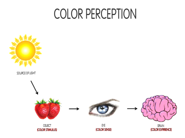
In short lines, light, which is electromagnetic radiation comes to the object which reflects, absorbs and does transmission (usually all three) toward human eye. Eye's retina, which is light-sensitive, trigger nerve impulses when the light comes to it. Impulses travel to the brain's vision center, where are processed so we experience colors.
LIGHT SOURCES
Light sources can be direct or indirect. Direct light sources are divided into natural and unnatural. Indirect light sources are object which reflects, absorbs and does transmission as I mentioned earlier. Visible light is usually defined as having wavelengths in the range of 380–700 nm.

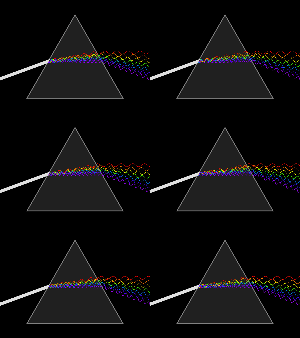
Sun light is originally white, but it is dispersed into different colors depending on refractive index - describes how light propagates through material. The range of 380-700 nm is visible to people - red wavelengths is the longest (640-700 nm) and it's the fact and reason why STOP signs and traffic lights for STOP is red. Violet is "the shortest color" (around 380-400 nm).
ISHIHARA TEST
Unfortunately, not everyone sees the same.
Retina is made of layers of neurons, but only neurons that are directly sensitive to light are the photoreceptor cells. There are 2 types: rods and cones. Rods function is to provide black and white vision, actually, it serves the sharpness of the vision while cones functionality is color perception.
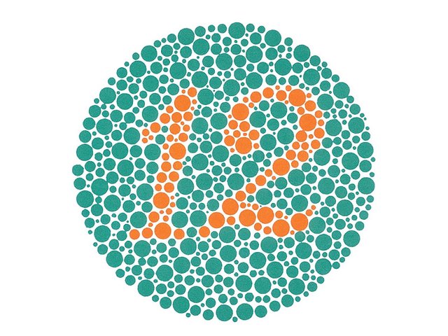
The Ishihara test is a color perception test for red-green color deficiencies. Its target is to check if a person has good color vision or is part or fully color blinded. The test contains a sample on a paper full of colored dots which form a number and those with normal color vision easily see it. It is named after its designer Dr. Shinobu Ishihara. It is a common test in driving school.
COLOR BLINDNESS
ANOMALOUS TRICHROMACY
As stated on Color blind awareness official site:
People with ‘faulty’ trichromatic vision will be colour blind to some extent and are known as anomalous trichromats. In people with this condition all of their three cone types are used to perceive light colours but one type of cone perceives light slightly out of alignment, so that there are three different types of effect produced depending upon which cone type is ‘faulty’.
Laic said, That is disorder in which person has all 3 cones for colors but 1 cone perceive color a little bit different.
There are three types of anomalous trichromacy:
- Protanomaly - a problem with seeing red color
- Deuteranomaly - a problem with seeing green color
- Tritanomaly - a problem with seeing blue color
There are several color blindness disorders, and in all of these people are confused with some of color hues, and they can't uncover and be sure about what color it is about.
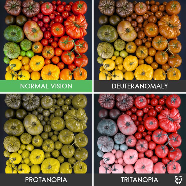
- Protanopia - disorder in which person mix red and green color.
Protanopes are more likely to confuse:
Black with many shades of red
Dark brown with dark green, dark orange and dark red
Some blues with some reds, purples and dark pinks
Mid-greens with some oranges
- Deuteranopia - disorder in which person is in lack of the green cones in mid spectrum(green, yellow and some of red).
Deuteranopes are more likely to confuse:
Mid-reds with mid-greens
Blue-greens with grey and mid-pinks
Bright greens with yellows
Pale pinks with light grey
Mid-reds with mid-brown
Light blues with lilac
- Tritanopia - disorder in which person is dichromat and is fully missing short-wavelength cones charged for blue green and some of yellow
The most common colour confusions for tritanopes are light blues with greys, dark purples with black, mid-greens with blues and oranges with reds.
DESCRIPTION OF COLORS
Attributes which define colors are ton of color ( hue ), the amount of gray in color ( saturation ) and lightness of color ( brightness ).
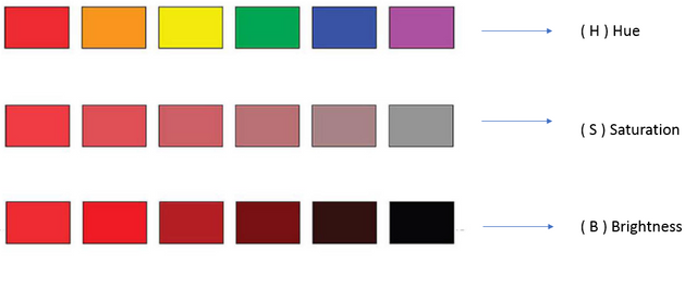
HSB color space is in other words how our brain works.
Hue is a ton of a color as I said, that means that hue is any color our brain can differentiate, e.g. red, violet, brown etc.
Saturation is dose of gray in color so for example at value of zero saturation everything would be black, white or grayscale.
Brightness refers to how close on the scale from white to black the color is.
For example, brown color in HSB would be around 25% orange, 50% saturated and because it's dark around 30% bright.
There are 2 types of color mixing/system:
- Additive synthesis (RGB)
- Subtractive synthesis (CYMK)
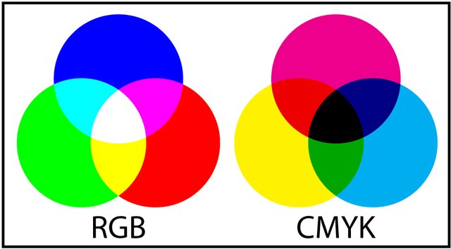
RGB is called additive synthesis because you get different colors by adding colors on white base.
Red + Green = Yellow
Red + Blue = Magenta
Green + Blue = Cyan
Each part of the color varies between 0% and 100% and all 3 colors together gives white.
RGB model is used on screens ever since LCD monitors came by.
CMYK is a subtractive color mixing template that is primarily used in printing.
Cyan + Magenta = Blue
Cyan + Yellow = Green
Magenta + Yellow = Red
All 3 colors, in theory, gives black, but in reality it's equal to dirty brown or something like that, so designers developed K which means Key ( Black ) to make it really black.
THE MEANING OF COLOR IN GRAPHIC DESIGN
WHITE - perfection, purity, safeness, simplicity..

source BLACK - sadness, evil, elegancy, mystery, night...

source
BLUE - peace, trust, intelligence, creativity, freedom..

BROWN - stability, friendship, house, care, productivity...

GREEN - relaxation, freshness, life, stability...

RED - passion, fire, speed, power...

YELLOW - optimism, happiness, memory, organization, energy...

PURPLE - luxury, wealth, dignity, delicacy, pride

Personally, my favorite color is green. Green color scientifically proven relaxes brain and is most widespread color besides blue.
This is excellent, congratulations. Resteemed and upvoted, of course.
Thank you very much :)
Very nice explanations of colors and how all this works. Great for my beginning of photography.
Thank you! Im in the beginning of IT tech, currently at Informatic design course on technical polytechnic college. I hope it's usefull :)
Purple or cyan really capture my eyes. Something just draws my brain to it. Nice job though.
"luxury, wealth, dignity, delicacy, pride" it seems you chose nice color :D Thanks though.
Took me a bit to read the whole post, but I'm happy I did. This is interesting, I especially appreciate the color blindness explanation, it was always curious to me.
Thank you for sharing this with us. 💚
Yes, it's a little bit long but I decided to write just quality posts with checked information. That color blindness was new knowledge for me and it was interesting to study that part. Thank you for reading :)
I will now see the colors in a completely different way, not literally ofcourse. I find that interpretation really useful especially when it comes to decorating, painting, drawing, buying clothes etc.
Brilliant post mate!
I'm glad it affected on you in a good way :)
Thank you very much!
Excellent and elaborate post @tonac it's posts like this that bring the quality to this platform, thank you for investing time and effort to gather the info to create this content 👍
Thank you for your kind words. It's not just about time and effort, it's about getting some new knowledge. You gotta love what you do and do what you love ♥
Exactly @tonac love what you do, do what you love 👍
life tutorial :D @ivan.atman
👍
Congratulations! This post has been upvoted from the communal account, @minnowsupport, by tonac from the Minnow Support Project. It's a witness project run by aggroed, ausbitbank, teamsteem, theprophet0, someguy123, neoxian, followbtcnews, and netuoso. The goal is to help Steemit grow by supporting Minnows. Please find us at the Peace, Abundance, and Liberty Network (PALnet) Discord Channel. It's a completely public and open space to all members of the Steemit community who voluntarily choose to be there.
If you would like to delegate to the Minnow Support Project you can do so by clicking on the following links: 50SP, 100SP, 250SP, 500SP, 1000SP, 5000SP.
Be sure to leave at least 50SP undelegated on your account.