Rising Star: proposition of the game images optimization
Yes, this is the simple-to-do improvement also helps to optimize scaling of the Rising Star trading card game on the Hive blockchain.
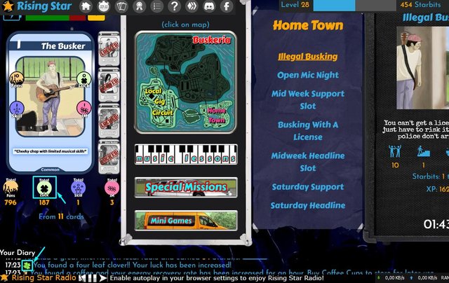
Look what I want to propose. First, lets see the facts on this example:

On this screen I highlight two images
Total Luck -- and you can see it directly here:
https://www.risingstargame.com/images/total_luck.png
And the four leaf clover:
https://www.risingstargame.com/images/clover.png
If you open them - you will see how large they are.
also I want to pay attention to the weight of both:

total_luck.pngwith size 264x309 has 25 Kbclover.pngwith size 514x516 has 261 Kb
It's not so much when you see them single, once.
But it is quite enough superfluous for the game page infrastructure with all others such images there and how many players and their requests to the site to download for the website page regularly.
My verdict: no need such sizes and no need such weight of files.
If you ask me what to take as a basis and an example, then I recommend looking at the Splinterlands game website. And if you are looking for the much ideal images optimization, I think, you can ask the @nateaguila (Creative Director, UX/UI, Design for Splinterlands + Keychain) to consultate you, @risingstargame (it would be a great hand of help for the another TCG on Hive blockchain, I love both and I do not see them as competitors to each other, but only more opportunities to involve people in the Hive blockchain community).
Have a witness !BEER
This post has been rewarded by curator of "The Community of Three Countries Ukraine Russia Belarus" with support from the Steem Community Curation Project.
За этот пост проголосовал куратор «Сообщества трех стран Украина Россия Беларусь» при поддержке проекта Steem Community Curation.