for Non-Creative Marketers: How to Design a Professional-Looking Quick Logo
Every business needs branding. But for most startups, hiring a design company is just too expensive while some cheap graphic designers are often just starting out and trying to make some money while learning the curve. If you can't afford to get a cheap design or an overly expensive one, here's a quick guide on how to get a professional looking design you can do on your own while keeping a good visual communication with your intended audience.
Read on and get your quick logo started!
Keep the color limited: One color would do the trick, most often monochrome logos are best for many reasons, one reason is it's easier to remember and people are often more inclined to trust logos that easily look good on any platforms like print, or web. Two or Three colors would also do it, if you really believe your audience would appreciate it but just keep on that limit. 4+ colors is bound to get messy and leave it overly complex and confusing.

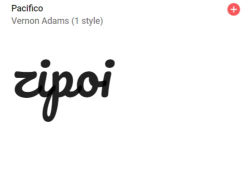
Choose whether you need a type or symbol/mark: I would suggest you go with a Type based logo for obvious reason, it's way easier to create, just have to go to fonts.google.com and choose the font type you like, type your company name and click "Apply to All Fonts" and tada! you got a bunch of possible logos to choose from, be sure to change your preferences from the right panel, change thickness, choose script types, handwriting or monospaces it's all up for your to choose from! Google fonts is a collection of free to use fonts so you don't have to worry about ownership of the fonts you chose, plus it's used by most professional designers especially for web.

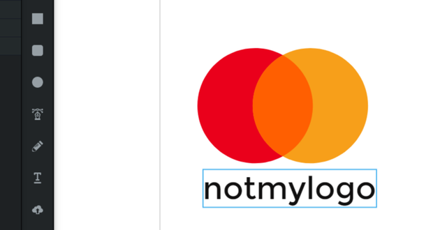
But if you think you have some time for practice to spare, you can also do a quick work for a symbol. In this case you can use VECTR, it's a forever free online design tool you can use for any type of quick designing. It's online so you won't have to install anything on your computer and it's tools are the most basic of basic so you can also save yourself from the geeked up interfaces of most of image creation softwares/applications.
.png)
Now if this is your first time to use creative tool, this might look a little scary. However, if you keep these few points in mind while creating your symbol you'll get your way into it a lot more easier;
First. Simple is beautiful. Create the simplest form by using basic shapes. From my example above I recreated the mastercard logo, since it's using the the most basic shape you can think of, just circles. You can also play with other shapes to form a symbol that you thin could stand as you visual identity.
Second and most important part. Maintain Balance. For most designs, balance is everything. Maintaining balance throughout easily creates a professional look for your logo, it's not a geek thing really. All you have to do is make sure that everything on one side looks as heavy on the other side, that's basically it!
Now you can work on your quick logo without spending a dime, and saved yourself from commissioning a cheap designer or a fortune-worth for an overly expensive design agency!
Still can't work on your own logo? In my next post, I will teach you how to talk to your designer and avoid an uncomfortable designer-client experience, if in case you chose to commission one.
Congratulations @zipoi! You have received a personal award!
Click on the badge to view your Board of Honor.
Do not miss the last post from @steemitboard!
Participate in the SteemitBoard World Cup Contest!
Collect World Cup badges and win free SBD
Support the Gold Sponsors of the contest: @good-karma and @lukestokes
Congratulations @zipoi! You received a personal award!
You can view your badges on your Steem Board and compare to others on the Steem Ranking
Do not miss the last post from @steemitboard:
Vote for @Steemitboard as a witness to get one more award and increased upvotes!