Steemit Blog Graphic #1 What Do You Think?
Steemit I Need Your Feedback
I'm a photographer and kind of all over the place with my steemit content and would love to hear your suggestions.
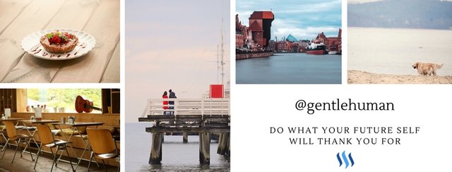
This graphic which I designed with Canva was supposed to show up in future under every post of mine, but I'm not satisfied with the result and can't tell why.
I would love to hear your Feedback:
What would you change about this graphic?
EDIT: Thank You guys for your feedback :)
New Graphic:
.jpg)
Before:

Love the boxes, however I personally feel like the banner images could be curated a little more personally to your name + slogan “do what your future self will thank you for”. all of your pictures showcase a general vibe... I see nothing of yourself nor am i challenged to believe in your slogan. I also am not fond of the huge white space bottom right as with the website being white as default it creates a big “hole” amongst your pictures. I would make it a colored box with white colored font. Otherwise, I love the color composition of it all and the clean composition.
Thank you, your feedback helped me a lot!
.jpg)
oh wow! so much different from your first edition. looks more like a logo now!
Some feedback: I actually liked the lowercase on your first logo. I think it humanizes you more actually. Also could you center the icons + text so that the space between the top and bottom is equal? :)
Honestly this is darn good and you gave me a great idea! If I had to change one thing it would be the little cupcake, instead you could have a hot coffee cup with the actually steam but the cupcake is cute though so it's a tough choice.
I'm fairly new to this site so I am still learning along on the way but I realize from an idea like is much needed to give taste. Bravo!
Thank you, I changed it to the matcha tea :)
That's awesome, what's your idea?
That is even better, with the steem logo nice!
I plan to put the a similar collage as my signature, sort of like yours and the old school signatures in forums. I'd like to do that again. Thanks!
Yes, It's a great way to personalise one's blog here :)
I've completely changed my design now :)
.jpg)
Very cool! I should probably have something like this at the foot of my blogs. We shall see..
Thank you! I've made it with canva.com it's an amazing tool, if you don't know it yet you should check it out :)
I would be very glad if you could give me some more suggestions and feedback for my content, I feel kind of stuck.
I've bookmarked it so perhaps sometime soon :)
As far as content, you have travel / photography / daily life as interests and so these are the categories and tags to have a look around and see what others are doing with regards to content and formatting.
#walkwithme I think contains some nice content.
Personal insight, a bit of history/information, photos to complete the picture, a nicely formatted post, around 500 words.
I think its this combination that the curators seek.
And you always have dtube. I think the competition will get tougher there so video editing, music, new locations.
Reviews of Films, games, restaurants, museums, could also be an option.
hopefully some ideas for you :)
Thank you, I will make some more research and the #walkwithme is also a good tip :)
I've got to learn to write better. I'm also very interested in personal development and thought about writing and talking about this, but my challenge is how to combine it with photography.
How do you manage to write about different topics that aren't obviously connected?
Yes, I want to make more dtube videos. I will make a trip to Malta and try to upload almost every day :)
Thank you for helping me out! :)
This is the best post on Steemit. I gave you a vote now, ya heard?
You got a 66.09% upvote from @minnowvotes thanks to @gentlehuman!