파이썬을 이용한 빅데이터 분석 - 히트맵 만들기(Heatmap)
파이썬을 이용한 빅데이터 분석글입니다.
작업환경: jupyternotebook, python3
학습용으로 진행한 분석입니다. (저는 전문가가 아닙니다 ㅠㅠ)
notebook파일이 있는 곳에 데이터파일이 있어야 합니다.
원본데이터에는 한글이 포함되어 있어 수정 후 2015.csv 라는 파일을 만들 었습니다.
원본 데이터는 https://www.data.go.kr/dataset/15007122/fileData.do에서 받을 수 있습니다.
코드는 <www.ritchieng.com/machine-learning-project-customer-segments/>를 참조하였습니다.
코드는 다음과 같습니다. 사용하실 때 주석삭제 후 사용하세요.
#--------------------------------------------------------------------------------------------------------------
import pandas as pd
import numpy as np
import matplotlib.pyplot as plt
from scipy import stats
import tensorflow as tf
from sklearn.cross_validation import train_test_split
from sklearn.tree import DecisionTreeRegressor
from IPython.display import display
#라이브러리 임폴트
f = "2015.csv"
data = pd.read_csv(f)
COLUMNS = ["anual", "NO.", "gender", "age", "location",
"height", "weight", "Waist size", "sight_l", "sight_r",
"Hearing_l", "Hearing_r", "Systolic_blood_pressure", "Diastolic_blood_pressure",
"Fasting_blood_sugar", 'total_cholesterol', 'Triglyceride', 'HDL_cholesterol',
'LDL_cholesterol', 'hemoglobin', 'Urine protein', 'Serum creatinine', 'AST', 'ALT',
'r-GTP', 'smoke', 'alchol', 'Oral examination', '?', 'Dental caries', 'tartar',
'date']
#칼럼 라벨 설정
dataset=pd.read_csv(f, names=COLUMNS, skipinitialspace=True)
#만든 칼럼 추가
dataset.drop(["anual", "NO.", "location", "Waist size", "sight_l", "sight_r",
"Hearing_l", "Hearing_r", "Systolic_blood_pressure", "Diastolic_blood_pressure",
"Fasting_blood_sugar", 'Triglyceride', 'HDL_cholesterol',
'LDL_cholesterol', 'Urine protein', 'Serum creatinine', 'AST', 'ALT',
'r-GTP', 'Oral examination', '?', 'Dental caries',
'date'], axis = 1, inplace = True)
#필요없는 칼럼을 데이터 셋에서 제거
#원본데이터는 한글로 되어있습니다. 의학적 지식이 없어 제가 임의로 영어로 변경하였습니다.
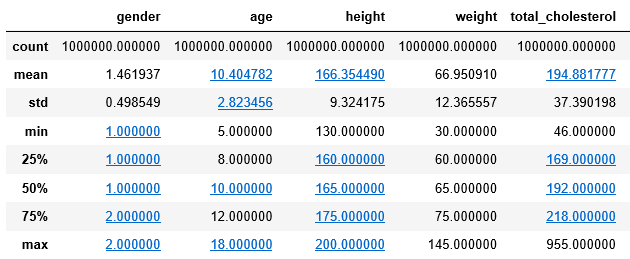
stats = dataset.describe()
stats
#추출된 데이터셋 상태를 봅시다
size=15
corr = dataset.corr()
fig, ax = plt.subplots(figsize=(size, size))
tt=plt.imshow(corr, cmap='plasma', interpolation='nearest')
fig.colorbar(tt)
plt.xticks(range(len(corr.columns)), corr.columns, rotation=90);
plt.yticks(range(len(corr.columns)), corr.columns);
plt.show()
size=10
corr = dataset.corr()
fig, ax = plt.subplots(figsize=(size, size))
tt=plt.imshow(corr, cmap='plasma', interpolation='nearest')
fig.colorbar(tt)
plt.xticks(range(len(corr.columns)), corr.columns, rotation=90);
plt.yticks(range(len(corr.columns)), corr.columns);
plt.show()
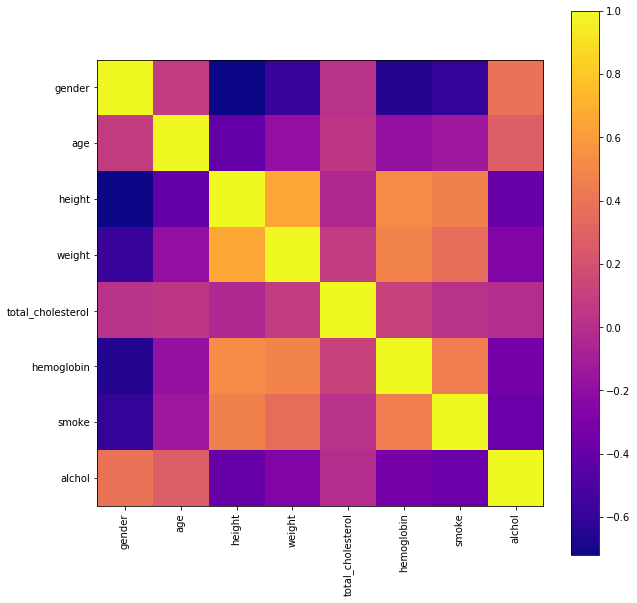
각 인자별 연관성을 시각적으로 볼 수 있습니다.
-키와 몸무게(키가크면 몸무게가 높음)
-헤모글로빈 수치는 키,몸무게 마지막으로 흡연과 관계가 높음
Congratulations @savior1985! You received a personal award!
Click here to view your Board of Honor
Congratulations @savior1985! You received a personal award!
You can view your badges on your Steem Board and compare to others on the Steem Ranking
Vote for @Steemitboard as a witness to get one more award and increased upvotes!