Start Creating Beautiful Data Visualizations: Advance from Excel to R [Part 1]
Introduction
Data visualization has become an integral part of every single industry. From a multinational corporation showing how it is going to shave cents off of its supply chain to a cancer research center presenting data to convince the medical world that a new treatment is promising, industries everywhere rely on making clean, understandable, and beautiful data visualizations to highlight their work and convince readers of a particular point. Even though it may seem like it takes expensive software and years of experience to create these figures, it actually only takes a few lines of code to create stunning graphs on R. Furthermore, learning R will allow you to have the power to answer questions you have about anything. Sports statistics, genetics mutation data, and historical stock and crypto prices are all readily available, and R makes it simple to gain access to this data for analysis.
Excel works, but...
Excel has become one of the most widely used programs for recording, analyzing, and visualizing data. Its interface is easy to use, and every step you perform is based on going form cell to cell. In this way, excel avoids the need for you to have to write "complex" code and allows you to see the data being analyzed step by step. Though this makes excel easy to use, it can handcuff users in terms of handling large data sets, reformatting data, and creating visualizations. We all have spend hours on excel trying to reformat their data to work for particular forms of analysis, only to find out that they accidentally deleted a few rows or that we need to redo a portion of our analysis that would require us to scrap all the work we put in the last few hours.
Let's say you get all through that work and the final result is not what you expected; what then? There no concept of "debugging" in excel. The only way to find the bug is to go through each and every cell. The worst is when you want to redo a if statement that is the length of the paragraph and has hundreds of parenthesis. An accidental click or push, and the formula is ruined and excel annoys you with popups and its own attempts to "fix" the formula. As you work and get more data, excel will start to crash and your entire computer will start to slow down. Thanks a lot Microsoft for offering a worthless "error report," but what I really need is all my time back.
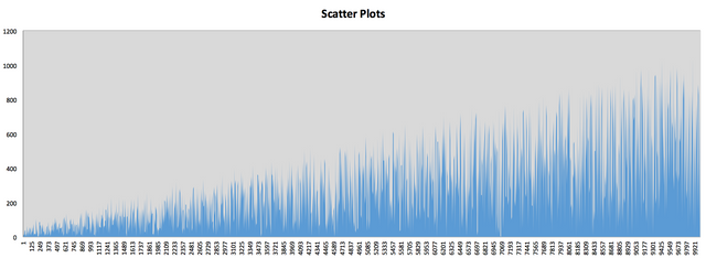
Finally, you fight through all the limitations of excel, and all you have left a small selection of graphs that excel can handle. There is very limited selection of options, and basic functions needed in statistical analysis such as plotting error bars are not available. You spend even more time slaving over the details of what fonts are present and manually formatting every aspect of your graph, and then there is not even a way to export the graph as an image. Even worst, you cannot make it directly into a vector graphic that you can resize without any pixelation. What if you want to create a similar graph with different data? Unless the data is formatted exactly like your previous project, you will likely have to repeat a lot of the analysis. Furthermore, you will spend more time manually recreating the graph.
Exhibit A:
Introducing R
Let me introduce you to your new best friend: RStudio. This 100% free software will allow you to take you analysis and visualization to a professional level:
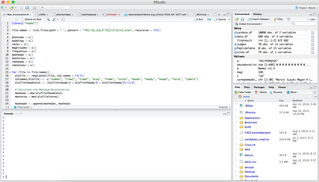
RStudio allows you to interact with the programming language R. R is one of the top languages used in statistics and scientific studies. There are thousands of free packages that people have created to allow you to have access to certain data, perform advanced statistical analysis, and build stunning visualizations with just a few lines of code. Furthermore, there is a booming community of data scientists that are regularly updating the software. For example, if you are an NBA fanatic, there are packages such as nbaTools that will allow you to easily gather all the data on NBA.com for your next study. If you want to study how crypto currencies relate to google trends data, there are many packages allowing you to gather data on thousands of cryptos and plot them against search terms. The possibilities are endless once you harness the power of R.
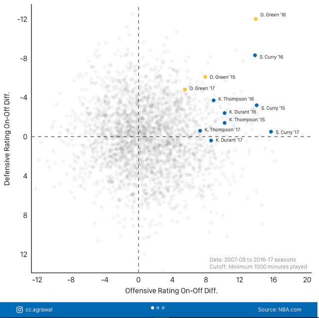
Here are a few examples of what people have been able to do with this software:
Clean Graphs:
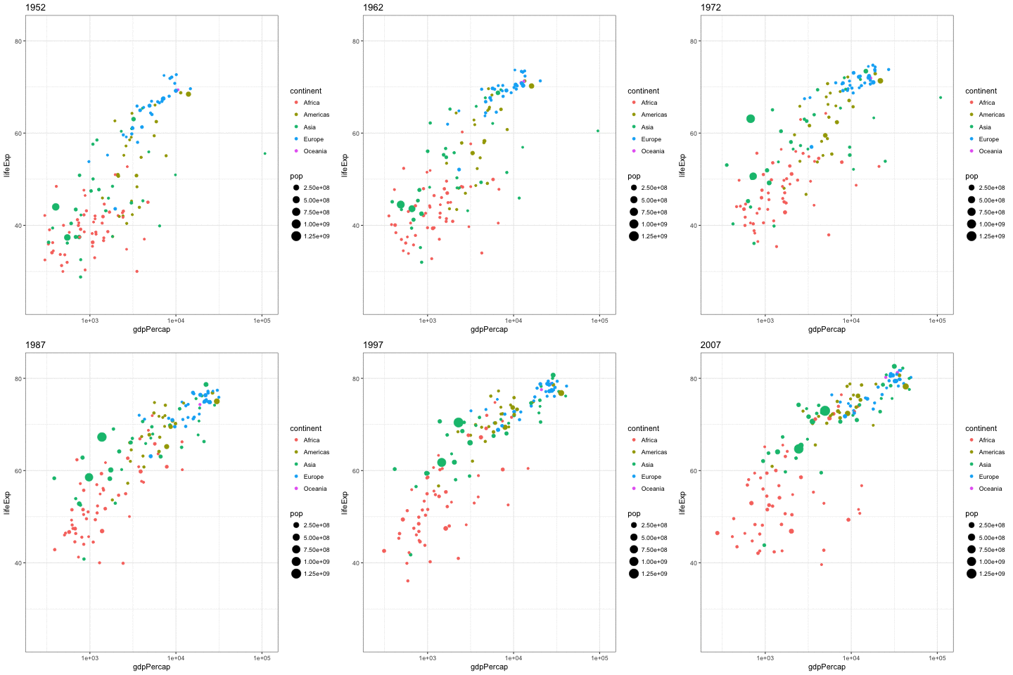
Animated Graphs:

Interactive Graphs:
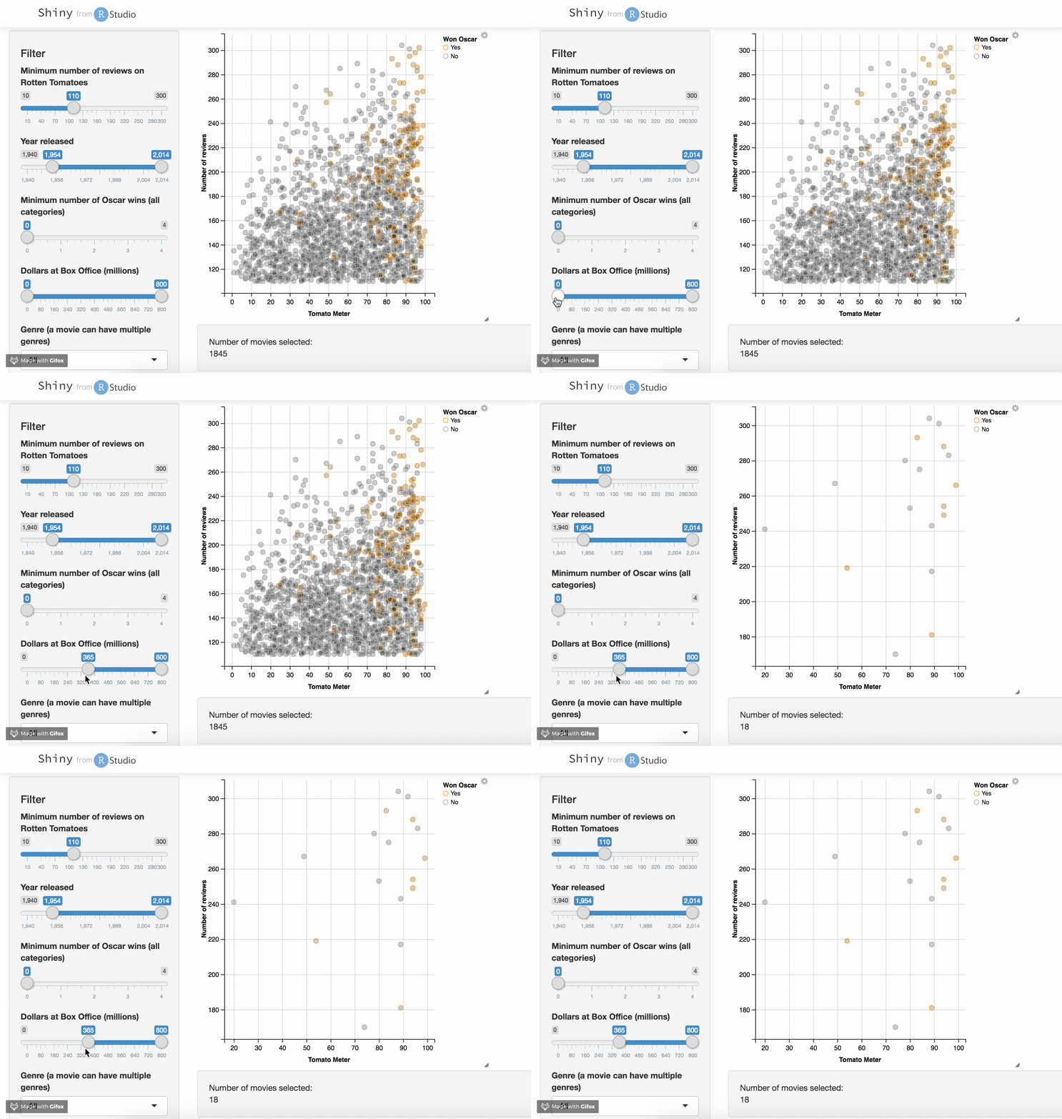
As seen above, you can even create dashboards with interactive data that people can use to explore your data even further!
Quick Start
To start off, you need to first install R and RStudio.
Install R from here: https://cran.cnr.berkeley.edu/
Install RStudio from here: https://www.rstudio.com/products/rstudio/download/#download
If you have any questions, I will try answering any and all comments to make sure everyone has this installed so that we can start plotting some graphs in Part 2 of this series!
Motivation
There is an incredible interest in having the ability to explore data, and I want to teach the Steemit community on how we can make visualizations that are publication quality. Steemit incentivizes user to make quality content, and with the right direction, we can make visualizations together that will rival those of some of the top news sites. Furthermore, I am currently a graduate student that simply loves to teach and I want more people to be able to harness the power of R. There is a bunch of data waiting to be explored, and a community of motivated analysts can definitely make some important insights.
Being an avid R-user myself, I can only concur with your post. R is wonderful...and a lot of FUN! I can really recommend using ggplot2, it’s an awesome and very intuitive R-package. Hadley Wickham even found the time to dedicate a whole book to the package (it’s called R for Data Science). You have my follow and I really do hope you keep posting R related stuff.
Sounds great man! It will be great to have your insights as I move this series along!
R is so incredibly powerful. I am taking two courses on it currently in my graduate studies. It's definitely tough to learn at first but once you get the hang of it it really is fun. I love that you mention what a pain Excel is when you have to change data and it can't just update plots like r... It can also work with GIS applications and analyze geospatial data which is so dang cool and is actually more efficient at some things than running tools in ArcMaps.
I agree, and the community is amazing. I cannot believe how powerful some of the tools are, and they are completely free for use