Power BI Designs for Impactful Reporting: Make Data Work for You
Power BI is a useful solution that converts ordinary values and figures into handy reports, thus minimizing the complexities of reporting. Today, businesses create massive amounts of data, and the capacity to visualize this data is key. The best Power BI dashboards and reports distill even the most complicated information sets into actionable reports. Power BI designsnot only present information but also include elements that enable users to drill down into it.
Understanding the Importance of Power BI Designs
While the Power BI designs, it is crucial to remember that they are more than just a presentation of numbers. They explain to the user what the data is communicating and how this is relevant to their unique business environment. In the following figures, Power BI reports become dynamic tools that are easy to read when designed well, help in decision-making, and increase efficiency. These designs can be adopted by businesses to detail several trends, track KPIs, and even make decisions.
Developing these designs entails understanding the audience, details, and a driving strategy that is aligned with the business objectives. For the same data, the layout, types of visualizations, and interactivity are crucial since they determine which data is easier or more difficult to understand. When Power BI designs are well implemented, they transform data into a valuable tool in an organization.
Principles of Great Power BI Designs
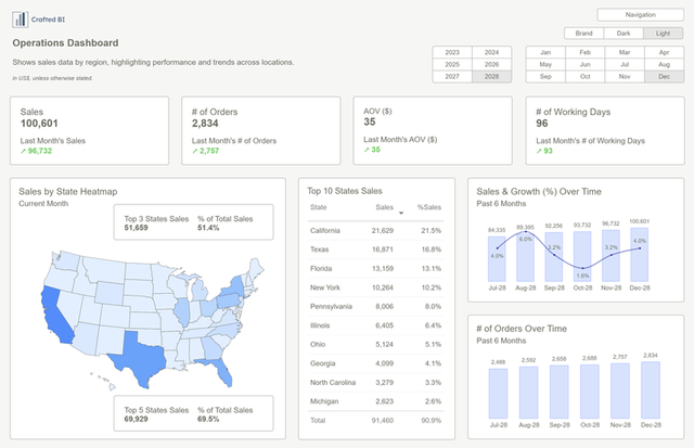
The most important aspects of Power BI designs are aesthetics, good readability, and usefulness. In this context, reports do more than look nice; indeed, they have a task to perform.
Simplicity and Clarity
For data to be easily interpreted by the users, it has to be made in a clean and simple design. The design of the Power BI should not be done with too many complexities to accommodate too many aspects or indicators relevant to the organization. Having too many visuals or too much information in a presentation can be quite disruptive or distractive to the user in an attempt to capture their attention toward what counts most. To present the information in a form understandable by users, it is easy to identify trends, unusual events, and occurrences at a glance.
Use of Color and Contrast
Color is a strong design asset in Power BI; it can draw attention to itself and highlight areas of interest in a dataset. A well-planned color scheme can aid in readability, enhance identified trends, and lead to a more engaging user experience. In the selection of colors, adherence to the principle that colors should be uniform in your reports and attractive to the eye should also be taking place. However, it’s essential to strike a balance—too many contrasting colors can be overwhelming and counterproductive. Power BI designs should not become a color explosion but a unified color story that supports the narrative of the data.
Interactive Elements
Interactivity is one of Power BI designs' unique and interesting aspects. Interactiveelements such as slicers, filters, and drill-downs provide ways in which the user can interact with the data, resulting in a more customized and dynamic experience. With these interactive elements, users can phenotype subsets of data, analyze trends over time intervals, or move into the granular details with only one step without moving out of the report. Interactive Power BI designs enable users to customize the report to their requirements, facilitating the ability to identify and recognize important insights and trends.
Prioritization of Key Metrics
Power BI design should give primary attention to presenting the most essential metrics (first) in a friendly way. Based on audience and report objectives, corresponding key performance indicators (KPIs) should play a central role. Avoid overwhelming users with excessive data. Instead, focus on metrics that directly impact decision-making. After users familiarize themselves with the main data points, they can drill down to find out more by navigating menus in the form of filters. Power BI report designs should prioritize key performance indicator (KPI) clarity by using larger type sizes, color contrast, and/or placement at the top of the report.
Conclusion
Power BI designs are an effective method to make data more transparent and informative. The design of an effective design necessitates careful planning and an awareness of what the audience requires. By design, Power BI posters turn data into meaningful reports that can be used to make business decisions. By adhering to a simple, clear, interactive, and consistent design, companies can really get the best value out of their Power BI reports. Using these designs, organizations can realise the maximum value of their data and lead to improved results.