ART SPOTLIGHT 3: BEGINNERS
REFORMATION OF CHARACTER [PHOTOGRAPHY]
Never be afraid to change and embrace innovation.
Hello everyone. I am Dammie and this is another entry to the Art Spotlight series. This is long overdue and I am really happy that I am making a comeback to this field.
For the Art Spotlight series, I aim to show how I achieve various artistic pieces using different mediums. However, for this segment, I am going to focus on the reformation of an image from its basic state to a commercially ready print, which would be added to my online shop. I am also going to include a step by step walk through and a spedup video on how I achieved the final image, so stick around and let’s get creative.
The idea for the reformation of character is to take an image that is ordinary and change it up to fit another purpose. It is about experimenting with ideas and trying different techniques to achieve a unique result with the aim of changing the character/intent of the original image.
For context, the image I choose was sent to me by my partner, the photographer, who provides the materials for me, the editor, to work with. As we are a duo team, creative options are open ended and we often have different creative waves. However, it is my job to enhance, correct or alter any image to fit a specific purpose. And this is an example of such process:
STAGE ONE: TAKING A PICTURE
This is first step in creating an art piece. The main crux of this section lies with the abilities and techniques of the photographer. If a well presented image is given to an editor, the job becomes easy to perform. However, a badly shot image can make thing significantly harder for the editor and in severe cases, the image would have to be discarded.
In order to avoid this or if you are new to Photography, I have written an article on tips and tricks of basic elements in photography called “The Principle of the Mundane” that you can check it out for an in-depth understanding into the field of photography.
https://steemit.com/photography/@williamdidi/art-spotlight-2-beginners
In this case, the image I got was a picture of a beach side filled with rocks with a horizon shot. While the image is quite simple and in raw format, I found it to be easier to work on because of its straight perspective shot and easy leading lines. Also the angles were tame and did not require much alteration, asides from overexposure.

Taken with an iPhone 5s without any editing.
STAGE TWO: INTENT
Another thing to consider is the intent towards the image. Either it comes from the photographer or based on the whims of the editor, the main purpose for the image is what will direct the creative flow and the final results of how it turns out.
In this case, the main intent of the image is to sell it commercially, so it must be something that is aesthetically pleasing and can be used in a variety of situations. From graphic design, to wallpaper to web design, the image must be clear with high resolution and provided in a format that can be altered.
STAGE THREE: EDITING
This stage is one of the most crucial parts of creating an art piece. The job of an editor is just as important as they are the ones who holds the reins to the final product. While working on a project, the photographer has the creative freedom to present a piece that they find suits the particular purpose for said project and the editor has the freedom to alter the presented image to what they believe suits the main objective for the project.
Harmony occurs when both the photographer and editor both have similar objectives and find a compromise on the creative table. This also applies if a single person performs the task of photographer and editor. In this case, having an objective and clear mindset is crucial along with constructive feedback that the keeps the person focused on the success of the project.
PART ONE: IDENTIFYING THE PROBLEM
For this project, the main aim is commercial sales, so the mindset for the image is to modify it to be as simplistic as possible in order for it to be used in a large variety of situations. Hence, looking at the image I had, I knew that image resolution was crucial and such could only be achieved with sharper angles and depth of field.
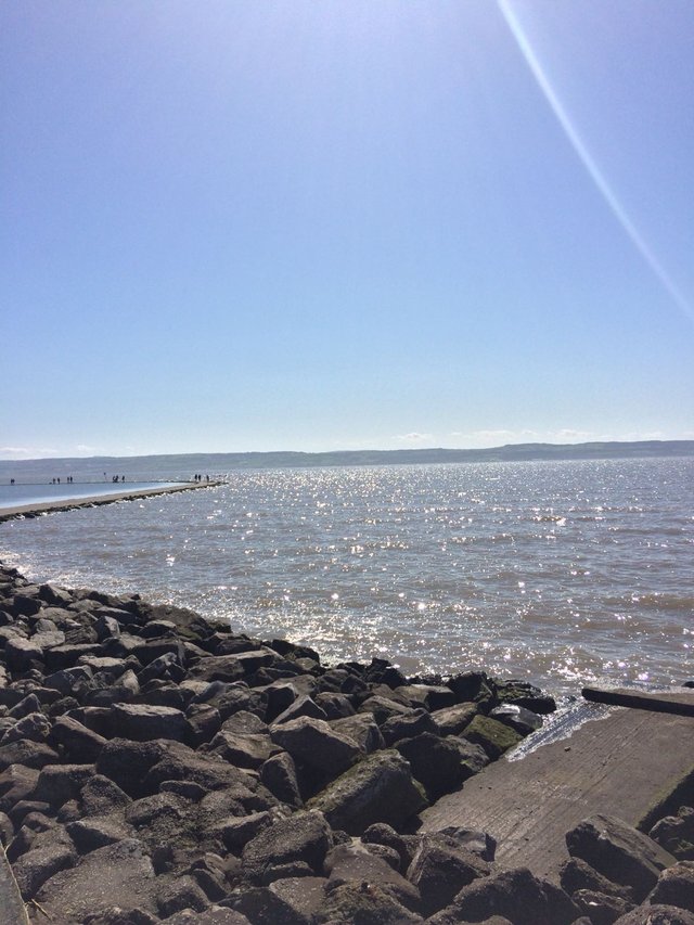
Taken with an iPhone 5s without any editing.
The original image has blurry filter to it, which could be as a result of over exposure and the position of the shot. As is to be expected form a horizon shot, one would have to deal with white balance, light reflective surfaces especially on the water line, a wonky depth of field and lens flares.
So, the best thing I could do at that point was to first correct the image and I wanted to do this without relying heavily on filters while maintaining the original composition regardless of any drastic alterations I would make. Then I would edit the image to be as aesthetic as possible with different values and tone to make it more realistic and improve the overall image resolution to give it a sharper and more refined look.
PART TWO: CORRECTING THE PROBLEM
So the app that I use to correct the image is called ‘Snapseed’ which very good for simple editing without much emphasis on reconstruction. It is easier to use on phones because it doesn’t cause lags, has a fair variety of editing choices and forces you (in a good way) to be creative with a strict guideline.
As said previously, I didn’t want to alter the original composition for the image, so it was perfect for the job. These are the step by step processes I used to get the desired image.
A. INSERT IMAGE
The first thing I did was to insert the image from my library and add it to the work table.
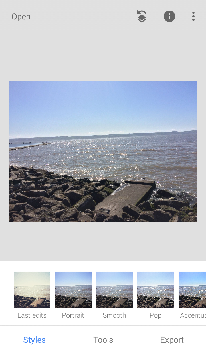
The interface looks clean and it immediately comes with a filter range that you can glide through.
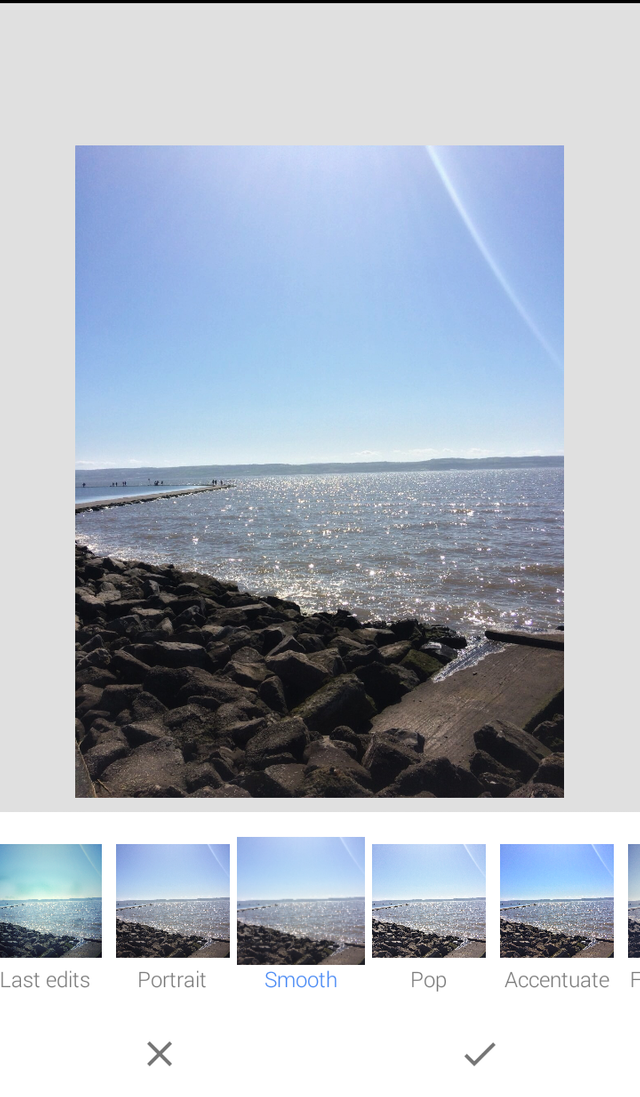
B. THE SMOOTH FILTER
Then, I choose the smooth filter because it smooths out the inconsistencies in the depth of field by making the resolution sharper and improves the grain quality in the rock textures.
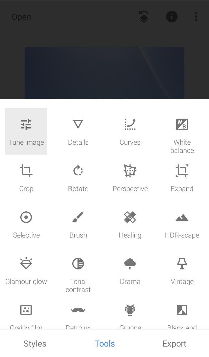
C. TUNE THE IMAGE
This is where the bulk of the correction comes from. I decided to go with a monochrome effect which resolved the issues with the white balance and reflective surfaces. In fact, the exposure helps the image to achieve an aesthetic look and reforms the character of the image from a basic horizon shot to a stylized image.
PICKING THE TUNE TOOL
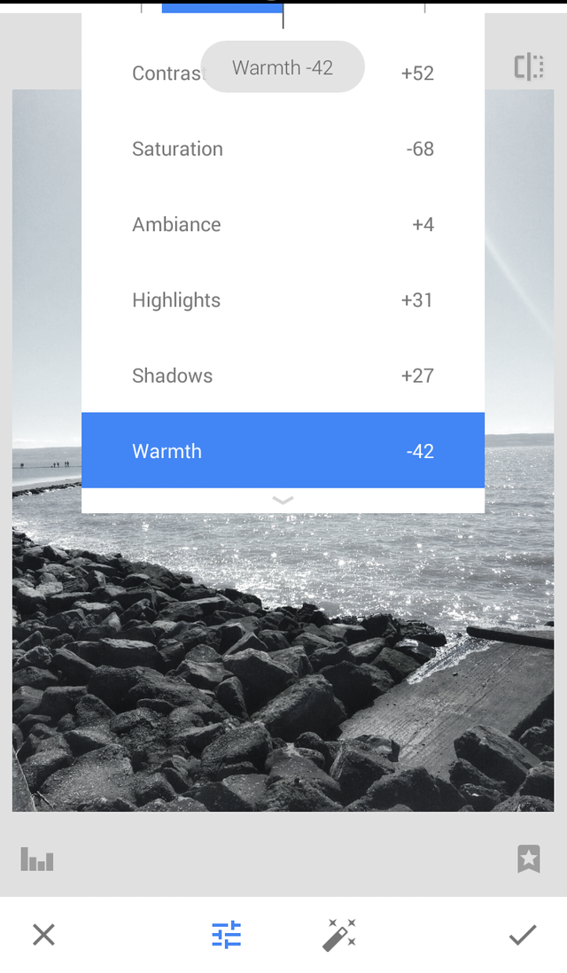
THE LIST OF ADJUSTMENTS MADE
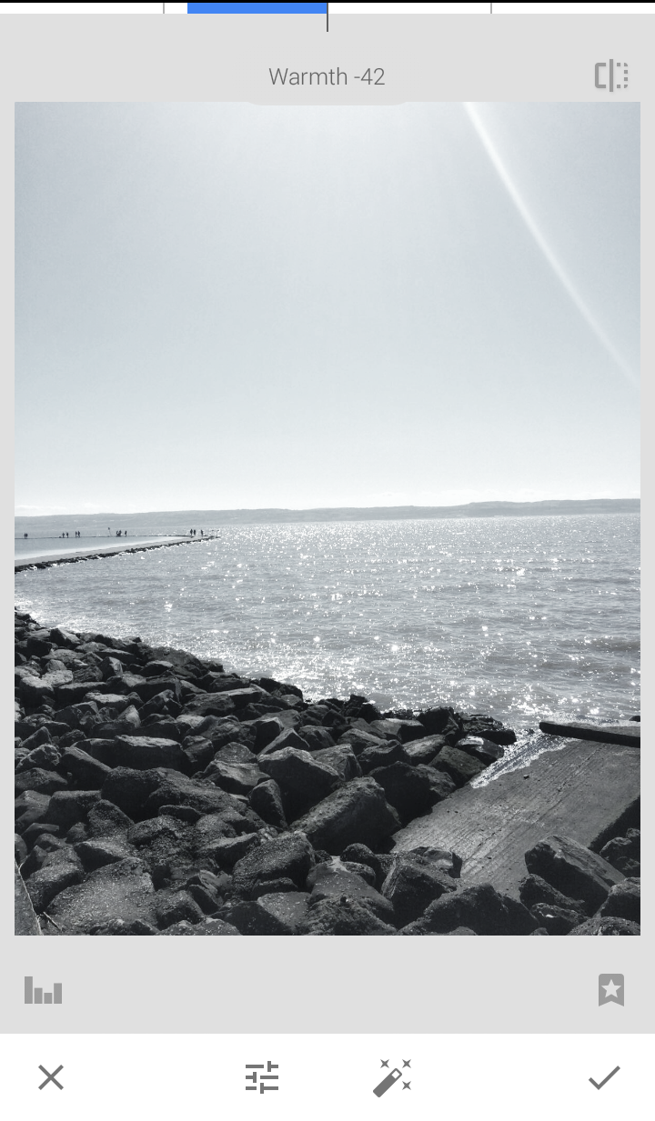
AFTERMATH OF ADJUSTMENTS
D. THE CURVE TOOL
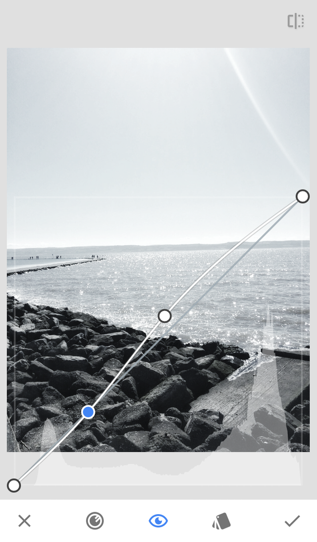
The curve tool is one of my favourite tool to play around with. It is the fastest way to give a variance in values and establish a tone in the image. This is important if you are trying to invoke a particular reaction in an image and even the subtlest changes mean a lot in the reception of such an image.
In this case, I used to it to create a depth of field by making the lower section (the rocks) darker with a darker value and forming a gradient in the higher section (the white line into a light grey tone) which creates an overall dimension into the image.
I also increased the brightness of the image to 20% to create a white wash of the horizon, similar to a misty effect but less blurry. It also reduces the reflection in the water line and instead places most of the white balance on the surface of the rocks.
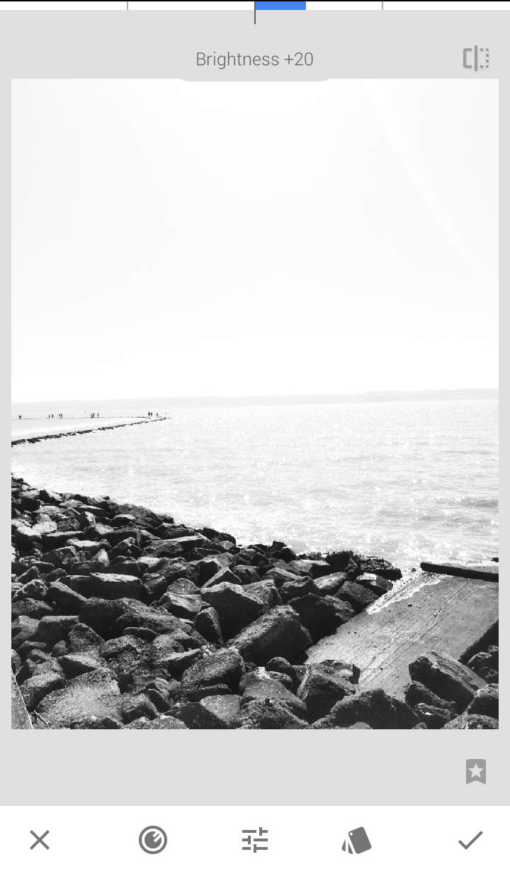
E. FIRST IMPROVED IMAGE [A]
This shows the first of improvement from the original image to the edited product.
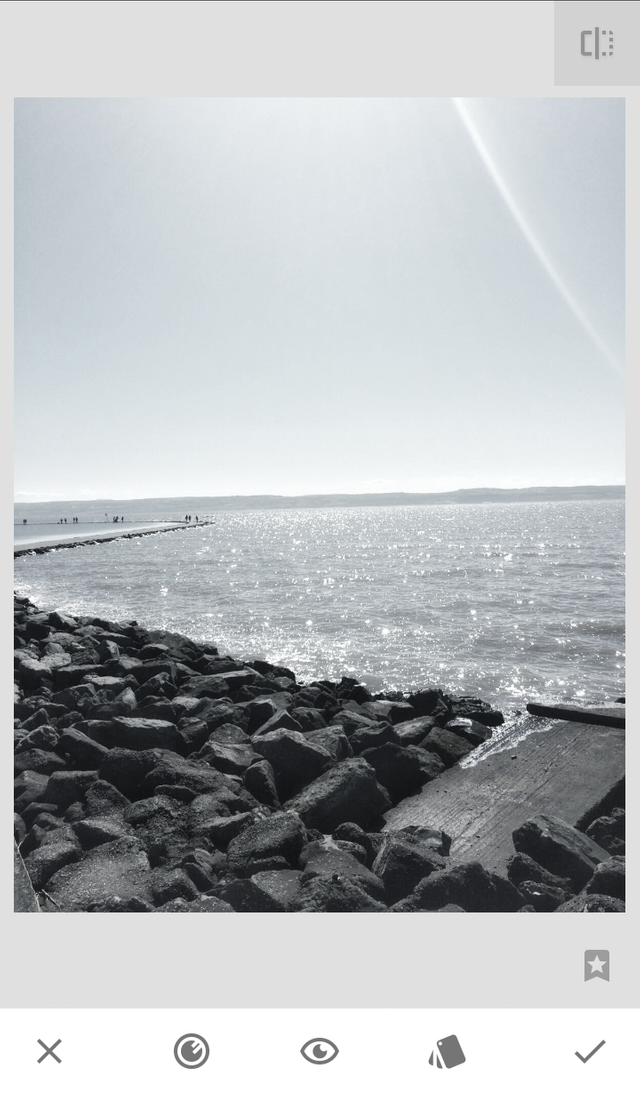
It is serviceable but I wanted to create more depth/drama in the image and make the make it more striking.
F. HDRSCAPE
This is a tool that I use when I want to drastically add dimension to a landscape and it has heavy consequences to an image. It does require a bit of knowledge/trial and error to tweak and make more serviceable. However, I found it perfect to use because it created a nice overall contrast.
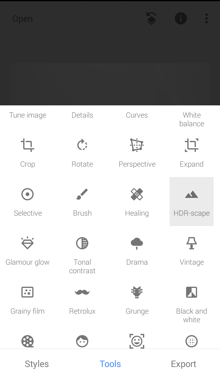
PICKING THE HDRSCAPE TOOL
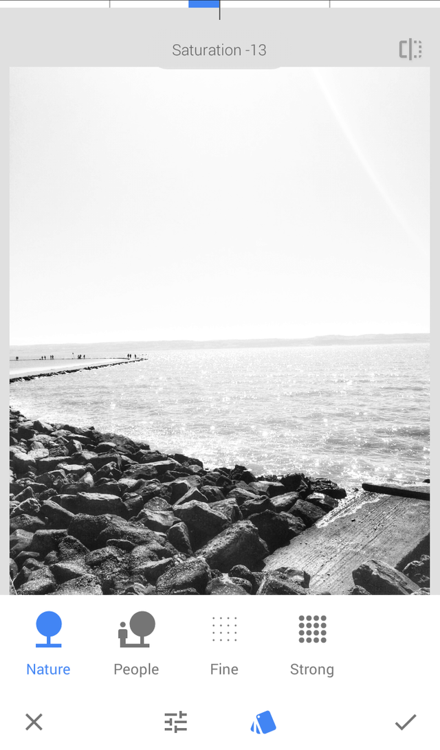
PICKING THE NATURE FILTER
I made some adjustments to the set filter to get my preferred image.
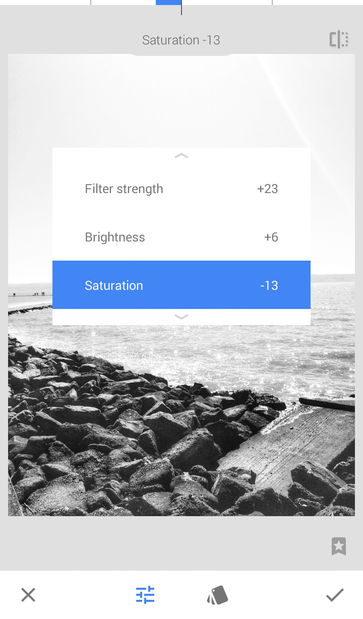
G. FINAL IMPROVED IMAGE [B]
This is the result of the corrections I made on the original image.
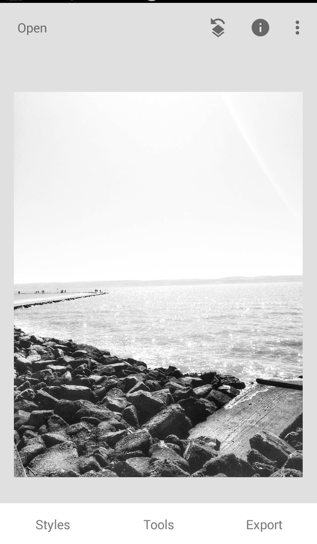
THE CORRECTED IMAGE IN THE APP
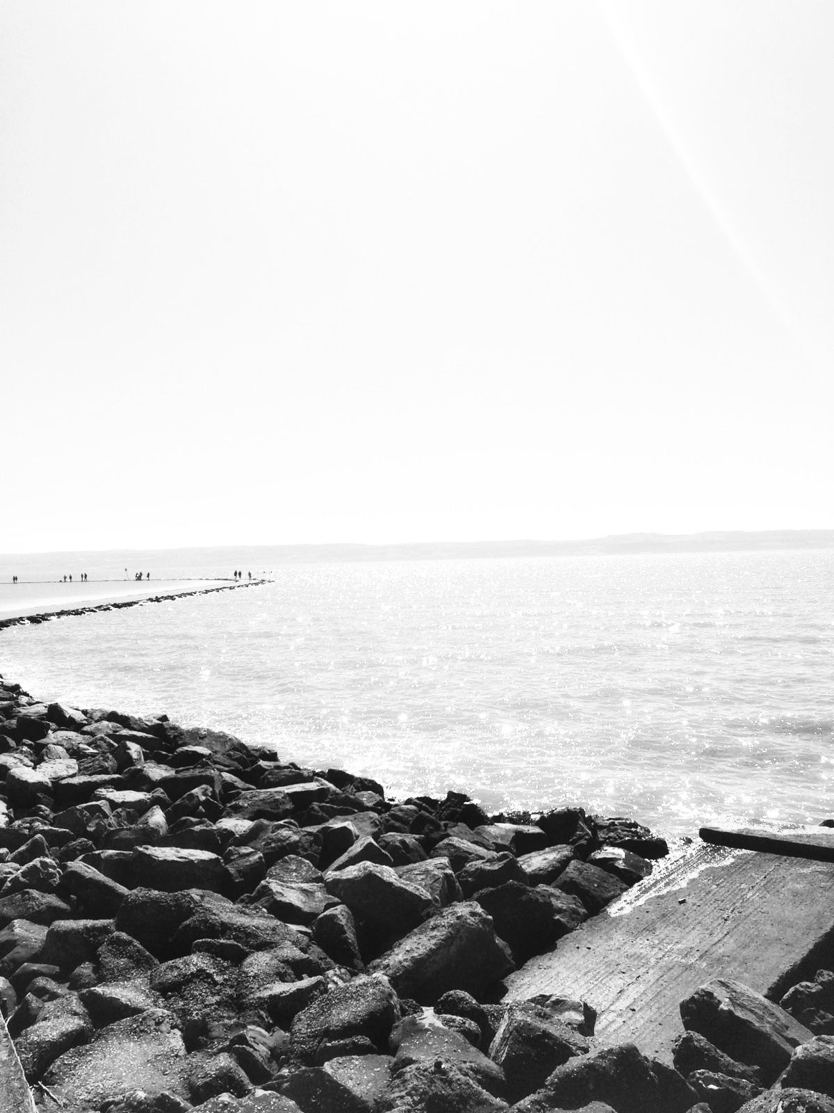
THE CORRECTED IMAGE UP FOR EDITING
PART THREE: MODIFYING THE PICTURE
This is where I start the second part of the editing process. Here, I make use of Photoshop c6 to enhance the image and fine tune any issues I found with the tone and value. It also allows me improve the resolution of the image and present the final product in a format that can be easily altered.
▶️ DTube
▶️ IPFS
I hope this is enough information for anyone to get an idea on how to I use Photoshop. I will provide the real time version of this tutorial in my online shop as a freebie when it come out but I just wanted to briefly show the techniques I use in this article.
PART FOUR: FEEDBACK
This is the final part of the creative process. This is where you meet up with the clients to show the final project and seek their approval; or this is the part where you present the final product to the photographer to check it fits with their image. If all goes well and it is approved, then you can go on to delivering the final package.
In this case, I met up with my partner and we both like the finished image. Like I said, I would post updates on this image in the nearest future, so keep in touch!
CONCLUSION
This series is long overdue and I am happy to back. I will be posting more of these type of content, so let me know if you are interested. Comment on this post and like it if you want to. Also follow me on Discord @williamdidi and send a message on what types of areas you want me to focus on next.
Thanks for the support and hope to see you soon!
Much love and Respect
Dammie