The Aesthetics of Trumpism [Unpacking the iconography of a man and a movement]
 Trumpism is, in many ways, a foreign country. To quote L.P. Hartley, they do things differently there.
We’ve watched Donald Trump for years, seeing him emerge from his minor celebrity into a TV superstar, and then rebranding again as a political firebrand. The man has remained uncompromisingly the same, not even allowing his hair to change with natural decency. But around him the iconography has transformed and the images of wealth — and its twin, poverty — have mutated with almost offensive ease.
Trump is no aesthete. He does not care for colour except gold or green. He does not have a cultural grounding or eye for art. He is motivated by quite different forces, but the relationship he and his movement have with aesthetics is fascinating.
For his own part, Trump supposedly has cultural tastes more befitting the metropolitan New Yorker he was a few years ago than the salt-of-the-earth, defender-of-the-people he’s become. He’s cited Citizen Kane (“He had the wealth, but he didn’t have the happiness”), The Godfather and The Good, The Bad and The Ugly amongst his favourite movies, whilst All Quiet on the Western Front is said to be his favourite book. But his relationship with culture has always been secondary to his desire to be visible — he has acted in films and shows from Zoolander to Home Alone 2 to Sex and the City, always as ‘Donald J. Trump’.
So the clearest example of Trump’s personal aesthetics comes from his real estate. Predictably, for a man who has made his fortune (or consolidated his inherited fortune, I should say) in the property market, he has a very clear, recognisable vision for the Trump World. The colour is reassuringly gold, the finish always reflective, never matte. The vision is skyward — a psychiatrist might say these buildings are phallic, but I feel they buy more simply into a New York tradition of competitive upward mobility.
A Trump building is like someone has planted a gold bar, instead of a flag, in unclaimed land. The Trump International Hotel in Las Vegas is a perfect example of this, standing like an elaborate tombstone in the desert.
Trump Tower in New York City (left, Spencer Platt/Getty) and Las Vegas (right, George Rose/Getty)
And inside the Trump world, these buildings look like they’ve simply been turned inside out. There is no disjunction between the exterior and interior. Take, for example, the lobby of Trump Tower, where we once saw Marine Le Pen having coffee after meeting the President.
Photo by Samuel Levine/AFP via Getty
The lobby is the perfect mix of Trumpism: Gaudy marble and gold provide the trashy ostentation that is his hallmark, whilst an in-house Starbucks reminds you that for all the signifiers of wealth, this is hardly the Ritz. Instead, it reminds me of a sort of low-rent belle epoque restaurant, with a dipped dining area. Le Train Bleu, a Parisian restaurant in this style, has become a tourist trap in itself, but put side-by-side with the lobby of Trump Tower it looks positively refined.
Trump Tower lobby (left) and Le Train Bleu (Photos by Mark Reinstein/Corbis and Francois Ancellet/Gamma-Rapho via Getty)
One of the images most often recognised as illustrative of Trump’s self-conception is this family portrait — or, at least, Trump, Melania and their son Barron — by French photographer Regine Mahaux. In it, Trump sits in a low throne, gilded in gold, whilst Melania looms over him in full glamour model pose. Trump is smiling, wearing a casual business suit, whilst Melania is dressed in a sweeping quasi-Greek dress, her legs planted in a powerpose. And, most bizarrely of all, poor Barron trump, dressed like Papa in a funereal suit, sits astride a toy lion, toy cars (two stretch limos and a vintage sports car), strewn at its feet like mauled prey.
The portrait is a work of art, from the tacky gold surfaces to the Corinthian columns that support the Trump penthouse, holding it up above the vista of Manhattan beyond. Trump and Melania are in their element, projecting themselves into the lens — only Barron looks confused by his role in this, his feet unable to touch the ground due to the sheer size of his toy lion, his hands gripping on for dear life. All the playful antecedents of children on rocking horses speak less loudly than a bored, confused child in a suit on a lion.
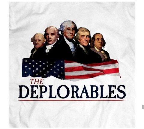
Photo by Stefano Bianchetti (left), © Historical Picture Archive (center), and VCG Wilson (right), Corbis via Getty
The styling of Trump here is quite different from how he has sometimes projected himself. The Trump dynasty is obsessed with the notion of royalty, hereditary power and success, but the 2010 portrait plays down the regalia, giving him just a simple suit and red tie, signatures of Trump the President.
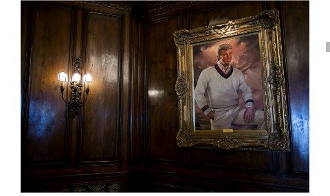
This portrait, on the wall at Mar-a-Lago, shows a different Trump. Leg up, like a great leader, clouds parting behind him like kitsch Christian art, a cricket sweater giving him all the constructed European credentials of Jay Gatsby. The biggest tip-off that these men are the same (other than the basic likeness, though the doughy edges haven’t been caught in oil paint) is the over-the-top gold frame that swamps the portrait.
“The Visionary” (or “The Entrepreneur”) is a painting by Ralph Wolfe Cowan hanging at Mar-a-Lago.
Somewhere in between these two visions is the portrait selected for the cover of Trump’s best-selling business manual, The Art of the Deal. Here he is photographed in a way that is so softly lit it almost looks painted. A suit and Manhattan beyond show that he is in business, not play, mode, but his arm is resting on a cocked leg, whilst the ghost of a smile plays on his face. It is simultaneously teasing and assertively masculine, and profoundly unsettling.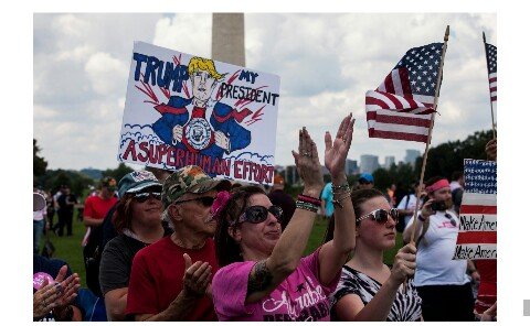
How does someone who loves Citizen Kane come to misunderstand good taste so profoundly? Did he simply read a “100 Greatest Movies of All Time!” listicle and decide that was how he’d appear cultured? How do you take away from the film the message that wealth isn’t everything, and still blithely model your interior design on its sets?
And, for that matter, William Randolph Hearst, the model for Charles Foster Kane, owned a property called Hearst Castle (naming properties after yourself, huh?) which was the model for Xanadu, and, it seems, the Trump property portfolio. Perhaps in years to come, Trump Tower will be immortalised in the next great cinematic masterpiece.
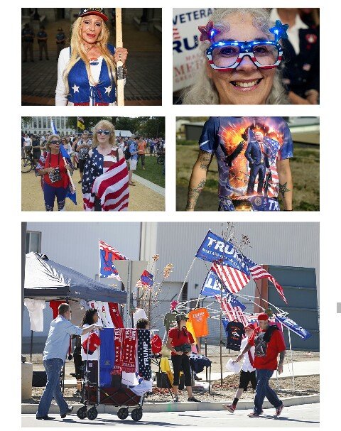
Photo by Visions of America/UIG via Getty
In looking at the aesthetics of Trumpism, the most important consideration to make is how Trump-aesthetics engage with Trumpist-aesthetics. On one hand, you have a brash New York businessman who has long been wrapped up in celebrity culture, living in a big gold skyscraper in the country’s biggest city, emblazoned with his name in big, bold characters. T R U M P. On the other hand, you have a guy who wears kind of ill-fitting suits, a funny hair piece, and a series of crummy fat ties, slightly favouring the colour red but basically trying anything bright enough to be seen by the colour-blind. He dresses like an accountant, but the sort of accountant who walks around naked in the locker room of the company gym.
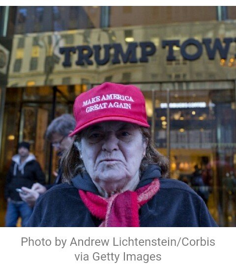
When Trump first pulled on the MAKE AMERICA GREAT AGAIN baseball cap, it looked wrong. Within the millinery subcategory of baseball caps, the MAGA cap is a trucker cap, popularised by companies like John Deere and Budweiser and associated with working class, rural areas. Even the shape is political. But the text is, as far as anyone can tell, basically Times New Roman; the most grandad of all fonts and Microsoft’s word-processing default. It is the product of a marketing department looking to start tapping into Trump’s “base”, but doing most of their graphic design in Word — or, if we’re being charitable, Paint.
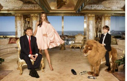
Photo by Visions of America/UIG (left) and Chip Somodevilla (right) via Getty
Despite the incongruous image of Trump, a white shirt with several buttons undone (where did those ugly ties go?), wearing the sort of cap more often found in the corn fields of Iowa, it sort-of works. And, indeed, the baseball cap became the signature of the Trump phenomenon, a low-key bridge between Trump the New York exec and his base outside of the metropolitan areas. Had Trump more totally rebranded his image, showing up to rallies in jeans and leather jackets (a move that George W. Bush could, just about, pull off) the element of performance would be too strong, too inauthentic. Instead, Trump gets to be uncompromising, simply pulling a hat over his maligned barnet and transforming.
You just need to look at the memorabilia for sale on donaldjtrump.com to see how hats continue to be the most influential piece of apparel for the Trump movement.
The success of the MAGA cap has allowed Trump to open up the visuals of that ‘logo’ to spin-offs. The AMERICAN DREAMER cap — retailing for a cool $50, but, of course, ‘proudly made in the USA’ — utilises the same, basically Times New Roman, font and ALL CAPS, like serif screaming. There’s a little star-spangled banner on the side, but otherwise this is another unmistakably Trumpist design that contains almost no actual design.
Even amongst the range of hats on donaldjtrump.com there is a creeping move towards the sort of design you’d more easily associate with the Trump who was donating to the Clintons. This next product, emblazoned with the number 45, looks more like a golfer’s baseball cap than a trucker’s. Which makes sense, after all, given that much of the President’s fortune is tied up in golfing realty. But that styling — №45 in fancy serif font — would be perfectly at home on the label of a $100 bottle of scotch. Someone wearing this cap would not be immediately outing themselves as a ‘deplorable’ (as was, to a large extent, the appeal of the MAGA hat).
It’s a flashback to a moment when the Trump brand was all about luxury hotels and links courses. No wonder it’s on sale.
But it’s not just the official stash that signifies a Trump supporter. The MAGA cap and MAGA slogan (even on unofficial gear that would make the businessman in Trump recoil) are ubiquitous, but Trumpworld is more generally rendered in the colours of the stars and stripes. Blocks of bright red, blue and, often starred, white form the basis of t-shirts, placards, flags. From afar, the ranks of Trump supporters look like variegated swathes of the American flag.
Photo Credits: Top row — RJ Sangosti/The Denver Post (left) and Jason Connolly/AFP; Middle row — Andrew Lichtenstein/Corbis and Jason Connolly/AFP; Bottom — George Frey. (Getty)
And in their conception of their man, The Don, we see the same brash kindergarten aesthetics. I did a long post looking at how magazine covers — predominantly from anti-Trump publications (after all, pro-Trump papers and magazines are vanishingly few) — and organising them by the manner in which the President was depicted. Angry baby, tycoon, politician, warmonger, explosion, hairpiece, patsy, tweeter: the methods of drawing Trump repeated themselves again and again.
There are some similarities in the depictions of the President coming from his own ranks. Here, the President is depicted as Superman (or ‘Superhuman Effort’, bizarrely). The crude, almost childish drawing gives him hair like Marilyn Monroe and a jawline like Sylvester Stallone.
Photo by Zach Gibson/AFP via Getty
And whilst anti-Trumpers have tried to use the image of George Washington and the founding fathers to undermine the President’s behaviour, the Trump ranks have taken on the notion of DJT as simultaneously a traditionalist and iconoclast.
Below are three variations on the theme of ‘The Deplorables’, a slogan they assumed after Hillary Clinton labelled their ranks a ‘basket of deplorables’ at a NYC fundraiser (the sort of fundraiser where 90s Trump would’ve been splashing the cash for the Democrats). First, a popular image that shows George Washington, Thomas Jefferson, Benjamin Franklin et al. captioned with “The Deplorables.” This is a good intersection between Trumpism’s inherent patriotism and his anti-establishment credentials, two themes that are constantly in tension.
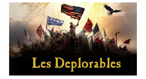
Similarly, this design takes The Deplorables and turns it into a modern day Les Miserables. Again, there are revolutionary themes and even tricolores splashed in amidst the stars and stripes (after all, they use the same colours) whilst an eagle soars out of the sunset. Inspiring stuff…
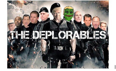
The above depictions are, in a way, quite atypical. Most of the graphic design to notionally emerge from the Trump movement originated in the bowels of the internet’s meme culture. Here is the famous Expendables/Deplorables mash-up that provoked debate when it was tweeted by Donald Trump Jr. during the election campaign. The issue was the presence of Pepe the Frog, who we’ll come to in a second. For now, just marvel at the idea that this became a serious campaign image, despite the infantile Photoshop work.
Pepe the Frog is an internet meme that has been making the rounds for a decade. A disturbing, wide-mouthed frog, often with a protruding red tongue, it bubbled through 4Chan and became a symbol of the alt-right — a movement that is operationally distinct from Trumpism but essentially a subset of the phenomenon. Pepe is, essentially, a white supremacist symbol, which was frequently combined with the Trump hairpiece by his supporters to reproduce a dog-whistle icon that spoke to a white nationalist element of Trump’s base. Because the Trumps began to notice and even share the Pepe meme, presumably not unaware of its context, it became an increasingly powerful, toxic symbol of digital Trumpism.
Trump the tycoon, Trump the politician, Trump the rabble-rouser, Trump the meme, Trump the symbol. Even just his silhouette in profile is immediately distinctive, conveying the essence of a major political uprising. Trumpism has never needed a uniform or symbol or any of the visual markers of fascist, communist or even social democratic uprisings (the swastika, hammer and sickle, New Labour’s rose). Trumpism looks like Donald Trump: flabby, pouting, hair like a grease streak.
Despite a lack of unity between the lush ostentation of Trump’s personal life and the working class communities who carried him to power, the aesthetics of Trumpism take their lead from the man. However hard Trump has tried to surround himself with crass beauty and distracting ornaments, he is still the figure at the centre of his movement. Excepting Obama for historical reasons, Trump is the most distinctive looking modern American President, and everything around him starts to look like the man. Take, for example, his signature, a huge (Trump is 6'3 and built like a rugby player) scrawl, that looks simultaneously like a Richter scale measurement for the earthquake caused by swamp draining, and a child’s drawing of the New York skyline. It is so sharp, so pointed, and even though the man next to it is so round and squishy, they are unmistakably one.
And there, at the end of the rainbow of Trumpism, we’re back at the start. You can strip away all the personal affectations — the family, friends and advisors who people the Trump landscape. You can forget about the colours of the American flag, the typography of MAGA or the lettering of T R U M P. You can discard Pepe the frog and his cartoon wig or badly Photoshopped versions of blockbuster movie posters. The image of Trumpism that unifies self-image, the base, the trolls, and the rest of the circus, is the man himself. Just a big rich guy in a suit, on top of the world.
Resteemed to over 18600 followers and 100% upvoted. Thank you for using my service!
Send 0.200 Steem or 0.200 Steem Dollars and the URL in the memo to use the bot.
Read here how the bot from Berlin works.
#resteembot #bestofresteembot #winwithresteembot
Feel free to join our partner crypto exchange: https://www.binance.com/?ref=10230705.
@resteem.bot
Resteemed by @resteembot! Good Luck!
Check @resteembot's introduction post or the other great posts I already resteemed.
This post has received a 2.66 % upvote from @drotto thanks to: @maxvoice.
@originalworks