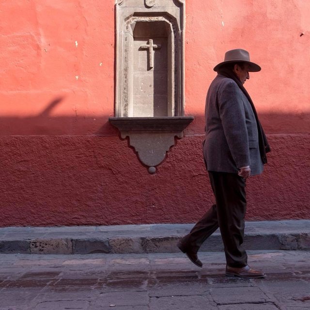
PHOTO TIP #2: Street photography composition
An accepted compositional principle for people walking past our frame is to have MORE space in front of them, and LESS space behind them. This allows for a harmonious directional “flow” within your picture space. The exception however is when you want to create a sense of tension or emotional dissonance. If this is the case, compose your photo in the opposite: LESS space in front of them, MORE space behind them, as they walk past your frame.
What do you want to learn? If you are stuck in some aspect of your photography, each day I will post a new photography tip to help you create better images. Just let me know in the comments below what you want me to discuss in my tips, and during my international travels I will find photos that match what you are wanting clarity on. Please share these tips with your friends, and let me know below what you want to learn :)
Lens & Camera: xf23mmF2, xpro2, fujifilm