Mobile Photo Editing and VSCO X | A Photographer’s Guide
Mobile Photo Editing
For years I have watched and read content discussing the value and possibility of editing photos for professional use using a phone or Ipad. The idea has been proposed that professionals in the future may only need a phone to organize, edit, and deliver professional content to their clients. I have been a skeptic of this idea for years in spite of feeling excited about the technology or possibility. I believe this skepticism has arisen due to my all-or-nothing notion of mobile editing. In other words, I have taken the approach that photographers want to completely replace their desktops with a mobile solution, which I’m sure has been suggested or may even be the case for some. However, I have started to see and understand that a professional photographer in the internet age has the ability to conduct business in more ways than ever. The definition of what professional photography is has expanded and blurred in the past decade with the rise of social media, and the new wave of marketing that has taken place. This redefinition and expansion of professional photography has in turn redefined our ideas of the required tools and methods. For most of us, we are not at the point of replacing our desktops and laptops for mobile only solutions and will likely never be, however we need to realize that there are solutions being provided by mobile apps, and they do in fact have a place in the photography world.
"The case for mobile photo editing will continue to grow stronger over the next several years."
What do my readers say?
To find out if other people edit on their phones, and whether or not they profit from those photos, I took a poll on my Instagram asking the following three questions:
- Do you edit photos on your phone?
- Have you ever sold or profited from photos edited on your phone?
- If you edit on your phone, which app do you use?
Results
Out of 255 responses 73% of people reported that they edit photos on their phones. Question two had a few less responses at 235 and 11% of those people reported that they have sold images, or profited in some way from photos that they edited on their phone. I received 43 responses when I asked what mobile apps people use to edit their photos. Most people reported just one app, but a handful reported that they use a combination of apps. I recorded those responses below in order of most used to least used.
- VSCO (22)
- Snapseed (15)
- Lightroom (7)
- Afterlight (3)
- Photoshop (2)
- Filmborn (1)
- Enlight (1)
- Instagram (1)
I had expected that VSCO would probably top this list, so this is no surprise. However, I was surprised by the Snapseed numbers. This app has improved greatly over the years and it's nice to see it widely adopted. It's an awesome app, and one that I should write a guide about in the future. This was obviously a very small data sample, but the results were interesting nonetheless.
Breaking It Down
I would guess that the numbers for these questions were much higher than they would’ve been if I had asked the same questions five years ago. There’s been some really cool advancements in technology since then. However, as cool as it is that we have these awesome apps and the possibility of editing on the go, I still have a few qualms about the whole thing.
Concerns
I recently went back and reviewed photos that I took with my phone over the past several years, and I was disappointed by the lack of technical quality. The worst part is that I overlooked this lack of quality when I took the photos because I was using the best phone cameras available at the time. This problem is less severe now with the big increase in phone camera quality, but I’m still a little worried that in five years, I’ll look back and wish I would’ve used a real camera.
Technically this article is about editing photos not shooting them, so you could say that the concern I mention above doesn’t really have a place in this article, because you could be using your phone to edit high-end DSLR photos, not phone photos. However, even though most cameras today have wifi, and the process of transferring photos to your phone is getting easier, in reality I don’t see it being very practical or efficient for most people. Because of this I think it’s safe to say that most of the photos people edit on their phones were taken with their phones. But, like I said before, phone camera quality is slowly becoming less of a concern, so I believe the case for mobile photo editing will continue to grow stronger over the next several years.
VSCO X
I’d like to review my favorite mobile photo editing app, VSCO X. I’ve loosely categorized the guide below into two sections: Strengths and Weaknesses.
Please note that I am reviewing VSCO X, the subscription based version of their free app. However, most what I share below applies to the free version. I’ll make sure to note if a feature I talk about is X only.
Strengths
Filters
VSCO is probably best known for their film-like filters or Lightroom presets. So it should be no surprise that their filters are what’s best about their mobile app. They are also the feature where there is the most discrepancy in cost. The free version of VSCO includes a base set of mobile presets, sampled from a variety of preset packs. There is a built-in store within the app where users can purchase entire packs of presets for small amounts ranging from $0.99 to just a few dollars. These are one time purchases that are tied to your VSCO account and can be restored if you get a new phone and need to reinstall the app. If you purchase the X subscription, you get exclusive access to an entire set of actual film based presets, named after an actual film stock. Each preset both free, paid, and subscription include a strength slider that lets you adjust the intensity of the effect. The exclusive subscription only film presets however also include a character adjustment and a warmth adjustment. From what I’ve been able to tell, the warmth adjustment works like a typical temperature or white balance tool with variance from blue (cool) to orange (warm).
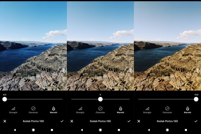
The character slider is unique from any other tool I’ve come across on mobile or desktop. It is set at neutral (zero) by default and when moved left to write, it adjusts contrast and introduces color shifts to the highlights or shadows much like the nuances resulting from pushing or pulling actual film, or shooting with expired film. As seen in the examples below, this tool is best used in moderation.
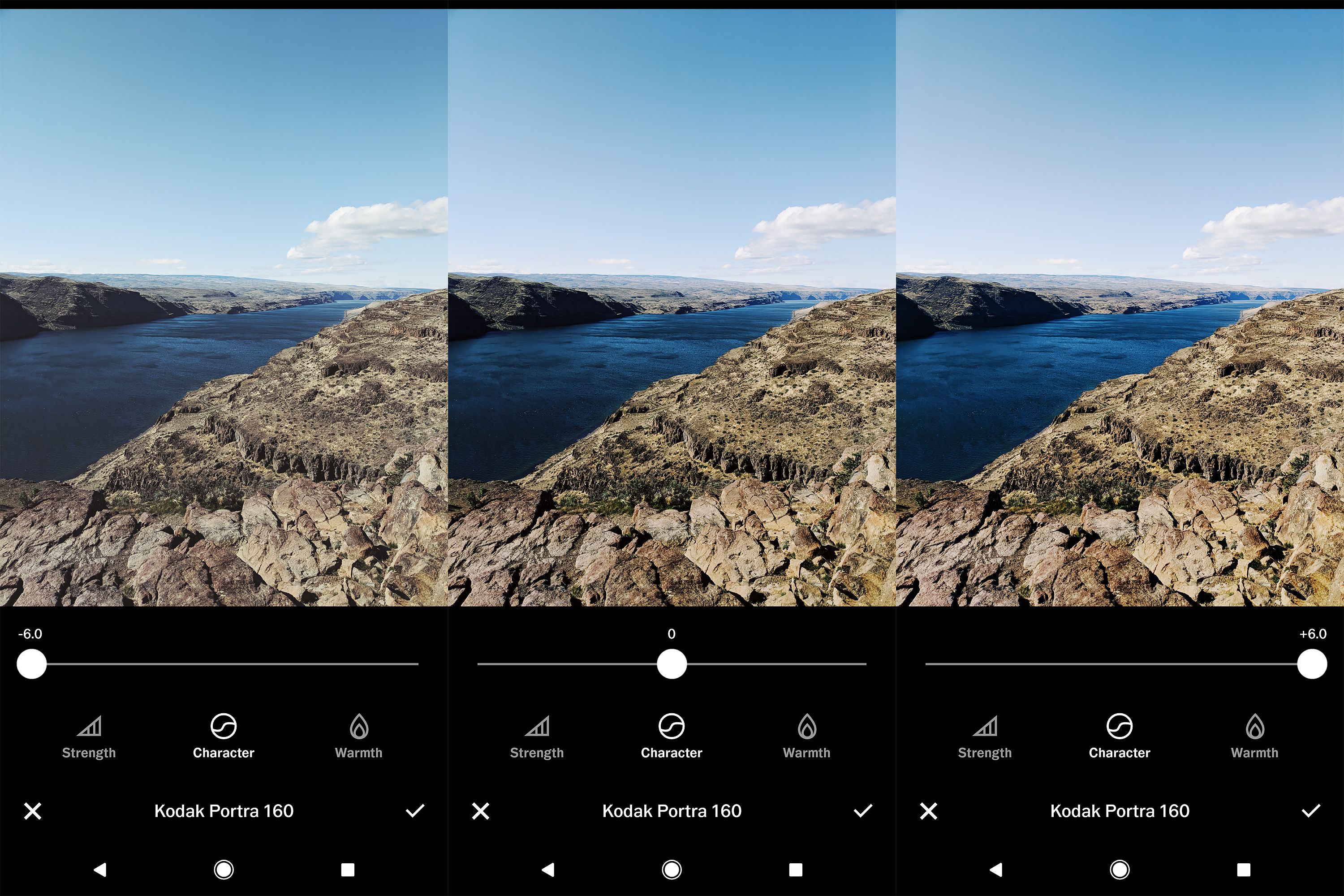
I love the effects these film filters give. My only complaint is that they are applied at full strength by default. It’d be better for the slider to be set at the halfway point. In its current implementation, it’s a temptation to over-edit.
Tools
The second strength for VSCO is it’s set of universal editing tools. They’ve included all of the basics such as exposure, contrast, saturation, temperature, straightening, and crop. These tools are expected in any editing app. It’s what else they’ve included that makes them stand out:
- X-Skew
- Y-Skew
- Sharpen
- Highlights
- Shadows
- Tint
- Skin Tone
- Vignette
- Grain
- Fade
- Shadows Tint
- Highlights Tint
- Borders
- HSL
My favorite tools are listed in bold above. You can read more about why I love them so much below.
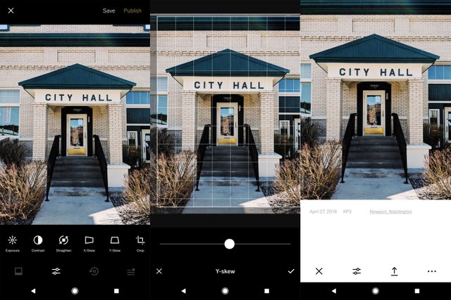
X + Y Skew
I’ve believed for a while that simple cropping and horizon straightening can elevate a poor or mediocre photo, to a great photo! This same concept applies to perspective adjustments
anytime you’re shooting predictable geometric subjects such as buildings with straight lines, angles, or symmetry. Often these adjustments are minor, but make a big impact on the final photo.
Borders
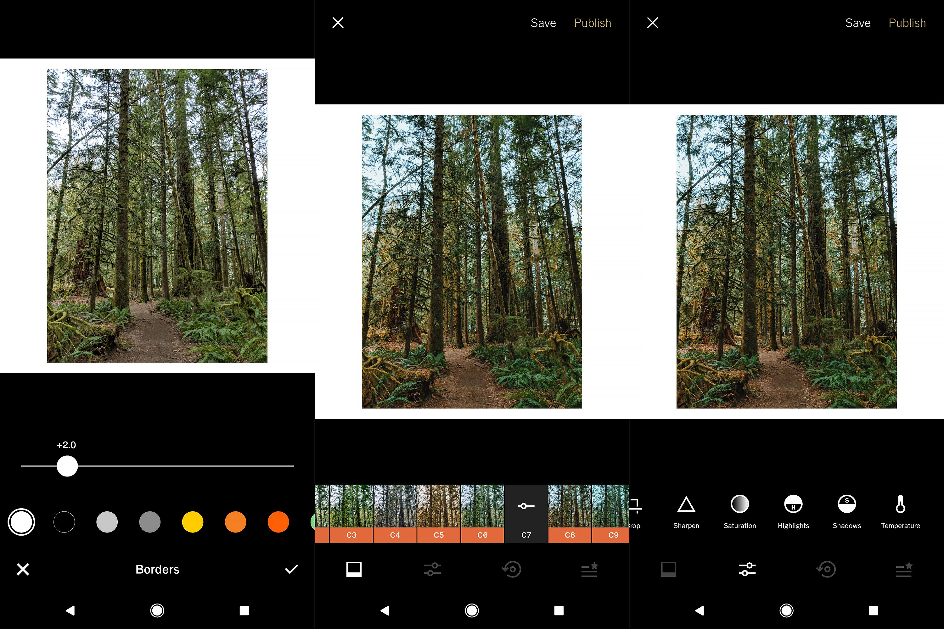
The reason for choosing this as one of my favorites is probably not for the reason that you’d expect. However, choosing a white border between two and three on the slider is the first thing I do when I start an edit. When I can frame my photo with white, I feel like I get a better sense of color, and it helps me see what I’m doing more accurately. I edit this way in Lightroom for desktop as well. I make the background of my develop panel white, and zoom out on the photo so it’s between a thumbnail and full-sized image. It’s important to me that the colors in my image complement each other, and I can get a better sense of this when the photo is smaller and bordered with white. I have a theory that the reason I see better in white is because that’s how I most often view photos. If I print, they have white borders. Instagram is white, my website is white, and even the prime days of Flickr, photos were placed on a white background. Can you guess what setting I use to browse photography on Steemit?
HSL (X members only)
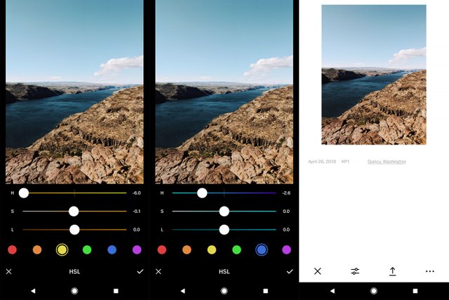
I would be tempted to say that this tool alone makes the $19.99 annual subscription worth it. It works the same way as it does in Lightroom and the functionality it adds is unbeatable in my opinion. It was the last tool I needed in helping me replicate my favorite looks that I’ve been able to create in Lightroom. If you’re not familiar with an HSL tool, it allows you to adjust three aspects of your photo: Hue, Saturation, and Luminance. You can choose one of seven colors and adjust the individual aspects of just that color. The fine tuning this allows is incredible!
The tools I use the least are skin tone, vignette and highlights/shadows tint. I typically do not shoot many portraits so the skin tone adjustment does not apply to me. Also, now that I have access to HSL, I’d prefer using that to adjust individual colors (including skin tones). shadows/highlights tint lets you apply a tint in varying intensity to the the highlights and/or shadows of your photo. This is similar to the split toning panel in Lightroom, which I also rarely use. You need very specific objectives in order to make split toning work effectively. Again, don’t over edit just because the tool is available.
Platform
This category is an important one and includes: non-destructive editing, recipes, and copy/paste editing settings. Let’s get right into it!
If you have a set of images that you want to batch edit VSCO thankfully makes this super easy. Here’s how it works.
- Make edits to one of your images until you’ve got your look dialed in, and hit save.
- Then go back to your grid and select the images you want to edit.
- With them selected touch the menu and select paste edits.
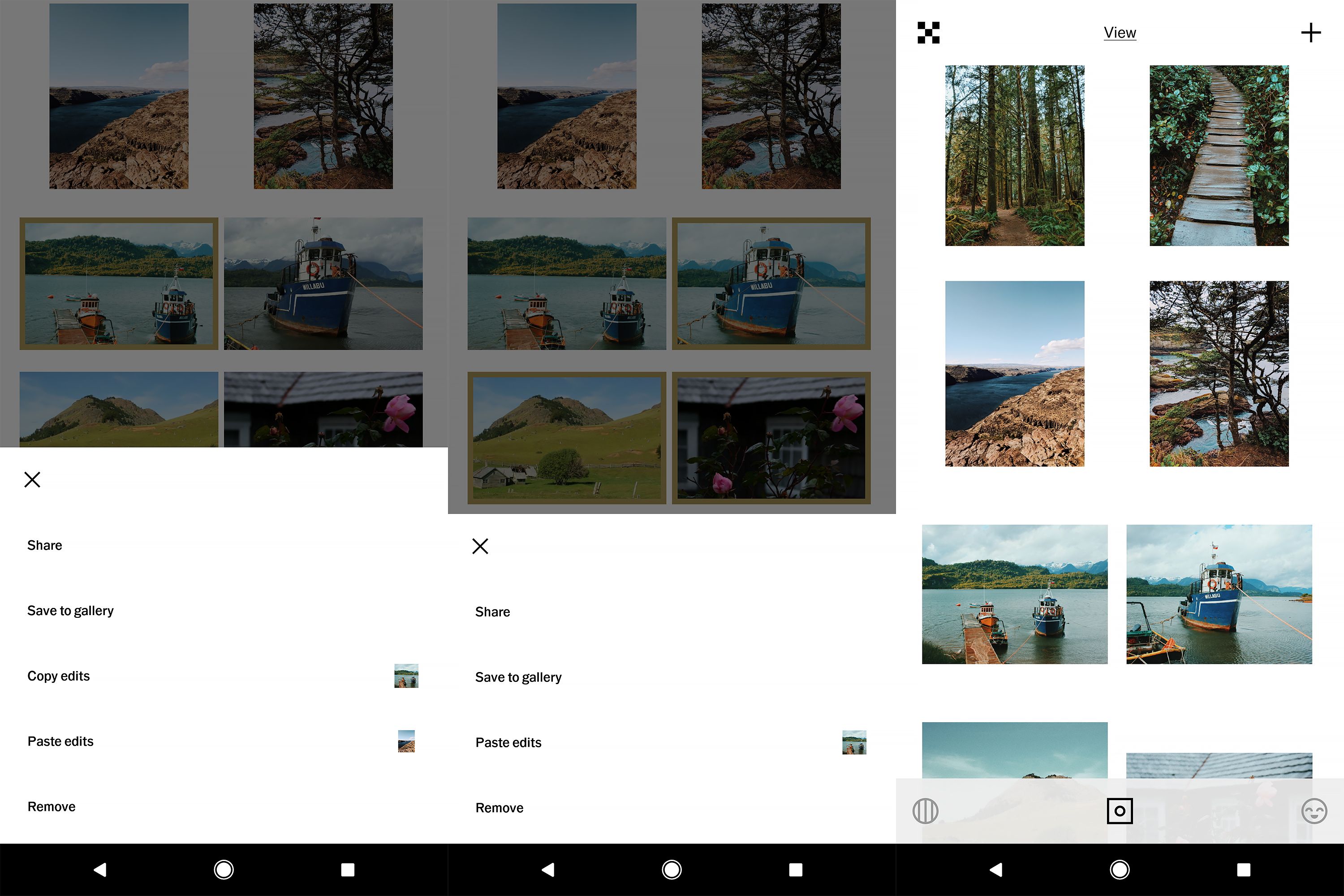
Just like that all of the photos you selected will have same set of edits applied to them in a just a few seconds. Keep in mind that this method copies all of the edits made. So to save time I wait to apply individual edits that I know might be different for each photo like exposure, cropping, or perspective until after I copy and paste the batch edit settings. The other great thing about this is that the edits for each photo are saved in the history and you can go back in and delete the edit, or individually adjust it as needed. All editing is non-destructive, meaning it is fully adjustable without image quality loss that comes from saving and re-saving a jpeg. You can continue to tweak your adjustments until you have exported that photo out of VSCO.
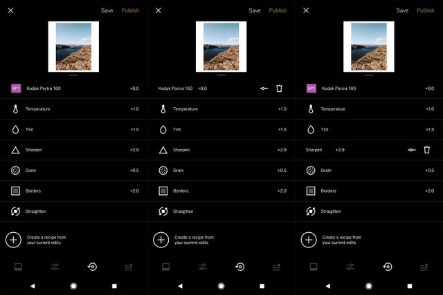
Finally, if you've created a look you really like from a combination of edits, you can save that look as a recipe (think preset) to apply to future images. Unfortunately this feature feels underdeveloped as there is no way to name or organize the recipes. Instead you’re given a tiny white button with a circular thumbnail of your current image. If I have multiple recipes, I have no idea what recipe I’m applying and no way of knowing which one it is and what kind of images it might work well on. However, I am listing this feature as a strength for right now and hoping it’s just a result of the poorly designed interface. The idea of creating unique recipes is appealing, it’s just not fully thought out and developed by VSCO. I end up just using the copy/paste edits feature as my way of saving an edit combo (preset). If there’s a way to better work with recipes, it is not apparent or intuitive.
VSCO provides the tools needed to effectively edit photos and achieve quality results. However, despite all the positive aspects, there are a few things I wish would be different.
Weaknesses
Interface
The VSCO app interface is a beautiful but unintuitive design. I have the editing panels sorted out in my mind but the rest of the app is a frequent mystery. Swiping and tapping in certain directions brings up pages within the app that have to do with the social and community features. I’m currently writing this with a pen into my Moleskine journal without my phone beside me. I have used the app for years and I could not tell you how to navigate this app outside of the editing screens without walking across the room, grabbing my phone, and sorting it out as I write. It’s not simple enough to describe without showing it at the same time.
Shadows and Highlights Tools
I may be the only digital photographer to ever use this, but I often slide my highlights slider to make the highlights even brighter. I do this especially in a day lit forest scene for example where the sky is intentionally overexposed to compensate for the dark shadows. I like the additional contrast that boosting the highlights gives, without making the shadows and midtones darker. It feels like a cheerier way of adding contrast. This feature is important enough to me that I actually export to Instagram and add it with Instagram’s hilight tool before sharing. Simply adding exposure or contrast does not give the same effect.
Miscelaneaous
Like I mentioned earlier, I wish the default intensity of the filters would be set at the halfway point instead of the maximum. My eyes would like to initially see just a subtle effect and then adjust it up from there. When my eyes first see a strongly edited image, that subconsciously becomes the baseline, and it is harder for me to dial it back and edit with a natural, more timeless look. I would also like to see the addition of a structure or clarity tool with the ability to adjust in both directions. Also, a spot healing brush like that found in Snapseed would also be a welcome addition. These are little things, and something you can get by without. But hey, VSCO if you're listening you heard it here first! :)
Below are two of the photos I edited when reviewing this app:

This first one I took with my Canon 6D in the Olympic National Forest this spring.
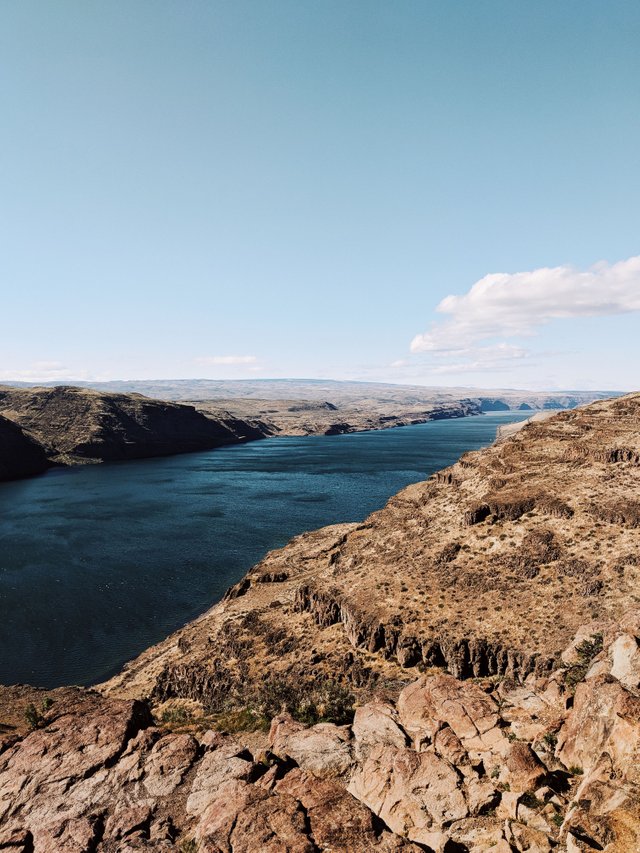
This shot is at the Columbia River Gorge along I-90. Shot on my Pixel 2 XL.
Summary
If you need a tool to produce professional quality edits from a mobile device, VSCO X is a nearly full featured app providing a full suite of global editing tools. It’s filters and the way the developers have built this app to work with colors is phenomenal. I’m amazed at the level of tools we have access to on our phones at such a relatively low-cost entry point.
Does it cost too much?
Some people may buck at the cost of the X subscription. However a desktop app with this functionality would cost at least this much if not more, and most of us wouldn’t hesitate to consider purchasing it. There has obviously been a lot of research and development put in to the color grading tools in this app, and for what you get, $19.99 a year feels like a bargain. The hang up people have with the cost comes from those of us who are slow to come around to the mindset of phones being tools for content creation. We often view smartphones just as gimmicks or entertainment devices, and the thought of spending more than a dollar or two on an app sounds ludicrous. However, as times change, so do the tools. It would’ve been difficult to even imagine this conversation just one generation ago.
Value
The value of an app like VSCO is hard to quantify and if you’d ask a dozen people what it’s value is, you’d get a dozen different answers. I know of great photographers who don’t use their phones for editing at all, and I’ve met others who import to Lightroom for basic corrections then export Jpegs to Dropbox and do their final edit and color processing on their phone with VSCO. As someone once said, “There’s a dozen ways to skin a cat”. A tool like VSCO is just one of those ways.
Feedback
I’m always curious and interested in other photographer’s ways of shooting, editing, and producing their photography. There is so much to be said on this topic and I’d love to keep the conversation going. Also, if you’ve stuck with me for this long about a topic like this, I feel like I might be able to relate to you, so why not drop a comment below and say hi!
Thanks for reading friends!
I wanted to mention that the VSCO X subscription also includes video color grading. This is a very cool feature, and one that I’d like to keep experimenting with. It might be worth it’s own post in the future.
Also, this post is not sponsored in anyway by VSCO. These thoughts are my own, and I get no compensation for this post other than the Steem rewards my readers give through upvotes.
Truly insightful review. But wouldn't be like the pain in the ass that one has to keep importing and exporting photos around several apps just to tune it? I'm not a photographer but most of the time I use Google photo to touch up my photos.
It's pretty fast and similar to how you'd work with files on desktop. For example after I visited the Olympic Peninsula this spring I went on my phone and batch imported about 20 photos. Once they were imported I batch edited using the method described in my post above, and then made individual edits and exported ready to print or share online.
Thanks for this comprehensive article. I see so many good looking color pics online edited with VSCO, it almost makes me want to get a subscription, leave my film cameras at home for a few days and go shoot some digital.
Thanks so much! Color is definitely where VSCO shines.
I have VSCO installed on my iPhone 8 Plus but I've hardly used it. My editor of choice has always been Snapseed, but I'll check out VSCO again after reading this fantastic post. Hipstamatic is another app I really enjoy using on iOS. Did you consider that in your choice of apps and discard it?
I have never used Hipstamatic, although the name of the app is familiar to me. Before the introduction of the film presets and HSL in the X version of VSCO, Snapseed was my app of choice. I'd love to do a short write up on Snapseed as well. It's definitely a capable app!
Wow Justin this is such a great post! Before I had kids I spent a lot of time on my laptop. Editing, designing, watching tutorials etc. But once I had kids it became so much easier for me to shoot on my phone as well as edit and quickly upload. It became my new norm and I relied heavily on VSCO. I worked for some pretty big brands creating content straight from my phone which was pretty neat. However, now I'm finally able to set time aside again for more laptop use and I have found my joy again for editing in Lightroom and creating my own presets. Even though it takes some extra steps and a bit more time it feels more rewarding to me. Clearly I could go either way in this poll though haha!
That's so cool you have experience creating marketable content using just your phone. There are so many opportunities!! I do agree with you about editing from a laptop with Lightroom or Photoshop, it's my preferred method, although there is something really fun about making really neat content with just this small device. I've sold photos on Stocksy that I've shot and edited with my phone. It's pretty rewarding. :)
Resteemed! Great to see this comprehensive guide doing so well man.
Thanks Chase! I have to thank @curie! They are an amazing community and are doing such a nice job of discovering and rewarding quality content. I feel quite honored to be curated by them.
VSCO is sick! I use it for all my personal photos on instagram. Their presets really took wedding photography to the next level in my opinion, 90% of well known wedding photographers in Australia use their presets, cutting down work flow.
Yeah! Their VSCO presets are solid. They can be overused like anything, but give an excellent and efficient base to start editing from! Thanks for the read!
Very informative. Thanks.
You're welcome!
Have you tried out the App called "Polarr" ? It has a free HSL feature.
I have not tried it! Gonna have to check it out. Thanks!
Yet another awesome post. I don't know where you find all the time to write these great tutorials, but I'm thankful you do.
VSCO's X membership is definitely something I'm considering more... I'm just sad that they didn't offer it at a discounted rate to people who have supported them throughout the years. I've spent well over $300 on film presets for Lightroom, but have to pay extra to use them in the app. A bit disgruntled about that.
Thanks again, Justin. I think you're going to do really well in the new blockchain-based social media landscape... it's only just begun.
Amazing post and great review !!