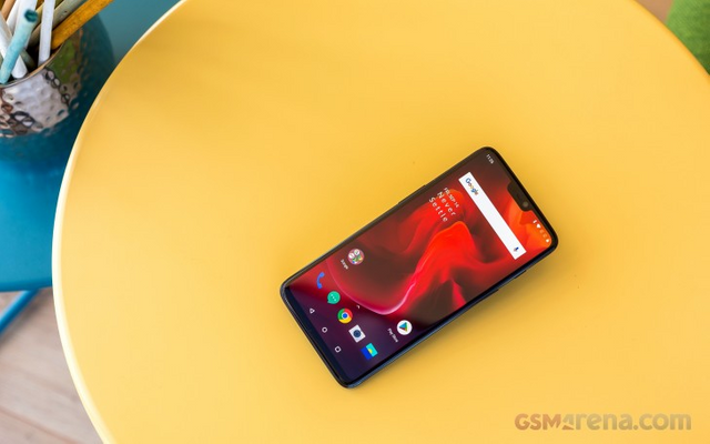
OnePlus 6 long-term review
The OnePlus 6: still a top notch deal? If so, is that despite or maybe even thanks to its top notch? On the surface, it definitely seems like this is a worthy contender in the flagship realm even today, with its glass back, minimal bezels, and top of the line internals for 2018.
The OnePlus One was the 'flagship killer' four years ago, with its high-end specs and crazy price. In the meantime, OnePlus' journey has altered its products somewhat, but since 2014 the company has consistently put out some of the most interesting handsets of each year. The OnePlus 6 represents the culmination of its work in making devices that are more affordable than their competitors while sacrificing less and less to achieve that with every year that goes by.

he price, however, has been keeping up with the improvements in every new OnePlus phone, and the OnePlus 6 is the most expensive model ever launched by the company. Over time it has basically gone from selling cheap flagships to selling cheaper flagships than the competition. The distinction is subtle, but it's there.
Join us over the next pages of this long-term review in order to find out whether that makes the OnePlus 6 a true spiritual successor to the original OnePlus One. We'll tell you what it was like to live with the OnePlus 6 day in and day out for an extended period of time, during which we've used it as our one and only smartphone. Is it worth the asking price? Do its performance and smoothness match those of other flagships?
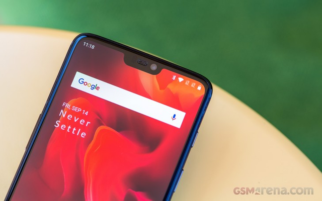
The notch is everywhere this year, so it's also on the OnePlus 6. Smaller than others, but still distinctively there. It's paired with a tiny but not invisible chin at the other end of the display, and almost nonexistent side bezels.
If you hate screen cutouts, the good news here is that you can 'hide' the OnePlus 6's notch in software. That works very well since the phone has an AMOLED display panel, so the deep black background for the notification area on either side of the notch fools your eyes into thinking there is no cutout, to begin with. Of course, if you like the look of the 'ears' or 'horns' as some call them, you can keep them, no one's going to judge you (hopefully).
This phone continues the OnePlus tradition of not choosing the highest-res panel possible. So it has to make do with 1080x2280 resolution, but that's very much a non-issue in day to day use. The screen looks very good and sharp, and unless you have really amazing eyesight, it's unlikely you'll be able to see individual pixels.
Not opting for 1440 horizontal pixels was clearly a cost-cutting move on OnePlus' part, though it also probably helps a tad with battery life. And don't forget that we live in a day and age in which Samsung's flagships have 1440x2960 screens but by default, they're set at to run at 1080x2220.

Build quality is exquisite, the OnePlus 6 feels solid, there are no creaks whatsoever. It is a bit top-heavy though, but you can easily alleviate that if you hold it closer to its middle. Both the rear and front glass nicely curve into the metal frame, while the buttons are clicky and feel great to use.
The alert slider on OnePlus phones is still unique in the Android world, and it allows you to quickly silence the phone (or turn it to Vibrate mode), without needing to even look at it or unlock it. The slider is somewhat configurable, as you'll see if you go through the Software section of this review, but it may not be as customizable as you'd expect.
The earpiece is smaller than usual, which will take some getting used to when you're in a phone call - some small adjustments in how you hold it to your ear may be necessary in order to better hear the person at the other end of the line.
Was this useful?
I upvoted your post.
Mabuhay, keep steeming.
@Filipino
Posted using https://Steeming.com condenser site.