10 Influential Paintings Referenced In New Wave of British Heavy Metal Album Covers... Part 1
I've decided to make a couple posts bringing the two greatest passions of my life together, namely obscure, studded denim and leather clad British Heavy Metal from the early 80s; with perusal of the major milestones of Western painting. So without further ado, it’s time to expose numbers 10-6 of my favourite references to delightful artistry found in NWOBHM cover art.
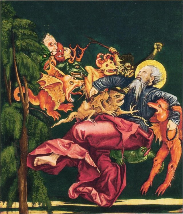
'St Anthony Tormented by Demons', 1520, Artist Unknown
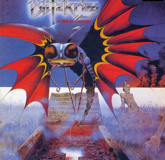
Blitzkrieg 'A Time Of Changes' 1985
The idea for this post formed while I was looking at this painting in Wallraf-Richartz Museum in Cologne. I remember admiring the simplicity of the almost cartoon-esque demon characters, the dreamlike contrasting colour scheme and the serene expression on the hermit’s face as he endures physical and psychological assaults from demons while retaining spiritual focus. Then my tranquillity was interrupted as I started thinking ‘this would have been a more effective album cover for Blitzkrieg’s A Time Of Changes, so why didn’t that artist make more effort?’. In fact, this painting is a good metaphor for the intense grip the NWOBHM has on my poor weak mind. I think I can remember losing sleep over the lame quality of the cover art for Blitzkrieg’s 2013 comeback masterpiece ‘Back From Hell’, even the moth demon mascot looked worse than usual. If you’re ever meditating in a desert wilderness and tempted or tormented by the unholy sound of ‘A Time Of Changes’ I recommend just lying back while the demons violate you and try to enjoy it. The production is balls and the album versions of earlier singles are somewhat weak, but aside from these nitpicks this record is great, especially the title track and the definitive version of the Satan (vocalist Brian Ross' other band) song ‘Pull the Trigger’.
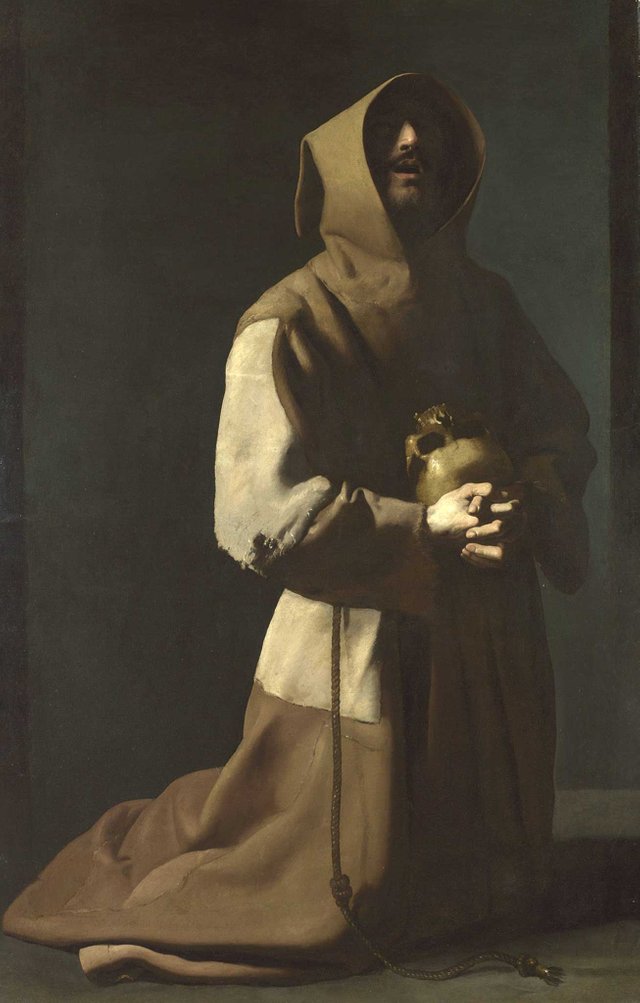
'St Francis in Meditation', 1635-9, Francisco de Zurbarán
Dark Star 'Dark Star' 1981

As far as dodgy album covers go, this manages to go one step further by not even bothering to attempt designing a proper logo. Still, lets look at the artist’s motivations, was it inspired by this atmospheric scene of St Francis in religious ecstacy? In this piece, Spanish baroque master Zurbarán, whose distinctive style (influenced by the realism of Caravaggio and his followers) juxtaposes an almost confrontational directness with an intensely spiritual atmosphere.
Saints contemplating skulls are frequent in Spanish and Italian painting in the early 17th century, which is mirrored in the, uh, colourful, Dark Star cover. The artist has taken the main features of this masterpiece and composed them with the monk’s habit over the skull incorporating some menacing protruding teeth, perhaps in an attempt to reflect the religious exercise of meditation. I imagine this half assed skellington is contemplating not only on the ephemerality of life, but also having to sit through side A’s half-assed, out of place folky interlude ‘The Musician’ while waiting for the song Dark Star will always be remembered for ‘Lady of Mars’.
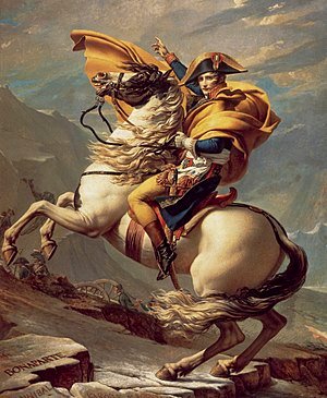
'Napoleon Crossing the Alps', 1801–1805, Jacques-Louis David
Battleaxe 'Burn This Town' 1983
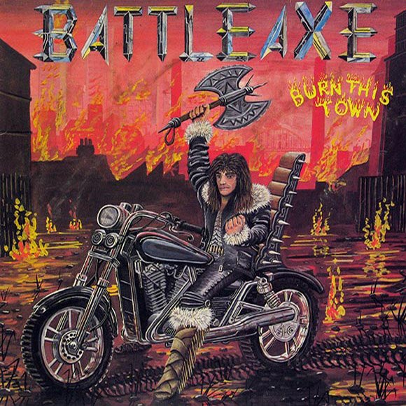
One of the few differences between these two very similar pictures is the mode of transport (and perhaps if we're being fussy the quality of the painting). In commissioning the striking piece of propaganda that is the David piece, Napoleon wanted to be shown 'calm on a fiery steed' (despite having made the journey on a mule ((or perhaps a badass motorcycle with spikes coming out of it))). The Battleaxe masterpiece echoes this timeless image of dashing authority, considerably improving it by adding distant chimneys, a swamp highlighted with inexplicable fire effects and a fur collared leather coat. It's hard not to love Battleaxe, and if you can excuse them for trying to update this glorious image for their 2013 High Roller reissue you should visit their website and befriend them on stalkbook.
The Rokeby Venus, 1647 -1651, Diego Velázquez
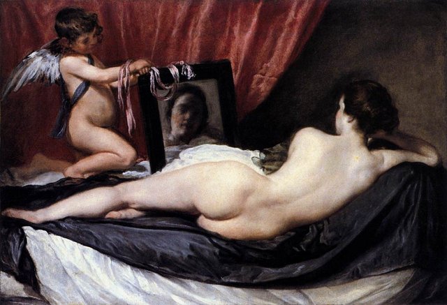
Split Beaver 'When Hell Won't Have You' 1982
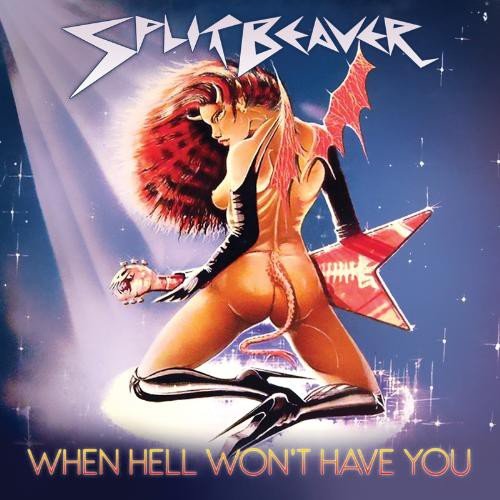
First of all, can you believe that this Split Beaver album cover painting was done by a female artist? Once you have digested that piece of information, take a closer look and see how she has delicately recomposed the most striking elements of a renown treasure of the Spanish Golden Age, the Rokeby Venus. The iconic original is an extremely rare example of a Spanish seventeenth-century nude, as such works were forbidden by the Inquisition. See how the artist has taken the subtleties of this forbidden treasure and re-framed it to celebrate the creative freedom of the early 80s by adding demon wings, kinky boots, a flamboyantly dyed perm and (the piece de resistance) a Flying V axe with a spinal cord printed on it. Also notice the subtle reference to the flickers of light on the the Rokeby Venus’ flesh, playfully manifested in the stark, contemporary spotlighting effect on this joyful monstrosity, whose offensiveness to the eyes and intellect somehow manages to be more entertaining than the album. OK, I'm being mean, some of 'When Hell Won't Have you' (such as opening track 'Savage' ((which was initially released as a single with other stand-out album track 'Hounds of Hell' on the B side))) kicks ass, whereas at least half of it treads water...
Oh and in case you were wondering, in the NWOBHM Encyclopedia Malc Macmillan insists that the name has 'literary origins'. He doesn't mention what literature they may have been referencing, so until someone spills the beans and tells us the deep and meaningful cultural significance of Split Beaver I'm just going to assume they were perverts.
'Horsemen of the Apocalypse', Albrecht Dürer c. 1497–98
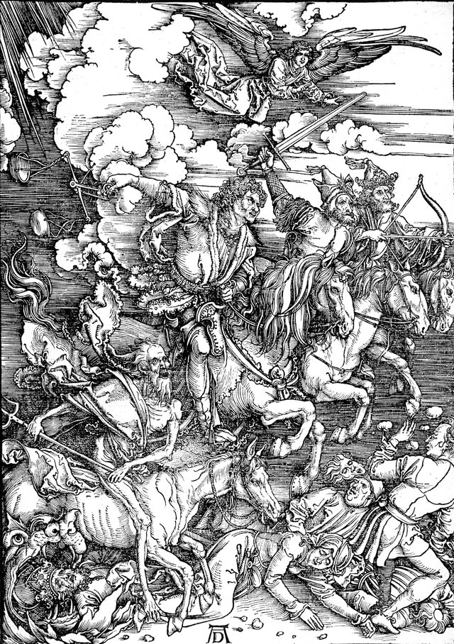
Holocaust 'The Nightcomers' 1981
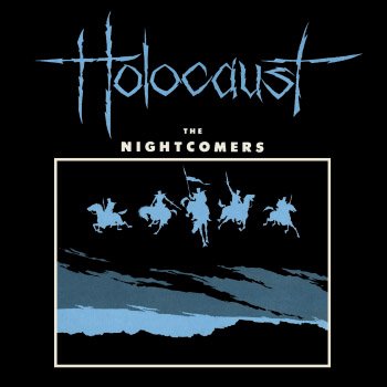
When northern renaissance master Dürer published the Book of Revelation with 15 woodcut illustrations, he transformed the appearance of the illustrated printed book.
Since he was publishing the book himself, Dürer had to pay skilled block cutters to cut around his drawn lines. This was slow, difficult work and therefore expensive. However when the task was complete, the blocks provided him with a source of income for the rest of his life. If only the same could be said for Holocaust's amazing debut album! I genuinely think all post renaissance interpretations of the four (or in this case five) horsemen of the apocalypse owe a debt to Dürer, but notice the white border, it looks like an inverse coloured reference to his woodcutting technique. OK, so it probably isn't, but either way it's a great image that sums up the more rabid side of the era.
Holocaust are pretty active these days, be sure to befriend them on stalkbook and get their impressive 2015 album 'Predator'.
Breaking: https://steemit.com/news/@bible.com/6h36cq
Thanks for writing this. I use the Dark Star album as my avatar on my NWOBHM youtube channel and now this one. I wanted a mascot and just thought it looked cool. I figured it was a slightly altered version of the Grim Reaper. Never considered that it could be a monk.