3D can sometimes be deceptive
Designing a Logo can be really tricky. Reason being that it will be presented to your client in a very aesthetic platform.
Many like me will love to put it in a 3D mockup for a better validation and acceptance.
But most times it turns out to be the worst decision. Plane 2D now looks/works better for the purpose.
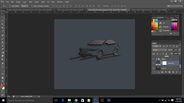
For instance I was modelling a car, to be used in a Logo Design for a car sales company. The drafting looks nice & perfect.
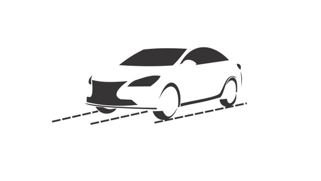
The areas in the image above, within the car body surrounding are not white but empty/transparent.
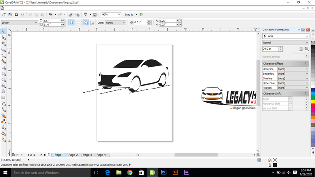
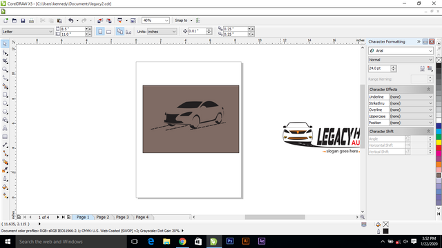
So I decided to try it out on 3D before furthering the design.
Guess what;
Is really bad & ugly
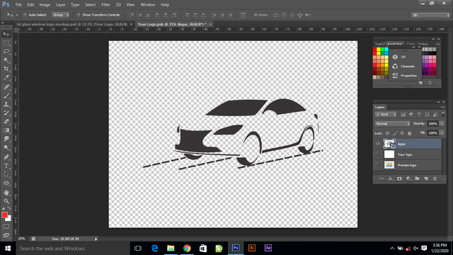
Uploaded the PNG file in Photoshop for the conversion.
And I go this........
So finally I'm presenting the finished works in 2D.
Yeah I thought about changing the colours but is still not useful.
Thanks for stopping by
Stay creative & healthy
Well, some people might fancy it in 3D. You could consider repositioning the card.
Posted using Partiko Android
Right, that's true.
Nice job on the 3D editing buddy!
As a matter of interest, @build-it and @neoxian-city has collaborated to reward steemians with over 200 liquid STEEM and a couple thousand of their tribe's tokens in an ongoing, do check it out and consider participating:
https://www.build-it.io/build-contest/@build-it/extended-build-it-x-neoxag-tribe-contest-or-new-year-bonanza
Okay