nTopaz Contest Logo Entry
Hello, dear ones!
Haven't posted in a while. I've been a bit busy with other projects (which I'll be talking about in my upcoming posts, I promise ;) ) and also kinda down, probably because of the season. Don't get me wrong, I'm not really complaining about it, just spending more time with the family and less productive work. XD
But today managed to stream again after a two-month break. I was really nervous at the beginning. XD
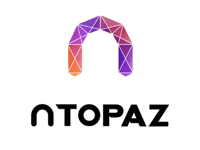
Anyway, tried to pull myself together and came up with this logo contest entry. I was really interested in the nTopaz community and what better contribution than making something useful for them.
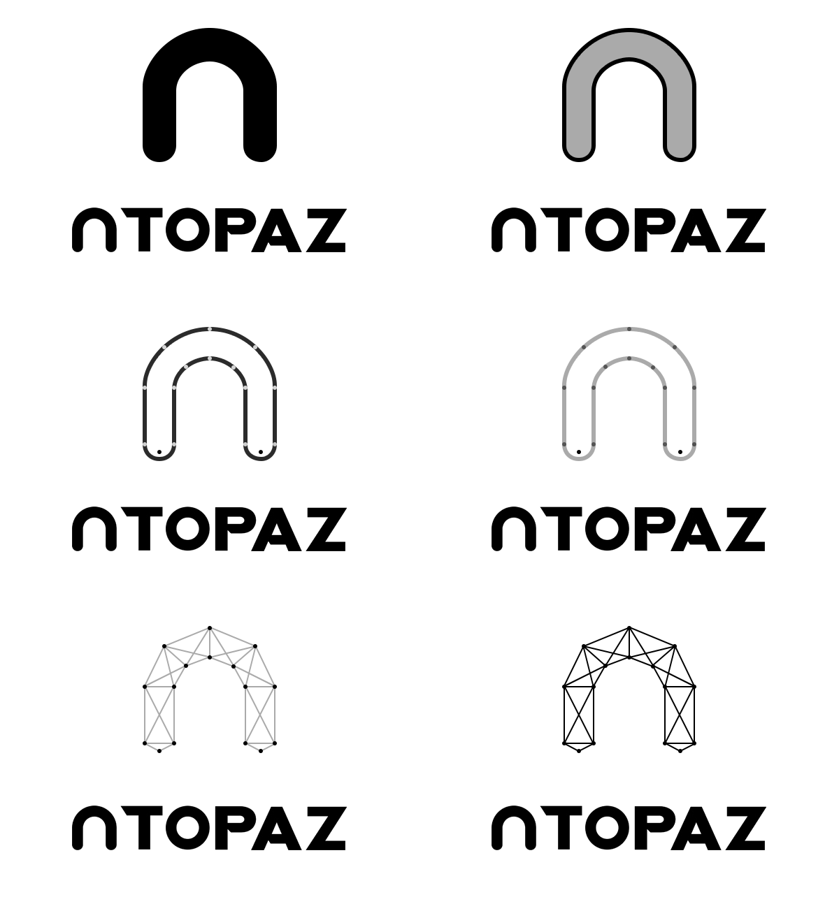
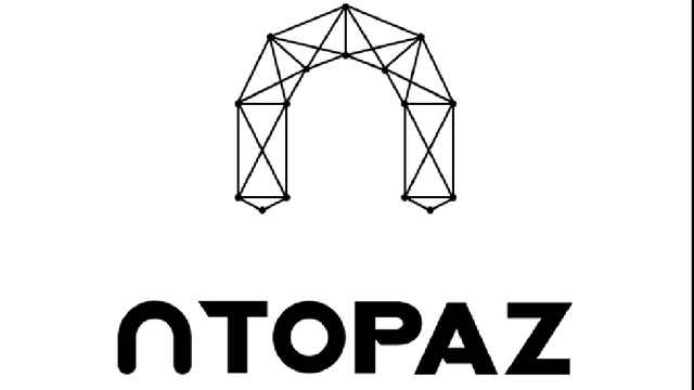
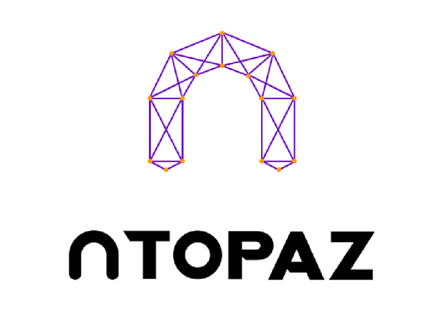
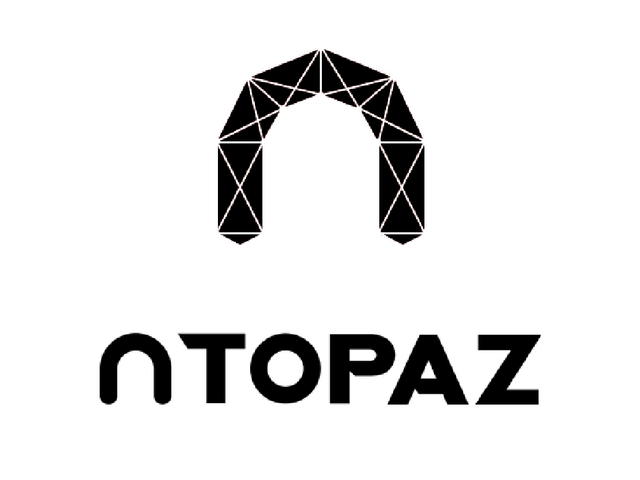
I'm so glad you can upload more images than before, that's why I'm going to share one entry, but in different versions, depending on the places and sizes that are needed. But the shape remains the same in all 4 pics.
As the .gif shows, the whole idea started from the initial letter N. I was inspired by other participants in the contest and added geometric form, connecting the dots. But it has also a symbolic meaning - it's a network of people, authors, rays of light and creativity... and a diamond.
Wow, it can be interpreted in many ways. That's what I like about logo design. But that's also the hardest thing to achieve. XD
If I have more time, I'll probably share another entry - this time with a soft shaped N. ;)
But I think that's about it for today.
Hope you like it!
Have a great day, everyone!
Thanks for stopping by! ^.^
Looks really cool, Katalina ! I love all of them but the third one is my favourite ! So sleek and lovely <3 <3 <3
Good luck with the contest !!!!
I like the colourful one :) And nice ideas that went into it :D
Yey, thank you, Fyn! ^.^
It's simple and looks very easy, tho' I've been thinking about if for a week. XD