SLC | S21W2 | Introduction to Logo Design
Hello lover's of graphic design, i believe you're all doing great in your different destinations. It's actually a new week to embrace our afresh lecture class. Good enough, we're expatriating on logo design, an interesting and lucrative part of graphic design.
In as much as we're all humans, we all have gotten our own understanding and perspective about logo and it's creation, base on my understanding and what i acknowledge from this week lesson, I'm here to share with y'all about logo design.
What is a Logo. |
|---|
Logo is a visual representation of a company or brand or even an organization as well. Logo makes it easier for an individual to understand what a particular company, brand or an organization is meant for. Logo here is made from simple elements like image, word and even a symbol.
For instance, most schools would always use a book cover in their loco that makes it easier to understand that a particular building is a school. What comes in your mind when you sight a man on a flex placing a clipper on someone hair? We easily detect a barbing salon.
You see! Logo create a stronger communication and value between an individual and a brand. Don't ponder if I comment that in some cases, logo is the first factor that drives customers to a particular market place.
Discuss extensively the role and impact of logo to a brand. |
|---|
Just like others stuff that comes with rules and impact, logo Play a crucial roles and has a lucrative impact to a particular brand, I'm duly to discuss them here.
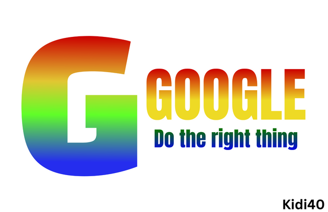
Since a logo is a strategy used in recognizing a particular company or brand, it should be simple design that last longer in a client mind. The Google has an Upper letter G as their logo, this letter is popular known and it is simple to remember whenever a client thinks of it.
In this aspect, a design must have the principle of versatility in mind, creating a logo that can be published on various applications or post on different places. Having this principle in mind is crucial because it leads to the recognition of brand or company, purples and etc.
Creating a logo that looks appealing and outstanding requires a vivid consideration of Typography
The symbols, lower or upper letters, even the colour should compliment each other in a logo, establishing a sense of Harmony in a logo. While compliment is important, balance is also crucial, this principle creates space for a designer to position all the elements properly.
Following these rules and others while designing logo team up together to create the following impacts to a company.
- Create a company identity.
- Differentiate between others competitors in a particular area.
- Add extra value to a company through promotion
- It develops connection and trust between audience.
Explain and demonstrate visually the do's and don't when it comes to Logo design. |
|---|
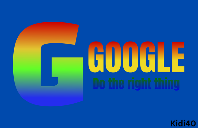
Understanding the concept of colour theory is very vital when it comes to creating a logo, it'll help choose the right colour that in return compliment a logo design in such a way that appeals an audience.
 |  |
|---|---|
| ✅ | ❌ |
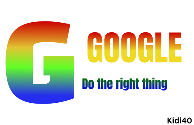
Compliment here play important roles when it comes to positioning every single elements, symbol or letters in a logo, therefore every elements in a logo should compliment each other.
 |  |
|---|---|
| ✅ | ❌ |
Designing a logo in a simple manner is one of the factors that develop easy connection to a particular company, it also paved the road to remembering a particular company or brand through the simplicity of a logo.
| Dont. |
|---|
First, as a designer; making used of existing logo design should be avoided.
Making used of a variety of colours and font would always disrupt a design, therefore such habits should be ignored.
Design a simple logo with the knowledge you have gotten from this lesson by assuming that a client gave you a job to design for his brand (business). |
|---|
Let's assume a friend of mine who's named is kidi, has asked me "a graphic designer"to design a cold photo studio logo for his new launch photography shop, here I go.
| Step 1. |
|---|
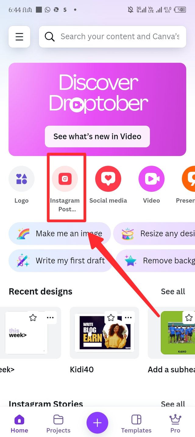
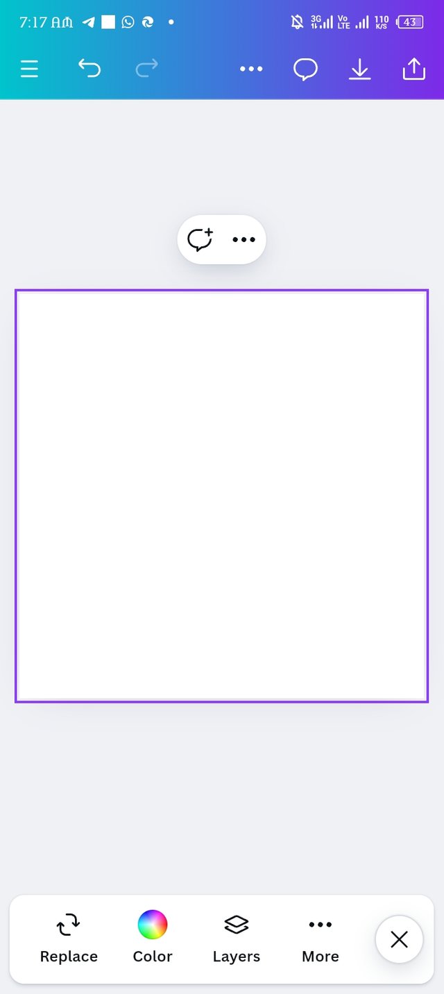
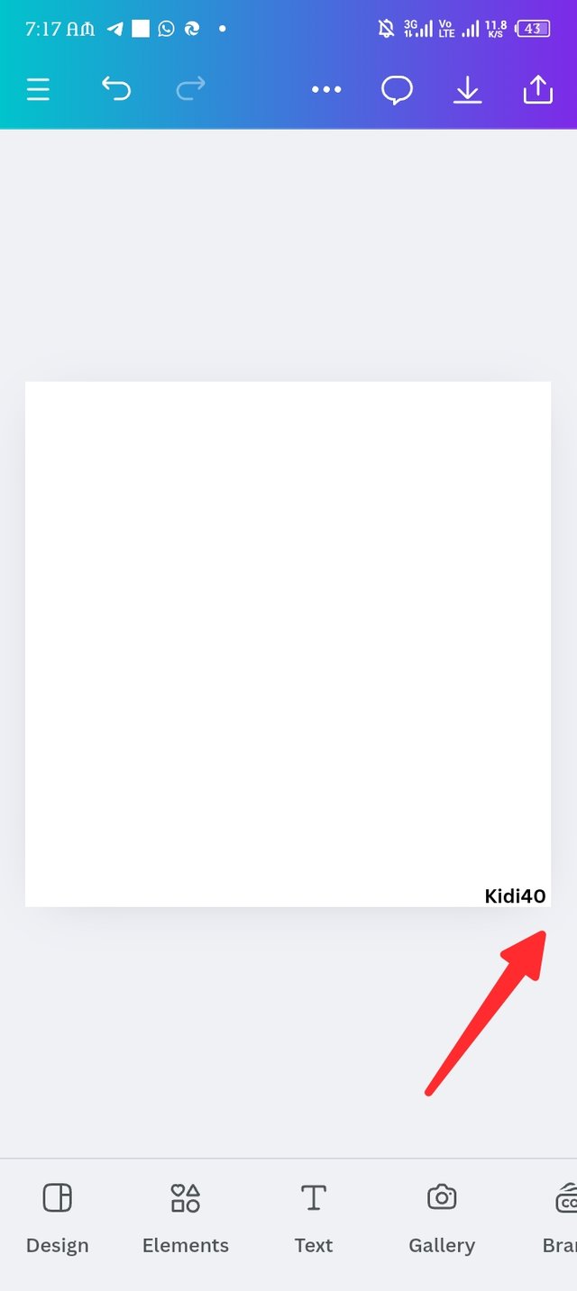
First of all, i launch my canva application to begin my work, immediately it open the interface i click on Instagram post as seen in the rectangular red shape, there i have my work space. I paste my username as seen in picture three.
 |  |  |
|---|
| Step 2. |
|---|
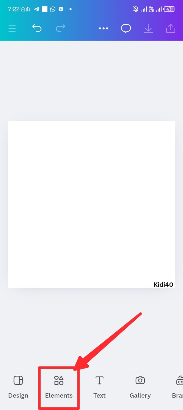
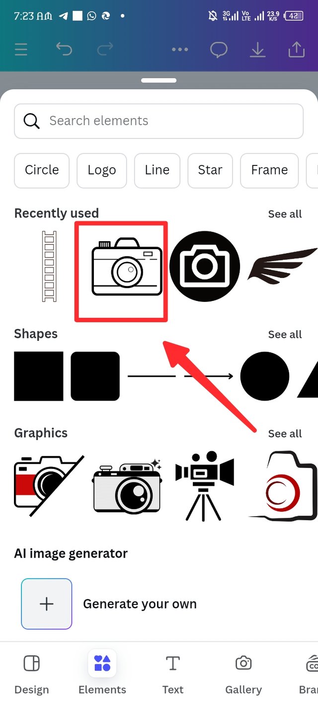
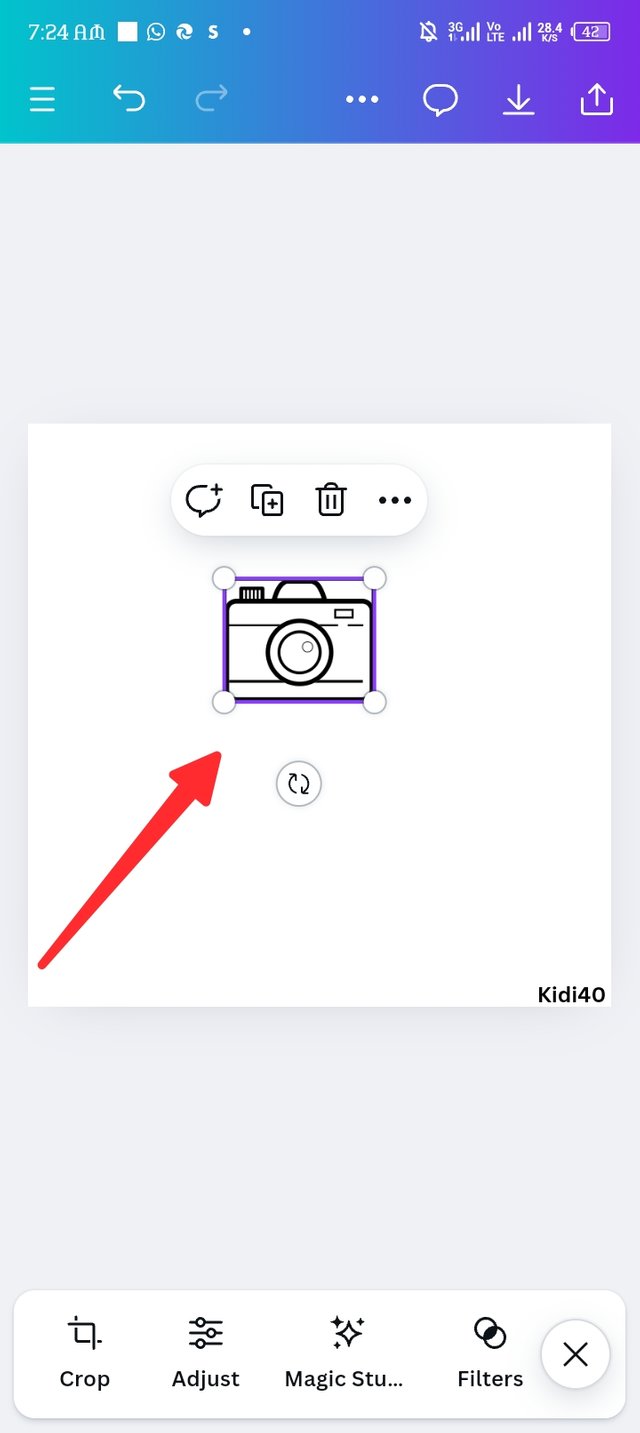
Here in step, I introduced the element section to my design, i picked the photography icon which i had already used in the past. In picture two the icon is ready in my design.
 |  |  |
|---|
| Step 3. |
|---|
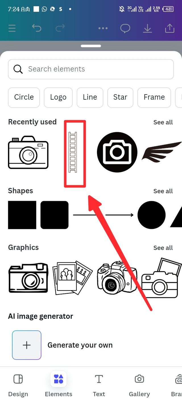
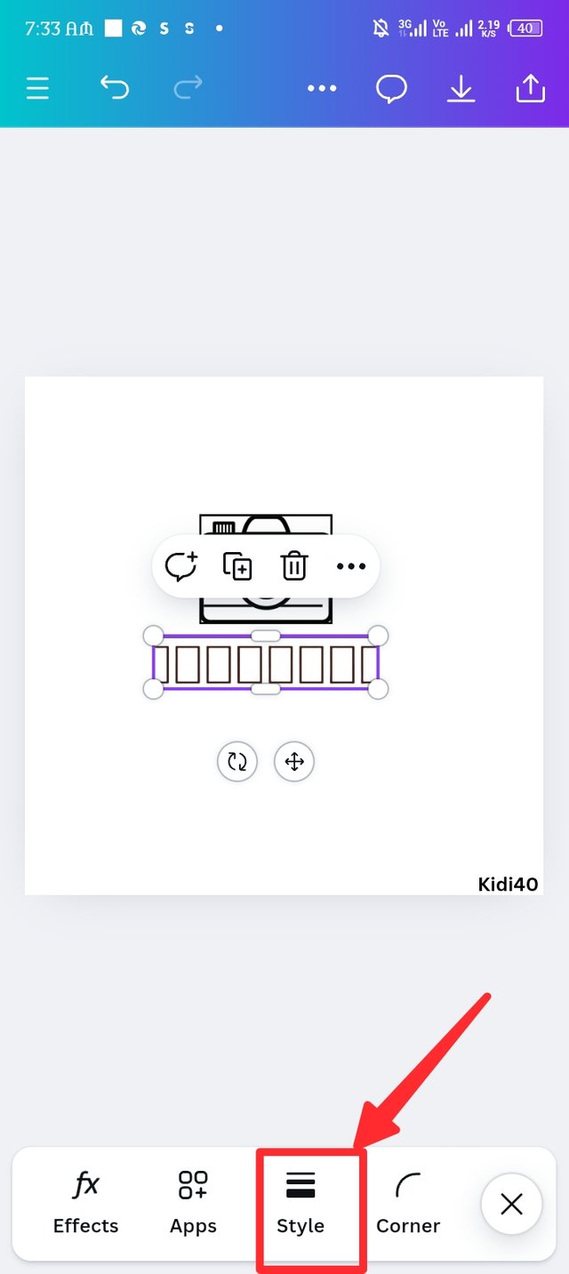
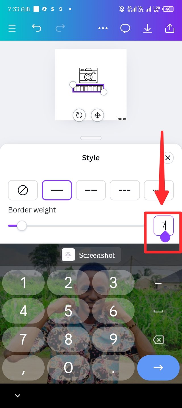
Here again, i repeat the element adding process to select an element that looks like a ladder, i took to playing around the size by reducing it. In picture two i intrude the style icon to make the border a bit more bold.
The style icon play a role of making a boarder bolder or tin, it has numerical numbers from 1-100, you can increase the number to any amount by dragging the slider or you just insert any number in the square located in the right. The amount of number you choose or the more you drag the slider forward determines the how bold or thin you want your boarder to look like. As seen in picture three, i inserted 7; let's see the outcome in step four.
 |  |  |
|---|
| Step 4. |
|---|
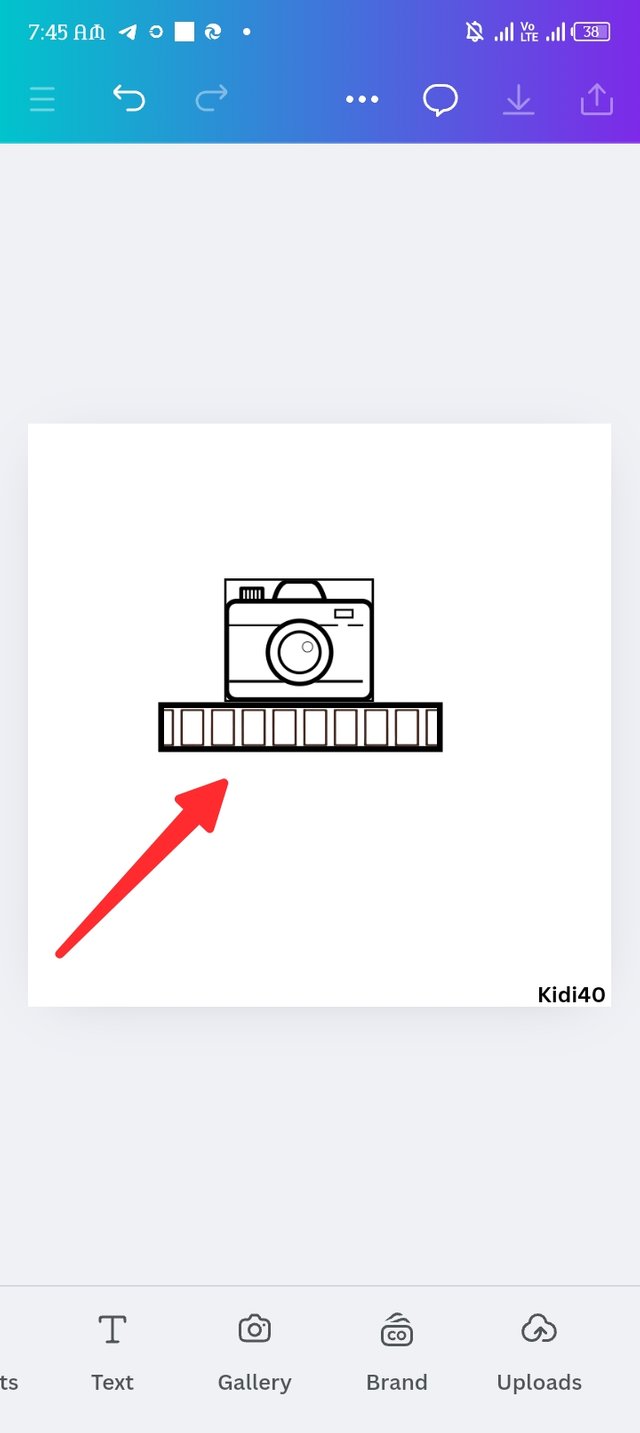
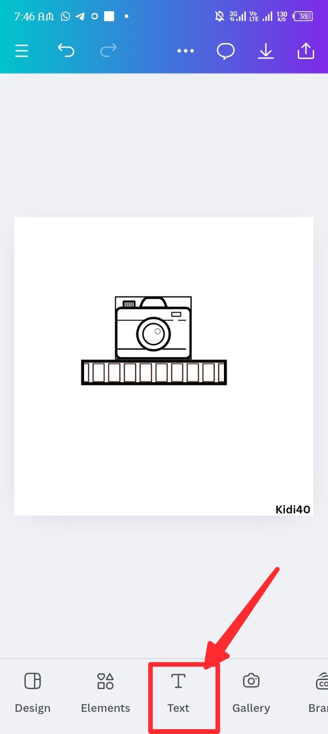
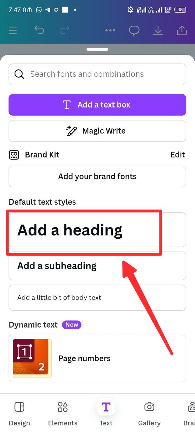
The outcome of the border style has now reveal, the border is a bit bolder than the natural, i then position at the edge of the camera element. O then introduce the text button and choose the add heading feature.
 |  |  |
|---|
| Step 5. |
|---|
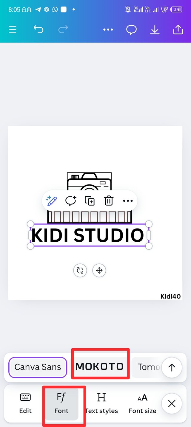
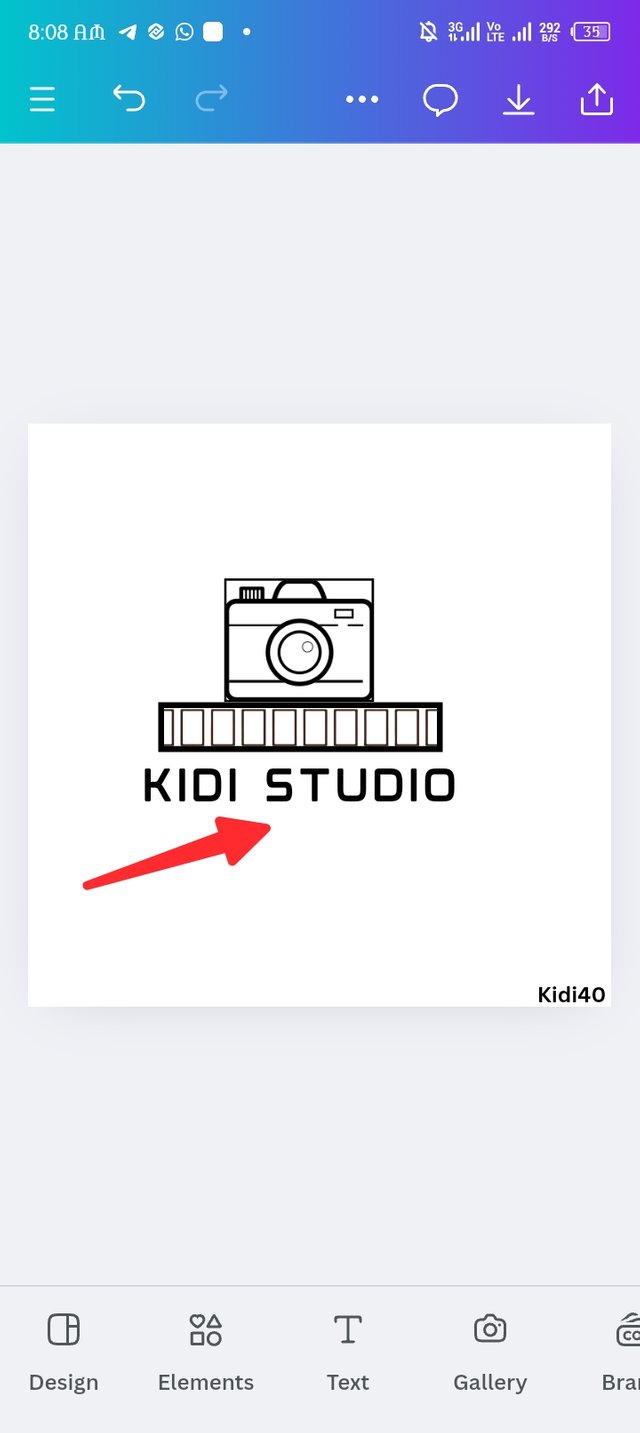
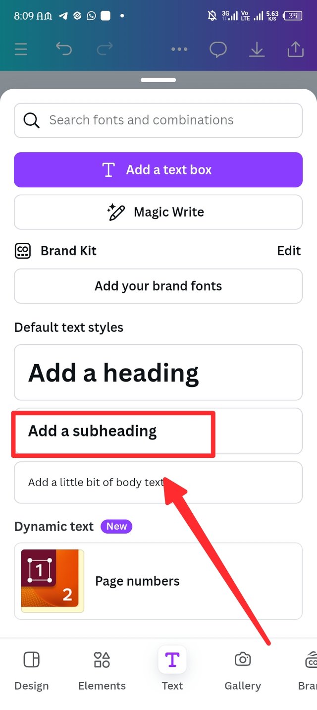
After having my heading display in my workspace, I took to adding my business brand, here i write Kidi studio in upper letter. Am not satisfied with the canva San font so i choose the mokoto font instead as seen in picture two after resizing it to my taste. I then introduce a new text but this time I choose the add a subheading.
 |  |  |
|---|
| Step 6. |
|---|
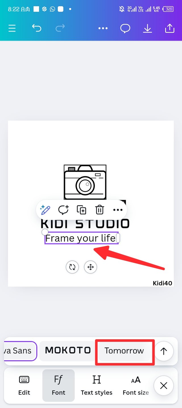
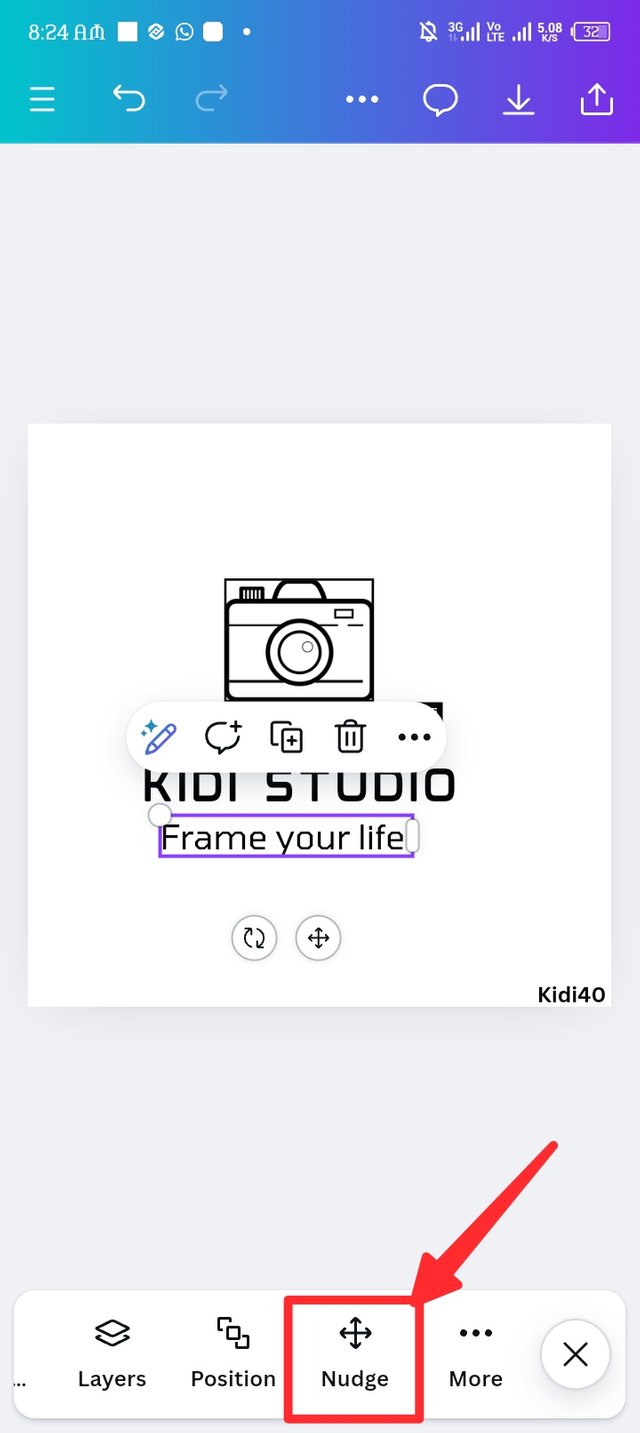
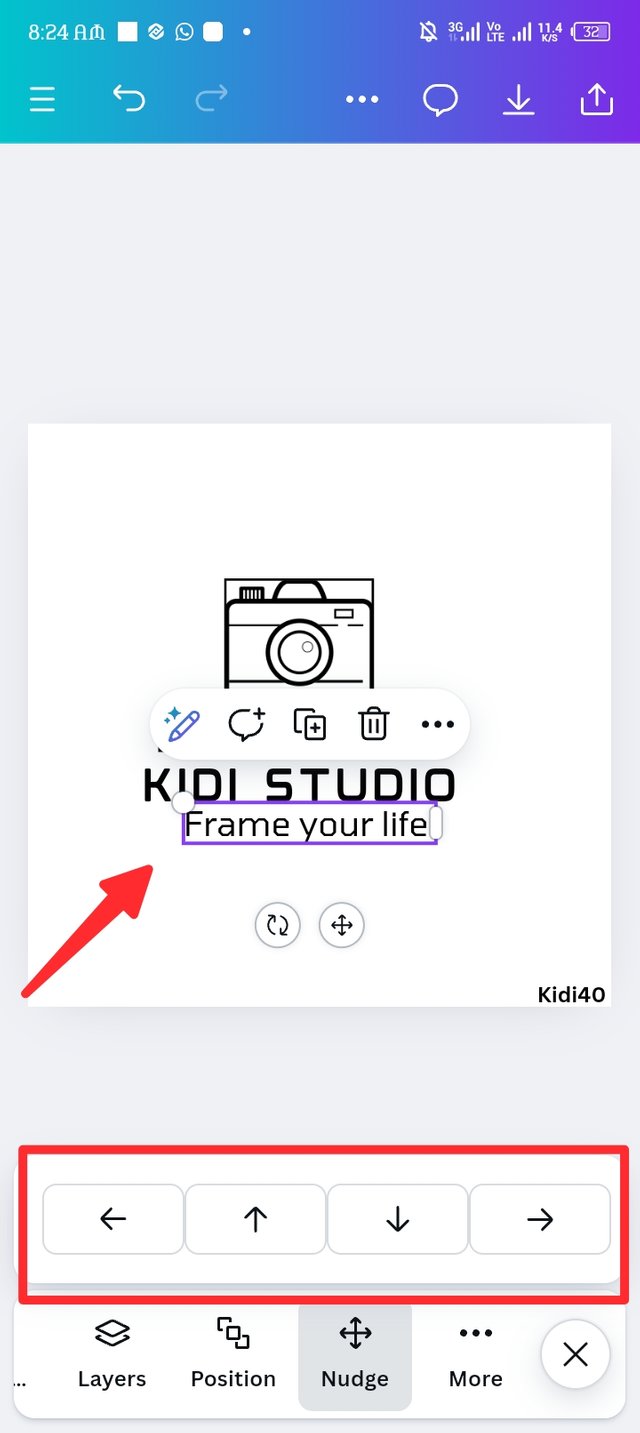
My purpose of choosing the subheading is to add my slogan which I've done so as seen in picture one, frame your life as a photographer, we capture beauty in everyday life, we frame this beauty to keep memories. I then introduce the nudge to position my slogan in a good position.
The nudge is used to shift backward, shift forward, shift downward and shift forward. Be it element, numbers, alphabet, symbols and etc, you can shift them to any position by intruding the Nudge icon as seen in picture three.
 |  |  |
|---|
| Step 7. |
|---|
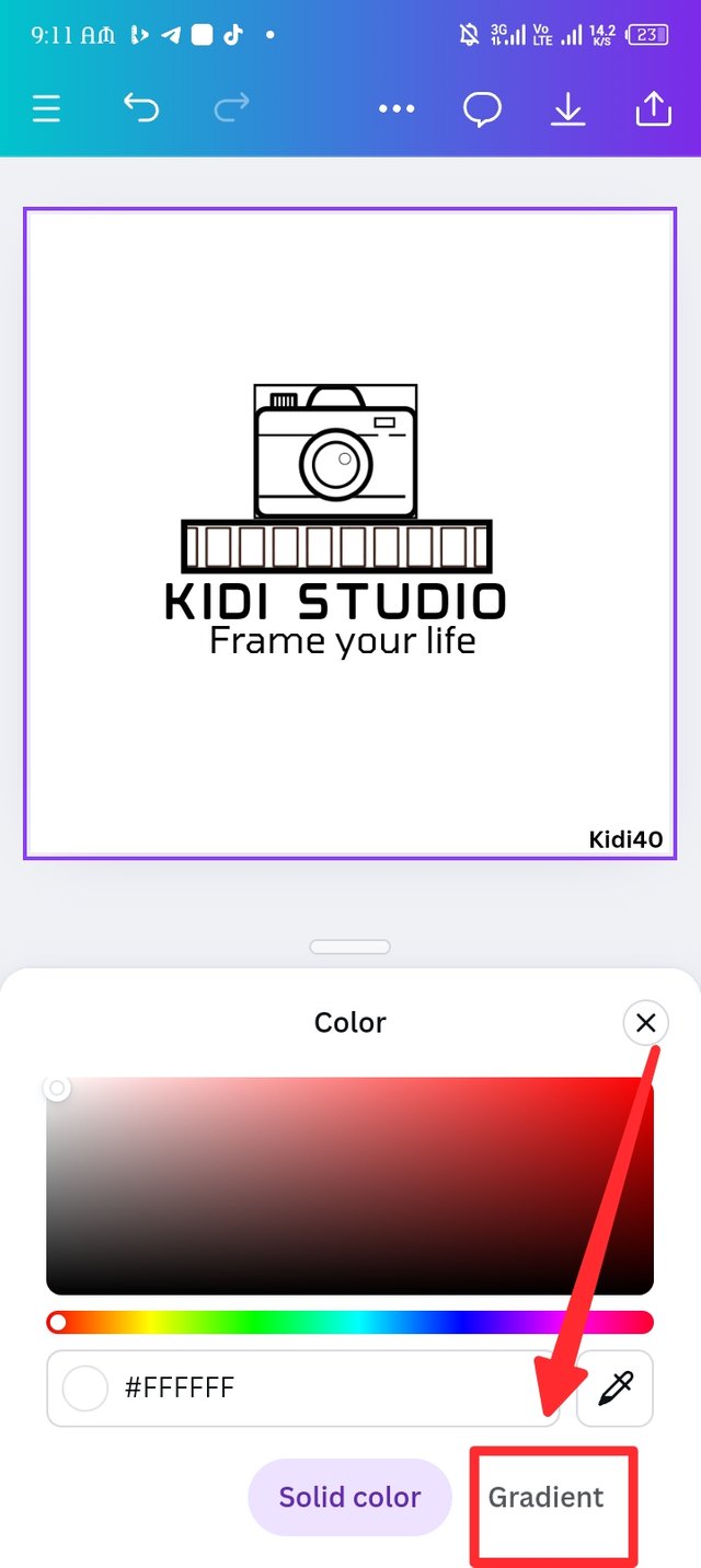
I'm not satisfied with the natural white colour, I thought of making use of gradient to reveal it best appealing form, here I go.
 |  |  |
|---|
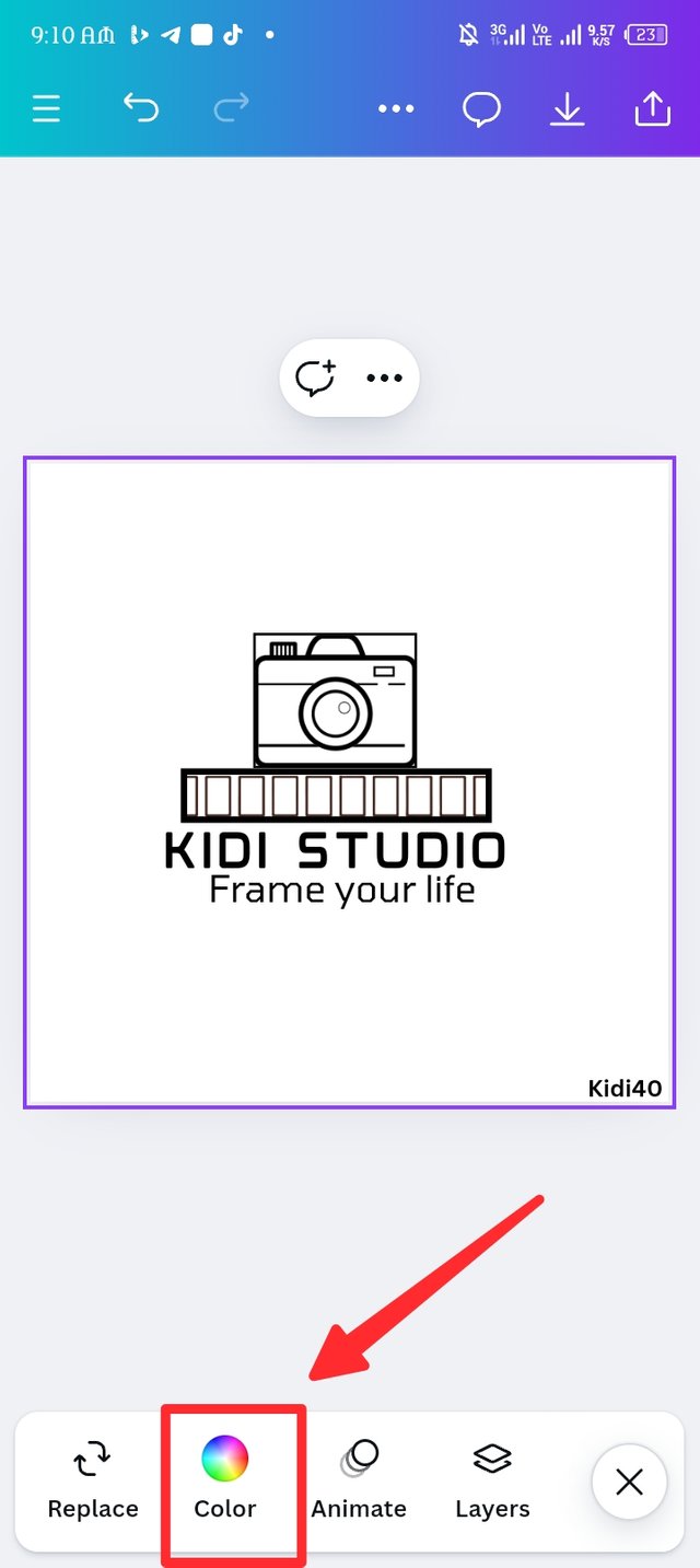
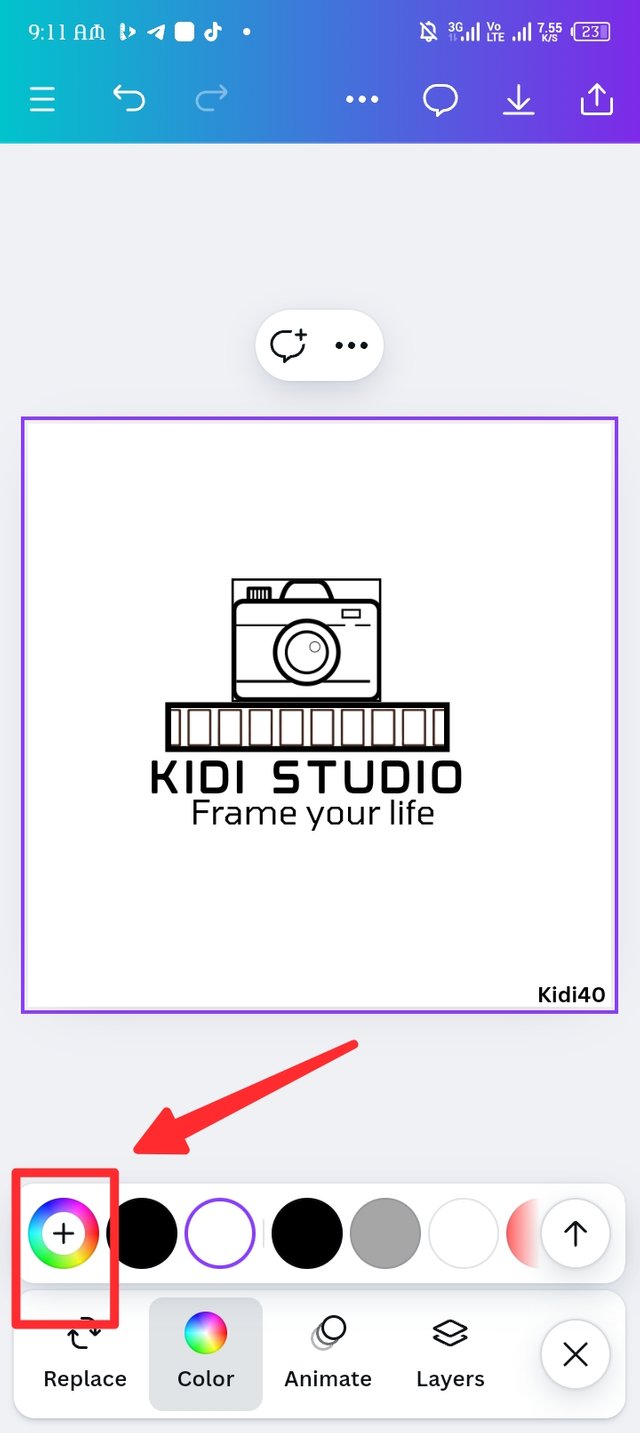
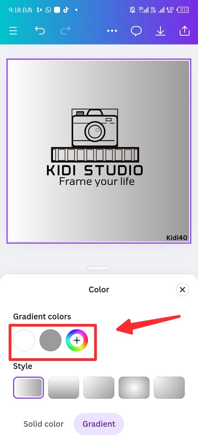
I introduced the colour icon as seen in the first picture, a couple of 6 different colours pop up along with the colour wheel, since I'm looking for gradient, i choose the colour wheel as seen in picture two, another page pop up where i ignore the rectangular shape mixed of colours but I focus on the two types of colours at the end, there's a solid colour and gradient, i choose gradient as seen in picture three.
 |  |  |
|---|
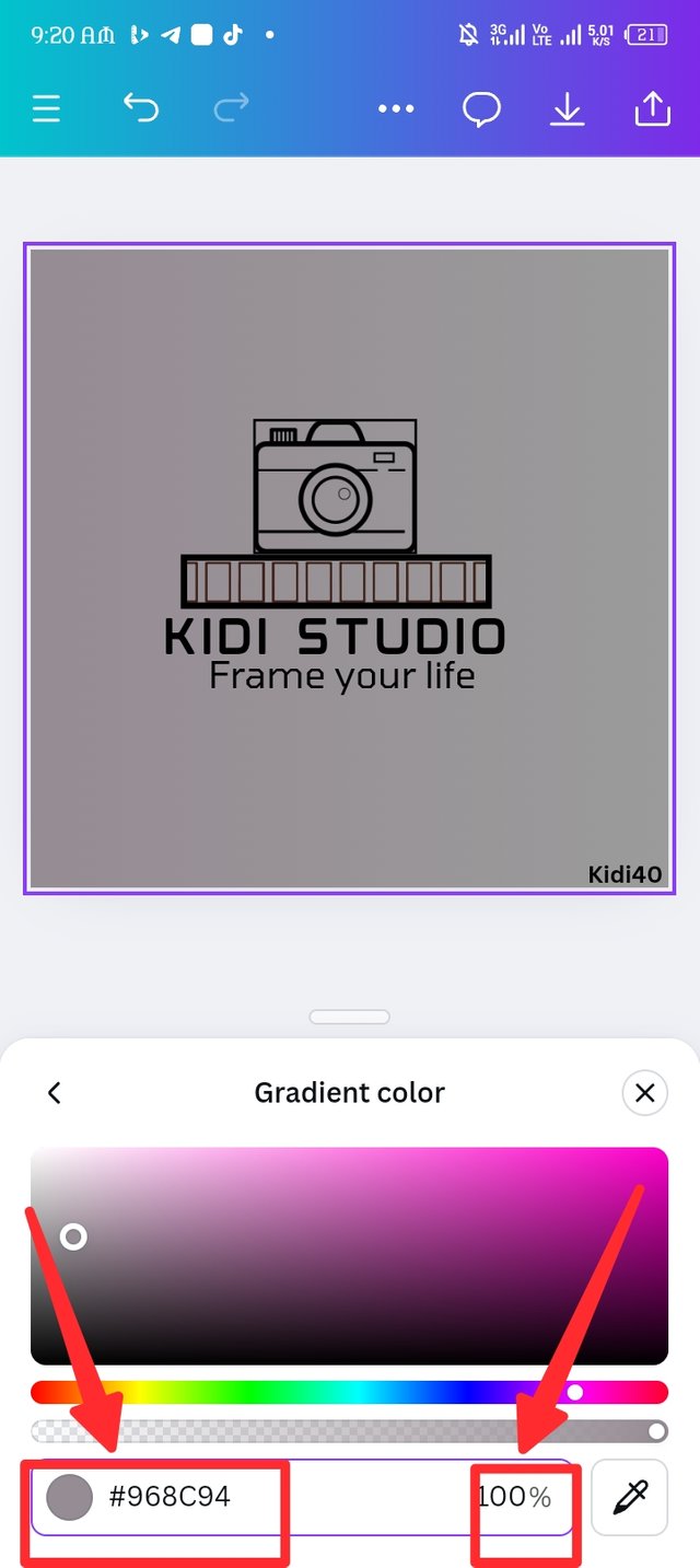
Here, i finally gotten to the gradient section where the original colour white and grey as seen in picture one. I changed the first colour by clicking on the white colour icon to add my hex code as #968c94 which brings out the purple -gray color as seen in picture two, i set the composure at 100 percent.
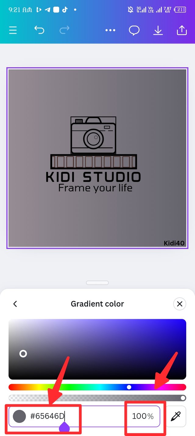
In picture three, i click on the second gray colour in picture one, i Then insert my hex code as #65646D which brings out the gray-blue color as seen in picture three, the composure remains 100 percent.

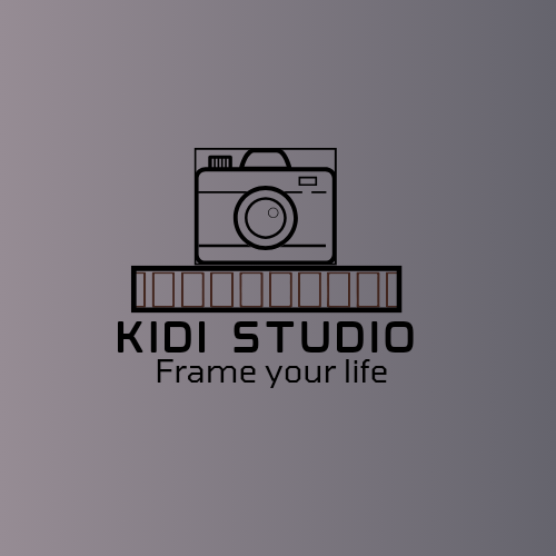
Looking at the logo, anyone can easily sense a photo studio. The camera at the top which represents the logo makes it easy for a clients to notice a photography shop within the environment.
The kidi studio which happens to be the company brand alphabetically proven that the logo is for photography seek.
In conclusion, logo design is a wonderful design that must carefully made, it takes a whole lots of consideration to create a logo that appeals the audience. See you guys i the next class.
I'm inviting @wilmer1899 @goodybest and @saintkelvin17 to join me in this contest.
Cc: @lhorgic.

Best regards KIDI40 |
|---|
You've got a great stuff in here friend but your entry came in rather too late. Kindly ensure you make your entry within the stipulated time stated in the contest rules. However the new week is opened for you to show us what you've got once. Thanks for your understanding.