Google is testing an elegant new interface for Google Now
Google might be going all-in with its supercharged Assistant AI, but it seems it still hasn’t quite given up on improving its older and slightly dumber sibling, Google Now.
It appears the internet giant is currently testing a new user interface for Now, so you could be greeted with a little more elegance when you address your phone with the magical ‘OK, Google’ phrase.
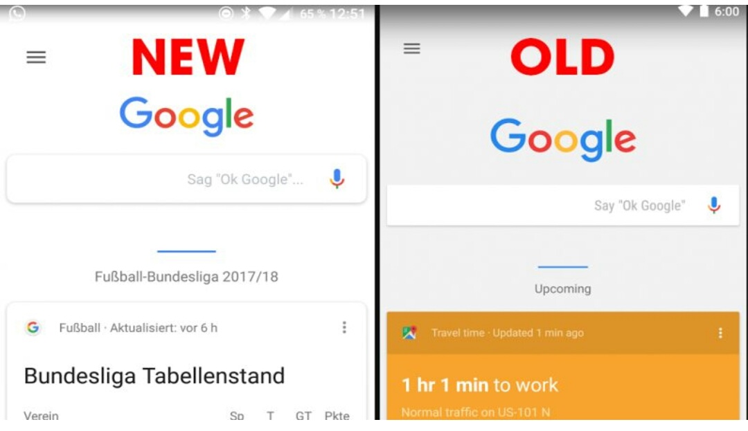
In all fairness, the changes are rather incremental, but these small touches do make the overall design significantly more appealing – at first glance at least.
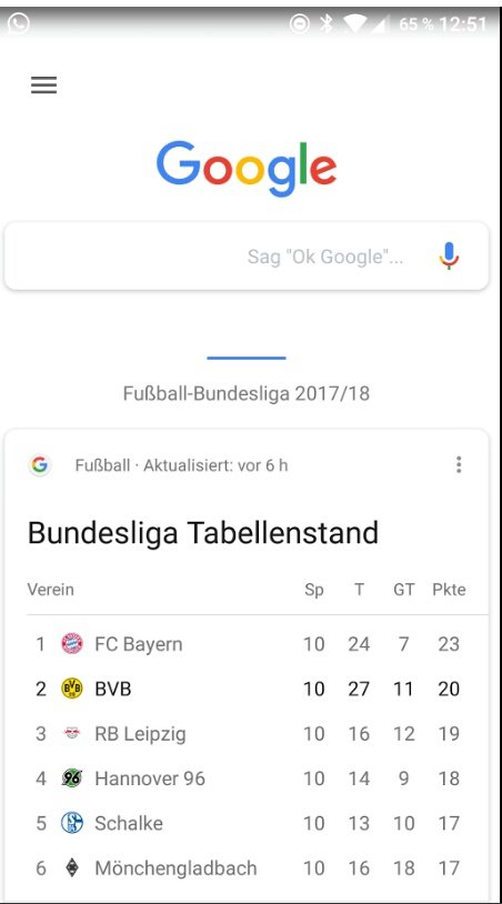
For starters, the dedicated search box has left behind the old rectangular(ish) shape in favor of a little more rounded design. The same applies to the various cards that show up in Now’s feed.
The other difference is that the old greyish background has now been switched to plain white. In order to accommodate for this change, the Big G’s designers have opted to make the shadow effect on the cards a tad more prominent.
All in all, the freshly introduced visual revisions make for a much neater and more polished look – similarly to what the company recently did with Calendar. See if you can spot the differences in the images below:
The new changes were first spotted by fastidious Redditors who took to the Google subreddit to share the new interface with fellow users.
As is the case with all tests, there is no telling when or whether the Mountain View heavyweight plans to roll out the new design to all users. All I know is that I’m digging the cleaner interface.