A week in knitting | Shortbread Inspirations
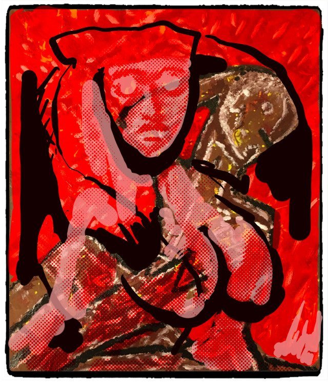
When this thumbnail turned up in my feed, I was immediately attracted to it - the bright red colours, the slightly abstract look and the rich texture all caught my attention. I have stared at it fascinated for some time now, not least because of the story ideas it conjures up.
Shortbread - a picture modified by @katharsisdrill using a Creative Commons licence (explained in this post). The original picture was by @shortcut published using a Creative Commons Attribution-ShareAlike licence in this post of four paintings.
I have become increasingly interested in how to render complex colour effects in knitting. My ideas were about creating garments that contained commentary in their patterns and designs. Two that I have started to look at were inspired by the 100th anniversary of votes for (some) women this year, and FC United of Manchester - a supporter owned football club. Both of these are social movements and come with a rich cultural history.
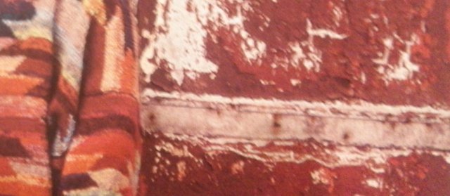
This slightly blurred cropped picture of a Kaffe Fassett design combines two visual effects that I like. On the one hand, a dense, rich pattern and on the other hand, a peeling, disintegrating surface revealing the substance below. I particularly like the effect of colour barely covering the canvas, like a worn pavement or much-used embroidered cushion. Some of Cezanne's Bathers are like this, creating a tension - where does the colour and apparent solid form end? Again, the colours are very appealling, just like Shortbread above.
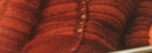
Here's another by Louisa Harding, using a Fair Isle pattern and stripes. Here the colours are more subtle and muted, creating a dense, rich texture that I almost want to bite.
I wondered how I could take Shortbread and use it to inspire me in my own designs and expression. Yesterday's there is always snow above by @neumannsalva reminded me of her method of using leftover paint in her palette as the inspiration for new ideas and paintings.
Long ago, I worked in Slater Street in Liverpool. It was run-down then (and has probably been regenerated within an inch of its life now) and its main claims to fame were the site of the Jacaranda Club where the Beetles had played in their early days and the Cream nightclub. During the day, Slater Street was a sleepy backwater, by night, it was heaving with throngs of people going to and from Cream and the other clubs and bars. The nightlife in Liverpool was something else.
I worked in one of a pair of lovely three story early Victorian houses where we ran a training centre. Unlike many buildings and centres, we suffered very little vandalism or pilfering, the building and everything in it was much loved by everyone who used it. When once someone put a brick through the window (for the fax machine - it seems strange now), many people were sad that something they valued had been damaged.
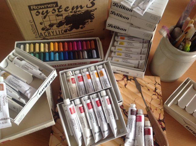
Down the road was an old-fashioned artists' materials shop, still with its original facade, gently decaying as the years passed. The tiny shop windows were always crammed with items and the interior quickly disappeared into an all encompassing gloom. I had never been in until they had a closing down sale when I went and bought a tube of every colour they had of something they called designer's colours. Looking at them now, I think the idea was to add a small amount of the intense colour to another medium.
They were packed in a fairly small but quite heavy box. I carried them with me through various moves around the country. At one time I gave them to some young friends and then asked for them back for some project I had in mind (my young friends had graduated to computer painting programmes, they didn't understand these material paints). My head was aching yesterday, I've had an intermittent migraine for several days. About four o clock in the afternoon, after a little sleep, I wondered what I could do to feel better.
I remembered the paints. I tried to remember where they were. I wondered if I had a palette knife and other painting tools. I looked for my sketch-books. On the way to gathering together everything I needed, I found some other lost treasures - embroidery threads, fabrics, my button box (with buttons from when I was a teenager), small sketches and notes from exhibitions and talks, an embroiderer's magnifying glass, my video camera.
Finally, I had found everything and set myself up at the dining table, materials to hand, a cup of tea, and some classical music on the iPad. I looked through my ninety-two tubes of paint and chose some that were close to the colours in Shortbread - a beautiful array of names (and one or two more prosaic ones) - bordeaux red, deep madder, alps red, brilliant pink, middle cadmium and yellow brown.
I realised afterwards that I had squirted far too much of each colour on the small saucer I was using as a palette. I ended with enough paint for four waiting-to-be-an-artwork paintings. The colours were interesting, some were translucent and others opaque, and sometimes, this wasn't revealed until they dried. The first painting was so thick and dense and crusted, I was able to take a print of it. I struggled with the palette knife, learning how to apply the paint, discovering how far it could (would) go.
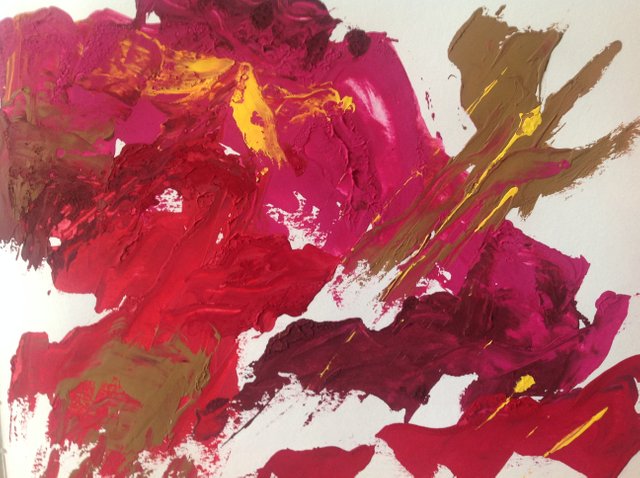
My first attempt. The paints were different textures (well, they had been sitting in various cupboards for over twenty years), some were very dry, others very wet and runny. I picked up too much paint at first and was clumsy with the palette knife. It was also too pink and unbalanced for Shortbread, I decided.
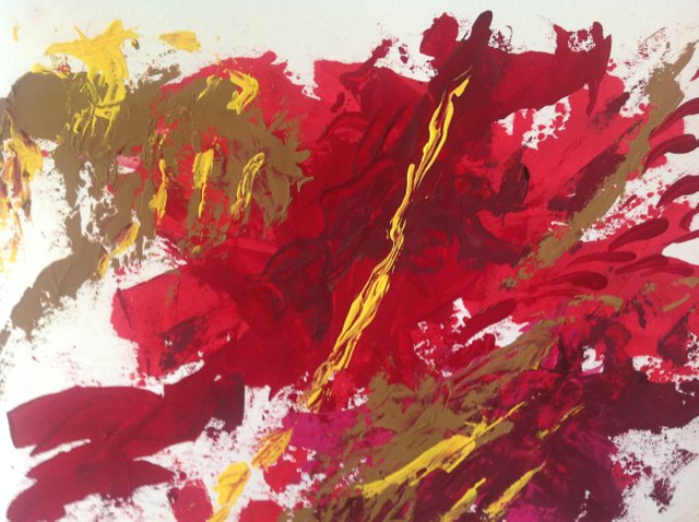
I was happier with this one (my second try). The colours were more balanced and I liked some of the effects I was discovering. I still had paint left after this one and created two smaller paintings using a different base colour each time. I was amused to notice my strokes changed as the music changed and the last one (not shown) is very choppy - the Toreador theme from Bizet's Carmen was playing.
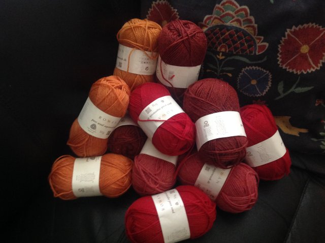
The paintings have dried overnight and I'm curious to see where I take them when I next sit down. Coincidentally, John Lewis (one of our big department stores) has a clearance sale. I was unsuspecting as I walked into the haberdashery department and discovered ...
Possible yarn for Shortbread II?
Thank you to the other artists on Steemit - @katharsisdrill, @shortcut, @neumannsalva.
Incidentally, my headache cleared.
This post was shared in the Curation Collective Discord community for curators, and upvoted and resteemed by the @c-squared community account after manual review.
Thank you very much, really appreciate the work that manual curators do on here.
HI @shanibeer, I just stopped back to let you know your post was one of my favourite reads and I included it in my Fiber Ramble. You can read what I wrote about your post here
Join us on Mondays for Creatives' Coffee Hour at 1pm EDT in the Steemit Ramble on Discord or view it life on Rambling Radio.
Fabulous, thank you very much!
@shanibeer that picture is very eye catching and textural. I can see why you liked it. It reminds me vaguely of some of Picasso's pictures.
I love the way that that particular piece of art work has inspired you to creating something new :)
Hello @jenniferbailey, how nice to see you! I agree - the profile head is very reminiscent of Picasso.
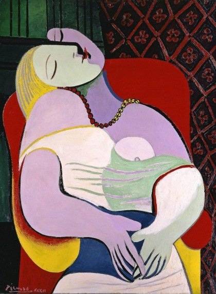
Source: Tate Gallery
Yes ... let's see where it leads 😊
Often, I would create my own cross-stitch patterns instead of using a factory-printed one. While trying to cross-stitch a scene from a photograph one day for a gift, I needed a color for the roof of a house that didn't exist in my rather large collection of cross-stitch floss. (The shingles on the roof weren't quite gray, and weren't quite brown.) So, I took a strand of two different colors and put them on the same needle and did the stitching. From a normal viewing distance, the two shades blended, perfectly, into the exact effect I needed!Could this technique be something you could use? By the way, I really like that painting, too! It is wonderful! 😊
Yes, that's a great idea to get lots of more subtle effects. You would also get a textural effect, because for that area, the wool would be thicker. I want to try some experiments with crochet because it might be easier to change colours (many times), but you have set me thinking about dfferent samples now!
Thank you for commenting. Have you seen #needleworkmonday? People post all kinds of needlecraft ... on Mondays 😊
That looks so interesting! Are you part of the fiber ramble discord?
And we miss you at the freewrite!! Hope you join us again someday!
Thank you @mariannewest. I miss the freewrite as well, but I work much more now and I have to prioritise. I think this post by @cryptocariad would be a good prompt though. I've asked her whether you could use the final image in the comments. She likes the idea :)
I enjoyed reading your post @shanibeer and I'm intrigued by your future creation; I do love the colours and look forward to reading some more soon! 😊
These are grand visions (or delusions) - so different from the re-cycling side of my personality. I have a busy fortnight with work and other things so it may be a while before I get back to this. I have already thought that I may need another ball of each colour yarn for experiments. There is enough there for a marion-style jacket, but not for trying out samples. I am drawn towards crochet (although I am so new at it), I'm wondering whether it might be easier to control colour changes?
I have a very vivid imagination @shanibeer... I can see Shortbread 'distinctly' as a crochet piece and I would personally check out a page like this posted originally by @oceanmoon. Hope you can get some rest over the busy period.
Ah, thanks for the link.
What a wonderful post! resteemed! (and I am vain... you mentioned me :-D)
I love your ideas of texture, colour and fabric and think that your painting experiment beautifully combines the items you liked in the top photos: You painted rich, pastose and intense colour-fields wile simultaneously leaving room to breathe (meaning white unworked paper) With the paint you are not only creating a (flat) image, but also a texture like the peeling wall you mentioned.
Personally, I like the first painting more, but this is me and my love for pink hues.
And with the wool - wow, this was luck. The yarn has the absolute right colour combination. I am curious to see your design <3
With the paint... I am a bit unsure... the Pelikan colours seem to be tempera paint, which is unusual, because tempera is a tad complicated to use (but I am not too educated in this... I only remember my father who painted icons with egg and linseed oil tempera, but traditional icons are perhaps no comparison)
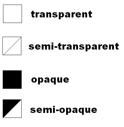
With acrylics you have pigments and fillers and adhesive agents, which influence the opacity. Mostly you will have symbols on your paint which tell you the grade of opacity (but perhaps you already know this, then sooorrryy)
I will now hurry to you pattern making website and try it out :-DD
I like both paintings - but they are different. For the first one, I was just concerned with getting the paint on to the paper, I didn't feel I had any control and I wasn't really concentrating on the colour and what was happening with it. It's a bit like when I recently learned to crochet - my big problem was keeping the yarn on the needle! With the second one, it was more meditative and I started to have more control and I was more aware of colour and the balance of colour.
There is also a very interesting discussion here by @lloyddavis about the process of drawing and how children draw for the experience, rather than the outcome. It has some interesting links.
Thank you for the information about translucent/opaque colour and the re-steem.
Ohhh I will check this, thank you for mentioning the discussion. With dancing it is so easy for me to simply enjoy the process or if necessary to switch to a more controlled/assessing state of mind. While painting this switch does not come easy to me... here I am often more concentrated on the result (although I enjoy the process) I think perhaps dancing is a more ephemeral and with painting you are constantly confronted with the result.
I have a friend who "teaches" painting with the method from Arno Stern who valued the process strongly (over the result). As you said a interesting discussion :-)
I like the idea, nice post
Thank you, I appreciate your comment 😊
I am really looking forward to see where you get with this :)
Me too, there is so much in it!
The image that inspired you is really a sight to behold, it's so eyecatching and the more I look at it, the more hidden messages I get to seek out.
Although I'm wondering why it is called 'shortbread'
Your pieces are also cool, I like that you are branching out to unfamiliar terrain which is painting,
I do some pencil and Biro scribbles nothing too fancy, never worked with paint. If I had made that first attempt, I honestly would display it on my wall lol, but the second attempt is finer tho and now you've got yarn! I'm curious to seek how shortbread is gonna emanate from the yarn
The artist @katharsisdrill named it Shortbread - I'm glad you see lots in it, that's one if the things that struck me, too. I think there are some more steps before I start creating the garment ... we will both have to wait and see. Thank you for coming by to comment.