Nasdaq Composite Index analyse
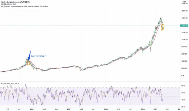
The chart spans from the year 2000, to now. Looks familiar, doesn't it? The mega run-up, breaking major support lines, panic, then a giant bullish weekly candle pulling us back to the moving averages. Looks very very similar to our current chart, doesn't it?
This move up and sideways could last for months and leave us blindsided, but the developments will unfold slowly enough to catch anyone off guard. Of course, we could keep trending sideways or higher for the rest of the year even, but don't be mistaken, this up move can't go on forever.