Dow Jones Fractal: The Spectre of 1929
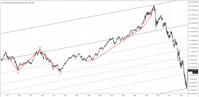
Chart 1. Dow Jones 1917–1932, weekly bars
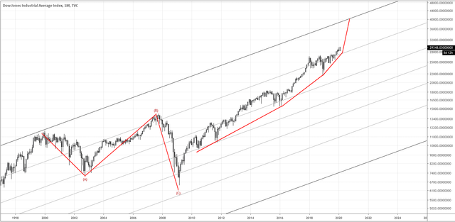
Chart 2. Dow Jones 2000–present, monthly bars
Could history be about to repeat itself? The two charts above show the development of an interesting fractal on the Dow Jones chart.
In Chart 1, two structures are highlighted: the first is a corrective pattern (marked ABC) between 1917 and 1921; the second is the frenzied rise that preceded the Great Crash of 1929.
Chart 2 shows similar structures overlaid on the chart from 2000 to present: the major corrective pattern between 2000 and 2009, followed by the bull cycle that began thereafter. Somewhat ominously, the rate of increase in price appears to be speeding up, similar to in the run up to the 1929 crash.
A blow-off top, parabolic… Call it whatever you want to call it but this bull cycle may still have room to run. However, the similarity in the two structures suggests there is the possibility for something nasty to follow. It’s an interesting scenario to bear in mind in the context of this year’s bloody battle that will determine the outcome of a crucial US election.
Stay safe.