Introduction to Charts in Microsoft Excel
Charts are a great way to represent your data in a visual form in order to better understand your dataset and get hidden insights which otherwise you wouldn't be able to.
Microsoft Excel offers a variety of chart options and in this article I will show you how to make and customize them to your needs, using the most common chart types.

In this article you will learn how to:
- Insert charts
- Create line charts
- Create bar charts
- Create pie charts
- Create a waterfall charts
- Explore other chart types
- Customize your charts with Elements, Styles, and Filters
Select your data
Every type of chart in Excel will require you to go through the same setup process. After you learn how to create one chart, you will know the rest as well.
First, you will have to select your data. You can do this in a variety of ways:
- Click the first cell, holding down your mouse, and then dragging through the rest of the cells.
- Click the upper left cell, hold down the Shift key, and then click the bottom right cell.
- Click any cell in the table and use the shortcut key Ctrl+A
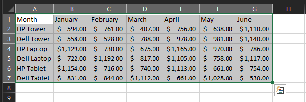
Note: Include headers for the columns and rows. This will make the chart easier to read and you can make adjustments at any time.
Insert a chart
There are two main ways to insert a chart to your spreadsheet:
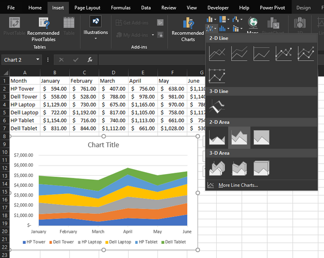
- The first option is to go to the Insert tab and then pick a chart from the ribbon. You’ll see a preview of it as you hover the mouse over it and after you click the icon, it will pop right into your spreadsheet.
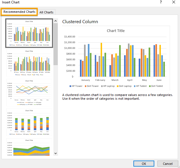
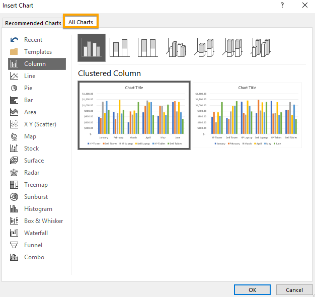
- The second option is to choose the Recommended Charts button to inspect the recommended chart types if you aren’t sure which one you want to use. Additionally, you can see all the available chart types, which can be helpful. If you decide to select one from there, click OK to insert into your spreadsheet.

Creating a Line chart
One of the more popular chart types is the line chart. They work well for visualizing trends across a time period or presenting categories when their order is necessary. Excel gives you a few options on how to display charts:
- 2-D or 3-D version
- stacked or unstacked
- with or without marker lines
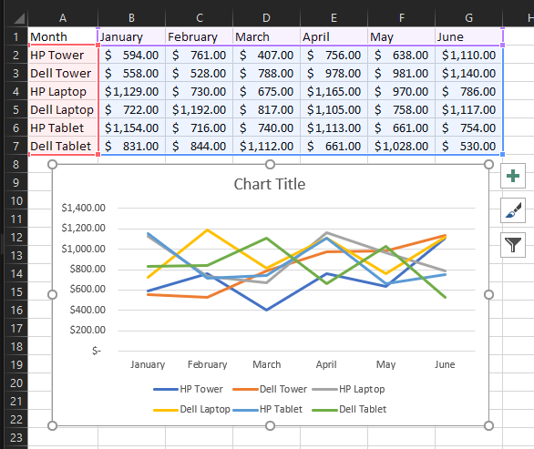
For instance, we have total sales of products over a six month period. To display a line chart follow these steps:
- Select your dataset
- Click the Insert tab
- Click the button on the ribbon which says Insert Line or Area Chart.
- Choose the chart style you would like to appear on the spreadsheet
- Additionally, you can set a different pre-made design on your chosen chart type by going to the Design tab > Chart Styles
Creating a Column / Bar chart
Another type of chart widely used in visualization is a column or bar chart.
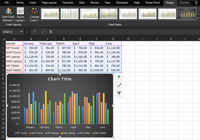
These charts also work well with the sales data where we used a line chart for. Their foremost goal is to compare data categories along with changes over time. To display a bar chart follow these steps:
- Select your dataset
- Click the Insert tab
- Click the button on the ribbon which says Insert Column or Bar Chart.
- Choose the chart style you would like to appear on the spreadsheet
- Same as with line charts, you can set a different pre-made design on your chosen chart type
Creating Pie Charts
A pie chart is an excellent approach to visualize a single categorize of the complete dataset.
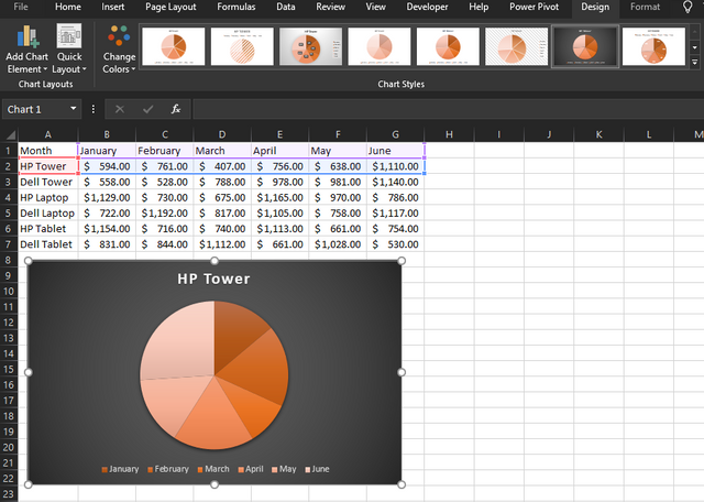
Working with our sales dataset, let’s say we want to view sales for only the HP Towers products over the six-month period.
- select only the section with the product and dates
- Click the Insert tab
- Click the button on the ribbon which says Insert Pie or Doughnut Chart.
- Choose the chart style you would like to appear on the spreadsheet
- Same as with line charts, you can set a different pre-made design on your chosen chart type
Creating Waterfall Charts
In comparison to other charts in this article, waterfall charts might not be as popular, but it is a very useful chart type when it comes to visualizing increases and decreases in financial datasets. There’s only one type of waterfall chart in Excel, however, it's appearance is still customizable in the same way as other charts.
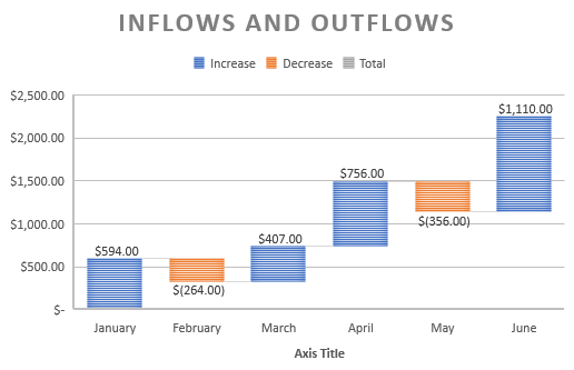
You could use a waterfall chart to display the ups and downs of monthly income, sales percentages, or inventory counts.
- Select your dataset
- Click the Insert tab
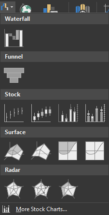
- Click the button on the ribbon which says insert Waterfall, Funnel, Stock, Surface, or Radar Chart.
- Select the Waterfall chart to display on your spreadsheet.
Other chart types in Excel
The mentioned charts in this article are certainly not the extent of what you can create in Excel. To see other recommended charts based on your dataset go to Insert tab > Recommended Charts button. You can browse the Recommended Charts list if you aren’t confident which chart type would best describe your dataset.

In order to see the list of all available charts in Excel, click the All Charts tab. There are numerous choices to choose from along with the traditional chart types. Once you make your decision, click OK and the chart will display on your spreadsheet.
Customizing your Charts
Once you chose your chart, you can begin customizing it with a variety of possibilities. Select your chart and small menu icons will appear on the top right representing Chart Elements, Chart Styles, and Chart Filters menu. Let's look into what each of these options can offer to us. (keep in mind that not every chart has these options)
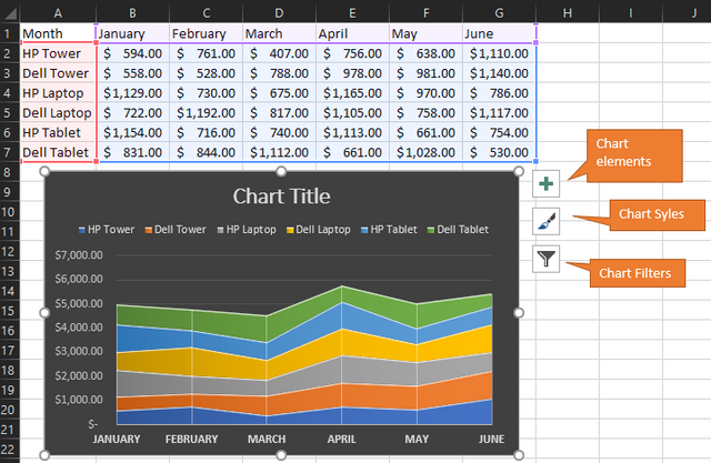
Chart Elements
Here you can select elements you would like to include on your charts such as axes, data labels, gridlines, and a legend.
These choices vary depending on the chart type you use. Certain elements let you customize it even further. For example, if you want a legend, you can choose the location it where to display it on the chart.
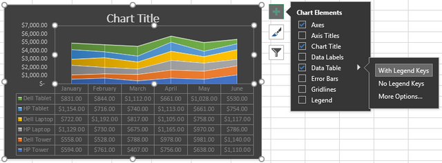
Using our bar chart from above, let’s customize some elements. We’re going to include axes, chart title on top, a data table with legend keys.
Chart Styles
Here you can customize the look and feel of your chart in the same way as you would go to the Design tab > Chart Styles ribbon menu. Let’s give our chart a different feel.
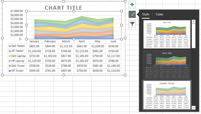
As you hover your mouse over the various styles and colors, you can preview of how your chart would look. Click when you see one you like.
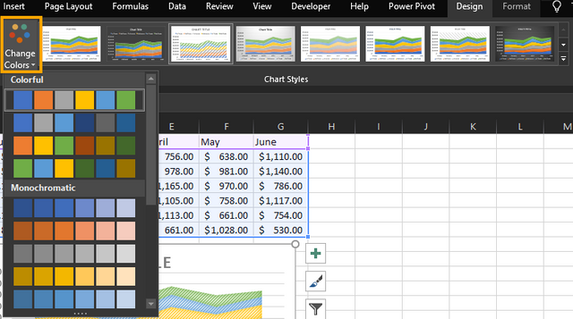
Additionally, a good practice would be to use colors that are aligned with the company colors you are analyzing. You can do this by selecting your chart and navigating to Design Tab > Change colors menu.
For additional color schemes for your chart, you can navigate to Page Layout tab > Themes and browse and scan through the options.
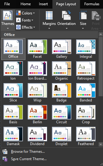
Chart Filters
Chart Filters offer you the options to quickly add or remove certain data categories.
For instance, let's assume we only need the first quarter of sales in our chart.
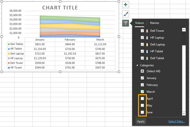
Select the chart and click the Chart Filters menu button. Here you can uncheck the data categories you want to remove. In our case, we want to remove April, May, and June out of the chart. Click Apply when you are done.
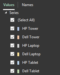
In case you only want to include certain products on your chart, you can use the Series section to remove products. Apply the changes by pressing the Apply button.
Moving and Resizing Charts
Moving your chart to another spot on the spreadsheet is relatively simple. The only thing you have to do is select it and when the four-sided arrow appears, drag the chart to its new location. In case you have to move it to another worksheet, copy the entire chart by applying the shortcut key Ctrl+C and once you navigated to the new location, use Ctrl+V to paste it.
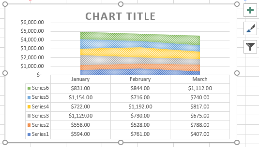
In order to resize your chart, you can achieve it in a similar way by selecting it and drag one of the circles from the corner of the chart in the direction you would like to expand it.
found your posts from @theexcelclub resteem. Hope to see more learning blogs appear on steem
You got a 0.37% upvote from @minnowvotes courtesy of @exgap!
Congratulations @exgap! You have completed the following achievement on the Steem blockchain and have been rewarded with new badge(s) :
Click here to view your Board
If you no longer want to receive notifications, reply to this comment with the word
STOPTo support your work, I also upvoted your post!
another great #excel post. Sharing on twitter and resteeming :-)
Congratulations! Your post has been selected as a daily Steemit truffle! It is listed on rank 8 of all contributions awarded today. You can find the TOP DAILY TRUFFLE PICKS HERE.
I upvoted your contribution because to my mind your post is at least 4 SBD worth and should receive 144 votes. It's now up to the lovely Steemit community to make this come true.
I am
TrufflePig, an Artificial Intelligence Bot that helps minnows and content curators using Machine Learning. If you are curious how I select content, you can find an explanation here!Have a nice day and sincerely yours,

TrufflePig