Composition Basics In Microphotography
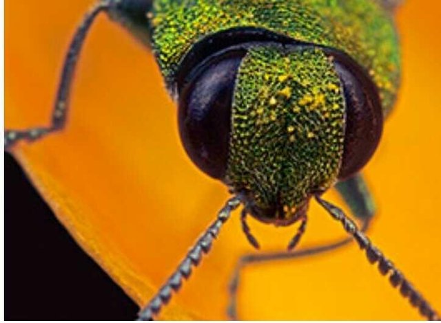
ortrait of small Jewel bug: Magnification 7, f/9, ISO 100 and 1/250 sec.
Microphotography is magical because it takes us into a smaller universe of vibrant colors, exquisite details and extraordinary patterns that can literally take your breath away. I photograph invertebrates so close-up that they are transformed into large subjects. Through my images I aim to highlight the different characteristics of a variety of species – and their individual charm.
Microphotography can be challenging because it involves moving in close and magnifying what is there beyond our normal perception of it. As a consequence, we need to pay a lot of attention to every detail we see in the view finder because it will have a huge impact on the overall look and feel of the image. Where we place the subject in the frame (i.e. composition) is critical; even the smallest movement left-right, up-down, can substantially change its impact.
It’s hard to overstate the importance of composition. For all of the emphasis we as photographers tend to place on which camera, lens or other gear to use, there’s nothing that contributes more to a pleasing image than careful attention to the framing of your subject. In this article I’m going to discuss some of the compositional techniques most applicable to microphotography.
Unique Viewpoint
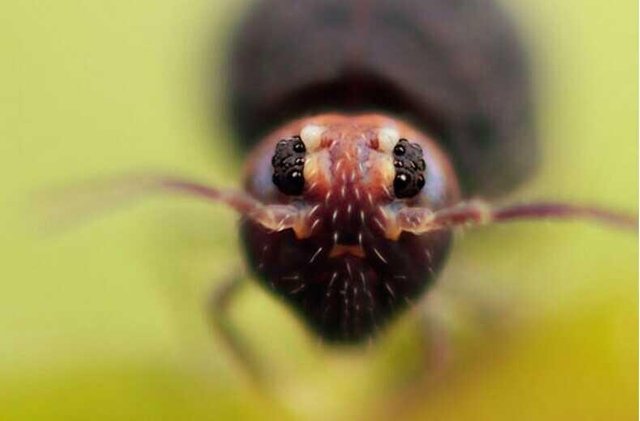
Shooting from eye level allows the photographer to show the subject as if looking at it from within the subject’s own world. Springtail with a size of around 1.0 mm: Magnification 12, f/6.4, ISO 100 and 1/250 sec.
Taking your photos from a unique viewpoint is a microphotography technique that you should try to use. Imagine yourself admiring the insects flying around or walking upon the petals and blossoms of the flowers in your garden. When you are looking at these insects, you are always looking from a top-down perspective. As such, if you take a photo from the same viewpoint, it is not unique and doesn’t captivate the attention of your viewers.
Shooting extremely close at eye level allows you to show the subject as if looking at it from within the subject’s own world. It makes insects seem man-sized and look more threatening than an elephant or bison. Many times macro photographers put too much effort into capturing their subjects “head-on.” Think outside the box and experiment with different angles to create a unique perspective. This helps to capture the attention of your viewers and draw them into the microphotography world.
Composition
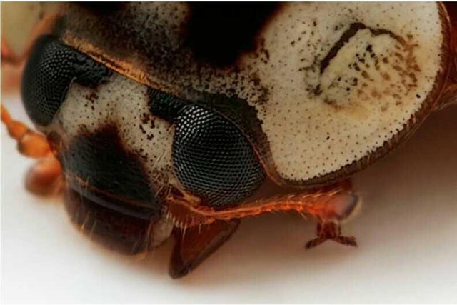
Including the whole body would mean shooting at a relatively small magnification ratio. Portrait of a ladybird: Magnification 8, f/11, ISO 100 and 1/250 sec.
The increase in magnification reduces the depth of field in an image, decreasing the total area of the image which is in sharp focus. This provides another disadvantage. The reduced depth of focus makes it more vital to think about composition and selecting which area to place the most focus on. Magnifying the image also magnifies any movement of the camera and the subject, so it becomes far more challenging to make super sharp images.
Even with all the limits of insect photography, photographers have found ways of getting around them and producing vivid images. There is an inverse relationship between magnification and depth of focus. To make up for the limited amount of depth of focus, photographers are more careful of what areas to include in the final image. Composition is a key element to insect photography. In most cases, we want good focus and sharpness on the eye of the insect that we’re shooting. But with depth of field of less than a fraction of a millimeter, getting any part of the animal in focus can often be quite a challenge.
When deciding whether or not to include a subject’s entire body, one guideline to remember is to ‘cut hard or not at all.’ It’s often problematic to include the whole subject in a frame. Apart from anything else, some insects have very long antennae, so including the whole body would mean shooting at a relatively small magnification ratio.
Capture the aspect which makes the insect unique. If it is the insect’s mandibles, then compose the image to show the insect when it is eating. For maximal sharpness throughout, adjust the angle of your camera so that the plane of sharpest focus aligns with the head/plane of your subject. Play around with composition until you get something that works.
Insects are also known to be jumpy. Knowing the behavior of the subject is needed to determine how to best approach and how to capture the image without scaring the insect away. It also pays to be patient, allocating a significant amount of time to photographing insects.
Magnification
"Magnification describes the relationship between the actual size of the subject and the size of its image on the sensor of the camera. Dividing the size of the subject’s image on the sensor by the actual size determines the magnification. At 1:1 life-size, the size of the subject on the sensor is as big as it is in real life.
Look Room and Headroom 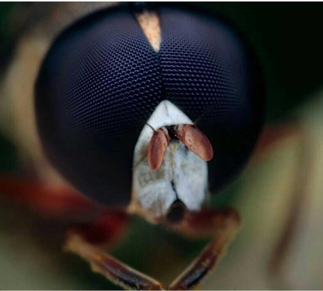
The amount of look room necessary is dependent upon the angle of the subject to the camera. Cheilosia female hoverfly: Magnification 8, f/11, ISO 100 and 1/250 sec.
The concept of ‘look room’ and ‘headroom’ are important in microphotography as well as other wildlife photography. Well-composed shots leave space in the direction the insect’s eyes are looking. Indeed, having a subject looking at the nearest edge of the frame can be unappealing. If you don’t leave enough look room, your subject will appear to be boxed-in and confined. The use of appropriate look room contributes greatly to a sense of balance in the image. Be aware that the amount of look room necessary is dependent upon the angle of the subject to the camera. A subject looking directly toward the camera will require less look room than a subject shot in full profile.
Headroom is another element you should consider when framing your subject. Headroom is the amount of space between the top of the insect’s head and the top of the frame. If you leave too much space, the subject will appear as if sinking in quicksand. If you don’t leave enough room, the subject will seem in danger of bumping its head.
Rule of Thirds
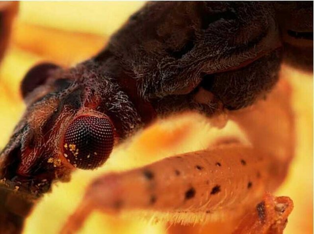
The eye of the hunting bug is placed in one of the intersecting points. Common Damsel Bug: Magnification 10, f/8, ISO 100 and 1/250 sec.
The rule of thirds states than an image is most pleasing when its subject is composed along imaginary lines which divide the image into thirds — both vertically and horizontally. It is actually quite amazing that a rule so seemingly mathematical can be applied to something as varied and subjective as a photograph. But it works, and surprisingly well. The rule of thirds is all about creating the right aesthetic trade-offs. It often creates a sense of balance — without making the image appear too static — and a sense of complexity — without making the image look too busy.
Before taking a photo, imagine the grid in your head and play around with composition until you get something that works. If you’ve already taken the photo then try cropping it to meet this rule, most editing software will have a grid you can overlay on your image to help. Does this mean that you need to worry about perfectly aligning everything with the thirds of an image? Not necessarily — it’s just a rough guideline. What’s usually most important is that your main subject isn’t always in the direct middle of the photograph.
Background
In macrophotography and microphotography, the background is often so out of focus that it appears as a solid or smoothly varying patch of color. The color of the background, as one would imagine, plays a significant role in emphasizing the subject. It’s important to choose a background which complements the color and tone of your foreground subject. Doing so brings out the subject by emphasizing its own colors. Fortunately, one can often pick a different background by simply shifting the camera’s vantage point. Capturing striking colors, and combinations of colors, is just as important in the micro world as it is in everyday photography. One should also take care to avoid placing distracting out-of-focus highlights behind the subject.
A related issue is the brightness level of the background. A background having similar brightness to that of the subject will of course create less contrast in comparison to a background which is brighter or darker. Keep in mind that your main subject must stand out while composing a shot. Try to refrain from creating a background which is too bright or too dark, as that can throw the image out of balance.
Leading Lines
Leading lines naturally control the eye movement of the viewer. Our eyes naturally follow the path of a line, and you can make use of this knowledge in your composition by placing the main subject of interest at the end of the line where our eyes will rest. Whether they are graceful curves or dynamic diagonals, all lines should lead the viewer’s eye to a specific area within the photo that is an important focal point.
Leading lines are a key element of composition. Learning to use them effectively comes by learning to “see” lines. But, be careful with the use of leading lines. They can also work against you by directing the eye away from the subject.
Just as there are times when guidelines are helpful, there are times when they can be modified or ignored altogether. Knowing when to ignore the guidelines requires some experience, but the results can be quite surprising.