GOOGLE MAPS IS DECEIVING YOU!: Find out how
MAPS CAN BE DECEIVING, WHEN IT COMES TO THE SIZE OF COUNTRIES AND IT'S REPRESENTATION ON IT
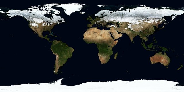
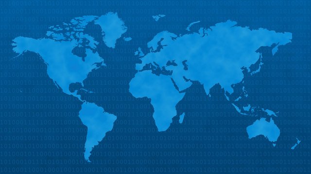
 This is how we see our world.
Even in our phone’s maps we can see that Russia is bigger than Africa. Don’t rely on my words alone, go check it out yourself. Done? So, you believe me now.
Now, here’s a small figures fact which you can google to verify: Area of Russia is just 17.1 million km², while area of Africa is 30.22 million km².
When we look at the world map there’s one thing we don’t take into account, Our earth is spherical and in order to project it into 2-D flat paper/screen, one has to stretch the region near the poles more than the region near the equator.
To make it clear imagine unwrapping a globe.

What do you notice? Width of paper near the equator is more than near the poles, now if you try to make it a perfect rectangle by stretching the region near poles you’ll end up with something like this:

It's because almost all maps use a common projection called Mercator Projection. You can read about more projections here.
Why does Google use a flawed map projection?
Find out here.
There's also a website called thetruesize.com which does exactly as it's title suggests.
NOTE: All images used in this article are sourced from pixabay and licensed CC0 which doesn't require attribution.
Also read: The Dark Web