Why your company logo design matters. Instagram case study.
After carefully crafting several hundreds of logos for multi-million dollar companies in major industries, I can attest to the fact that most entrepreneurs who hire design professionals tend to have wrong expectations when it comes to a well-designed and effective logo. Over and over again, my team and I receive the same requests from our clients wanting to include every aspect of their business in their logo. For instance, an oil service client of ours, whose name I will not mention, found it very hard to accept the final logo because it was too “simple,” even though it encompassed every aspect of their company symbolically.
You would think that due to the rise of the Internet and overload of information, most entrepreneurs would know the best practices for branding and design, but that’s false. It is as if us design professionals are in a bubble of our own and cannot reach our clients no matter how hard we try. At least now it is easy to address this situation and hopefully save some businesses from failing before they even begin. In this article, I want to bring to your attention some reasons why major companies are redesigning their logos even after billion-dollar deals and millions of daily users. Instagram recently unveiled a new logo and here are three noticeable features:
- Flat Design
- Vibrance, and
- Simplicity
A high percentage of the effectiveness of your logo consists of these three components. If your design professional is not putting emphasis on these things, you might want to find another.Let’s look at Instagram’s new logo in detail.
- Flat Design: The first thing we notice is the flat design style of this new logo. Most of your favorite brands are switching to a flat and sharp design style not only for the their logos but for their entire brand integrity -- Apple, Google, Facebook, Twitter, and of course Instagram, to name a few. Adopting the flat design style is beneficial because it’s clean, looks incredible on mobile, and most importantly brings out the bold, vibrant colors of your logo.
- Vibrance: The color of this new logo is very vibrant. Selecting the right colors for your logo can effectively trigger the right emotions from your customers. Instagram’s choice of colors for this new logo is very strategic. Here’s why I think the colors are perfect. First, let’s ask ourselves what emotion this triggers: Imagination.
The color purple triggers imagination, curiosity and creativity. Instagram using this as a prominent color is a strategic appeal to convey its message of creativity and imagination amongst its users. As if the users were not already highly creative and imaginative, this emphasis will encourage more users to explore and innovate.
- Simplicity: Your logo can include the above features but if it’s not noticeable or recognizable, you’re not going to be successful. The best way to stand out is simplicity. Ensuring that your logo is simple is the most effective way for customers or visitors to remember and recognize your logo wherever they see it. Instagram’s logo exhibits this feature in the clean camera outline, visible on the rainbow, gradient background. Apple, Nike, Coca Cola, Dell, HP, Amazon, CNN, Virgin, Yahoo!, Times, Avis, etc. are proof that a simple logo can go a mighty long way.
These three components of a great logo has been well accepted with major brands.
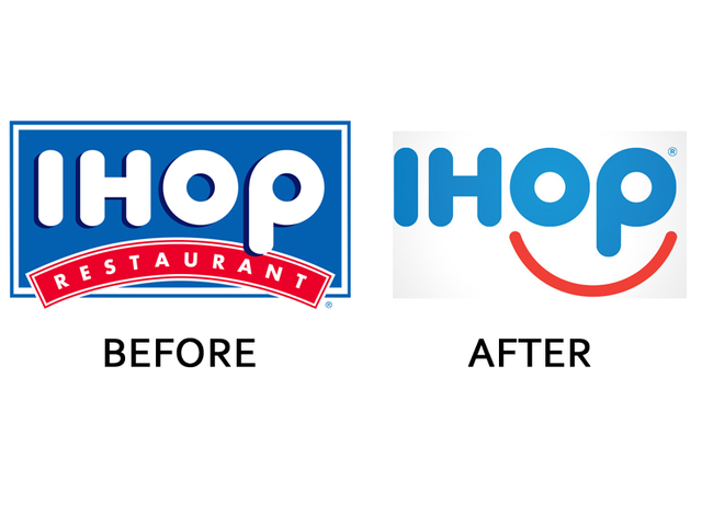
- IHOP changed its logo last year to include these three features.

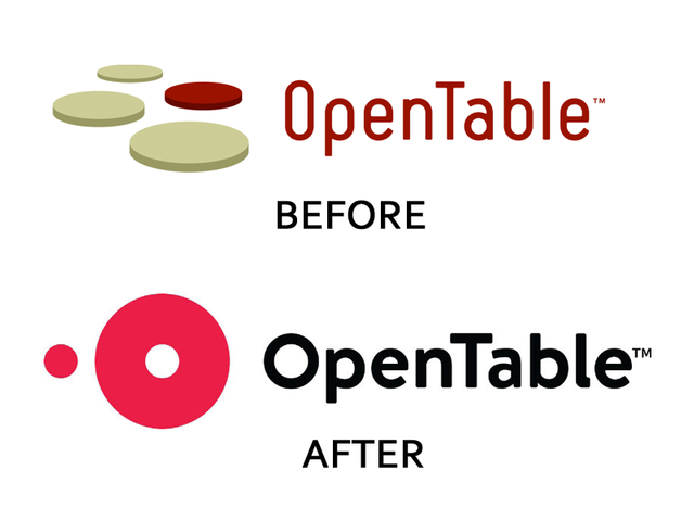
- OpenTable changed its logo last year to include these three features.

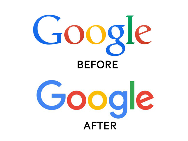
- Google changed its logo last year to include these three features.

- And now Instagram. I hope you get the picture.
In conclusion, ensure that your logo embodies these three major features. Even if you’re already in business, review your options and consider rebranding if your current logo is not working for you. The majors are doing it for the good of their companies. Do it for the good of yours.
I got my friend whose a graphics designer to help me design my logo for my business. It was extremely simple but effective.
I feel like Business Owners just find it difficult to pay money for something that "looks" like a simple 10min job, so they expect more.
I agree! Most business owners expect so much in a logo. I've had several clients ask me for multi color, dimensional designs and I'm like no that's not going to be an effective logo for your business. Some listen but others don't since they're the owners ha! But those who end up listening, always benefit in the end! I'm glad your logo is doing it's job man!!
Congratulations @williamntim! You have completed some achievement on Steemit and have been rewarded with new badge(s) :
Click on any badge to view your own Board of Honor on SteemitBoard.
For more information about SteemitBoard, click here
If you no longer want to receive notifications, reply to this comment with the word
STOPThe flat design looks much nicer IMO. Great post!
Congratulations @williamntim! You received a personal award!
You can view your badges on your Steem Board and compare to others on the Steem Ranking
Vote for @Steemitboard as a witness to get one more award and increased upvotes!