Logo Design
So for our Video Production class we're required to get into groups. I formed a group with three others and the four of us were thinking for quite some time for our group name. It ranged a lot from vegetable names to really weird animal names.
In the end we thought of naming our group related to stars for some reason, and we googled name of stars. My group was really hooked on the name Bellatrix, though I wasn't too keen on it since it was also the name of a character from Harry Potter. So to make things fair we decided to take a part of the name and officially named our group Trix Studios (Yes it's also the name of a cereal brand).
So with the group name decided, it was time to decide on a logo.
Below is the completed logo :)

Since our name was inspired by a star, we wanted to do something that is stars, space, or galaxy themed. Thus, we all pitched in ideas on what the logo should look like.
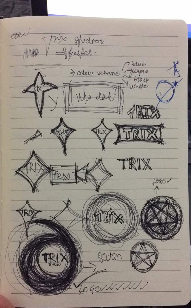
Sketches for ideas. (Please ignore the pentagram and the word satan there haha ha ha)
In the end we decided to do the one on the bottom left of the page.
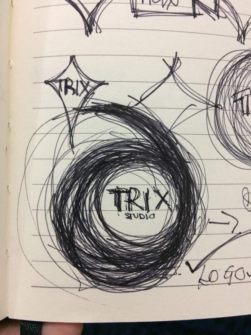
The design is actually inspired by a black hole. Black holes are technically dead stars. Or more accurate black holes are formed due to a star that has ended their life cycle. Anyhow, the swirling also looks like an object going towards you, or a visualised shooting star from the front. Basically it looks like something that is moving forward, with the top part being its trail. Our group name is placed nicely in the center.
Looks quite difficult to execute, doesn't it? However, I managed to pull it off, which I will demonstrate in a while.
Since it was my design, and also since i enjoy creating logos, I offered to create and finalise the logo. So, I decided to use Illustrator.
First, I opened my reference photo in Illustrator.
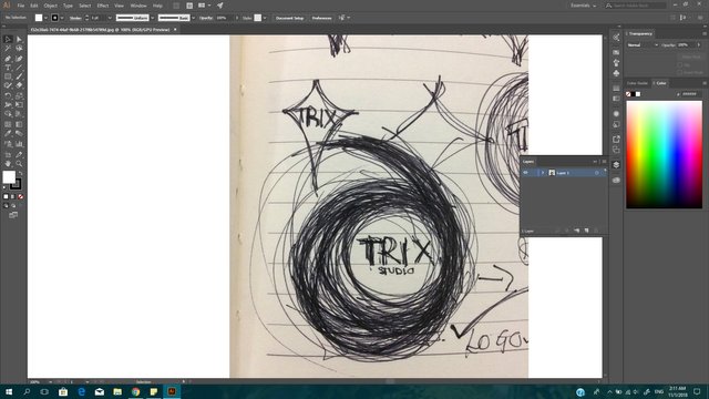
Then we determine what shapes we're going to use. Since the design is very circular and was just me making a lot of swirls, I'm going to use only the circle shape for the whole logo.
I used a large circle and two slightly larger circles to get the main outline of the logo,along with one small circle for the center.
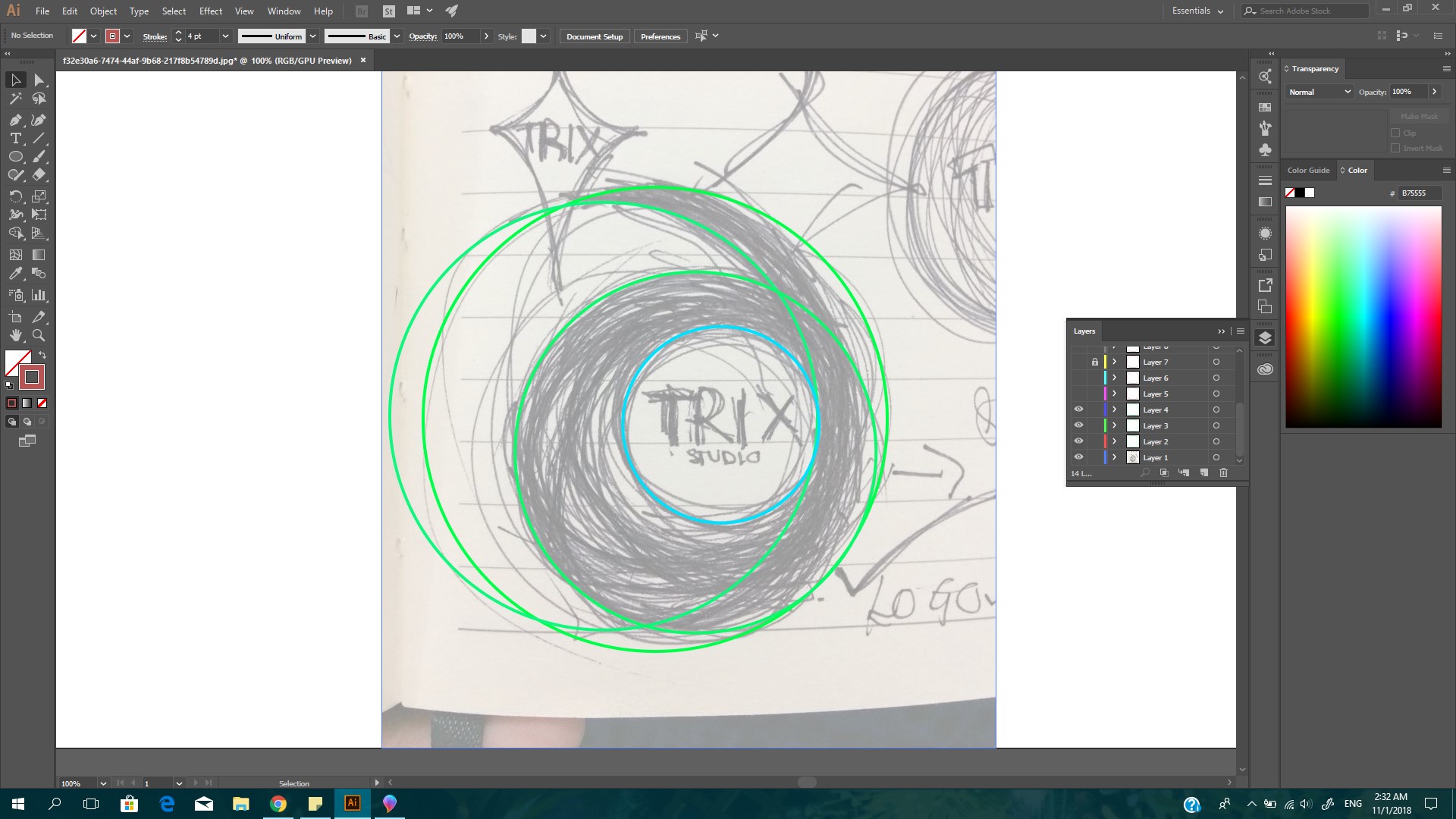
Then we add circles to mimic the swirls drawn in the sketch
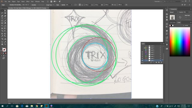
Add more
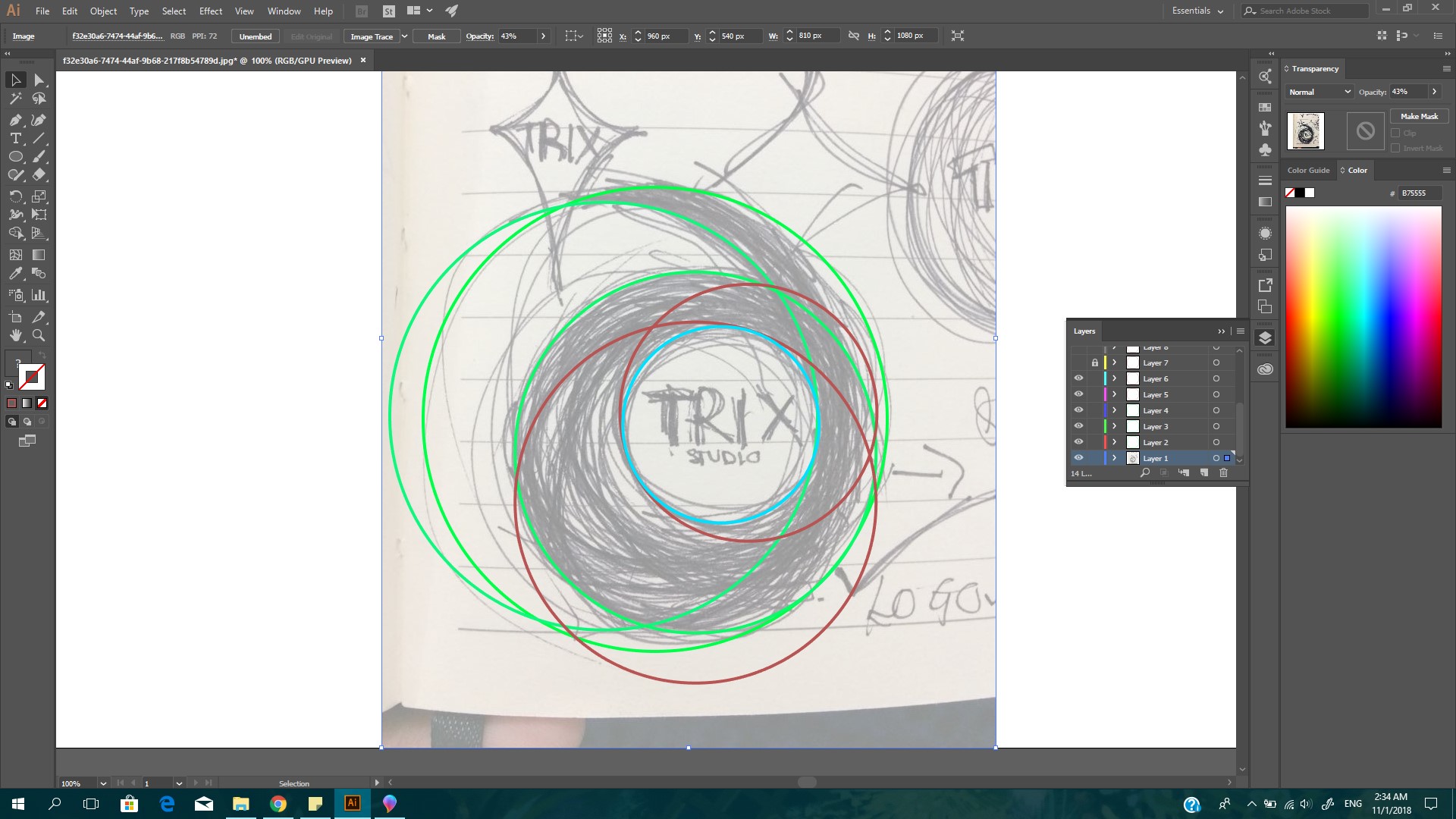
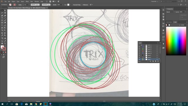
And more until satisfied.
Hide the reference picture and hide the red circles for now, and adjust the three main circles to make the shape more balanced and to ensure you get the desired shape.
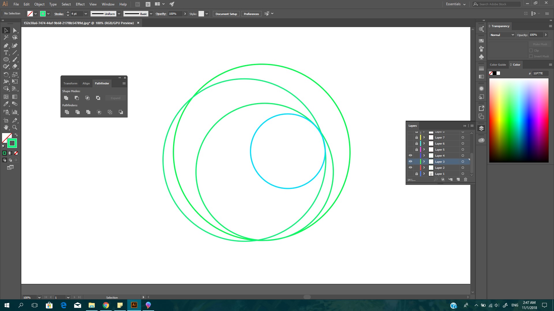
Select the two large circles, and use minus front from shape mode in the pathfinder window (To make the window visible, go to Window and select Pathfinder). The shape will turn out like this.
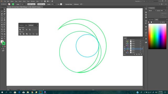
Next, select everything except for the small blue circle and select unite from the pathfinder window.
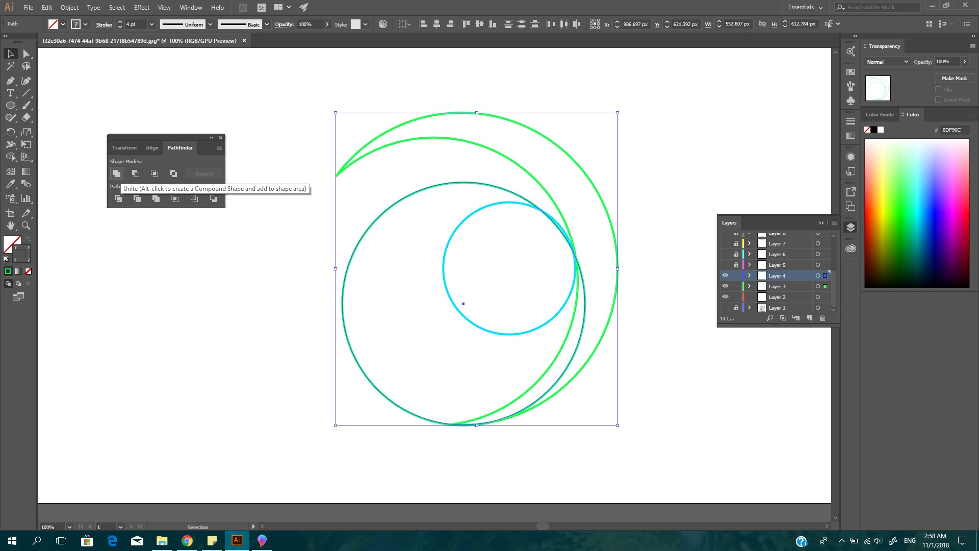
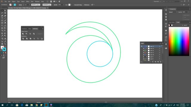
Now select everything and use exclude.
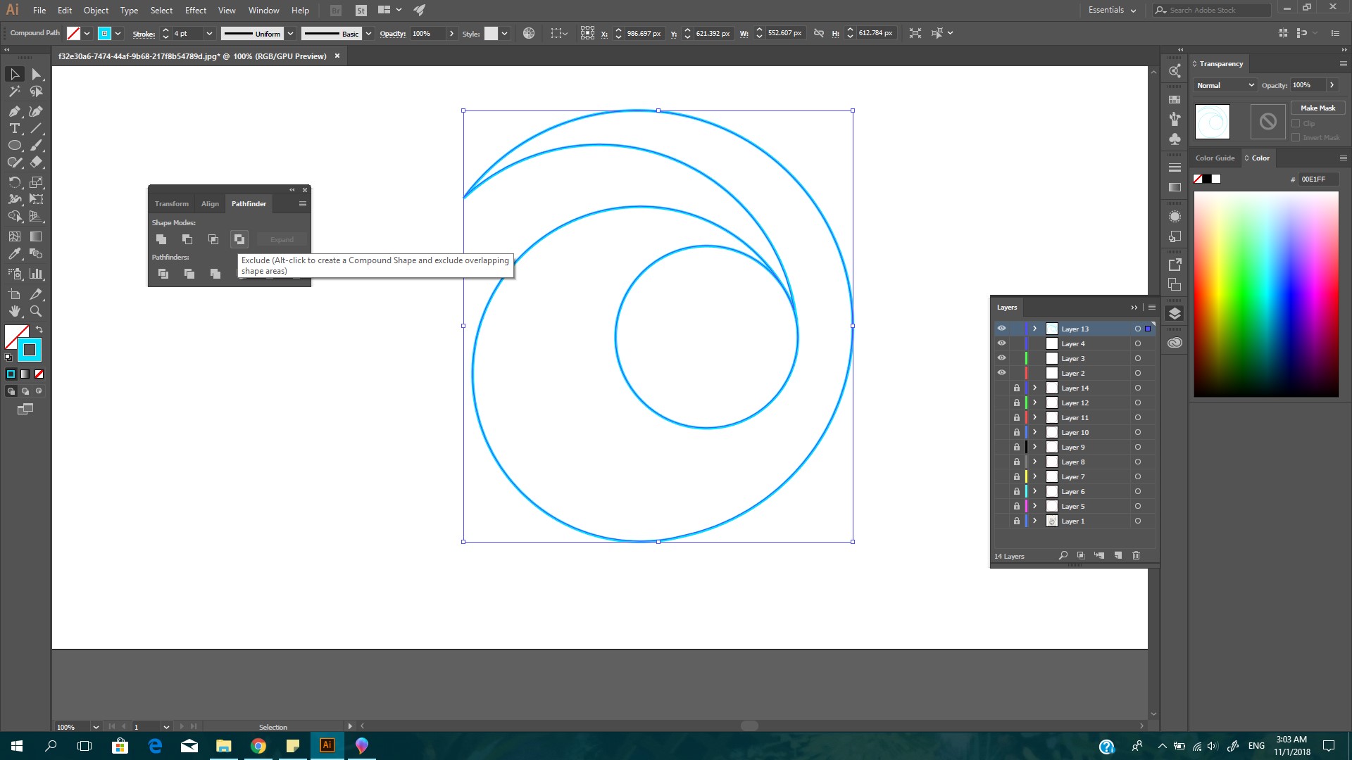
Yay we're done with the outline! Give yourselves a clap for going this far.
Continuing on, we're going to mask the red circles we did before so it would only be visible inside the outline. Unhide all the red circles.
First, make another copy of the outline on a new layer, because if we mask the red circles using the outline, the outline will reduce to a very thin line, and we do not want that.
Make sure the copy of the outline is above all the other layers.
To mask successfully, the original outline must be above the red circles. Choose all objects except for the copied outline, go to Object in the top menu and select Clipping Mask -> Make. It will turn out like this.
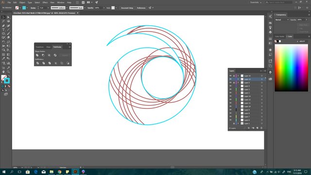
I missed one circle so it came out a bit wrong lol, its okay I fixed it. I also changed the colour so that it will look whole.
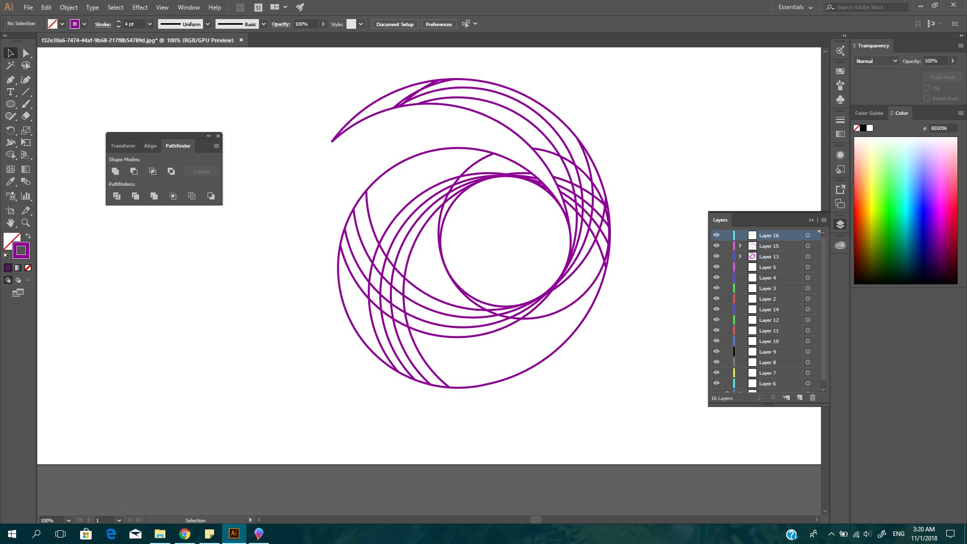
We're almost done! Choose a font for the logo name, and adjust the colours accordingly. I used Myriad Pro for the font, and chose my colours based on galaxy themed colours, purple and blue. Place the name in the center of the logo.
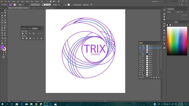
Due to not being able to fill the logo with colours because the Live Paint tool is not applicable to masked objects, I chose to continue on the logo in Photoshop by exporting the file as psd. file.
After rasterizing the image I filled in the logo and made adjustments to the name as well.
Going with one of my groupmate's, who is under the alias of King, suggestion, I downloaded free psd star brushes online to decorate our group's name.
And thus, the final outcome.

Thank you so much for reading this extremely long post. I'm sorry if it was too dragging or unclear at some parts, I have to admit I got a bit lazy with the screenshots.
Contact me if you guys want my help in making logos ;)
Again thank you and I hope to post more stuff soon!
Congratulations @maryamarmalade! You received a personal award!
Click here to view your Board
Congratulations @maryamarmalade! You received a personal award!
You can view your badges on your Steem Board and compare to others on the Steem Ranking
Vote for @Steemitboard as a witness to get one more award and increased upvotes!