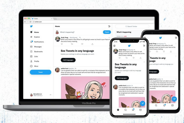
The Twitter font changed, many netizens complained of sore eyes.
Some time ago Twitter has changed the font on the website and in the application. This was not so well received by some people. Many complain of sore eyes and headaches.
For some netizens, the new font is considered more difficult to read, confusing, and too bright. Even this font is a challenge for people who have had visual impairments from the start.

"The writing is smaller and denser so it puts more strain on my eyes," said one user as quoted by the BBC, Tuesday (17/8/2021).
"It is impossible to read if someone has impaired vision and/or mind function," continued another user.
This was also responded by the Twitter. They said they would immediately fix it so things like that don't happen again.
"We changed the contrast on all the buttons so they are easier to see because you said the new design is not comfortable for people with sensitive eyesight. We listened and tried again," wrote Twitter.
