How I created my personal logo to use in my new website.. with photos of the process!
Hi beautiful people!!
I'm really excited because I'm creating (with the amazing help of my boyfriend) my new webpage as an artist! yeeeeiii :)
You don't have any idea how long I've been waiting for this!! And I want to share with you the entire process of the site development. Because I'm not a web developer (I'm trying to learn though!) I can't explain you the details, but I will certainly show you all the process in the future so you can learn with me... but in the meantime...
** I will explain to you how I designed my new logo in pretty simple steps.**
But first, let me show you the old "logo" (or something like that) that I was using before...
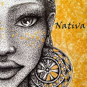
It was made from a zoom of a drawing I made, and I really like it, because I feel identified with it, but is not what I need for a professional logo. So I was looking for something totally new, simple and minimal for me, and the first step was to do some...
1. Sketching!
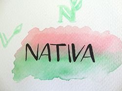
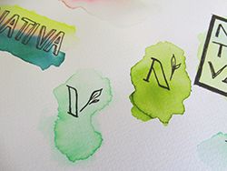
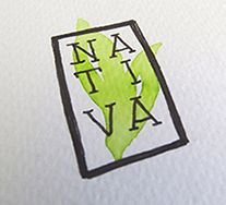
This was the fun part. Like I said, I wanted something minimalistic and I love watercolor, so I used some Tombow markers mixed with some water to do some leaf and abstract shapes and then I wrote over them with an ink pen. At the end, I was happy with the designs I got.
For me, it was easy to know what I wanted, but if you need some inspiration to create your design, you can find some really good ideas here, here and here.
Pinterest is always a good place to get inspired too, and Behance is my favorite one.
Also, there are some very good tips to keep in mind when you're creating a logo, that will make so much easier the entire process, and the results will be even better.
2. Digitalizing
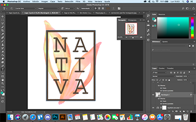
I chose one design (not really, I couldn't decide, so I chose two of them) and took a photo with my iPad camera and I used Procreate to separate the font's shapes. I could use Photoshop from the beginning, but I'm a Procreate lover.
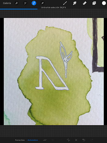
Then I exported the .psd file to my computer and opened it with Photoshop because I remembered I had really good watercolor brushes that were going perfectly with the design.
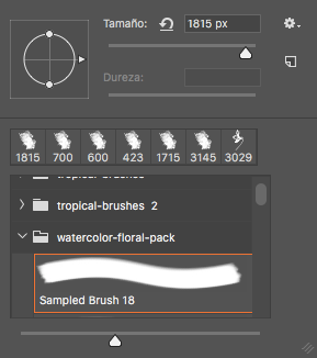
And I tried with many background colors to see how it looked better on the webpage.
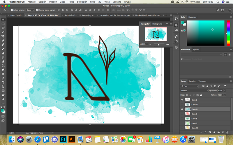
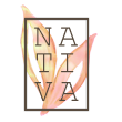
So this one was the selected logo for my website. The theme that we are using has a small space to put it at the top of the page, so I cant' use a vertical design like the next one...
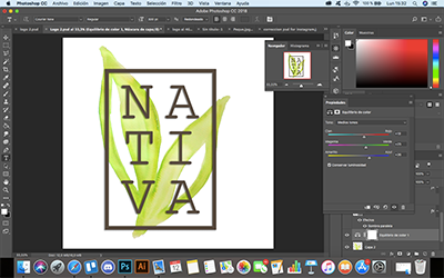
But I think is really cool too, so I will find a way to use it...
So that's it! Now I have a new logo that looks much more professional and I'm really happy with it.
The website is not finished yet, I need to upload more pictures, improve some of those that are already up (with mockups and cool stuff) and of course we'll be making some changes in the entire appearance of the site, but is taking a good shape, so please take a look and tell me what you think!! (By the time is in Spanish, but of course, it will be translated into English in the future)
I hope you find something useful in this post and if you have any question about it, I will be happy to help you in the way I can.
Have a nice week!
You did an amazing job... wow... being a designer myself, I envy you now. You just made it look so simple and elegant!! Amazing...
gracias!!! I'm just having fun while I'm learning :)
very nice! love how you've gone through the process ! i think logo design is difficult to nail right and you certainly did <3
upvotes
thank you!! I was avoiding this task but I'm happy with the outcome :)
Wow I like the old logo as well, looks really cool! 🌹🌹🌹
haha thank you @melooo182 this is the artwork I made from where I took the old logo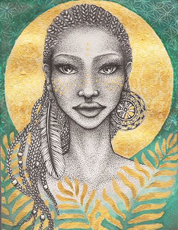
I call it "Mama Africa" <3
Hablas español, genial!
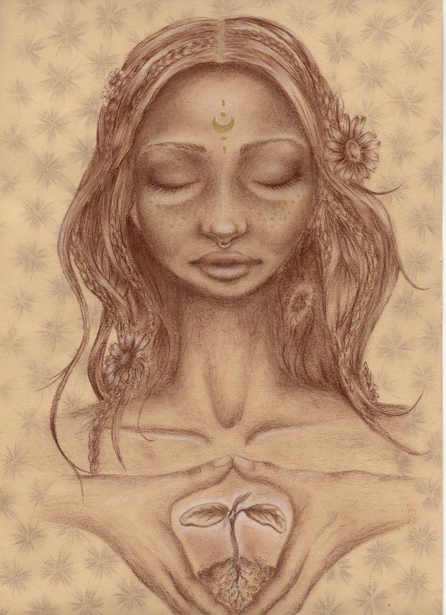
💙 👍👍 me encanta!
este otro tambien me gustó bastante
😃
Podrias publicarlos en posts independientes y si gustas tambien unirte al grupo de @steemartists para promocionarlos y conocer otros artistas en steemit!
Saludos! 🎨
jaja genial!!! ya estoy en el grupo en discord :) y muchas gracias por los consejoss!!!
oye en qué parte de sudamérica estás ahora??
No es nada 🙂
Sigo en Colombia todavía, me quedare unos cuantos meses en Medellín 😁
Logo-making is one of the most challenging things to do. Yet you do it seamlessly well. And thank you so much for the tips. Highly appreciated :)
hi monica! I really appreciate your words, thank you!! <3
An excellent view of your process and a great logo.
thank you!!! :)