Design for iPhone X
The iPhone X is officially here, well it will be on November 3rd. It rocks an edge to edge Super Retina Display with a resolution of 1125×2436px. It also has a cut-out at the top of the screen where you can find some futuristic face unlock features.
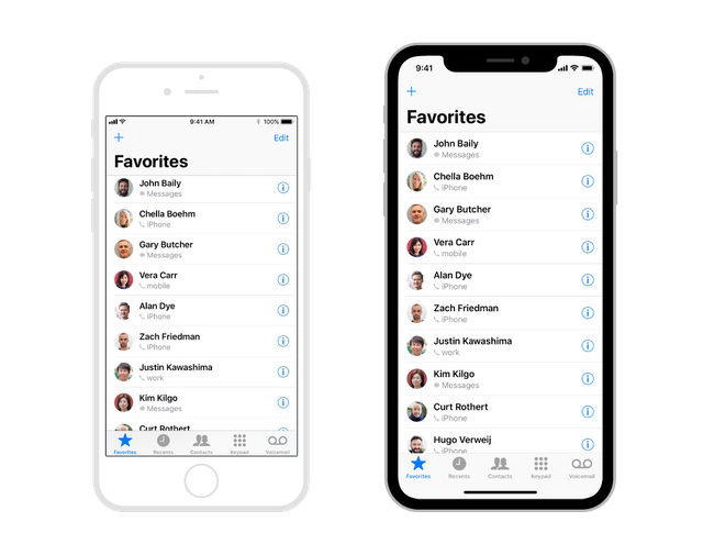
Designing for this beautiful machine will bring some new challenges, but also some new design opportunities. The width of the device in portrait mode is the same as the iPhone 6, 7 and 8, but is 145pt taller, which results in ± 20% more vertical space. When designing @ 1x you need an artboard of 375×812px. You won’t export images @ 2x like the iPhone 8, but @ 3x like the iPhone 7-8 Plus, because of the new Retina display.
When creating your design, you must make sure you don’t obscure your UI with the devices unique features (the round edges, the cut-out at the top and the home indicator). By the way, the home indicator is that small line that lives on the bottom of your screen, it replaces the physical home button. You swipe up from any app to go back to your homescreen or into multitasking.

If you currently have an app that uses iOS native component you will be fine and your app will already be adapted for this new iPhone. This can be navigation bars, tables, collection views and tab bars. They will be automatically inset and positioned.

If you use custom layout, your app might need to be updated to the new screen layout. If you use Auto Layout however, that might be fairly easy.
Let’s get started
First off, embrace the devices design, Apple employees didn’t work this hard for you to hide the wonderful features of this expensive piece of hardware.
Make sure you create a full screen experience. Let scroll views scroll to the very bottom of the screen even beyond the edges of the curved bottom of the display. Apple also kindly asks you not to hide the cut-out at the top and the curved edges at the bottom, so don’t go placing black bars to make it look like a regular old school iPhone 8.
Center and inset important information. Make sure that important content is aligned in the center and use symmetrical insets, so your UI doesn’t get clipped by the device’s sensors or corners. If you use Auto Layout, your content will automatically be placed within a safe area so your design won’t be hidden behind the corners, sensors or the home indicator.
The new status bar.
Because of the sensors on top of the display, the new status bar is split in 2 parts. If your UI is doing something special with that space (previously 20pt high, now 44pt), you will need to update your interface because it will be taller on the iPhone X. Make sure that it can be dynamically changed in height. A great thing is that the height won’t be changed if a user makes a phone call or is using a navigation app, which was previously the case on other iPhones.
You can see more here: https://blog.prototypr.io/designing-for-the-iphone-x-4239d5ac736c?ref=prototyprio