SteemPress 1.2 Update: New logo and design, curation, work on a new front-end, new features
Hello steemit! This is the official STEEM account for SteemPress, the WordPress plug-in built and operated by @fredrikaa and @howo to allow automated posting from any WordPress blog to the STEEM blockchain! (You can find more information about SteemPress on the wordpress.org plug-in store here or read our previous update post for v1.1 here).
It's been a month since our last update post about SteemPress. Since then, we have been working on a lot of exciting stuff essential to taking SteemPress to the next level! Most notably, our recent focus has been to create a new design, visual identity and logo , to test and improve curation and establishing solid voting guidelines, to develop and improve a dedicated front-end for content discovery meant primarily for curators, as well as implementing other features requested by our users. This update post is meant to bring you up to date on our progress and is also an invitation for you to give your feedback. Please note that all updates are work in progress.
As of today, more than 24 500 articles have been posted by 435 bloggers and we are currently posting 690 articles per day. We are really happy with this growth and with all of the support from you guys so thank you ! However, with 70 million WordPress blogs out there, our goal is to grow much, much bigger and we believe our current work will make that possible.
New design, visual identity and logo
Over the past weeks, we’ve been fortunate to work with a very talented designer on the STEEM platform, namely @foundation. As we prepare to launch our first rounds of serious marketing for SteemPress towards WordPress users everywhere, having a professional looking logo, design and brand identity is one key objective to complete first (the other being curation, which we’ll come back to later).
Therefore, we are very happy to share with you our newly updated design!
A blogger-centred design
Expanding beyond our first early adopters of people already on the STEEM blockchain, our target audience will be WordPress users looking for new tools to monetize their content and reach new audiences with their content. Our visual identity from the logo, general design and marketing material should therefore communicate the core value propositions we believe we provide to WordPress users out there. This regardless of their prior knowledge of steemit.com or crypto currencies.
Although we steemians are still the early adopters of blockchain and crypto-based blogging and content sharing, many people out here will have heard at least 2 things:
- There is money to be made in crypto currencies
- There are new opportunities for innovation using blockchain.
We therefore believe that the idea that a cryptocurrency can help bloggers make money, or that a blockchain can take their blog to the next level, is easy to sell. We therefore want to communicate those promises in our design.
- SteemPress helps you monetize your content.
- SteemPress helps you to reach new audiences with your content by displaying it on numerous front-ends.
We've gone through a handful of iterations of our logo to arrive at something that is not too STEEM or steemit-centred, but rather has an appeal to people anywhere. We are still in the process of gaining user feedback on the designs to see what flies. If you have any preference as to which ones you like the most, or don't like them at all, please let us know!

These are the versions of our new logo we have considered, please tell us which one you prefer and why!
We also have an updated banner which we hope helps demonstrate the core idea: By using SteemPress, you can take your content to new places to be seen and monetized.

The current SteemPress banner illustrating how a blogger can earn money by connecting to the STEEM blockchain to also take their content to man places on the web.
To help illustrate the idea we're trying to sell, we like to think of SteemPress as an entry point for current WordPress users to access people and engagement through the many front-ends and decentralized applications built on STEEM.

Illustrating how content to uploaded to the blockchain can reach new audiences through different front-ends.
A dedicated website for content discovery
Tools for more convenient content discovery on the STEEM blockchain is something we all want. As SteemPress benefits from the success of our users due to benefactor rewards, helping our users be discovered by curators is a high priority to us. Therefore, we are building a dedicated website to discover content published with SteemPress. We are currently working with manual curators and STEEM communities to understand the challenges they face finding content as well as new users. Our first example is the opportunity to search purely for users who made their first ever post in the last 6 days. This to allow curators to discover new users without relying on tags such as #introduceyourself, but because it is actually their first post.
We’ll be looking to implement unique search alternatives benefiting curators and communities make the life of a curator more convenient and also to ensure that the best wordpress bloggers we onboard are discovered and rewarded. Our mission is to provide seamless integration between a wordpress user’s content and the STEEM ecosystem, which involves more than just the blockchain but also the communities and people on STEEM. As such, we want to collaborate with communities to support their growth while also introducing SteemPress users to the most relevant and engaging communities.
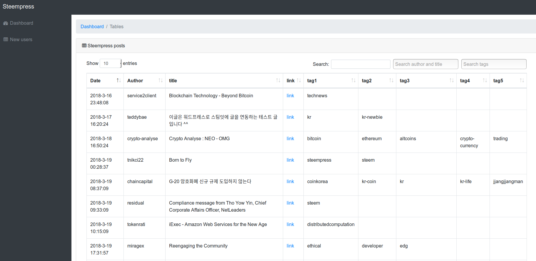
Screenshot from our demo website displaying posts made with SteemPress by new users.
If you have any suggestions for tools or search functions that would make content discovery more convenient and effective for you, then please do provide them in the comments! Please bear in mind that our website is the very first iteration and that so far we’ve only implemented the function to discover new users.
Curation with @steempress-io
To incentivize further use of SteemPress – and also to showcase to our adopters that we bring into the STEEM ecosystem for the first time that there is money to be made sharing content on STEEM – we will be upvoting content with @steempress-io. Since our last update, we have been testing voting with the account based on the 2000 Steem Power delegation we have invested in it ourselves. We are still working on defining and optimizing the curation guidelines in order to responsibly allocate our votes.
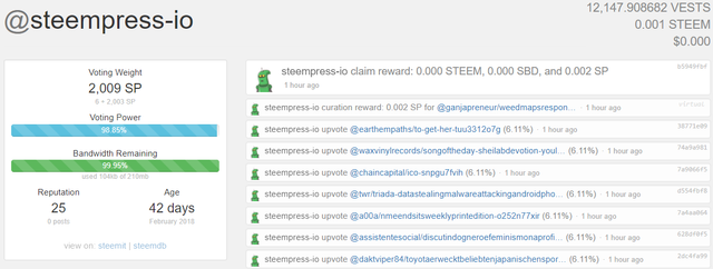
We have begun curating content uploaded with our plug-in based on different voting criteria that are still under development
We are currently in the process of writing a comprehensive SteemPress curation policy brief and voting guidelines paper. We believe that as a decentralized application whose profits grows with the value of the STEEM token, voting responsibly and contributing to improving how good content is discovered and rewarded is of the highest priority. Expect a more detailed update on this soon.
Other new features and updates
Every week, we engage with our users to understand what new features they would like to see on SteemPress and also how we could make their blogs more successful in general. Here's an overview of the new updates and added features since our last update:
Schedule posts
One of the most frequently asked questions we have received from our users is how cross-posting to the STEEM blockchain might hurt their blogs SEO (Search Engine Optimization). The issue is that with steemit.com becoming an increasingly popular website, google will often consider it as the main source for content that is posted simultaneously to a blog and to steemit.com. While we are working on many solutions to this issue, one easy fix is to simply set a delay for when a blog post is uploaded to the blockchain. This means that the content will first appear on your blog and then uploaded to STEEM after x minutes. Beyond helping google understand that you and your blog is indeed the original author, this may also allow you to keep your wordpress blog more exclusive whilst still adding your content to STEEM to also share it with your followers on steemit.

Optional posting checkbox
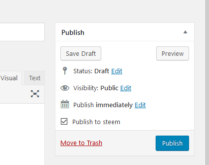
When you are writing a blog post on WordPress you may not want to submit that story to STEEM. And the only way to prevent that was to disable the plugin, post and then reactivate the plugin. So we added this checkbox (checked by default) to allow you to do that more easily.
Featured images support
If you include a featured image to your blog post, we will now add it at the top of your post.
You can see an example of it here :
Article on STEEM Article on wordpress The first image is the featured image.
Removal of spaces on tags and conversion to english letters
We had some issues with tags, first there is no support for spaces in tags for STEEM, so if a blogger were to write "mario bros" on STEEM it would appear as "mario" and "bros" for the tags, so we removed the spaces in the tags, now it'll post "mariobros".
Next we saw a lot of non-english content come to SteemPress(chinese and hebrew for instance) and these bloggers will obviously use tags in their non-english alphabet, but non-english tags are not supported by STEEM, so we now convert them to english. for instance if you write "Федерaция" (federation in russian) as a tag, SteemPress will convert it to "Federatsiya".
Default tags can now be set at the beginning of the post tag
If you make non english content, it's very common to use the community tag as the first STEEM tag "fr" for french "kr" for korean etc. But on your wordpress blog it makes no sense to always add that tag. So we added the possibility to always append the default tags to the STEEM tags.
for example if your make a wordpress blog post in french about sport your tags will be "crossfit sport healthy" and since your default tag is "fr" on STEEM your post will have the tags "fr crossfit sport healthy"
Edit the title if it's too long
Another issue with internationalization when you are writing with non-english characters is that they take more space on the blockchain : The maximum size for a title is 256 bytes, an english letter takes one byte, so that's about 256 letters, but in practice an international letter (japanese for instance) can easily take 2-6 bytes per letter. So we saw some bloggers failing to post using SteemPress because their titles were too long.
So if they are too long, we remove letters until they fit and add "..." afterwards.
Small fixes
- If you set no tags and no default tags, "SteemPress" will be used.
- Switched the domain name from steemgifts.com (legacy from our other projects) to SteemPress.io
- Fix a bug that caused the shortcodes not being stripped completely.
More shortcodes are removed :
- Nextgen Gallery : [ngg_images]
- ad shortcodes : [ad_1] and [ad_2]
- Visual composer : [vc_row]& [vc_column]& [vc_column_text]& [infobox]& [dropcap]
As always, take care and steempress on!
@fredrikaa / @howo
id take this one in my professional opinion
Occums Razor - simplist , minimalist... easier to relate to, more playful, expressive and easier to read from a universal translation direction of different cultures accessing.
much easier to streamline vector based i think as well when you decide to modify it to simpler iterations.
I think the "steempress" text works great... the way its done. simplified, a block font, provides easy legibility from far away...
heres a fun test step 4 ft back from all the logos and see which one you can legibly read easiest
from blog to blockchain i would consider ditching and use that on a case by case basis for branding. it could work well in the header of a website for example but i wouldnt have it associated with everything. i think having the mystery to allow someone to click it has value vs a phrase to have them read... in a way its negative bc it may create user disconectivity bc it doesnt assosciate to them... where as if it were missing a user would click on it and discover it. etc
the banner illustration needs work
i see the added logos on the below, they were buried and if not seen side by side i wouldnt grasp the connection at all , i would consider a rework on the banner for sure, its too busy and most wont get it. although a gif animation could help accent the connectivity. perhaps even a 15 sec animation describing what you do on the home page etc would allow for easy adoption as well
unsure if using the Amazon branding will work as well it feels stolen a touch but we already know the colors work for amazon so why not steempress right ?
happy to help always. lmk,
Thank you for the great feedback!
I actually never thought about the similarities with amazon. I'm not sure if it is something a lot of people will see, as none have mentioned it so far of the people I've shared it with. If anything, it sounds good that we've arrived at a style that has also worked well for what is now the second most valuable company in the world. ^^
AS for the banner, I still like it for the specific purpose we're currently using it for on wordpress.org where it helps provide some further information to the people that bump into it on the plug-in store. While I totally agree that one should stay simple and not include too many elements at once, the banner in the plug-in store will mostly be seen by people who are already looking it up and reading the description. Helping to visualize what they read about it there is the main purpose.
I also want to create some animations for marketing videos, gifs and a prezi presentation. For that, I think it provides a neat starting point to tell the story, but yeah you'll then need a format where you are guaranteed 10 seconds + of the persons focus. But yeah I also think we could do with a general banner that carries the core design elements but does not try to explain everything at once. Perhaps limit it only to the nodes and the network branching out of the steempress logo? (Basically the top part of the current banner).
As for including the "blog to blockchain":
I see what you mean. Perhaps it should not go with the logo everywhere it is used. However, as mentioned in the post, our main purpose of the current design is to maximize our impact and conversion rate when we go to our next target audience: Bloggers that are looking to advance their blogs in some form and not shy of trying something new / typical early adopters. For them, I think the text is quite powerful, it states very clearly what we do while also carrying a slight promise that going on a blockchain is a "level up" from a regular blog.
Anyways, your feedback really helped me see things differently and I appreciate it a lot :)
@fredrikaa I love it. first off. great styling and direction. For early adoption i always err on the occams rfazor side ..so keep it simple. Presi is a fun animation for sure. we used to use that format for BCG execs to convey a direction that they couldn't see. I think what you have is rather solid. be careful using yellow though, at certain depths it can become lost and for some its already an impairment for focal cognition. There is a safe for web scale for the hex color hue i can send you if you are concerned or care. as for the banners. I think they work but for example go in aftereffects and make the logos twinkle like little stars at the top. I think that subtle visual gif animation part will convey the banner nicely in a way to really accent the brand. thats just my two cents for free lol...
As we get deeper for your brand i can review the UI and see how effective and easy or hard it is to use if youd like me to audit i can... Overall a solid homerun and great first round. Always hit me up on discord whenever. I appreciate your consider my opinion in evaluating your brand and im always happy to provide a different perspective if youd like .
Hi there. I had a question. Is there a fee to use this plugin? I know the plugin is free but is there a portion of the post going back to the authors of the plugin? If so, how much? Thank you :)
Hi there ! Yes there is, we take 10% beneficiaries, which amounts to about a 3% fee :)
So the beneficiaries come from the Author rewards when it pays out?
Yep
Great work! This is a level up from the last round brother!
Thank you so much for this plugin! When finding @steempress-io I found everything I was looking for in a plugin. I've lost previous servers due to the inability to afford sustaining the information. Had @Steemit and Steempress existed I would have have my Steemit reprint! I think you've created something great! I'm extremely happy to have your plugin installed in most all of my Wordpress developments!
Thanks a lot for your kind words :)
Wow, so much great info! I’m going to have to read this a few times to soak it all in. For the logo, I agree with @theuxyeti about option #2. It’s friendlier and easiest on the eyes. However, if you don’t mind a little tweaking, I recommend starting with a version of the logo that only requires one color. If you can pull that off, it will only improve the impact and effectiveness of your brand as you add more colors or scale up/down in size. You’ll end up with a more iconic and lasting impression than if you depend on multiple colors straight from the get go. But overall, I’d say you guys are going the right direction! I’m digging the concept and style!
Thanks for the great comment and taking your time to share and explain your opinion :)
Personally, I also preferred #2, but it always takes a few rounds to arrive at the best version, so it's great to get new ideas and perspectives from you all!
I like the second logo, it is fresher and more pleasing to the eye. The others I see as very heavy and heavy to look at.
My vote is for the second logo🔛I like this circle 😇..is easily to be recognized and memorable.
Thank you for the comment and for sharing which one you liked and what you liked about it :)
This is awesome, thank you for all the work. I like the first logo as it is "clean" and looks great. I am new to steem and am loving it. Thanks again!
Thank you for the feedback! And also, welcome to STEEM / steemit :))
I think all the logos are good, but I prefer the first logo because it looks neat and nice to see, but if it can be the black symbol in the logo is sliding slightly to the middle to be more tidy.
Thank you for sharing which one you liked and why :)
Yeah, I agree actually, the messaging sign is perhaps a bit dominant as compared to the nodes which are perhaps even more central to the service. Good point!
Sama2, hopefully always to comment on each other, let me follow you.
This is absolutely wonderful!!!
I just shared, then upvoted and am about to resteem. Since I had not seen the first update, it is a full surprise for me to come across these wonderful news. Thank you for sharing!
I'd chose the third loge with the triple repetition of the first logo imbedded into the third logo. Using the triple repetition is extremely powerful and the exposure of the Steem ecosystem in the third logo is extremely powerful. Since the third logo has lots of space, I'd add up the triplet in there using different sizes for each of them. Great job!
Namaste :)
Thanks a lot for your feedback on the logos and your resteem ! :)