3 Awesome ICO Web Designs for January 2018
The emergence of cryptocurrencies and blockchain technology beyond Bitcoin has revitalized the internet, taking it into the next paradigm by giving new life to ideas that weren’t previously possible.
ICOs (Initial Coin Offerings) are hot right now. So hot, government agencies are hastily fumbling over each other to put a stop or regulate this new wild west of opportunity and change.
The internet is the only way new decentralised or tokenized economies can be found. With new ICOs sprouting everyday, I took the time this month to pick 3 ICOs with well thought out and designed websites.
How they were judged: Websites were judged by the overall user experience, engaging content and layout and pleasing visual
How websites were dismissed: The use of stock imagery, the overused and annoying “particles” in the background, utter unoriginality.
Please note: I am only reviewing the websites and do not endorse the actual use cases for the coins or tokens.
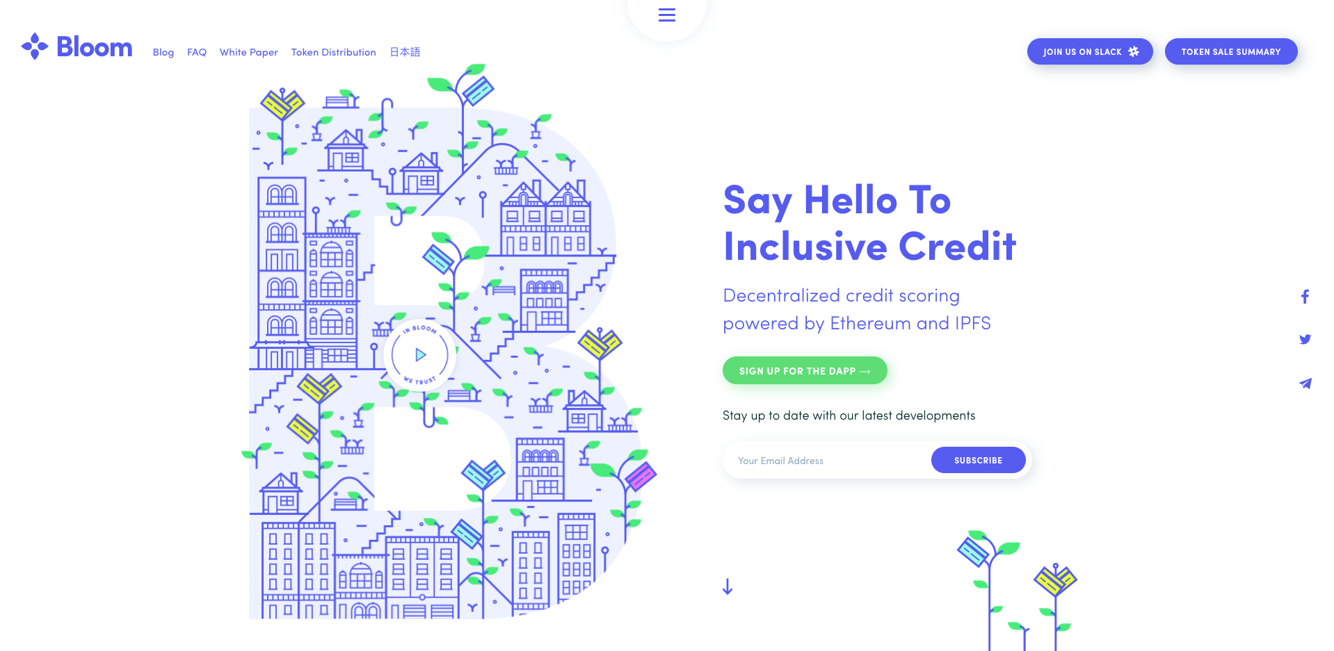
Bloom

Bloom allows both traditional and digital currency lenders to serve billions of people who currently cannot obtain a bank account or credit score.
Bloom is one of my favourite ICO websites right now. Making great use of whitespace and a colour palette that includes a soft, inviting purple hue coupled with an electrifying green it gives the user a sense of assurance and excitement. Load the site and you’re met with an amazing animated illustrations with bold typography making it engaging from the beginning!
Scroll down and the layout of the website allows for intentional story telling with scroll triggered animations, the content is laid out consistently and playfully. Navigation is also done beautifully with a large menu button that loads full screen allowing for the user to find their way throughout the ICO’s narrative.
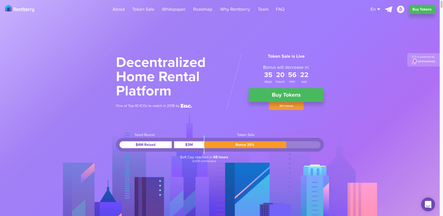
Rentberry ICO

Rentberry, our goal is to make both landlords and tenants enjoy a fully decentralized rental experience.
Bold use typography, prominent brand colours and illustrations bring the user’s attention to what the site is all about taking part in the “Decentralized Home Rental Platform”. There is a clear hierarchy for user interface elements such as buttons to draw attention to actions such as buying tokens, this all done within the hero section of the site.
As you scroll down the content which is laid out on a clear grid with nice transitioning microinteractions revealing the text and custom illustrations. I love the fact that Rentberry has chosen a large font size for legibility and made use of Proxima Nova, a digital typeface that reads well on all screens.
One of my favourite things about the site is the use of bright gradients to separate sections and create a pleasing visual narrative.
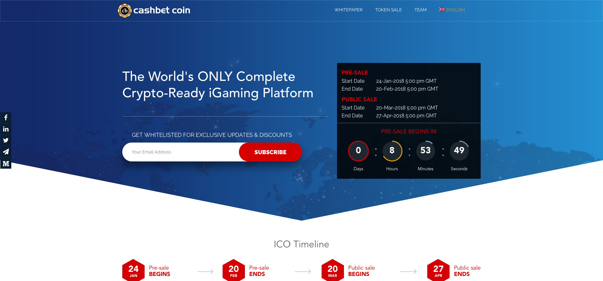
CashBet Coin

Through its incorporation of novel blockchain technology into its revolutionary iGaming platform, CashBet intends to >become the undisputed leader in enterprise software for the crypto-casino market.
For a crypto-casino idea, CashBet do a good job at laying out as much information as possible without giving the user info-overload. Keeping relevant information above the fold, I believe the site was designed for real investors who understand the CashBet platform which they describe as “a profitable, mobile-first iGaming platform for real money, social, and skill-based gaming.”
One of the nice features they employ is the use of diagonal shaped section colours to direct the user down the page, create contrast between content and make good use of the brand colours that aren’t neon like pink, green or aqua for a change. The colour palette makes use of deep reds, blues and subtle greys to soften the page
Again like the examples above, great use of a grid system and white space makes it an enjoyable read. The use of customised clear, minimal line icons and illustrations for diagrams with a literal “roadmap” that seems to go against the overall design of elements at first but somehow sits nicely.
The current situation is giving disruption hungry entrepreneurs a chance to finally make a change and bring better new products for consumers directly in previously hyper-monopolised industries. The website is the first point of contact and needs to be executed with great UX/UI design.
Welcome to the brave new decentralised world.
Don't forget to like, share and upvote to help spread the message!
https://www.icoweb.com
https://www.icoweb.com
https://twitter.com/ICOWebNews/
https://t.me/ICOWebAlert