Graphic Design Class 3 | Colour and Typograpghy
It's a pleasure to be taking part in the graphic design class organised by @atim1234 in the Steem Skillshare community, and in this post, I will be presenting answer to the assignment three (3) of the third class that was undertaken by @lhorgic.

QUESTION ONE
In your own word, explain what you understand by Colour & Typography
Answer
To begin with, it's important to note that everything that has to do with the beauty of a design all centres in the colour that is being used for that design. Thus, the major reason @lhorgic must have stated in his lecture that "colour in design is key".
The colour choices that is made by a graphic designer should be able to attract the prospective audience for which such design is being made for. Let's imagine a situation of trying to make a design to impress a group of Chelsea fans, it will definitely cut across the mind of the graphic designer to use an element of blue in the design in order to capture the attention of such audience easily.
Therefore, colour to me is like the most important element in graphic designing, because once the colour of the design is not attractive, then there's high probability the required audience may not pay attention to the details if the design.
Topography on the other hand is also very important in graphic designing as it portray the importance of the wordings in the design that is being made.
The importance in the use of topographic elements such as bold, italics, fonts, spacing, among many others come into play in making a good design. Bold for instance can be used to draw the attention of the reader to that particular word. Any reader who is probably glancing through a write up will definitely be forced to pay close attention to any word that has been made bold. Therefore, the elements being used must be used in such a way that it attract the attention of the desired audience.

QUESTION TWO
Mention 5 colours and what they represent just like you were taught in this class
Answer
Every colour comes with specialised form of meaning which most individuals can easily detect even without having any write up on the colour. On the basis of the assignment, I will be writiy on the meaning of the following colours; black, orange, white, red, and green.
Black: Black could be used to denote the following meanings.
- Strength
- Darkness
- Sad
- Power among many others.
Orange: Orange could be used to denote the following meanings.
- Sweet
- Fresh
- Successful
- Creativity among many others.
White: White could be used to denote the following meanings.
- Purity
- Joy
- Happiness
- Celebrations among many others.
Red: Red could be used to denote the following meanings.
- Danger
- Love
- Anger
- War among many others.
Green: Green could be used to denote the following meanings.
- Improvement
- Fertile
- Nature
- Healing among many others.

QUESTION THREE
Research 3 more fonts each for the following font categories
- Script
- Serif
- San serif
Answer
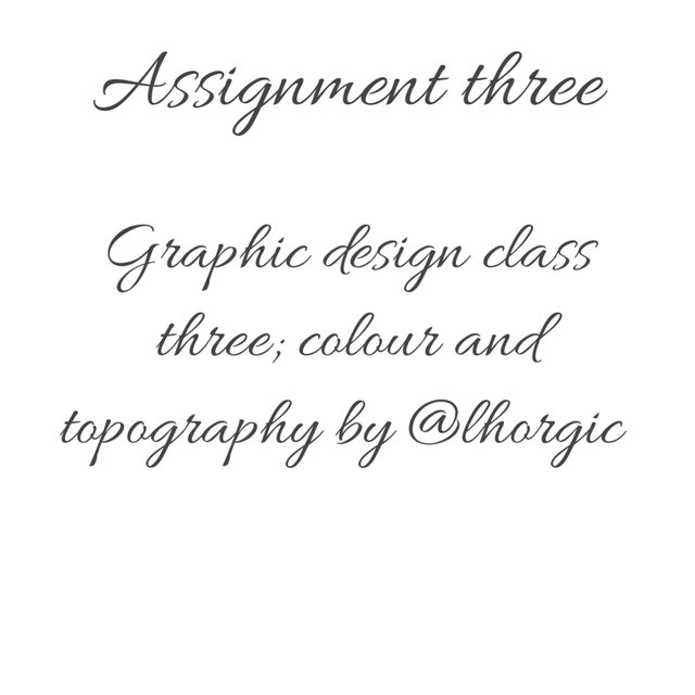
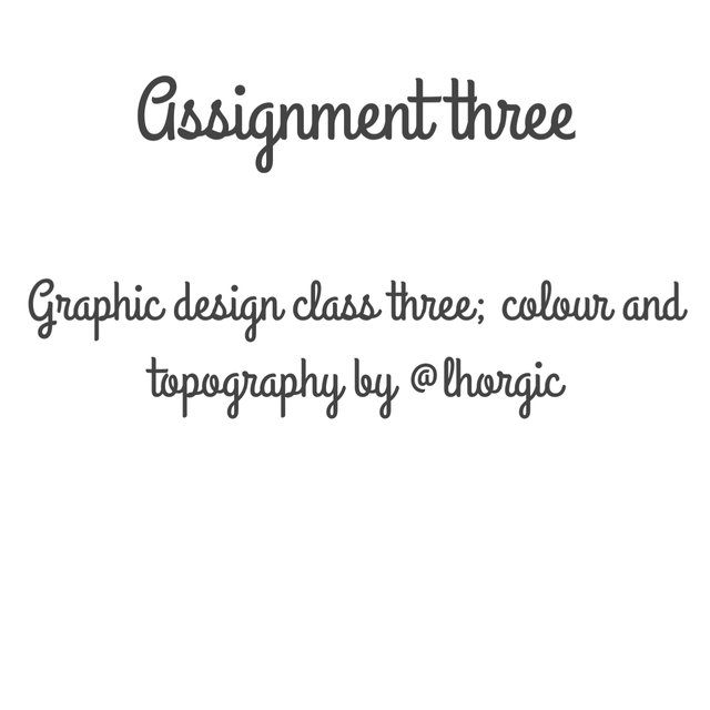
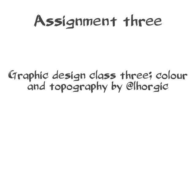
SCRIPT FONTS
Script fonts are stylish kind of fonts which depict curves and bends in the writing of words in order to beautify such words. Examples of such fonts are analysed below.
Allura Regular
 |
|---|
Grand Hotel Regular
 |
|---|
Belligerent
 |
|---|
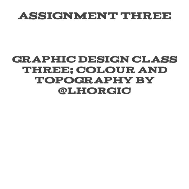
SERIF FONTS
Serif fonts are fonts which comes with tiny stokes at the edge of the letters of each words in a group of writings. Examples of such fonts are analysed below.
Acknowledgement
 |
|---|
Neuton Regular
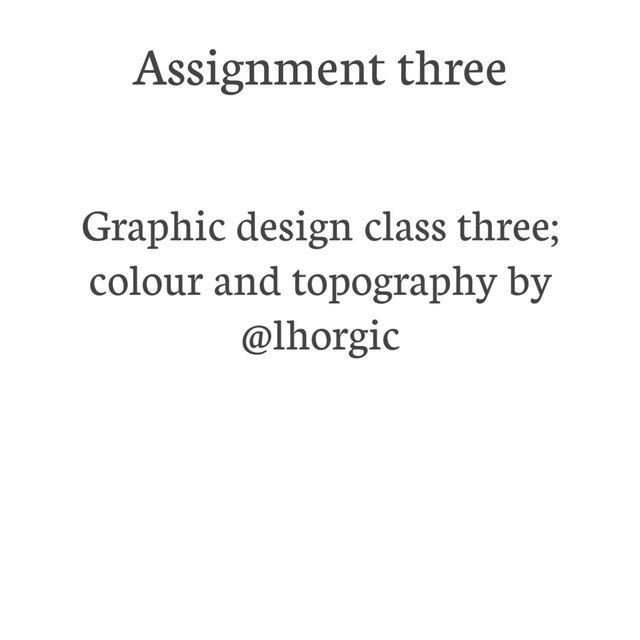 |
|---|
Copse Regular
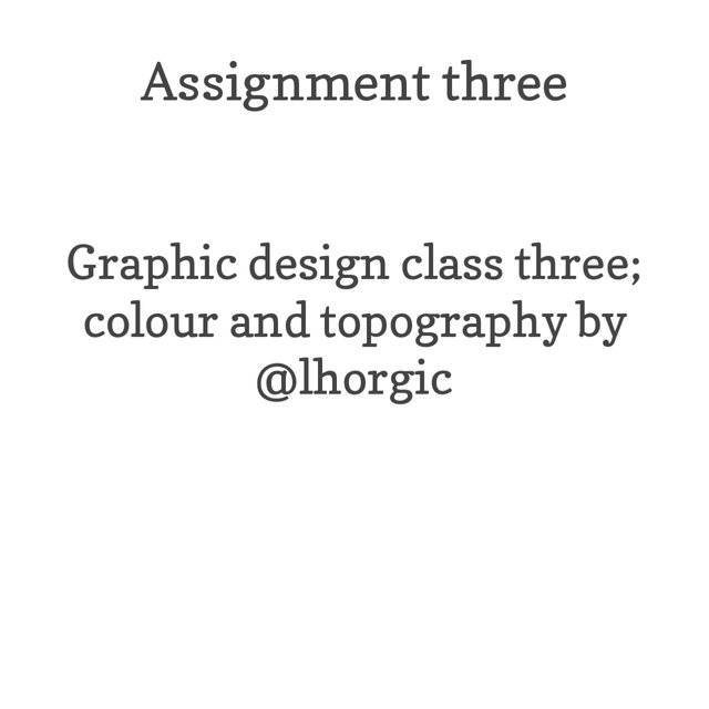 |
|---|
SAN SERIF FONTS
San serif fonts involves the fonts which does not come with the tiny strokes at the edge of the letters of each words in a group of writings. Examples of such fonts are analysed below.
Ariel
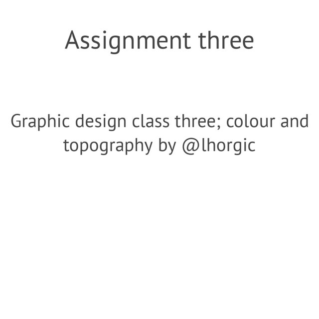 |
|---|
Meme Font
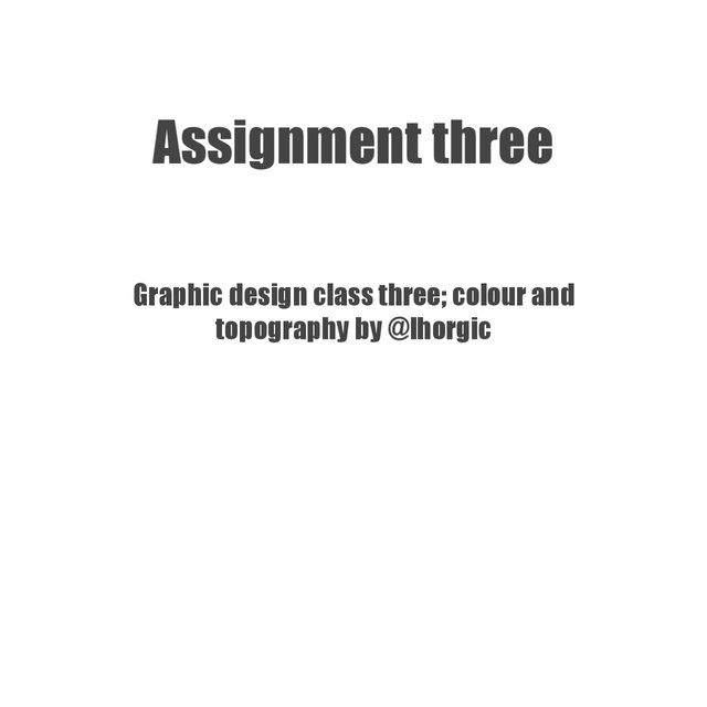 |
|---|
Roboto Condensed Regular
 |
|---|

QUESTION FOUR
Create a simple design showing your understanding about this lesson
The lesson was all about colours and topography in graphic design. I decided to use my understanding from the class to create the design posted below.
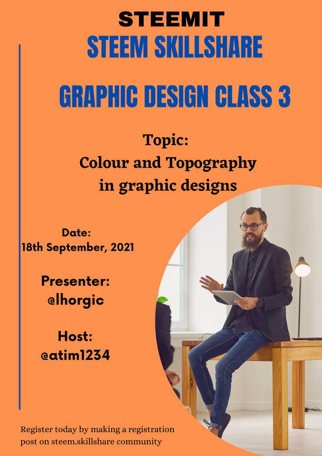
Designed with Canva App

I want to once again appreciate @atim1234 for the idea of organising the graphic design class which has been of great help in advancing the knowledge of the students and other members of the community at large, and also @lhorgic for the wonderful Graphic Design Class 3 held on the 18th September, 2021.
Cc
@atim1234
@nygls8
@printskill
@lhorgic
Regards,
@stanleynnah
@tipu curate
Upvoted 👌 (Mana: 2/5) Get profit votes with @tipU :)
Thank you
Thanks for participating
My observation
Your design is not bad but I observed that the spacing there is much maybe it's as a result of the flier size you used,the information supplied is not sufficient enough to fill it. Moreso you didn't align it well,as a beginer stick to a definite alignment pattern and as a time goes on you will be able to manipulate it. Also take note of your colour choice.You did a good job kudos.
Thank you very much for the feedback.
I really had issues aligning the texts, but will surely practice more on that.
Thank you once again.