SLC21/WK5: Hands-On Practical.
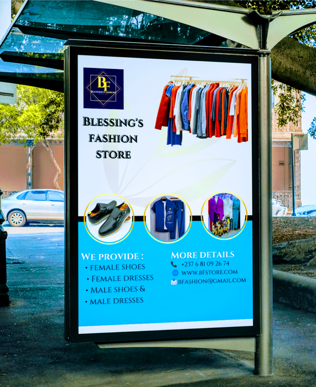
Hands-On Practical.
Hello people!
I salute you, it's another week of contest, week 5 of steeemit Learning challenge. We have had interesting weeks of amazing lessons, And I believe this One is not going to be of any difference if not even better than a previous one. Not wasting much time, let's begin working already.
In the previous lessons, we have done a lot about Graphics design starting from Typeface , mockups, color wheels, and also the principles involved in design such as balance, element spacing, emphasis, just to name a few. Doing graphics design, we all have to put this in mind and not getting out of the principles of designed. It is very important with specific and make sure our designs are much detail and straight to the point.
Coming to this week, we are not with so much of learning but a practical lesson which is not guided by any rules but simply, I'm implementing what we have learned so far in design.em. yeah. Thinking for what to design for this contest, let's pick something to promote marketing or business.
I was in this WhatsApp group where my sister promotes fashion products, yet she doesn't have a design. Maybe she can apply it in real life for her business. Because of this exercise, I decide to surprise her with something tangible and meaningful. A design for her business. Let's begin.
Design 1: Logo
As a business, we also have a well suited and dynamic design logo which speaks volume when observed and interpreted by our consumers. In our previous lessons we have treated logos and one of my favorite for a starting business is a combination logo. This logo is suited for businesses which are still developing and it gives the icon and the information about how the business is all about beside or below.
Steps to Design
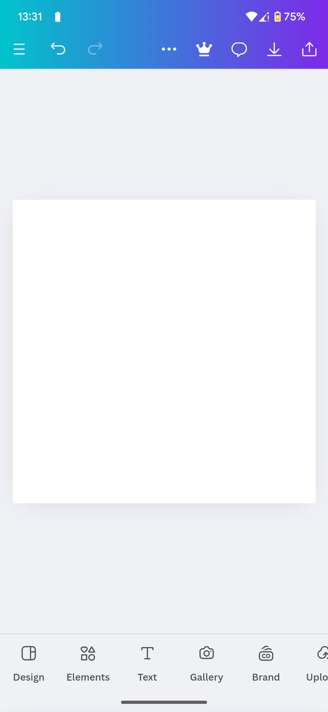
First I will go to my canva app And choose a suitable template suitable for my logo design. One of my favorite is the Instagram
 |  |  |
|---|
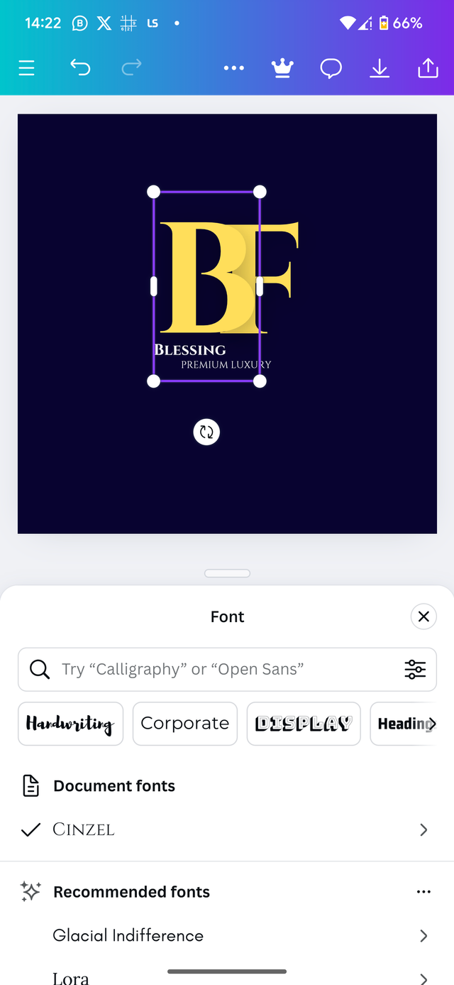
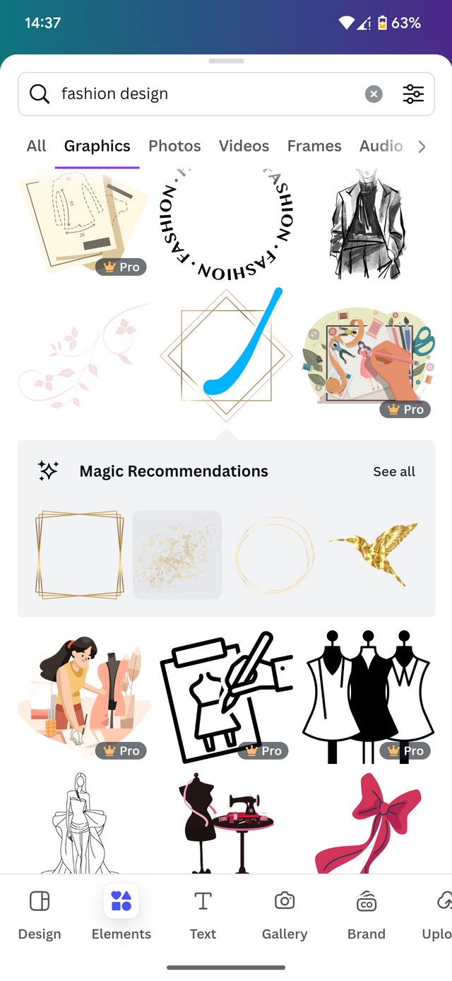
From this stage, I proceed to choosing a proper background for the design. I choose my typeface and add it to the text. I'm using document typeface specific cinzel bold.
 |  |
|---|
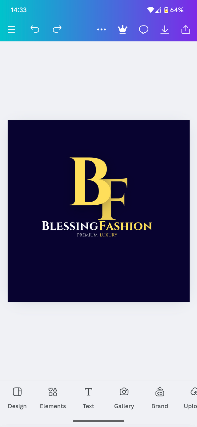
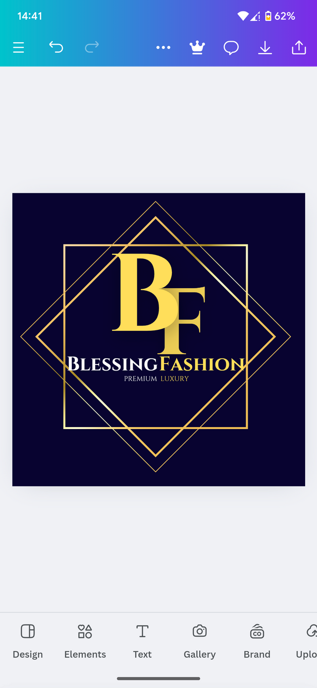
Moving on from here, I are an element to make my design look cooler and then proceed to adjust the element to the desire position is required. Now our logo is ready. I'm ready to be applied on designs.

Logo ready.
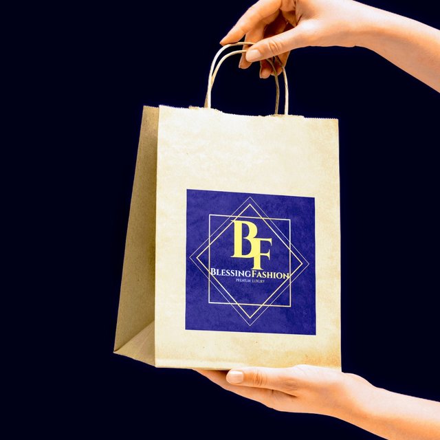
Practically if we were apply this design on a mockup, this is how it will look like.
Design 2: flyer
Alright, now that our logo is complete, we are going to design a flyer which will promote our brand in this section.
Steps to Design
Again I will open my canva app and pick a white screen which is the Instagram template.

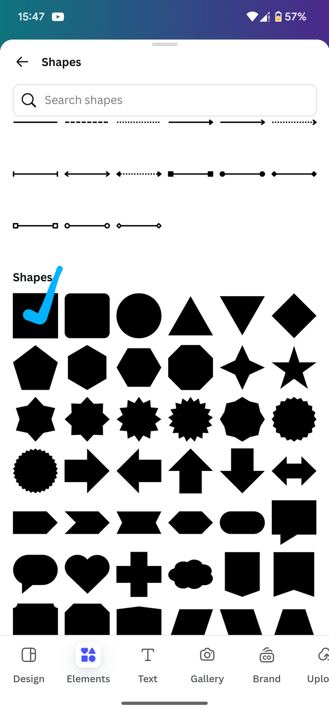
From there I proceed to have a few more elements which I'm going to be able to make our design look great.
 |  |  |
|---|
Afterwards I proceed By adding my logo to the design and then followed by a few elements which I then proceed by arranging them to the desired positions.
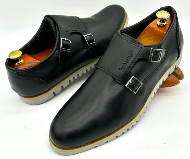
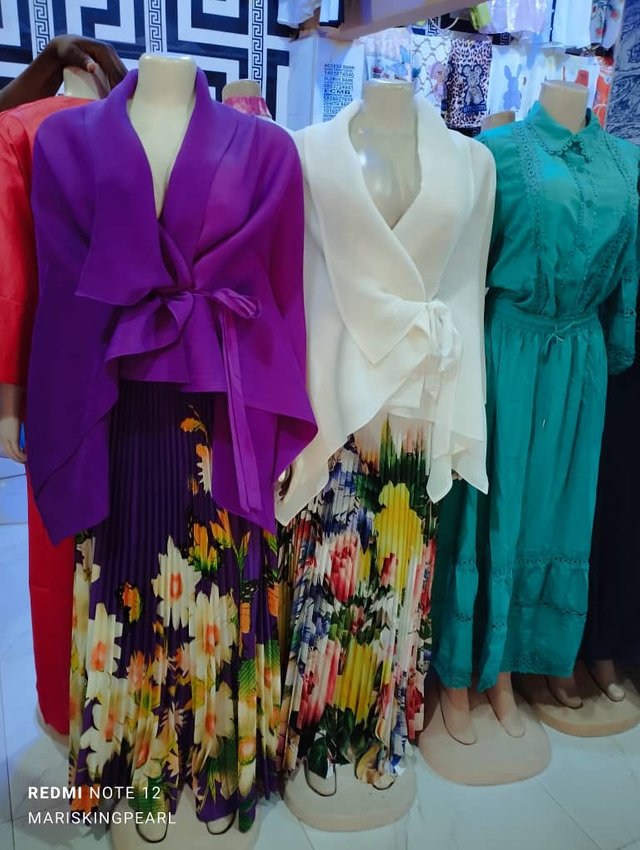
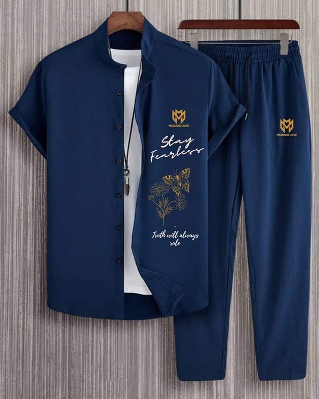
From here I move to the WhatsApp group to download a few images from the shopping group which I will be using for the design. Remember I'm making it the surprise my sister so I hope she likes it when I'm done.
 |  |  |
|---|
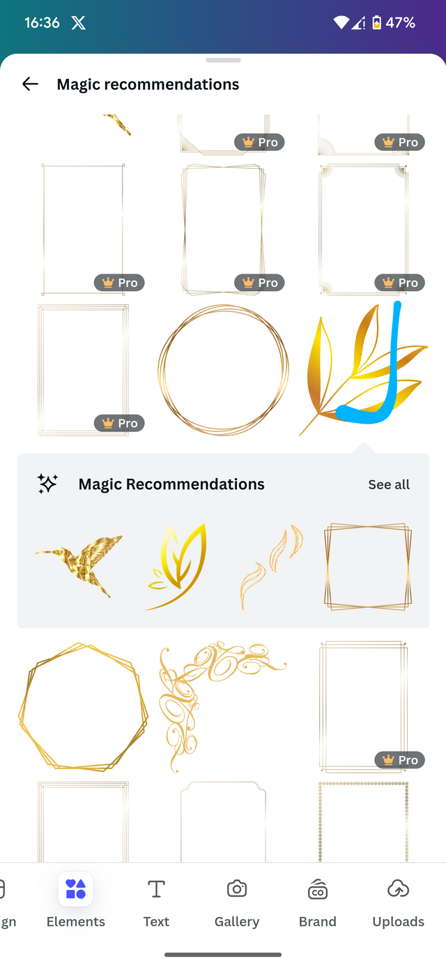
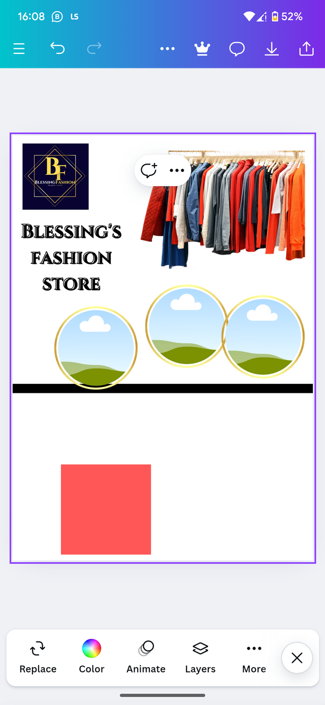
From here, I proceed back to my design and added a few mock-ups which I multiplied 3 times to fit in my clothes. I then added a few elements as well to make sure the design looks great.
 |  |
|---|
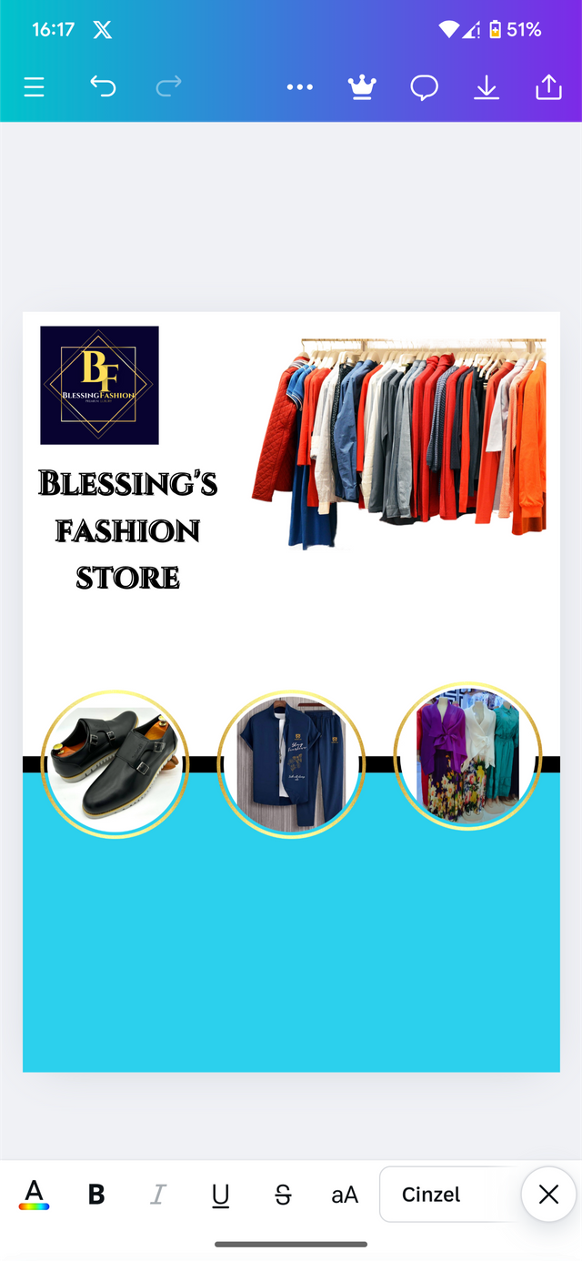
After arranging all the desired elements to do a various positions, I proceed by I did my typeface which you still dincel. From here I adjusted by adding a few effects to make it look cool.
Still on typeface, I add the services which the brand provides to the general public. I then arrange them as well in this position and this is what we have as the result.
 | 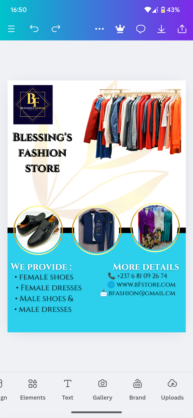 |
|---|
This brings the designs to completion. From here. Nothing much doing than to make a few more adjustments and then publish the design. This is the final result.
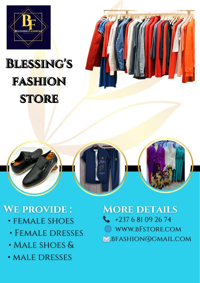
Applying design on a mockup
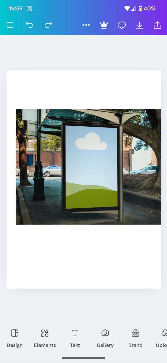
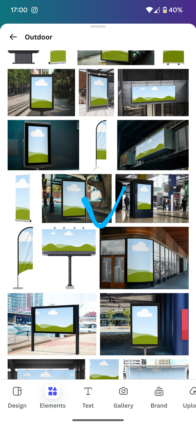
To apply my design on a mockup, I move back To the same document and add another page. Coming here, I choose the desire mockup which I want to promote my design and insert it on a blank page.
 |  |
|---|
Afterwards I insert my image and then I just did to the desired Dimension.
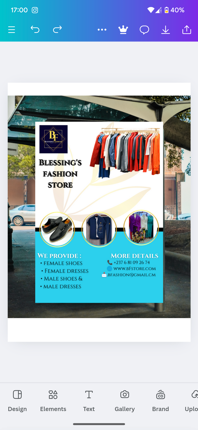 | 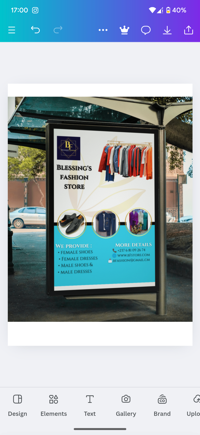 |
|---|
After inserts in the image in the mockup, This is how it will look like in real life.

Design principles use
Graphics design is a much more structured concept which must be implemented carefully in order to produce the desired results. We don't just get up and start designing it without taking insurance principles needed for design. There are a few things we need to know known as principles required for every Graphics design. Here are they;
Balance: It's like balancing a seesaw. Your design should have a sense of equilibrium, with elements arranged in a way that feels visually stable and pleasing.
Alignment: Think of it as lining up soldiers. Elements should be arranged in a way that creates a sense of order and connection.
Contrast: This is like adding spice to your food. It uses differences in color, size, shape, or texture to make elements stand out and grab attention.
Hierarchy: This is about creating a pecking order for your elements. Some elements should be more prominent to guide the viewer's eye and convey importance.
Proximity: Similar to how you group friends together at a party, related elements should be placed close to each other to create a sense of connection and clarity.
Repetition: This creates a rhythm and visual consistency. It can be used with color, shape, patterns, or typography.
Negative Space: This is the white space around your elements. It's just as important as the elements themselves, as it provides breathing room and helps to balance out your design.
Movement: This refers to how the viewer's eye is guided through your design. Use elements like lines, direction, and contrast to create a sense of flow and movement.
Nevertheless, keep in mind that this adjust guidelines to Graphics design as the real Graphics design is based on creativity. You should be able already in ourselves. Speak the design for you. While implementing the principles to have a perfect design.
Wrapping up with this week's challenge, I would like to invite the following persons to join me participate in this contest.
@chant
@simonnwigwe
@wirngo
@fombae
Cc: @lhorgic
Credit to: @rafk
In amazed by how you come out with the designs and make it so easy too
You are now a pro in graphic design. Each week I promise myself to take on this lesson but I ended up not having time to go through it and do the challenge task. I wish you good luck for this task.