SEC S19W4 || Organization using CSS (box-model Display, Position, Flex)

Greetings Steemit friends
Difference between in-line display and block display
This is an element display style in html when dealing with elements. The differences between depend on how margin/padding, with/height, are applied to the component. I will share examples so we can all have a better understanding.
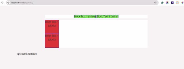


In the first screenshot, you notice I have presented two sections on the browser. We have to display in-line and the display block. Inline did not respect the width and height applied to the element.
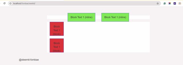

The second difference, I'm going to uncomment the padding and margins on the style. We will see the changes displayed by different elements. The inline pushes the padding and margin out of its parent container, while the block stays with the parent container.
What's the difference between Margin, Padding, and Border?
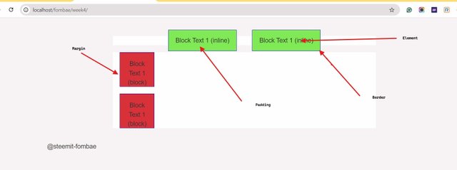
From the exercise I just mentioned above it is easy to have an understanding of these three concepts.
- Margin is the space or area created on the outer section of an element from the border.
- Padding is the space or area created on the inner section of an element from the border.
- Border is the container holding the element, or the actual space covered by an element.

Define Position property.
Position property tells how an element is placed. Five position values can be applied to an element. These values are static, relative, fixed, absolute, or sticky. For any of the values to work, you need to always make sure the position property is set. when we talk of position property, I mean top, bottom, left, and right properties that need to be used on the elements. the elements will always respect the value and position assigned to them.
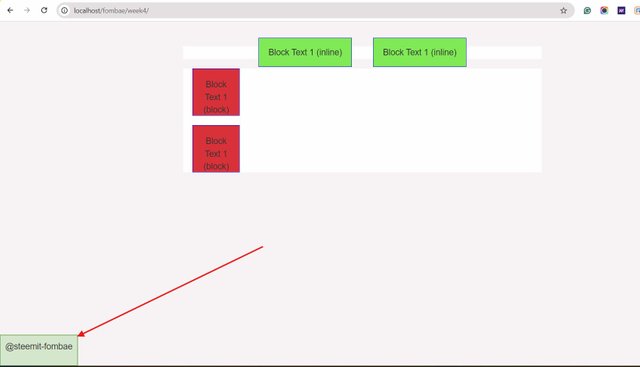
Below is an example. I have made use of the fixed value position bottom.


Differentiate between Grid and Flex display properties?
While we might look at Grid and Flex to be doing the same function because they are both layout systems. They have a slight difference in display.
- Grid is a two-dimensional layout, while flex is a one-dimensional layout.
- Grid, you can easily position elements without using attributes like float, while with flex you need float and position attributes.
- Grid display is challenging on different screen sizes as compared to responsive flex.
2. Practical Questions
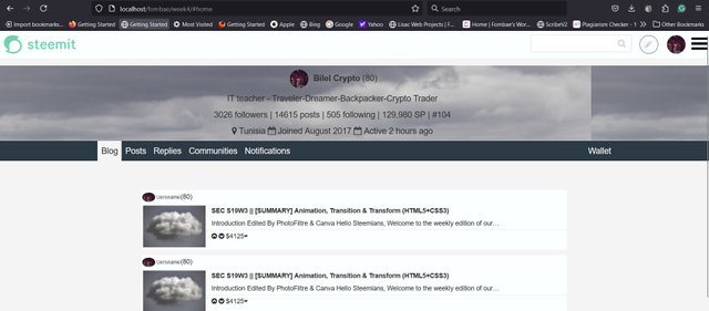
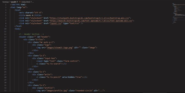
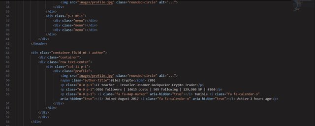
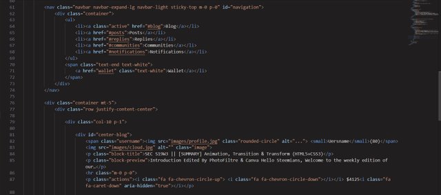
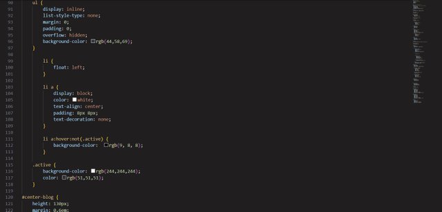
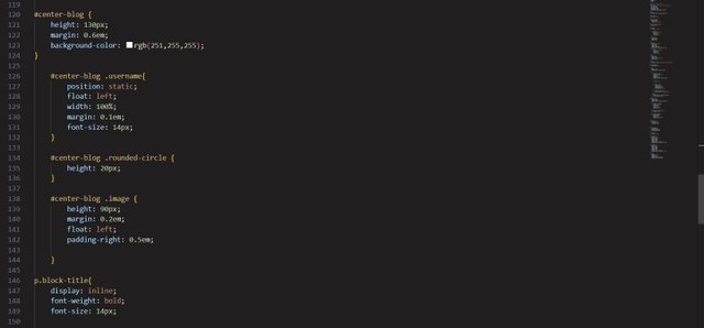
- Re-create this web page with your own unique design.
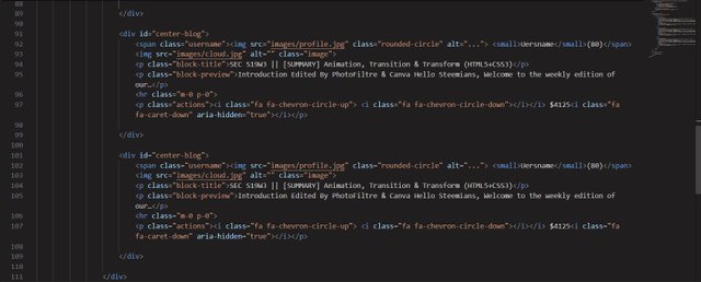

Css
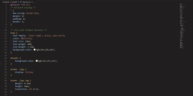
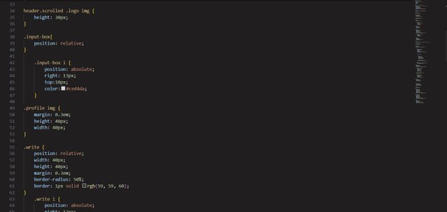
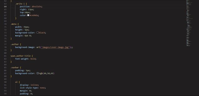

I invite @rosybelyepez, @menkemndi, @strawberrry
Cheers
Thanks for dropping by
@fombae
Hey, fombae, Good to see you participating in the contest. You defined everything properly as required. You recreated a good deigned web page, great job!
@suboohi thanks for dropping on my publication.
Though I am really willing to learn web designing techniques I am very lost right now 😂, maybe it's because I've read it just once I'll read it over and over again. Thanks for sharing sir
@bongk, you will have a better understanding if you start from the beginning of the courses. Everyone must have some basic knowledge of HTML/CSS
Ok sir
You recreated the page very well, awesome. Nearly it's very much near as the real webpage. It's extra ordinary you added the vote buttons too.
I wish you the luck, I have also participated in this contest today, I hope to get a view from you too.
Hello dear friend fombae
Greetings to you hope you are doing well. You explanation of theory part in Fabolous with practical examples. This is the easy way to understand through examples. Practical part looking like a original steemit page layout. You design it very well and using css perfectly. Hope for the best. Good luck to you.
Thank you, friend!


I'm @steem.history, who is steem witness.
Thank you for witnessvoting for me.
please click it!
(Go to https://steemit.com/~witnesses and type fbslo at the bottom of the page)
The weight is reduced because of the lack of Voting Power. If you vote for me as a witness, you can get my little vote.