Css Animation- Little Css HTML/CSS Tutorial

This is a simple CSS Tutorial to make animation in CSS. It is a fun thing to do. I will paste the code here for anyone willing to play with some CSS.
HTML
<!DOCTYPE html>
<html lang="en">
<head>
    <meta charset="UTF-8">
    <meta name="viewport" content="width=device-width, initial-scale=1.0">
    <link rel="stylesheet" href="/stlye.css">
    <title>Landing</title>
</head>
<body>
      <div class="showcase-content">
        <h1>Steem the best blockchain</h1>
        </div>
        <div id="cont">
        <p>Lorem ipsum dolor sit amet consectetur adipisicing elit. Sapiente totam incidunt nulla quaerat <br>laudantium suscipit ullam repellendus dicta, neque error a, sed eum maxime recusandae molestias<br> quod sunt dolorum sint.</p>
      </div>
</body>
      </html>
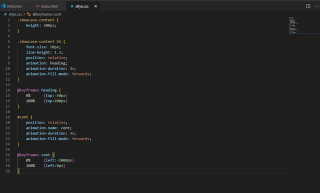
CSS
.showcase-content {
    height: 300px;
}

.showcase-content h1 {
    font-size: 50px;
    line-height: 1.3;
    position: relative;
    animation: heading;
    animation-duration: 3s;
    animation-fill-mode: forwards;
}

@keyframes heading {
    0%      {top:-50px}
    100%    {top:200px}
}

#cont {
    position: relative;
    animation-name: cont;
    animation-duration: 3s;
    animation-fill-mode: forwards;
}

@keyframes cont {
    0%      {left:-1000px}
    100%    {left:0px}
}
That is all for the code. You just need a little code editor to test it, but I have a video set up to show it up the page.
Thank you for this little CSS tutorial. I hope someone finds it useful.
Your post has been curated from the @steemcurator05 account.
Thank you. I hope someone trying to do some animations find it cool.