You are viewing a single comment's thread from:
RE: 0000000000000101 - Steemit Interface PoC - Some Polish and Enhancements
Hi buddy! I appreciate the work you do. The appearance of the tags does not look very aesthetically pleasing.
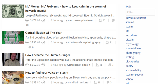
This is how tags looked in 2016.


https://web.archive.org/web/20160704203813/https://steemit.com/
I recommend you to look at the previous images of steemit.com from archive.org.
I've gone for a classic tag cloud because you can get a feel for how popular a tag is as well as how frequently the tags are used - the old Steemit version doesn't seem to have any order to it although this page is interesting.
I prefer the version I've created although I'm interested as to what you don't like about it?
One idea I've had is that the full tag cloud is not displayed by default and instead, I have a "see all tags" link underneath the "most popular tags"