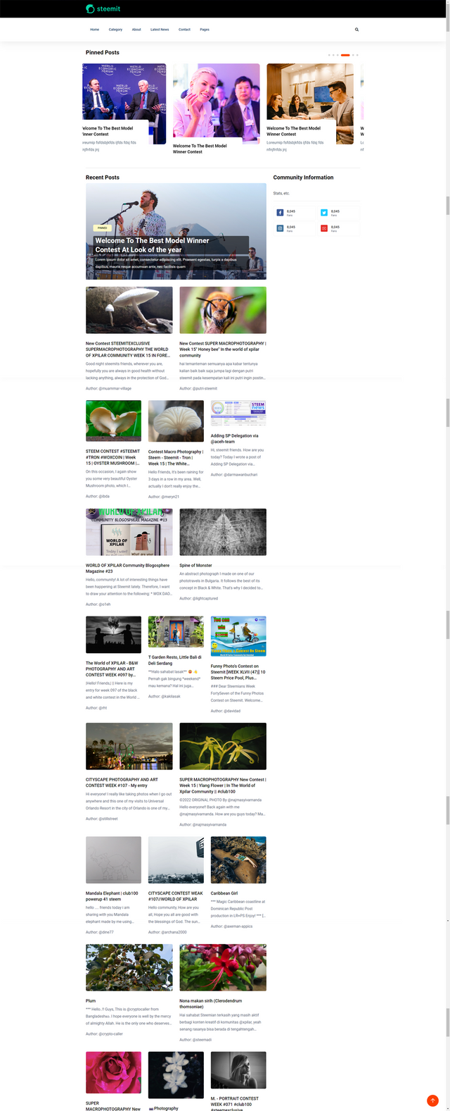
0000000000000011 - Steemit Interface PoC - Posts On The Community Landing Page
Following my initial success working with @steemchiller's API, I've been swamped by other things so have only had the odd moment to work on a new front-end. Today was an exception so I've made enough progress to warrant an update.
I initially tried to figure out how to use the templates highlighted in my initial post but quickly realised that they were unfit for the type of content produced on Steemit. So I returned to the frustrating task of finding something suitable which didn't cost $50 despite being advertised as FREE. Fortunately, today I had some success and found a template that I could work with that is more than suitable for a proof of concept and this is the product of my efforts...


There's obviously a lot missing at this point and a lot of placeholder content. The top area is a "carousel", the idea being that this is where the "pinned" posts will appear - dynamic enough to cater for a lot of pinned posts and small enough so that you don't have to scroll too far to get past it.
Underneath, is where all of the other posts get displayed in a 2 or 3 column layout. I could choose 2 or 3 but quite like the alternation. I could also introduce a 4 column layout but to do this, I think I'd need to lose the right column to keep the content looking pretty. There's also the option of a "full-width" post which could be a good way of displaying a "pinned" post within the context of the other posts.
All of the other posts are currently fed from @steemchiller's API and currently using the author, image, post title and start of the body content.
The right column could contain community stats, information, etc. and will require more thought as to what to put here.

The body content proved to be a challenge as the data stores tags and data that users enter for Steemit.com's layout which meant that things like images needed stripping out (thanks again to @tomoyan for the Regular Expression help here). It's amazing how long something which on the surface should be relatively simple becomes.
That's all for now - I have some Top Commenters to crown 👑
Can't wait to see more, great work
Thanks - you don't need to wait long for this one, it's something I've been thinking about for a while and hopefully it's liked 🙂
I can't wait to see what GIF today's post will get 😆
Your work is amazing. I will be so glad to follow you. Waiting for more.
I'm glad you like it 🙂 More has now arrived!
teach me to get many vote lord
[WhereIn Android] (http://www.wherein.io)