Color Guide 03 - The Color Wheel - Complementary Colors - Ran Art Blog
Color Guide - Part 03
The Color Wheel - Complementary Colors

Note:
You might want to read the first two parts:
Part 01 - primary and secondary colors.
Part 02 - Color Temperature.
The Color Wheel
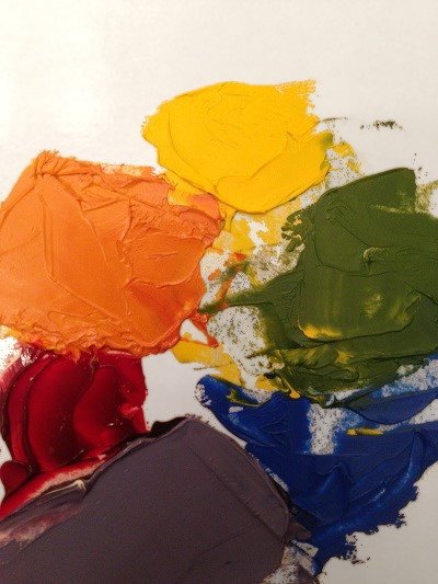
The color wheel is an arrangement of the 3 primary colors and the 3 secondary colors.
Between each two primary colors is the secondary color that is mixed by these two primaries.
Between red and yellow: orange.
Between red and blue: purple.
Between blue and yellow: green.
To create your own color wheel, put the three primary colors (red, yellow, blue) next to each other.
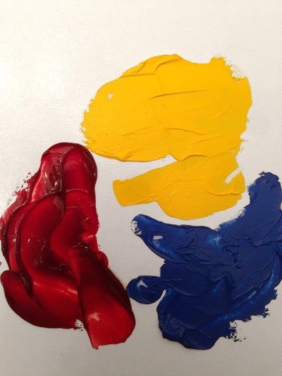
Then, mix each two primary colors to create the secondary colors.
Every set of primary and secondary colors, which are opposite to one another, cancel each other when mixed.
The reason is that each secondary color is mixed from the two primary colors next to it, and when mixing it with the third primary color, which is in front of it, you get a messy, unsaturated color, which absorbs many wavelengths.
Therefore, opposite colors are a great way to reduce saturation.
If the color you are using is too saturated (rich and intense), you can reduce its saturation by adding a bit of the opposite color in the color wheel.
Example:
Orange is too saturated for skin color, but when mixed with a bit of blue, making it less saturated, and then mixed with white, for a lighter value, you can get the base for a skin tone:
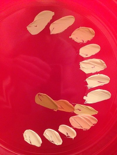
After adding a bit of other colors, or mixing different values (brightness values), you can reach the desired color.
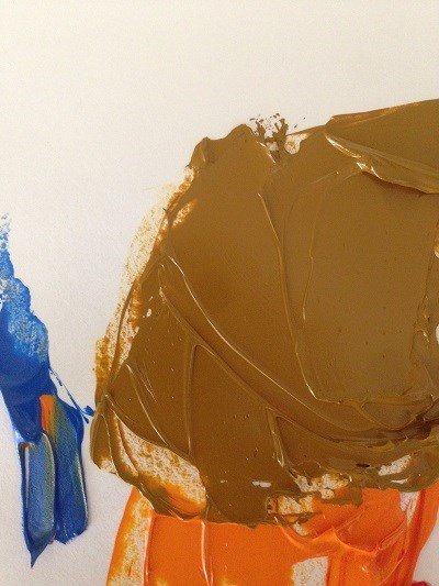
Another good use to for opposite colors, is to create brown colors.
You can add a bit of any primary color to its opposite secondary color, to mix brown colors.
In the next example, I mixed orange with a bit of blue, to create brown.
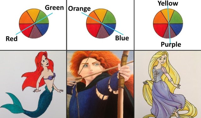
Complementary Colors
Opposite colors on the color wheel for the strongest contrast.
While when mixed they cancel each other, when painted next to each other they complement each other.
For example, a red apple may look good and noticeable with a green background.
The tree sets of opposite (complementary) colors are:
Blue and orange.
Red and green.
Yellow and purple.
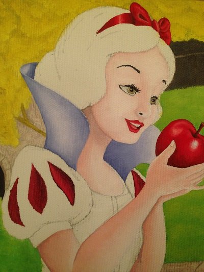
Here is an example of Disney characters that use complementary colors:
Summary
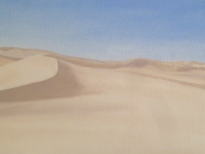
While I rarely use complementary colors intentionally, they do exist in some of my paintings.
For example, bluish sky with orangey sand.
Tip:
This was an old painting that I liked less.
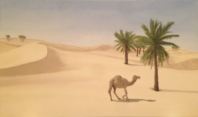
When I have a landscape painting that is less successful, I use it text things.
The sky can be used to paint airplanes or birds, the land can be used to paint animals, people, structures, etc., and water can be used to paint boats or anything that floats or swims.
I used this painting to test trees and a camel:
I painted all paintings in this guide.
This guide is part of my comprehensive color mixing guide.
Till next time...
Ran
Website: Ran Art Blog
Tutorials: Drawing & painting tutorials
Instagram: https://www.instagram.com/ran_art_blog/
Pinterest: https://www.pinterest.com/ranartblog/