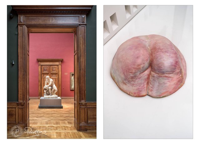
Evolution...

Such a museum where you have both a classic and a modern section is particularly interesting to make comparisons between old and new works of art. The evolution so to speak...
Now take these 2 sculptures... you can perfectly see the evolution by color, size and subject.
Color: The artwork on the left was pristine white while the artwork on the right…well, uh, went for gory realism…
Size: At the left you can speak of a life-size representation. Large, realistic, imposing, powerful. For the right, the choice was made for...well, hopefully not for realistic. It would be quite an ass 😱
Subject: At the left we see the representation of a muscular man at work. Totally focused on his job with a beautiful muscular body.
At the right we see, well, a part of a body, male or female (that's not clear). What is clear is that someone has dealt with that body part...in a rather aggressive way...
I'll leave it up to you to determine if evolution is going in the right direction...but a lot will depend on your personal preferences/experiences. So pay attention to what you write in the comments below... you might reveal a little too much 😉
You liked this post?
Right you are 😉
Just follow me here to make sure you don’t miss any new work. As you can see below, you will be in good company... my 3 skinny friends are waiting for you 😉
Curious to see my other work?
Although I spend most of my time here, you can also find me in other places… just take your pick…


