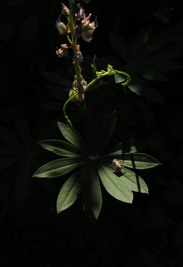
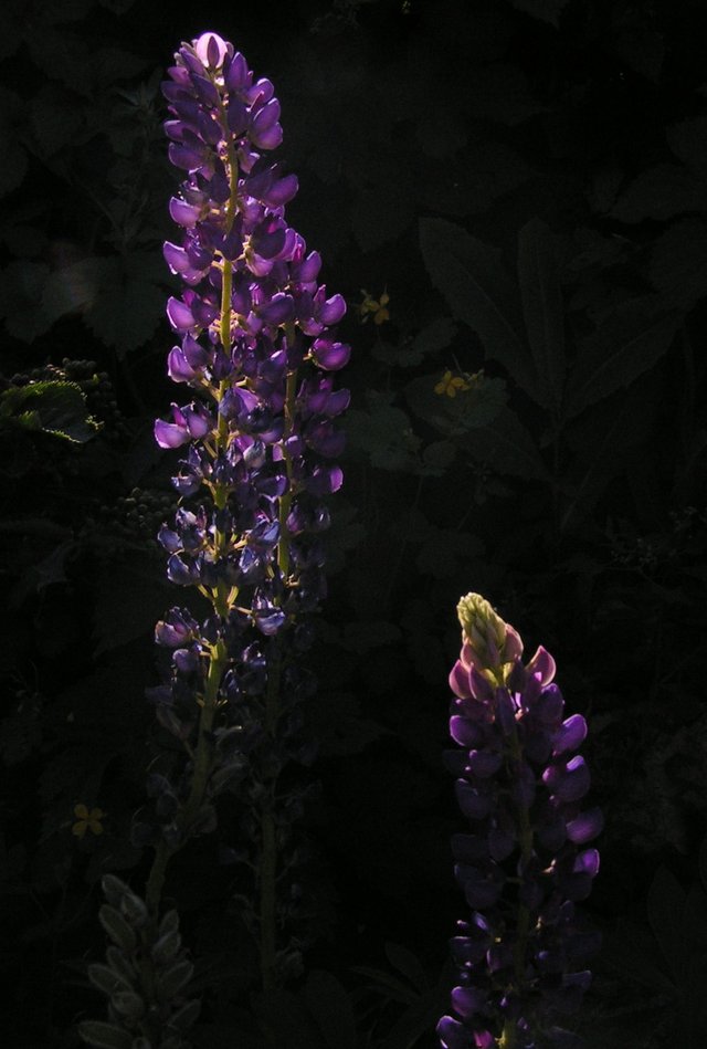
Lupines at sunset
Vertical frame formats are not given to me, and I do not really like them. I feel uncomfortable when the features of the object force me to resort to this, but this time, at the sight of these Lupines glowing in the sunset, I took this step almost with pleasure and was even satisfied with the result.
.jpg)
Starting with the normal first frame, on the second I already had in mind that I would cut it into a narrow, non-standard vertical. Probably, it would be possible to leave the object less space, but let it be so for now.
_cr.jpg)
It seems to me that for publishing on the Internet, vertical formats are not suitable at all, since viewing a photo on a page can only be done in several stages, which is not correct, but few people dare to open the photo in a new window to see the whole thing at once. I always do this if the photo interests me.


I will be glad to know your opinion about what you saw and what I said.

Camera used: Konica Minolta DIMAGE Z2

Thank you very much for visiting and reading!
With you @lllll1ll
You post is nominated for „Wold of xpilar“ Community Support Program, @booming account upvote. Only the posts that are not cross posted, original and posted from community page are eligible. If your post gets approval, then you get upvote within few days. Good luck!
Thank You!
Great photos, I like that close to low key. Very artistic.
I agree that for viewing on the Internet you need to open it in a separate window, but this is not very convenient either, the size of the photo is reduced and the individual details do not stand out as much as we would like. But what to do, we have what we have :)
Отличные фото, мне нравится то приближение к низкому ключу. Очень художественно.
Согласен, для просмотра в интернете надо открывать в отдельном окне, но и это не совсем удобно, размер фото уменьшается и отделные детали не так выделяются, как хотелось бы. Но что делать, мы имеем то, что имеем
Спасибо )