Commission #44 Landscape - Minefield | Digital Art

BE CAREFUL! DON'T STEP THERE! You almost put your foot where it shouldn't be. Welcome to my blog once again, this time you have to be very careful, because I have illustrated a minefield for @smanuels and the best thing would be to stay still, you don't know what your last step could be before blowing up in a thousand pieces.
Today I went a little bit out of the ordinary, since normally I usually draw some fantastic character for this project, but this time I was asked that the protagonists were the land mines, yes, those little things buried in the ground capable of exploding anything that happens over them. So be very careful where you step and accompany me to know the step by step of this dangerous landscape.
Tools:
- Wacom Intuos 4
- Photoshop
- Brushes courtesy of Imad Awan: Download here

-Step 1:
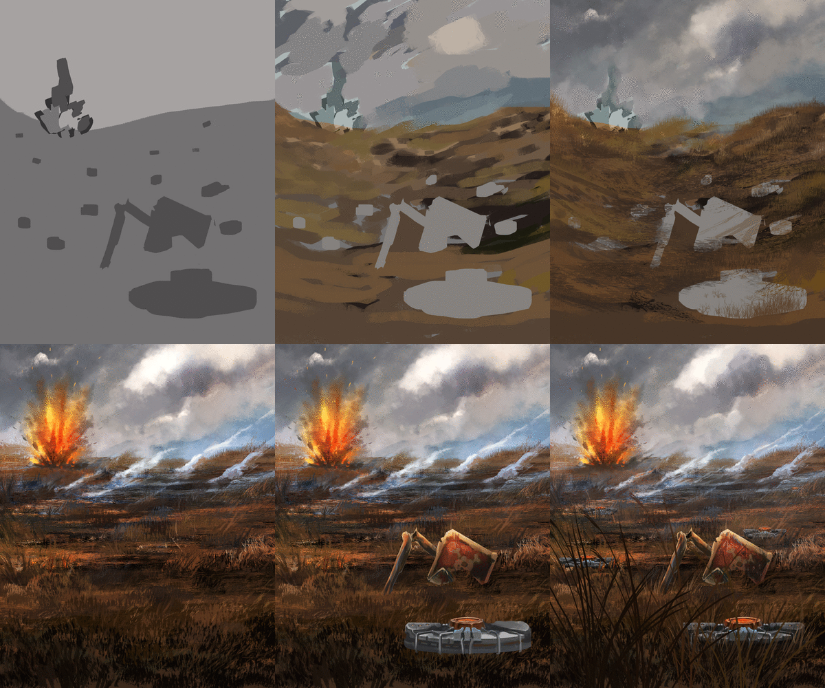
This time there are no sketch lines and much less an outline, no, since it is a landscape, I wanted to approach it differently, using a bit of stain paint, initially in gray to establish the shape of the main elements.


-Step 2:
Once I knew the initial shape and position of the mines and the explosion of the background, I went straight to implementing the colors of the environment, using a variety of browns and a little green for the dry and burned grass, and grays or very desaturated tones for the clouds and the smoke of the sky.


-Step 3:
At first I had in mind a kind of inclination towards the sides of the terrain, but then I decided to make a flat terrain, as it would be easier to locate the landmines. With some cloud brushes and the airbrush, I started the detailing of the sky, treating it as a gray and sad war environment, on the other hand I used some oil brushes, grass and strong textures to build the vegetation of the terrain and the explosion back there, using the "overlay" and "soft light" fusion modes to highlight the colors of the smoke and fire.
 |  |
|---|

-Step 4:
At last the protagonists of this explosive place appear, the land mines, its design is based on the traditional mines of the army but with some personalized touches that make them look more updated and attractive. To make them I focused mostly in detailing only half of one of them, select it and duplicate the layer, making a kind of mirror effect, achieving exactly the same proportion and design for the whole mine.
Once the prototype mine was ready, I duplicated the layer four times and distributed the new landmines all over the stage, and then covered them with some grass. It is also important to talk about the destroyed poster, for this I used the form I made at the beginning of the illustration, I blocked the layer and colored inside it, using colors according to the landscape and giving it that destructive aspect of the stage, achieving more attraction to the viewer's eyes.Tell me in the comments that you imagine when you see this illustration.
 |  |
|---|

I'll leave you a little gif with the whole process in it, so you can better appreciate the step by step.


See you in a future post!
Thank You for Supporting My Artwork
 @HADLEY4RT
