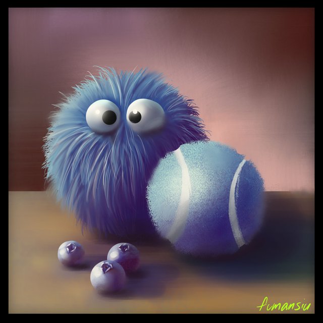
Color and Light: Blue Buddies Round 2
Welcome back for round 2! As you may know from previous studies the way we cement our knowledge is by repeating the first study but without using the reference. It's important to do this fairly soon after you finish your first study because the knowledge will still be pretty fresh and you can lean a little bit into muscle memory.
Blue Buddies 1 if you'd like to start at the beginning.
Let's start out with a sketch and move into our mantra. We're really starting to get the hang of this!
Base Color, Shadow Color, Light Color, Highlights, Bounced Lights, Sky Lights, Occlusion
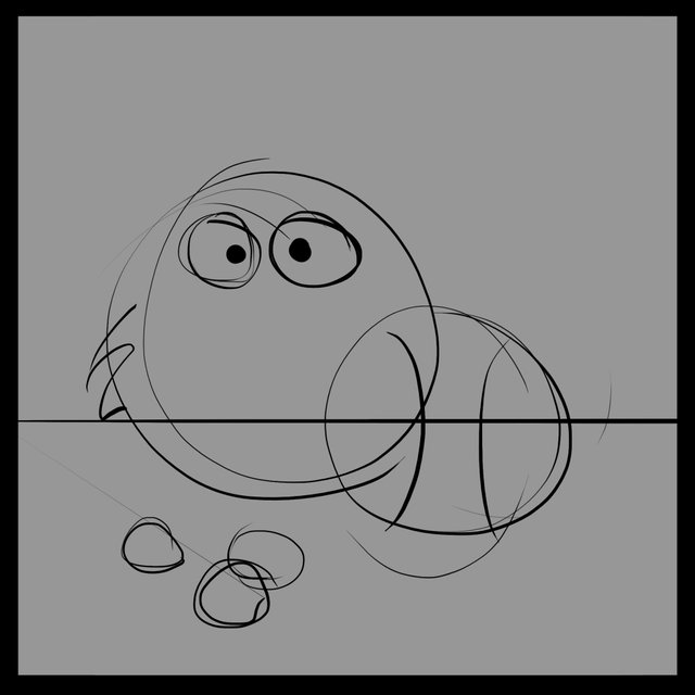
Simple, loose, silly.
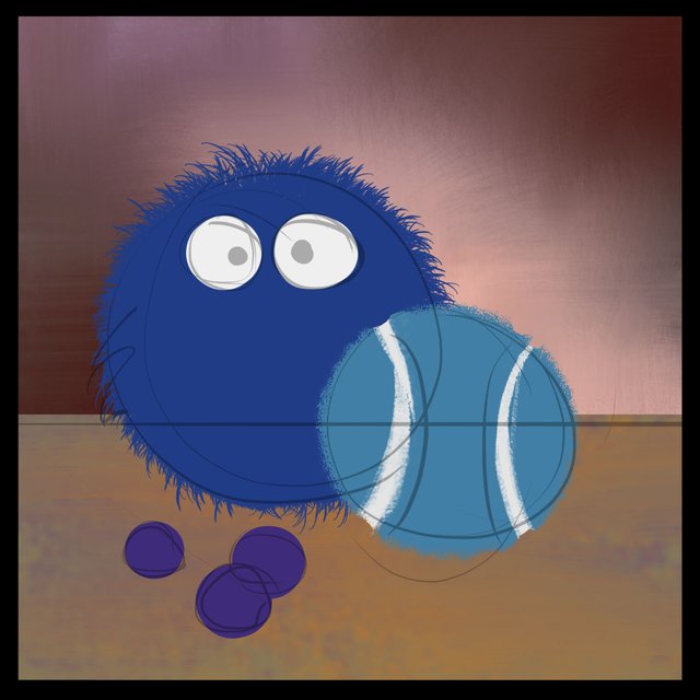
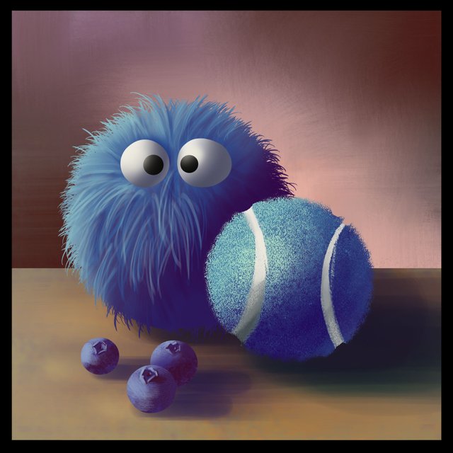
I normally wouldn't address the Base Colors, but I want to point something out real quick before we get going. Because we are dealing with blue, I want to set up a background that will really support that color and even make it look blue-r if that's possible. For that reason I'm using a lot of yellows, oranges, reds and pinks. I know that the warmer colors opposite from blue will create a little bit of a buzz when placed next to blue so I'm using de-saturated versions to help elevate our hero color.
You'll also notice that because I'm getting to redo this painting from memory, I'm choosing to go for that basic blue on the furball but going a bit toward teal on the tennis ball and purple-y with the blueberries.
Shadow Color
I've gone warmer and halfway to black on each element. The other thing you might notice that's new is that I even went toward the blues and halfway to black with my cast shadows. It's kind of a missed opportunity that a reference might not have in it but I'm excited about making this colorful so I've been a bit more creative here.
I'm paying extra care with the material shapes and being sure to break up the shadow shape to reflect each object.
Light Color
Again, with the light shape it's important to pay attention to each object's material and break up the light shapes a bit around the transition areas. About a 1/4 toward white and toward the color of the light, in this case, toward yellow.

Highlights!!
I love highlights. Gotta be gentle, but it's a lot of fun to pick different hairs to show off and add those nice round pops on the shinier things.
Bounced Light
Add the color of the floor into the objects and the color of the object to the floor. Don't go over board, a little goes a long way.

Skylight
Light blue of the sky will hit the opposite side of your main light source. I've even added a little bit into the cast shadow but gentle and only toward the right side where the shadows are exposed to the sky.

Occlusion
Where the light doesn't shine.
Here's where it gets a bit interesting. In the past I haven't really shown off how I think about taking a piece all the way but I want to include a bit of that break down here to add in yet another mantra. I know, are we bored yet?! haha
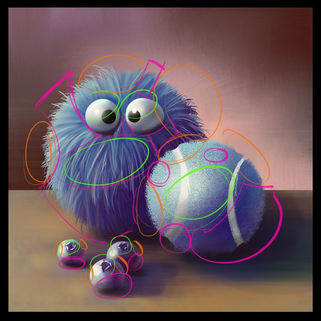
AOF, Silhouette, Soften
As I shared last time in Blue Buddies 4, this is our chance to take a good setup and really push the image with some care for how the viewer will be directed.
It's a big mess to look at but bear with me...
IN GREEN: These are the areas where we want to express detail. This is our Area of Focus, we want to lead the eye here.
IN ORANGE: The Silhouette tells us what the object is so anywhere where the contrast is high (Dark vs light) is a good place to show this off.
IN PINK: The viewer needs some areas to rest so we need to reduce detail and Soften up the areas that not important as a silhouette or AOF.

Soften/Reduce Detail
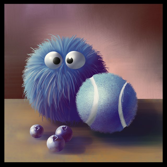
Because we set ourselves up with a well defined image it's easiest to do our softening phase first, avoiding the silhouette zones we marked out. I've brought the circles down a bit so you can see how I've gone around blending and softening things around the image.
It's already more relaxing to look at and those silhouettes really help sell the object materials!
Let's add a final touch with some extra fine details in our detail zones.
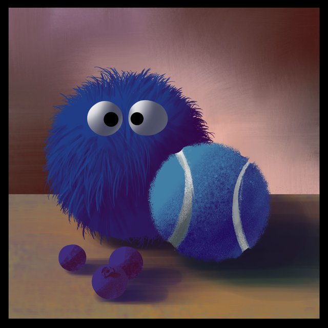
What a difference! You'll notice that I didn't do anything more to the tennis ball or blueberries. I just didn't think they needed it. A little bit more detail on the fur along the transition from light to dark and a bit around the eyes seemed like the right move and it really gives everything an anchor point to bring your eye to.
That wraps up round 2 and I've definitely retained a lot of that blue knowledge. The fur was easier to paint and the tennis ball was less bothersome for me as well. Doing these round 2 studies from memory are very satisfying AND they are an incredible reassurance to me that I'm not losing the knowledge after my first painting. It's really in there!
Check out Blue Buddies 1, Blue Buddies 2, Blue Buddies 3 and Blue Buddies 4 to start at the beginning.
If you want to go over how I made some of these color choices in this study you'll find a basic primer here.
If you'd like to get started with color studies we've got yellow and green now ready to go!
Yellow Bananas
Green Tomatoes
If you need help getting started drawing, I highly recommend you head over to @jorgevandeperre's blog and start following along his lesson plans. @jorgevandeperre has over 60+ posts now to get started!
Next up is Wild time, I hope you'll join me.
Thanks a ton, see you soon!
The fun continues, don't stop :-))
Your post is manually rewarded by the
World of Xpilar Community Curation Trail
STEEM AUTO OPERATED AND MAINTAINED BY XPILAR TEAM
https://steemit.com/~witnesses vote xpilar.witness