Color and Light : Blue Buddies 2
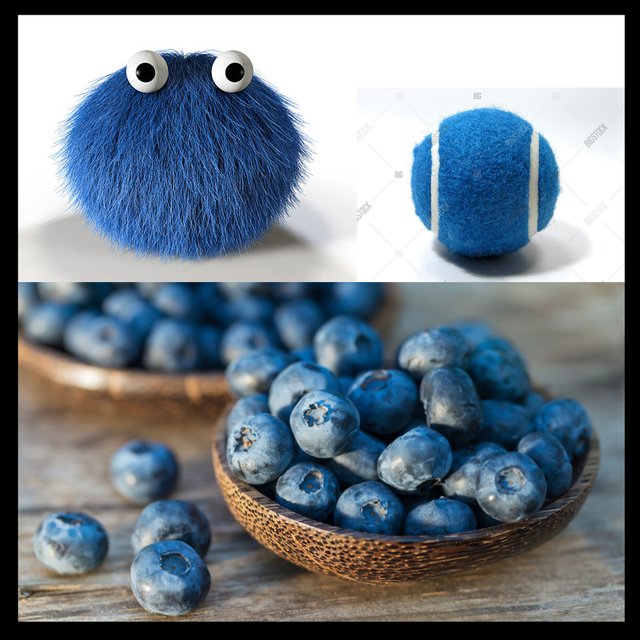
Welcome back for round 2! In order to keep things from getting over complicated we're opting to take on these materials one at a time. Up this time is the tennis ball. Blue Buddies 1 in case you'd like to start at the beginning. I'll be adding everything up as we go.
Hopefully you've painted up your Yellow bananas and Green tomatoes a few times by now and are pretty comfy with the color choices we make as we're manipulating our images.
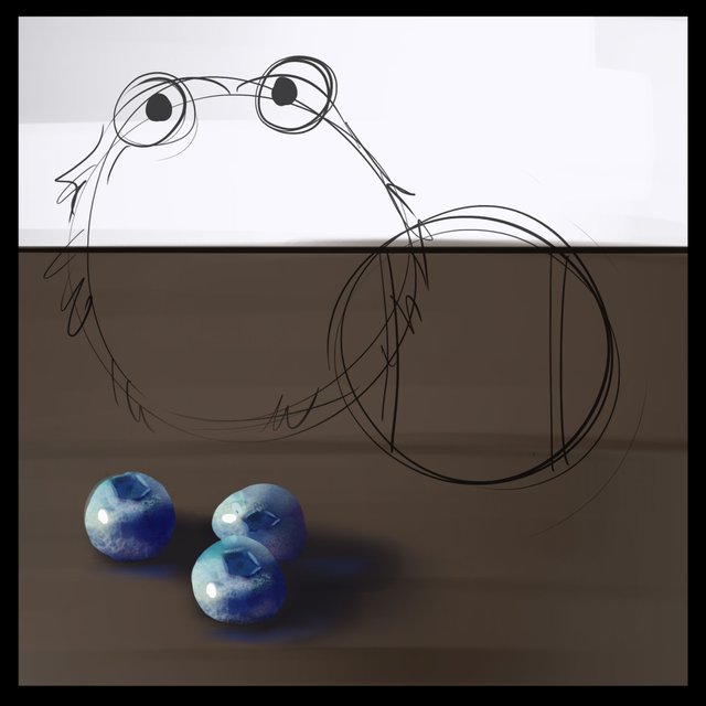
I've set up a sketch again to start out. You've done this a bunch at this point so I won't get too into it. We're going to paint over everything by the end so this is just a guide. If you need a little boost to get your drawing skills up I highly suggest heading over to @jorgevandeperre's page. @jorgevandeperre is putting together a very well thought out approach to handling drawing basics, practice, perspective as well as shadow and light and how to express form. Making things look 3D is a difficult subject already so if you're just starting out I suggest you start there!
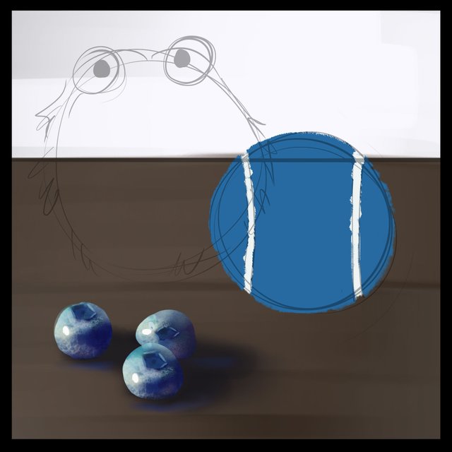
This is the first place where we are going to have to diverge from our usual mode. The tennis ball is not smooth on the outside so we need to lay in a kind of fuzzy shape for the silhouette. I'm not being too careful but I'm paying attention to making sure that the edge is rough and nuanced. Perfection is the enemy here so don't over rely on getting each fuzzy hair just right, just suggest the idea of the rough surface and you'll be good to go. We'll be addressing some of the higher level details at a later stage.
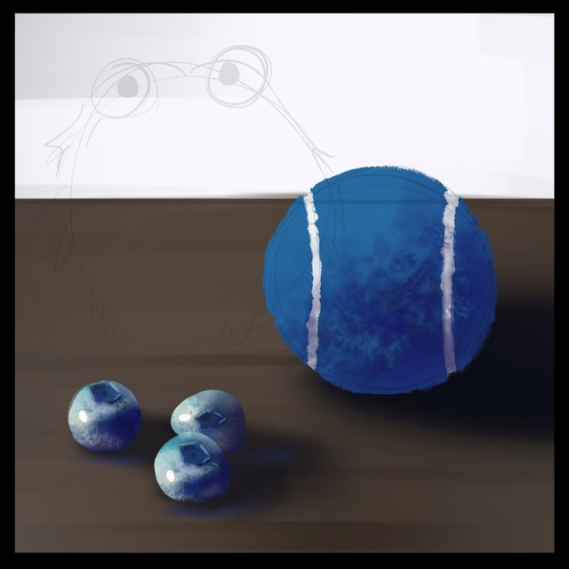
Now for the shadow shape. We've got a normal cast shadow but in the shadow on the tennis ball we have to do something different. Because of the texture of the object some of the light kind of travels a bit differently along the shape. For this I'm doing a similar idea to the rough texture I used on the silhouette. Again, not too perfect, just try your best to match up to the messiness of the reference image. It's almost exactly the same half moon shape as what we're used to with round objects but it's roughed up on the edges.
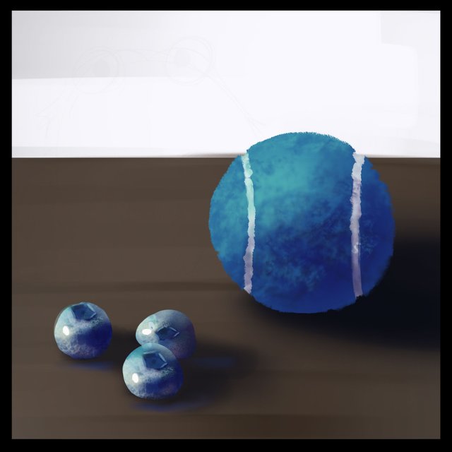
Same thing on the light side. It's the usual sort of half moon shape but not perfect, rough on the edges and a bit broken up in it's application.
It's time for highlights again, but this time it's a bit more spread out. Because of the nature of the tennis ball, a lot of the tiny hair bits are going to pick up a little bit of the whiter light but there won't be a centrally located shiny spot. I'm being very suggestive about how I place this light and I'm letting the texture be my guide. I'm giving the highlight area a wider zone and breaking up the shape the way I think it looks on the reference.
For our bounced light we'll add a bit of the tennis ball color to the surface and throw back some of the surface color onto the ball. The effect is very subtle but adds a lot of dimension. At this point we'll also throw our sky light color onto the right top side of the ball opposite our direct light.

Last up we must not forget to attach our ball to the surface by laying in the occlusion shadow. This is the area where light cannot make it and thus goes very dark between the ball and the surface.
We've made it! I'm going to stop here, again, so that we can take each of these materials one at a time. Have you noticed that we are going gradually fuzzier? At the end of this series I hope you'll have a grasp not only on blue, but also on some different material which will enable to you to apply this practice to more than just shiny fruits.
I did not go into the specifics as much in this study as I believe I'm starting to sound like a broken record but I want to sort of hit the nail on the head here. It does not change. The color choices/nuance are always going to be a place for exploration as well as the individual materials that you are painting, but at large the mantra that I hope is developing in your head is:
Base colors, Shadow colors, Light colors, Highlights, Bounced Lights, Sky Light (or secondary light, we'll try that out soon!), Occlusion.
again...
Base colors, Shadow colors, Light colors, Highlights, Bounced Lights, Sky Light, Occlusion.
As an artist I was a bit resistant to a system early on, but let me tell you. If you know where you are on the trail of completing an aspect of a painting it will allow you to be more playful at each stage AND you can leave something at a certain point and pick it right back up when you're ready. By separating each aspect of color and light you can have more control at each step and also not get too bogged down by trying to solve too many problems at once.
My hope would be that if you've followed along up to this point you are starting to find it intuitive to select your colors and how to break down shapes into where they belong. One of the masters of shape design was John Singer Sargent. If you want some extra credit, a fantastic way to do some more study is to take some of Sargent's paintings and trace the shapes of light and dark that he creates. If you're more into landscapes you might look at works of someone like Nathan Fowkes or Edgar Payne. Both of these artists similarly distill their images into the most basic values and shapes that they can in order to simplify and deliver impactful and easy to understand pieces of art.
If you want to go over how I made some of these color choices in this study you'll find a basic primer here.
Check out Blue Buddies 1 if you'd like to start at the beginning. I'll be adding everything up as we go.
If you'd like to get started with color studies we've got yellow and green now ready to go!
Yellow Bananas
Green Tomatoes
If you need help getting started drawing, I highly recommend you head over to @jorgevandeperre's blog and start following along his lesson plans. @jorgevandeperre has over 30+ exercises to get started and is even giving out rewards to students who complete homework!
Thanks a ton, see you soon!
Congratulations, your post has been upvoted by The Efficient Seven using @steemcurator04. We are supporting quality posts, so keep creating quality posts to get more support. #art theme
Account Used by: @rosz
Хорошая мантра, надо взять её на вооружение ))
That is very important lesson and the way how you split everything into multiple steps is very important. Thank you for this post, hope more people will see it. by the use, is #woxartschool as 2d or 3d tag. Thanks,