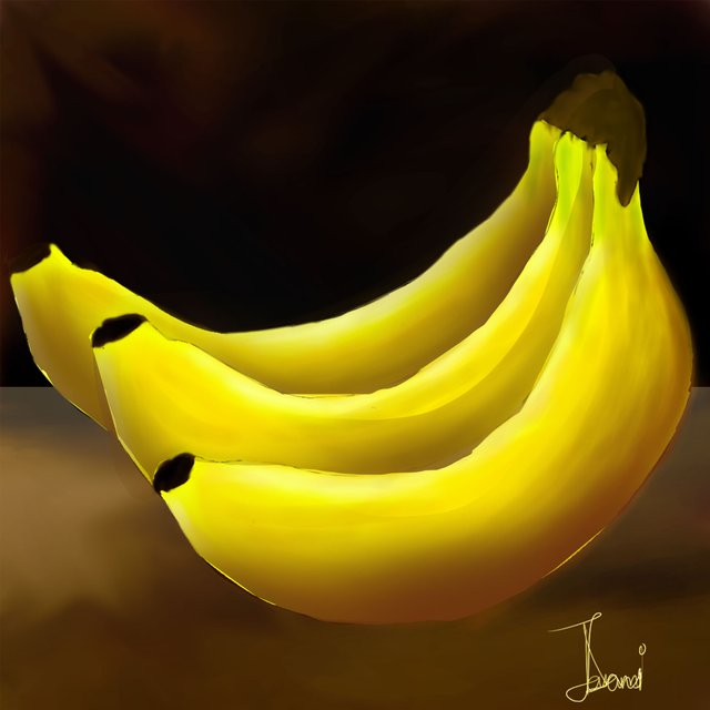
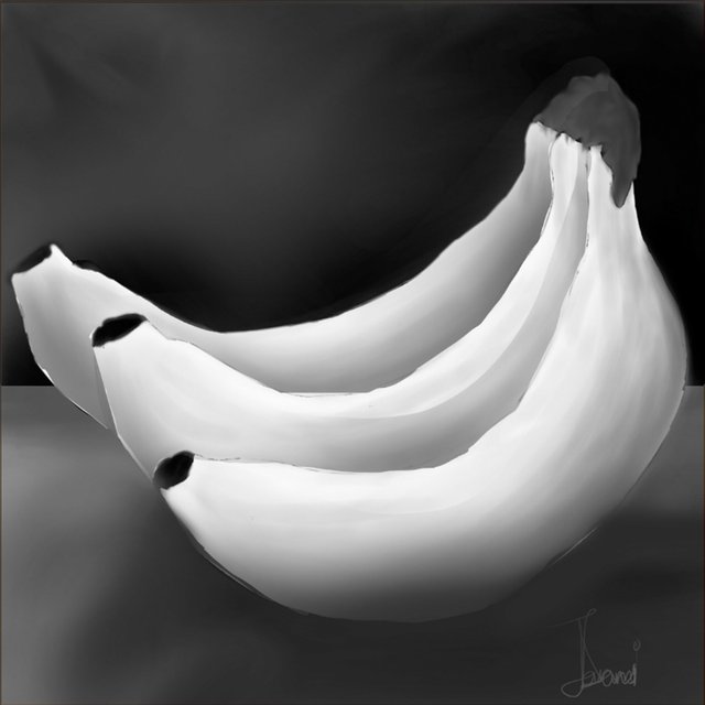
Color and Light : Banana Study by @ezunjoshy
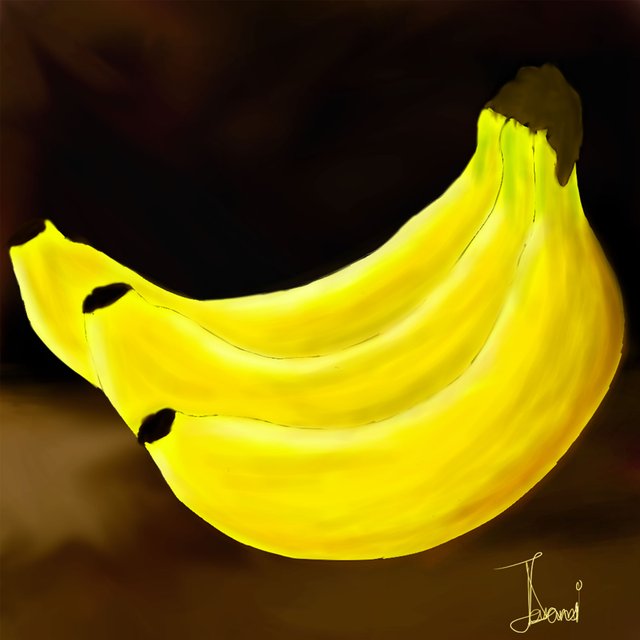
Wow wow wow! First off, thank you so much @ezunjoshy for taking on this study. It looks wonderful and I really like the nuance of color. Yellows, browns, the mixed greens and how he was able to keep the bananas separated from the background with subtlety. Beautiful work!
He was kind enough to ask me for a critique and feedback and I am absolutely down for that. So, @ezunjoshy, don't take any offense at all, we are aiming together, to strengthen what you already have, which is a fantastic start. Honestly, it's super close, there are only a few things I might add.
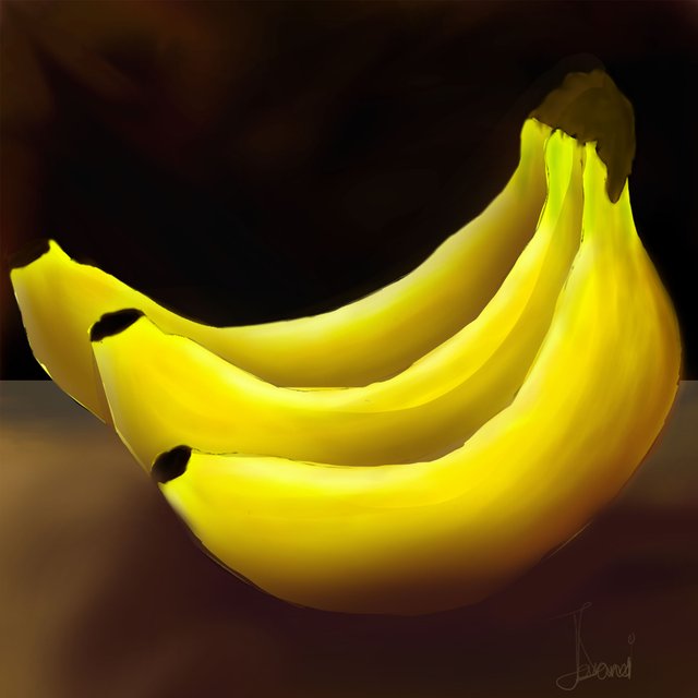
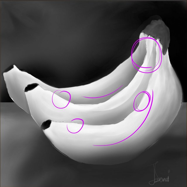
I'm not noticing a strong horizon line here which would tell our viewers where the ground plane is. It's important for the viewer to be able to feel like this is on Earth and feel grounded, so unless we're in a space scene and things are floating, it's always a good idea to think about where the horizon line is. @jorgevandeperre has a great series explaining perspective and he goes over that subject very well. I would definitely give it a read, it will help you define the space your subject lives in.
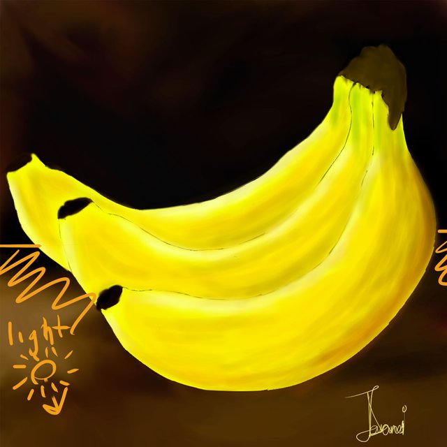
Here I've added a bit of an edge so that we know what the bananas are sitting on. I've also noticed that the light on the bananas indicates that the light is coming from above and maybe slightly behind the bananas, so I think the surface that the bananas are sitting on would receive some of that light.
Next up I would say that the light shouldn't really reach all the way around the banana. Because of the curved shape I think there would be pockets where the light can't reach, especially close the the bottom on the most forward banana.
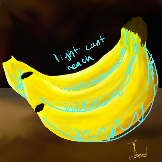
Here, I've done the usual and tried to go a little warmer, toward the reds, with the tone. A little darker as well. I think those pockets of shadow give the bananas a little more dimension.
Last off we need a little cast shadow.

I've added a soft shadow to show where the light can't reach. This is one of those places where if you're not sure, you can always grab something and put it in front of a window and see what kind of shadow it casts. Depending on the light that shadow will be sharper or more soft but there is always a direction to the shadow and that is what I am trying to find here.
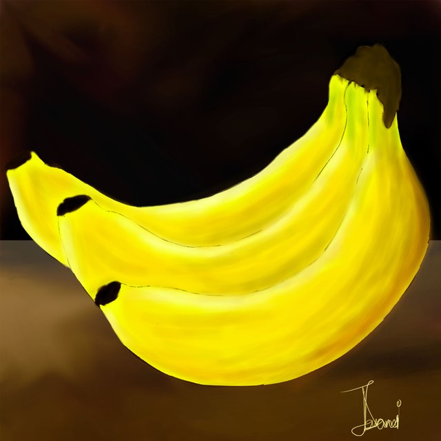
I noticed that the tip of the first banana is kind of bleeding into the background here. That kind of takes the viewer out of the 3D experience so we need to make that pop off the background a little bit.
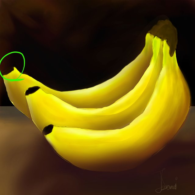
I just lightened up the background a teensy bit to bring the banana forward.
Well, holy moly, we're really plussing these bananas. Let's take a look at the grayscale version and see if there are any areas we can blend or bring focus.
I think for me, I want people to look at the areas I've marked in Pink. We're going to spend some time putting highlights and sharpness there.
The areas marked in teal here are places where I think we can blend because they are not in the area of focus and some of them share similar values so they will elevate our sharp and bright areas by not taking up too much of our attention.
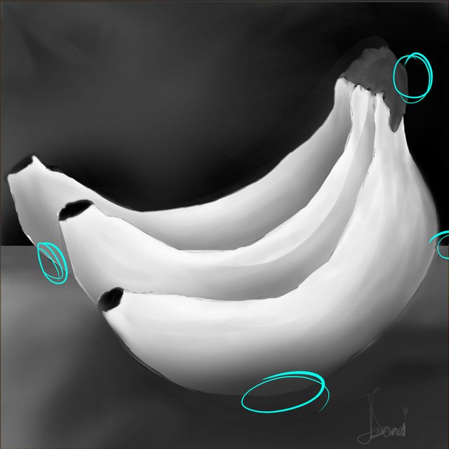
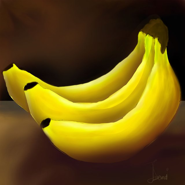
I've blended those areas that shouldn't distract and given some highlights and focus to the areas where I was thinking I'd like to direct the viewer and I think that's a wrap!

Like I said before, @ezunjoshy was so kind to ask for a critique and I want to applaud him for making the time to make a study AND for making it available for everyone to learn from. It was a fantastic painting and as you have seen I really didn't change much of anything. Very nice work!!
If you are curious about the banana experiment, take a look!
Banana 1
Banana 2
Banana 3
If you need help getting started drawing, I highly recommend you head over to @jorgevandeperre's blog and start following along his lesson plans. @jorgevandeperre has over 20+ exercises to get started and is even giving out rewards to students who complete homework!
I deeply appreciate this and apologize for not responding sooner, I was caught up in a program.
Thanks for the critique, the pointers are duly noted.
Would you advice I try them out doing the memory study or I just pick another subject?
Hi @ezunjoshy, next time you are painting up a subject I think these are the few things you might want to look out for. It might be helpful to paint up another banana or two just to solidify your process. Part of the trouble with painting anything is getting lost in the details so having a process or a list of essentials is super helpful to keep in mind.
For me, at least with a subject like this, it is: Base color, shadow side, light side, background and cast shadow, highlights and bounced lights, last details and smoothing... finish!
Getting a routine down will come with more practice and once you've gotten super used to it painting will be way faster and more fun/experimental. Even after painting for over 10 years I still find value in doing studies like these.
Okay, I'll keep that in mind and make another.
Thanks for taking time to put me through.
Very good feedback. You both did an interesting and useful job, bravo :)
You post is nominated for „Visual Art“ Support Program, @booming account upvote. Only the posts that are not cross posted, original and posted from Xpilar community page If your post gets approval, then you get upvote within few days. Good luck!