Color and Light : An appreciation of our colorful world
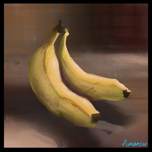
Welcome back! If you tried out the color work from our first part you'll already be ahead of the game for this first practice session.
I won't be going over drawing fundamentals but if you need help in developing a good eye for perspective and basic drawing skills I highly recommend you head over to @jorgevandeperre's page. @jorgevandeperre is putting together a very well thought out approach to handling drawing basics, practice, perspective as well as shadow and light and how to express form. Making things look 3D is a difficult subject already so if you're just starting out I suggest you start there!
Today we're going to explore yellow! To do this I'm going to use some bananas I happen to have in the house. If you don't have your own bananas you can probably find a picture with a quick search. It's very important to have a reference for any new subject. I'm sure you can probably picture what a banana looks like but having something to refer to will go a long way in helping you stay on track and will make the difficult decisions easier to make.
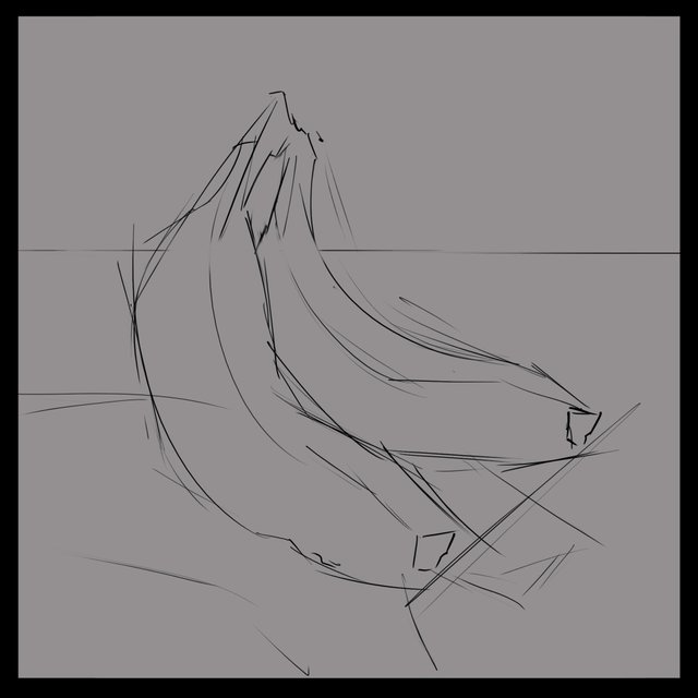
Lets sketch it out!
At this stage it's great to be messy. You are giving yourself the guidelines for the painting and using broad sweeping lines will help you deal with the curves of the subject.
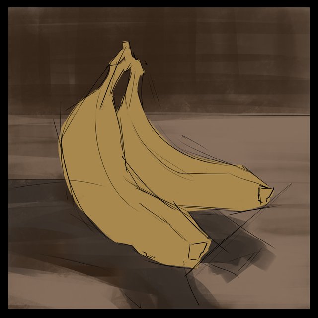
Next up I've laid in my flat colors. On 2 separate layers, I've put in a basic background and then on a new layer carved out my banana(s) shape.
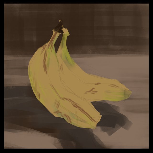
Next up for me, on a new layer, was to add in some of that variety you'll get on a banana. Some of the green from the less ripe parts and some of the brown stripes and dots that form as the banana ripens. We're trying to build up a good base to apply our shadow and light to and it's ok to be kind of messy and imperfect. We'll clean things up or smudge them around later.
Now if you remember from our first color exploration this banana is kind of a mixture of the cube and the cone shape. That means there will be some soft lighting because the banana is not completely flat. But at the creases of the banana it will act more like a cube for the shadows and the shadow shape will come right up to the edge.
Again, we are not aiming for perfect at this stage, we are just trying to get the jist in there so that we can refine it more as we go.
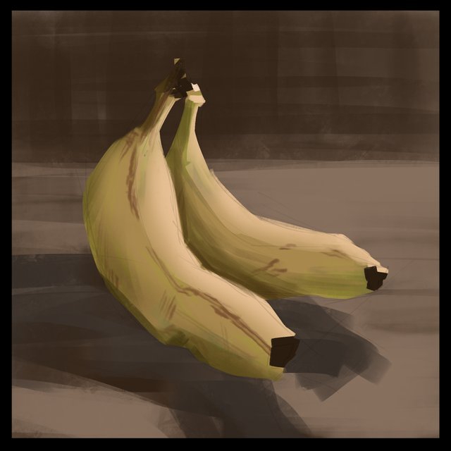
I noticed that the saturation of the banana was kind of lacking so I used a color balance effect to juice up the saturation a bit. As well I have opted to go a bit orangey as we get close to the shadow side of the banana and on the "shadow side" I noticed a bit of sky light coming from the left. So, I've very lightly added some cool light on the left side of the banana. I also pumped up the contrast of the background a bit because I really want that banana to be the most impactful bright thing on the page.
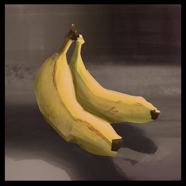
To further push this concept home I've pushed the background into more reddish purpley tones to make the yellow more powerful. When I feel pretty happy with what I've got I will flatten everything down into one layer and then take a blending brush to areas that have similar values. In this one when I squint I noticed that some areas look VERY similar in color and value and I want to blend those a bit so that I can soften some edges that I don't want to steal from the attention.
It's at this stage we can decide where we want the viewer to look. I decided that I really want the light on the banana to be the main point so I blurred away at the edges in shadow and in some other places where I wanted to blend the colors a bit more.

And that's that! If this was your first study, congratulations! You are well one your way to learning how to work with color. Don't be too worried if your study isn't a perfect painting, that's not really the point. The whole point of this exercise is to gradually train your eye to see the nuance of light and color on an object in the real world and replicate to the best of your ability in a painting. Over time your understanding of the subject will improve and your ability to make choices about a given subject will become faster and more second nature.
That being said, we are going to do bananas a couple more times so we can really understand what it's doing and cement the knowledge in our brain.
I you want to go over how I made some of these color choices in this study you'll find a basic primer here.
If you need help getting started drawing, I highly recommend you head over to @jorgevandeperre's blog and start following along his lesson plans. @jorgevandeperre has over 20+ exercises to get started and is even giving out rewards to students who complete homework!
A good lesson about yellow.
I have a question, what level of preparation / skill of the student is this lesson designed for?
After all, some questions remain "behind the scenes".
I am intending this to be a late beginner to early intermediate level. To make gains from working with color I am expecting that students have a basic understanding of fundamental drawing and how to use their painting software, or traditional medium. I don't think that the step by step, paint by numbers approach is very useful for advancing your own understanding so I am trying to impart how to think about it rather than what, EXACTLY, to do. I do think that in a lot of ways this is kind of the pillar of advancing in color and light that artists continually return to. @stef1 made a good point that it feels like art school basic color class.
I also think, just reading between the lines of your comment, I may be able to shed some light (pun intended) on some of the "behind the scenes" things as they come up. I'm learning how best to relate these ideas in the blog format as I go so I hope to streamline the ideas as I continue to make these little mini study lessons. My use of different effects layers for instance might be better explained by saying "I felt like this needed to be cooler, or more saturated, etc..." rather than talking about a specific function of software. These after all can also be done traditionally, it's not really meant to be a photoshop study.
It's okay @fumansiu
By asking my question, I just wanted to understand the level of the target audience for which your lessons are designed. It's even good that we can offer classes of different levels of complexity in our "art school".
It's just that I've been teaching technical subjects for a while and my approach to learning is too regulated))
I think that it would be methodically correct at the beginning of each lesson (or series of lessons) to determine the level, but which this lesson is designed for, and the purpose / task of this lesson.
For example: "if you are familiar with the basics of Photoshop and owns its tools, you may be interested in how you can work with color, layers....".
This will weed out those who are not familiar with PS at all, but may attract those who really need it. A small introduction at the beginning of the post will help the reader decide.
@bambuka, I appreciate your thoughts, I want to be approachable so if I'm doing things that will ultimately frustrate anyone that would be the wrong direction for me. I think a fine line exists here and I'll search for it. I don't think that these ideas are too advanced for a beginner but I think the over use of software mumbo jumbo will end up being frustrating.
I made another post already and plan on a third just on bananas and yellow. I am trying to make this practice the kind you would do with a new piece of music. At first you pick out the notes slowly, frustratingly, it sounds awful. The second or third go around you are starting to get the hang of it and the music starts and you think less about each individual step or note and "play" rather than read. In this way I think that I am trying to relate a way of learning. Not "how to paint x" rather "how you might think about painting x"
I'll keep in mind lessons from this first go around and adjust the way I deliver these ideas. I really do want people to just start painting, it's the best way to learn and making mistakes are the first step one takes in deciding there's a problem to solve in the first place.
I like the comparison with music. Yes, this is a good way For many novice artists it is difficult to distract themselves from the tool and the rules of drawing and this sometimes happens to be a brake on development.
Try to find this fine line, maybe it will be exactly what you need :)
delicious
nice drawing
Thanks @sammy00, glad you found this banana apeeling. XD
Love this tutorial :) I actually thought that these are real bananas when first saw your picture. They look real. also reading through the text that reminded me that it is true banana has not only this shape but combines different geometric figures put together, I actually remember how once when I saw oil painting of banana and many colours were used, due to impressionism the abrupt lines and shapes were more prominent but also the colours starting with dark to light but also including different colours that we never guess bring harmony.
Thank you that you mentioning @jorgevandeperre's blog In couple of weeks I am on annual leave and will catch up on all the tutorials that you and Jorge present.Thank you for doing that.
You post is nominated for „Visual Art“ Support Program, @booming account upvote. Only the posts that are not cross posted, original and posted from Xpilar community page If your post gets approval, then you get upvote within few days. Good luck!
Thanks @stef1, I'm glad you enjoyed this post. I plan on making a habit out of doing posts like these. It is helping me solidify my own understanding while at the same time giving a glimpse of the process. I'm having fun with it and plan to get into more complicated subjects after exploring some of the basic colors. It should be interesting at least!
I loved this post and the sample painted is really beautiful and realistic.
Thanks @jorgevandeperre, I'm looking forward to adding more, I hope this will encourage new painters to pick up a brush!