Edited using canva
I want you to see the same design on this dress or I want you to draw exactly what you see on your screen. Or I want you to define chemistry exactly as I gave you. If you go astray, you're in trouble with humans or grades. You may not be able to replicate exact but being close to perfection is exactly what is expected.
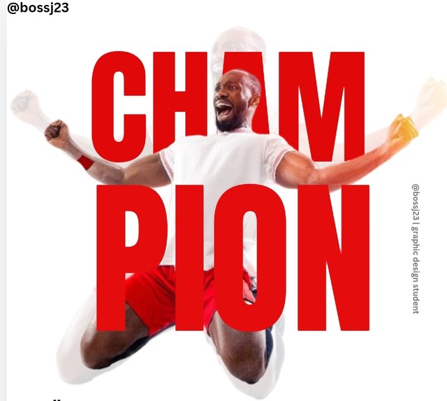
This is what this challenge tells me anytime our instructor says we should replicate the design above. I'll say it's a combination of a lot of principles to bring up the replica of this design. To replicate this design, you can't do without;
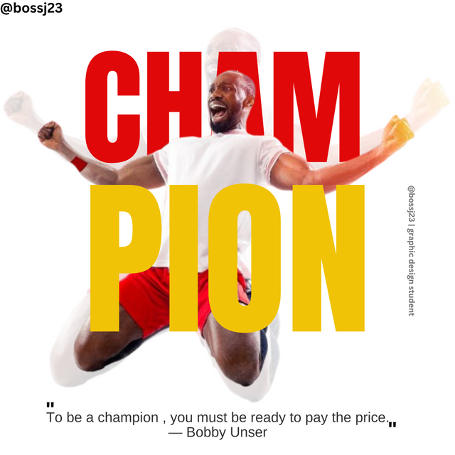
- Colour theory: The design above is a blend of colours Red and Yellow. These are matching colours that fits in to this design coupled with the image used. If you noticed, there's a touch of red colour on the shorts and there's a touch of yellow on his fist. The colour theory helps us know contrasting colours for use in our designs
| Transparent icon | Font |
|---|
| Font size | Typography |
| Text icon | Colour palette |
| Position | Insert icon or gallery |
These are features or icons I used to replicate this design as shown above. Knowing the icons alone isn't justifiable to creating the design. You need to know how to use these icons and these are demonstrated in the steps below. We'll start with the basics which is that of getting a good dimension for this purpose.
| What are we working with? |  |
|---|
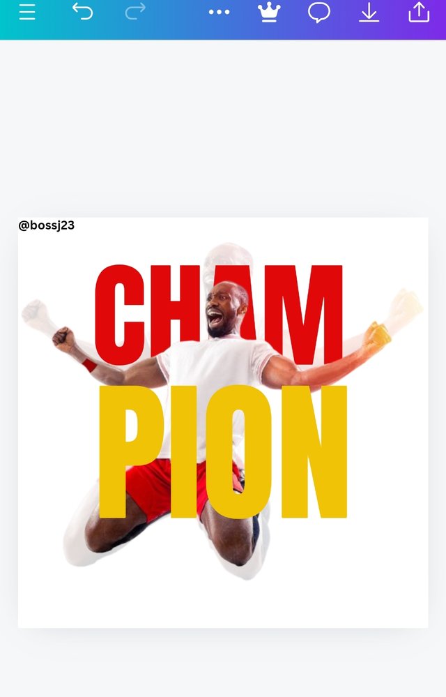
This is the design we are working with and as the instructor said, I'm to replicate this design, the colour and the like.
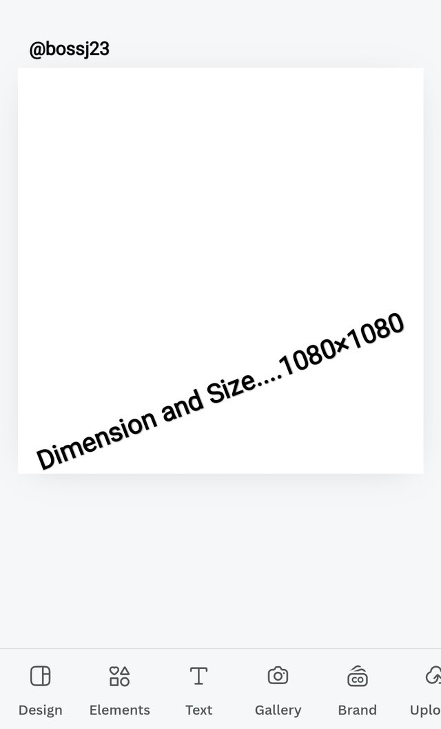
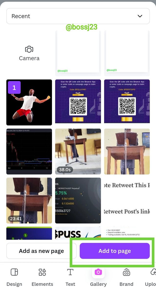
We all know the basics which is to open your Canva app and then click on Instagram post. Why did I say Instagram post? It's because it's my shortcut method of getting 1080×1080 size and dimension as related at the onset of this course. Dimension is very important in creating a design. It's more like sewing a cloth. The size of the material helps you create the design on the cloth and you'll be able to know the size and length to use for the design.
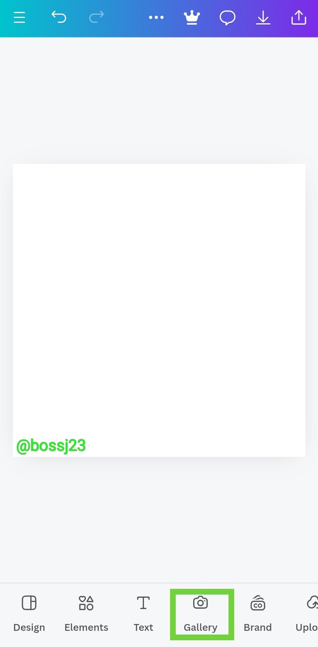
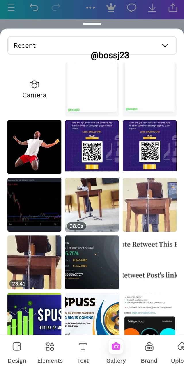
After that, it opened and I used a blank background with white to work on replicating the instructor's design. First thing I did was to click on GALLERY. Once it open, I selected the image I want to use and then clicked on ADD TO PAGE. It was automatically added. This is when skillful observation comes in as there were no tutorials on how the image should be sized.
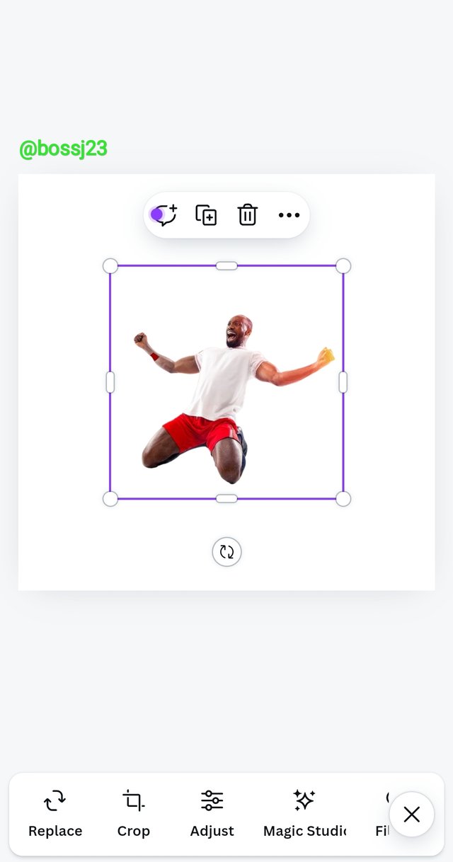
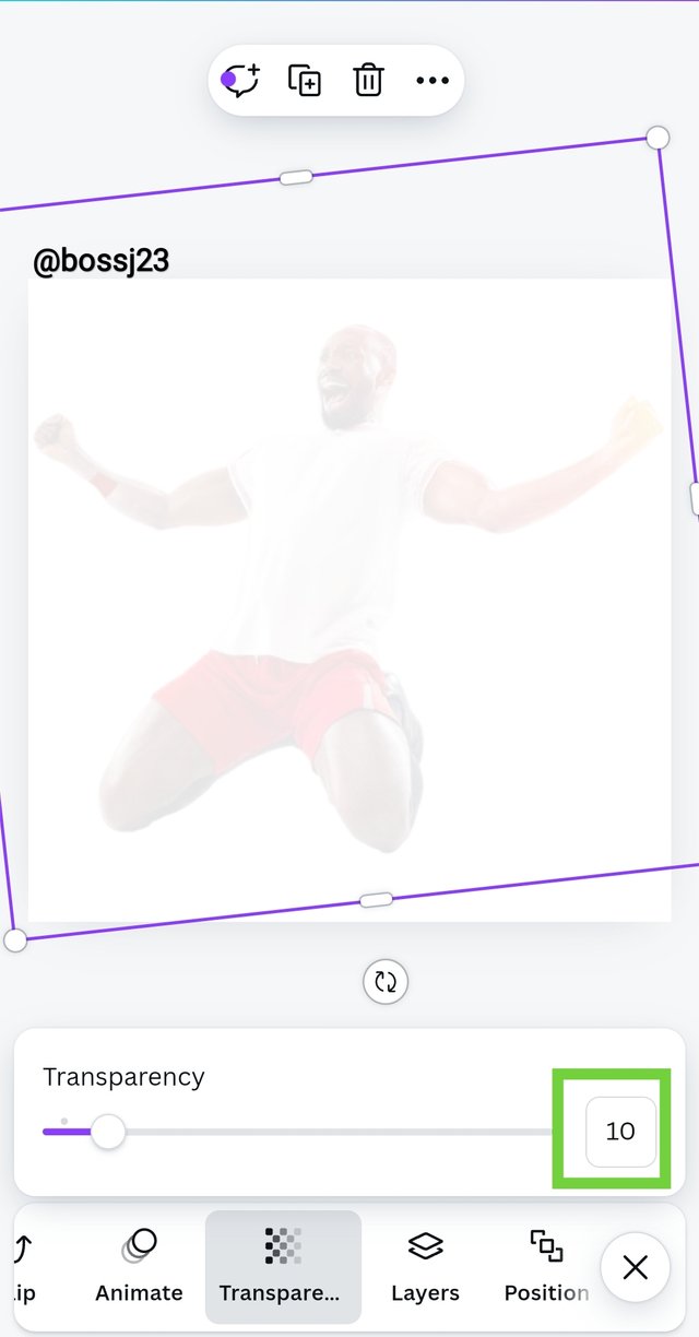
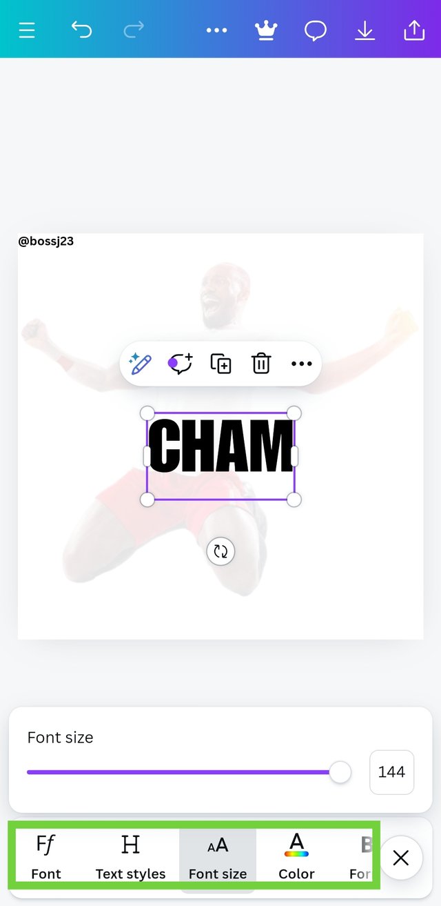
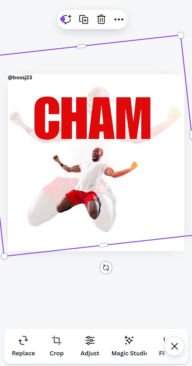
- I played with my font size and sector points on the image to move the image to the desired size and position as done on the instructor's design. It took me couple of minutes before I could get the adjustments and position in terms of body, hands and legs. I did attain this with FONT SIZE. After this, I applied transparency to the enlarged image. How?
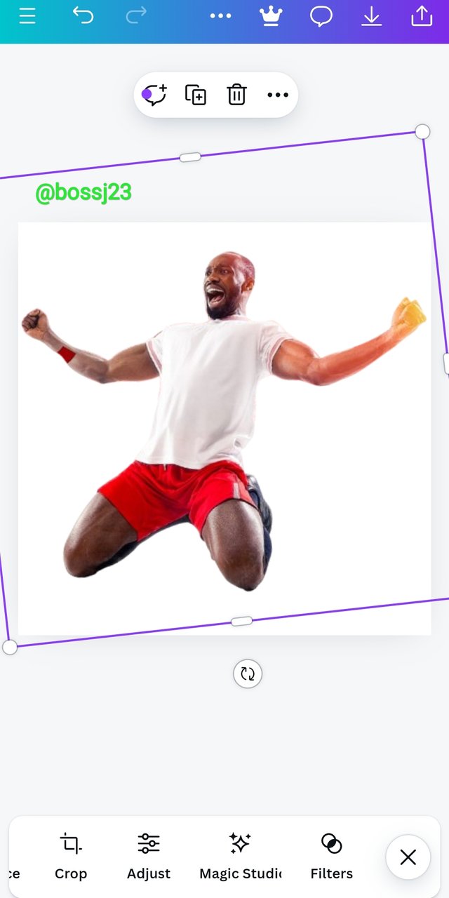
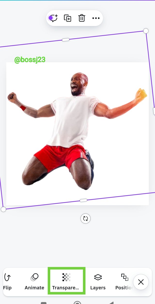
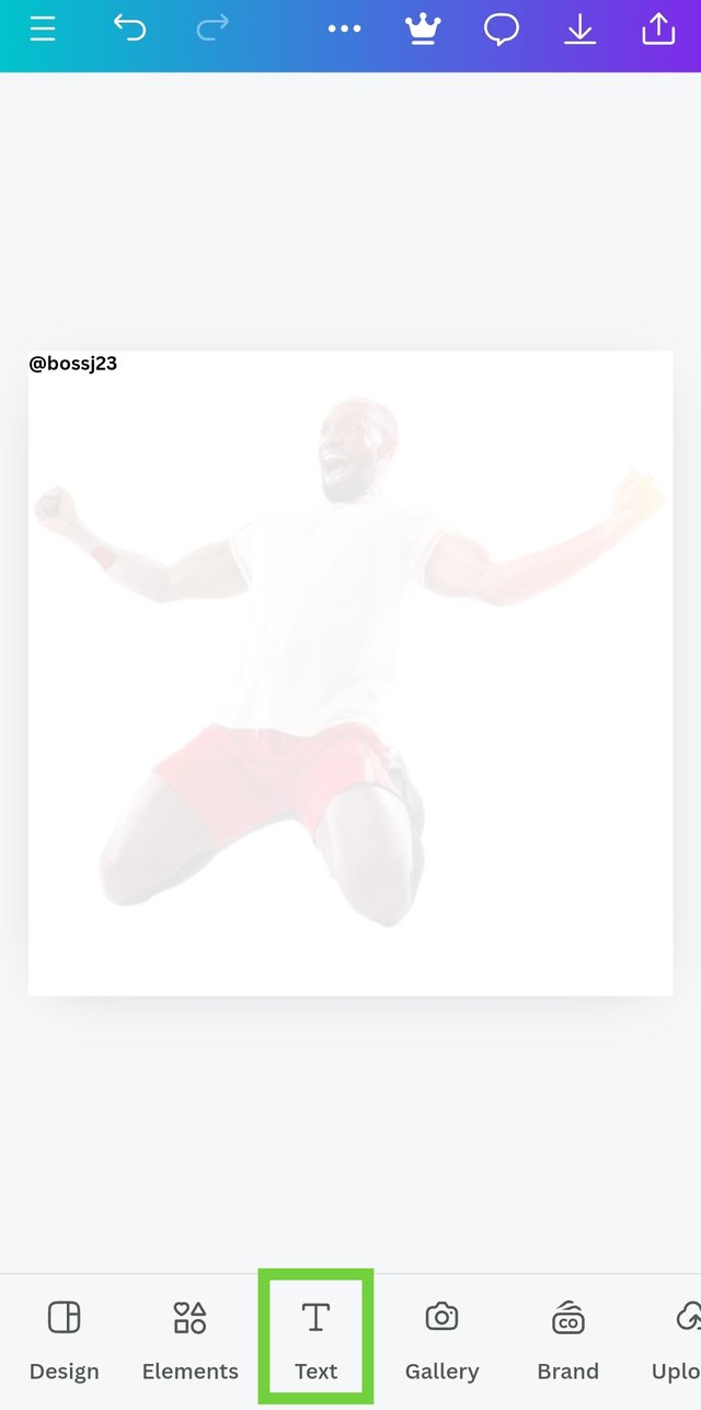
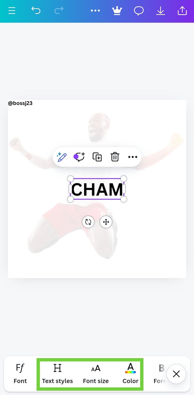
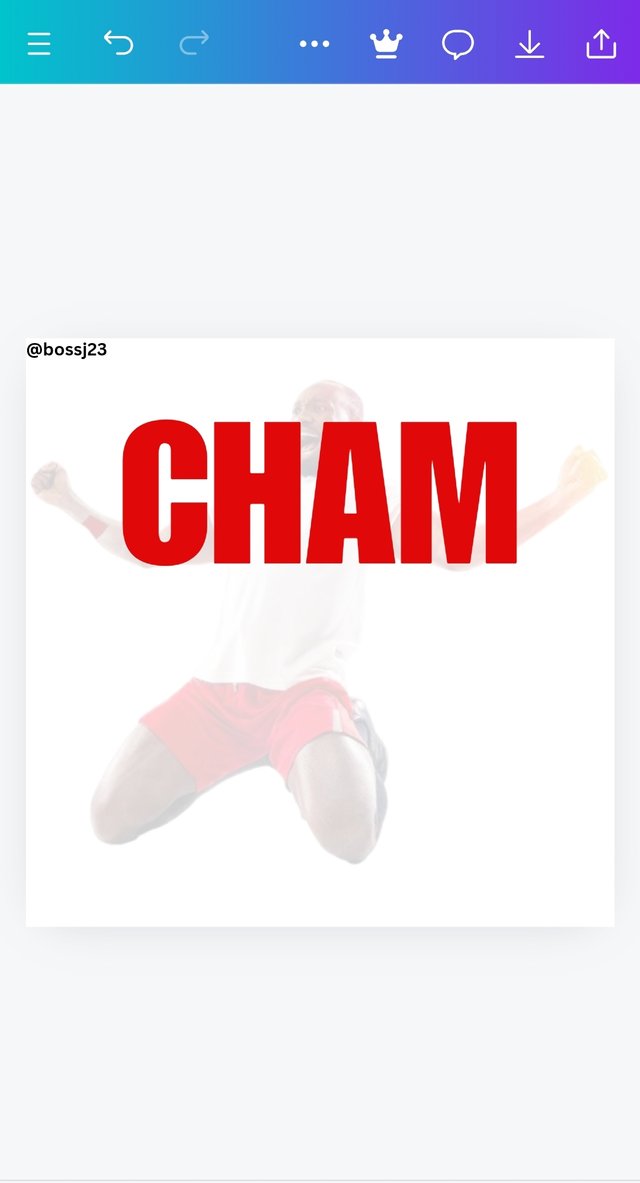
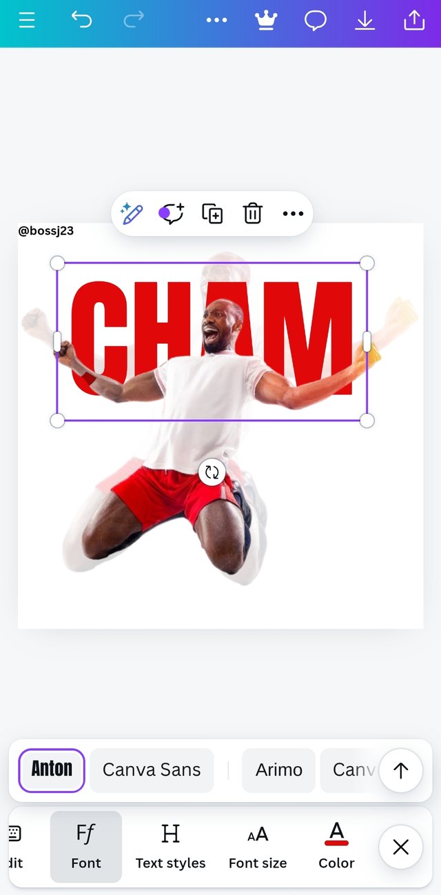
- Without highlighting the box but image, I checked the icons below my phone and saw TRANSPARENT. I clicked on it and moved the slider to 10 to make the picture more transparent than opaque. After making the picture transparent, I would have added the second picture bit I thought of bringing up the first writeup CHAM. I used the TEXT icon to bring this writing up and I changed the font from the normal font to ANTO.
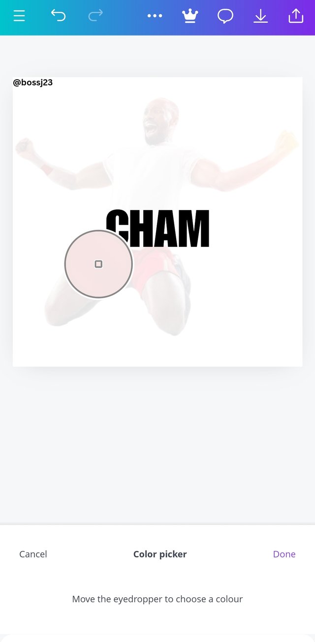
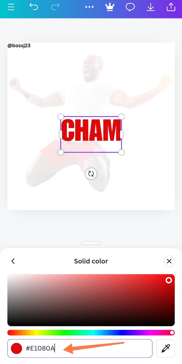
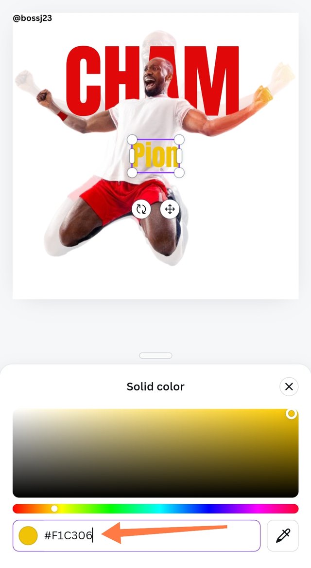
- This don't didn't just pop up. I had to try multiple bold fonts to see which would suite the instructor's font. It wasn't easy but I got something similar if not it. I tried impact but the texts were enlarged sort of. After getting the font, I directed my attention to colours. I used the instructor's design to get the Hex code to use for my colour as I didn't want to guess. This was all done with the aid of the picker or dropper icon and I was able to get the Hex code for red colour as #E1080A
- After adding colour to this, positioning seemed to be a problem. I ensured my letters were on the face of the image and the like.
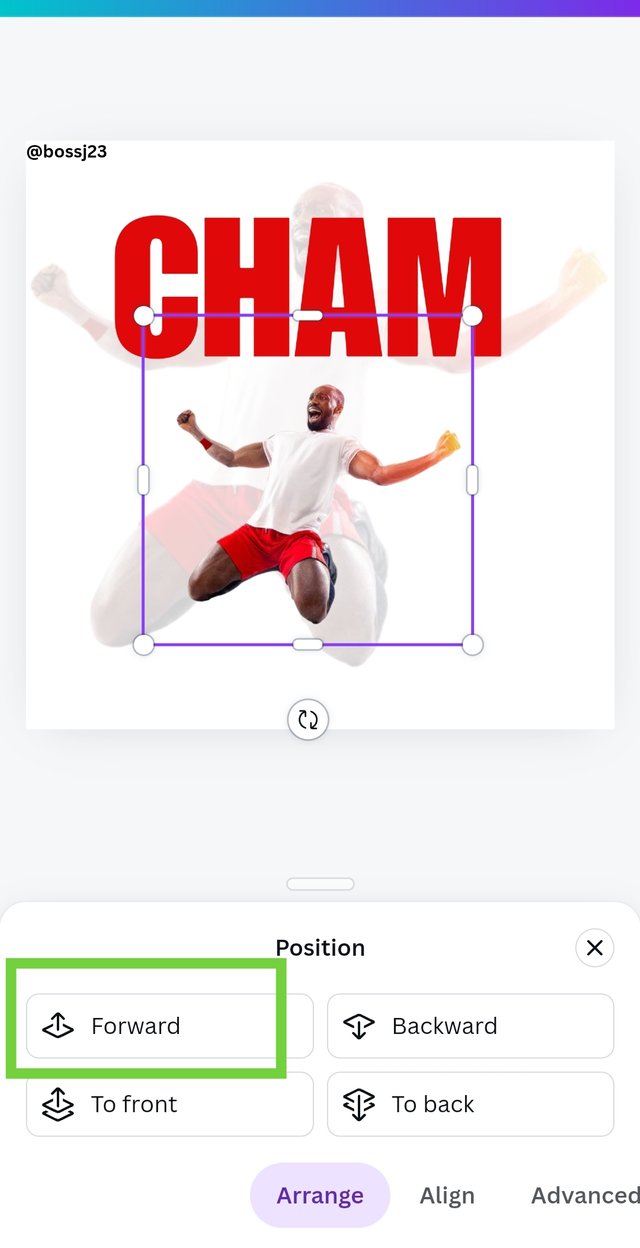
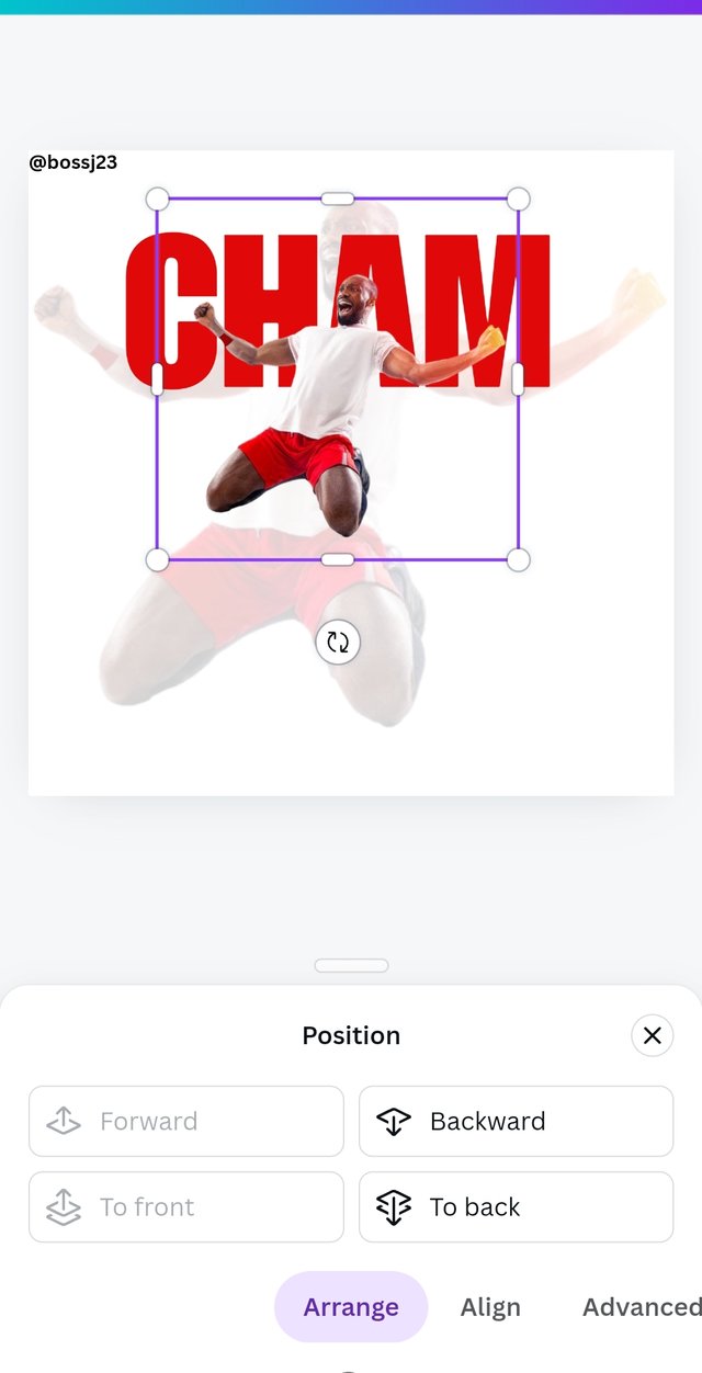
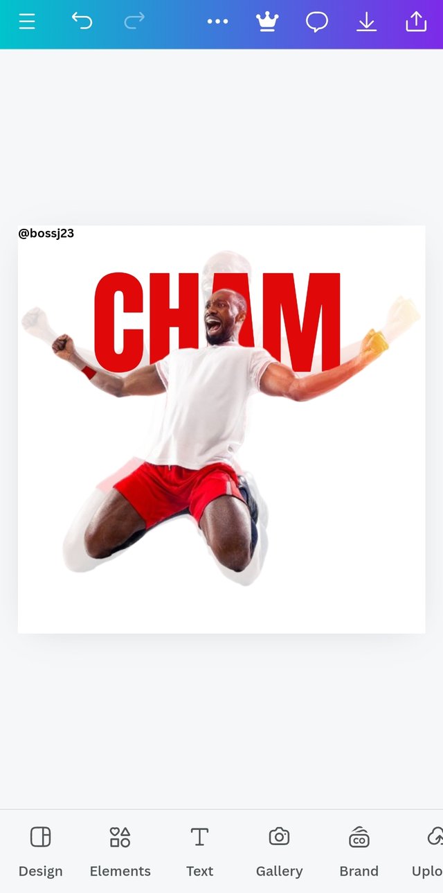
- After doing this, I added the second similar picture but didn't transparent it this time. **After adding the picture through GALLERY ICON, I then took it up to the word and used the position icon to make it appear in front of the letter and not behind. When I highlighted the image and clicked on POSITION, I then selected FORWARD and the picture was brought forward while the text was behind it.
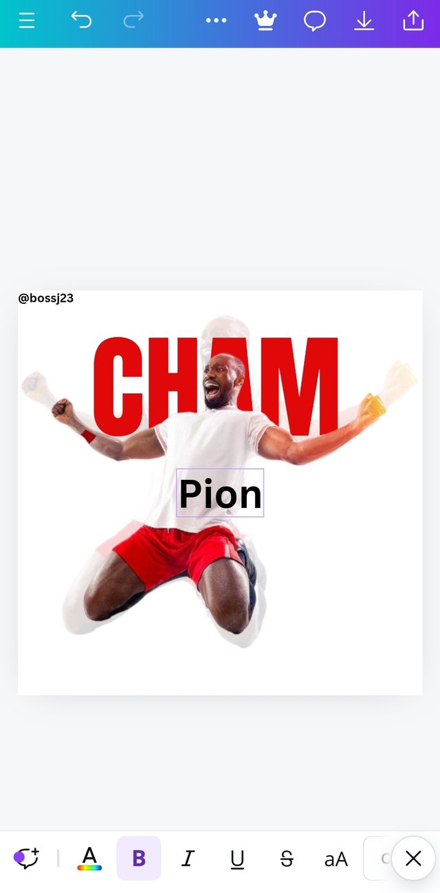
- After achieving this, I took on another form which is using the FONT SIZE to adjust it in a way that matches the transparent picture as demonstrated in the instructor's design. It wasn't that easy but was accomplished. I then added the last text which is PION. I used the same font to tally and then applied Alignment principle for this to be on the same line. I also adjusted the text to fit the design and then used the same picker or dropper on the instructor's design to get the Hex code for yellow.
Tip: To get the Hex code of the design, you'll have to insert the picture on a blank space and after inserting, highlight the picture and then click on colour. After clicking on the colour palette, click on the colour wheel to see the dropper icon. Once you tap on the dropper icon, take it to the colour you want to imitate on the picture and then click on done. It would be applied on the blank space. The hex code would be shown once you take the dropper to the colour you want to use. You copy it.
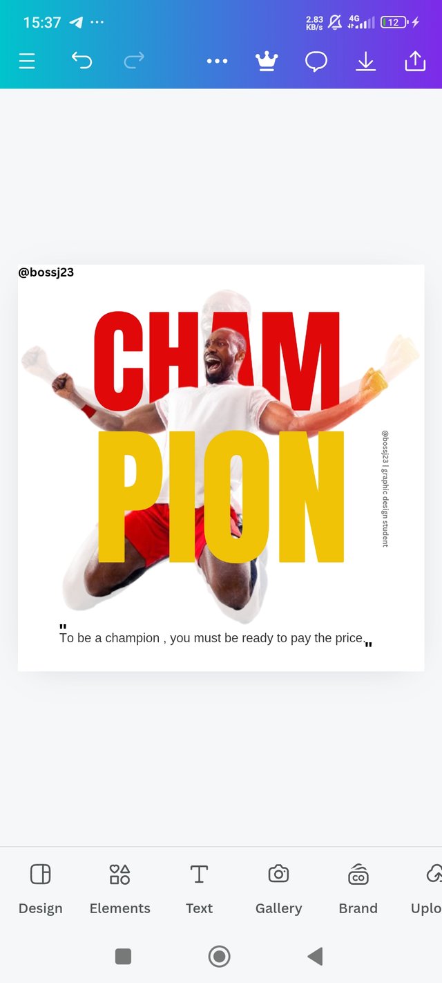
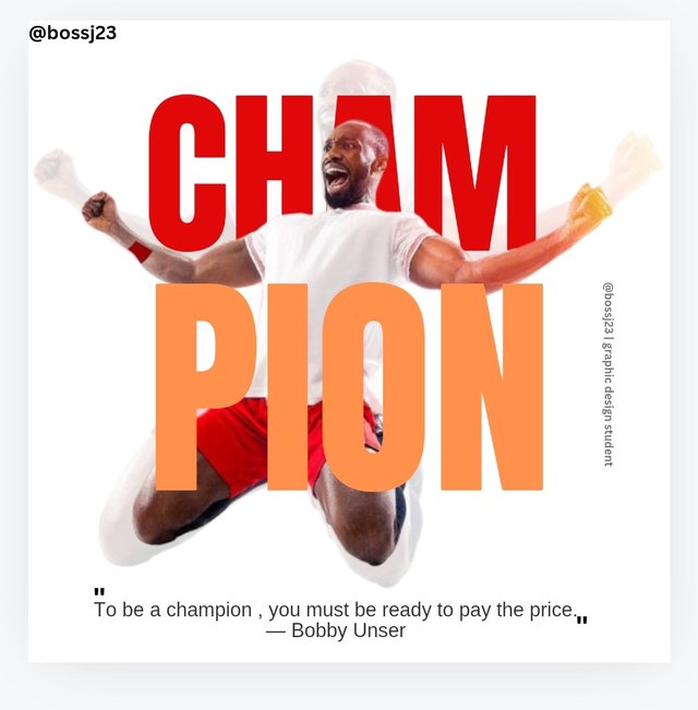
- After ensuring everything is in place and that principles are applied for professionalism, I then added my quotes and that was all about it. I was done replicating the Design. But how possible could this be without principles? I paid particular attention to principles which guided my actions.
| replica |
|---|
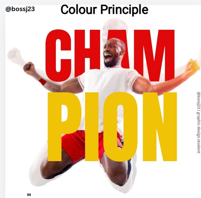
The following are principles I used in making this design a success. I used about 5 principles starting from the colour theory which is the most essential in a design. Leave the positioning. The colour creates first impression. Like I said, getting the hex codes for the used colour were easy but I applied contrast principle with regards to this colour.
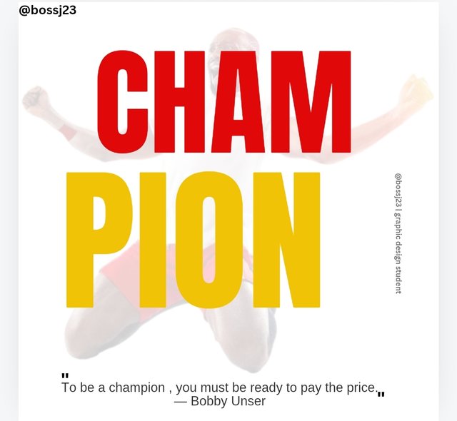
- Contrast Principle: This is a principle that's most important when it comes to choice of colours and it helps in blending. Let's take for example the champion segments were all in red, it would have been shouting and unappealing as shown below. The integration of yellow colour to fit in to this red reduced the flashings caused by the red. I used contrasting but matching colours that fits the design, relative to the picture. If you see, the yellow is on the red and the red on the white..
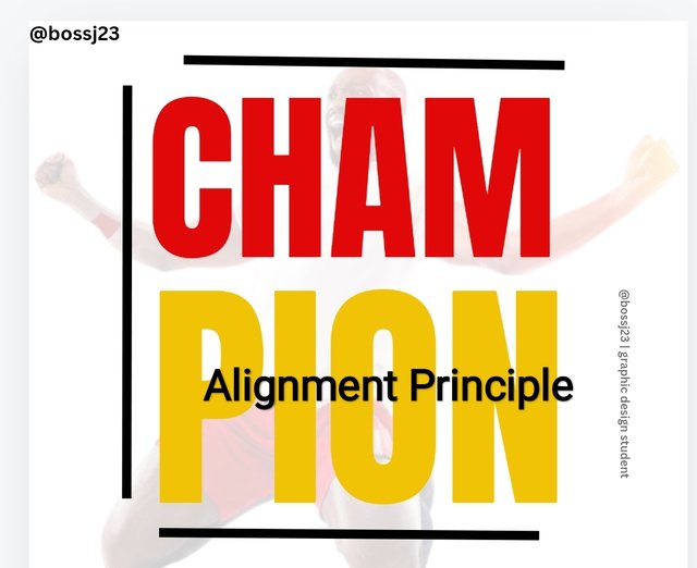
- Alignment principle: It would have been very unprofessional to see this Cham on one side and the Pion on the other side, no alignment in terms of initials. Aligning these letters makes the work professional and arranged. If you check, there are two contrasting screenshots. One shows how it would have been without alignment while the other matches this principle.
 ✅ ✅ |  ❌ ❌ |
|---|
- White Space: This is a principle that gives room for allowance or space in between words to avoid making it jam-packed or clustered so to speak. The picture shows a representation of this principle. There should always be a space in-between words or letters.
 | White Space |
|---|
- Typography: It's not outrightly a principle but it's what I used in getting the exact font of the word spelt in the instructor's design. Without this typography, I wouldn't have gotten this.
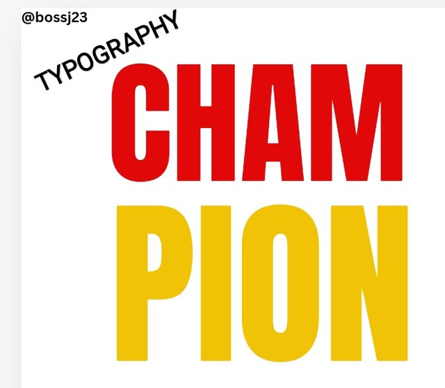 | Typography |
|---|
- Size and Dimension principle: This matters depending on what you want to do. You can't outrightly use 1080×1080 dimension for a wedding invitation card or you used a long portrait dimension for business cards. **This principle helped me know what to use for this design and I found it fitting.
 ✅ ✅ |  ❌ ❌ |
|---|
These are the principles I used for this replication. So let's compare and contrast. I may not get it perfectly in positioning but I'm close to 95% from my own point of view. What can you say?
| Instructor's design | My design |
|---|
I invite @whizzbro4eva, @basil20 and @richy20
Cc,
@lhorgic
Upvoted. Thank You for sending some of your rewards to @null. It will make Steem stronger.
https://x.com/bossj23Mod/status/1845603322822377849?t=S2puMRREXigk4MpJbTCReg&s=19
Congratulations on bringing a quality content. You have earned a positive vote from team 2, and it is delivered by @ashkhan.
Many Blessings...🙏🏻
Thanks for your support. Appreciated. @ashkhan