Art Process — Different Approaches to Renderning a Local Lighthouse
We have some pretty interesting and unusual architecture, here in our little town.
Being at the end of a peninsula, it includes a number of lighthouses, including several that have actually been converted to residences over time, because their location put them too deep in the *"light pollution" area.

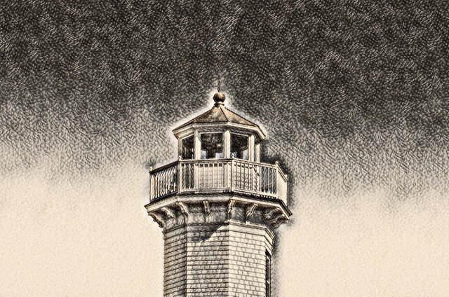
Starting with a basic photograph, the first rendering is basically a slightly stylized drawing; in the end it was the outcome I liked best, so it ended up being the top photo.
Originally, I was going for more of a "charcoal drawing" look, but I thought it was a bit too dull:

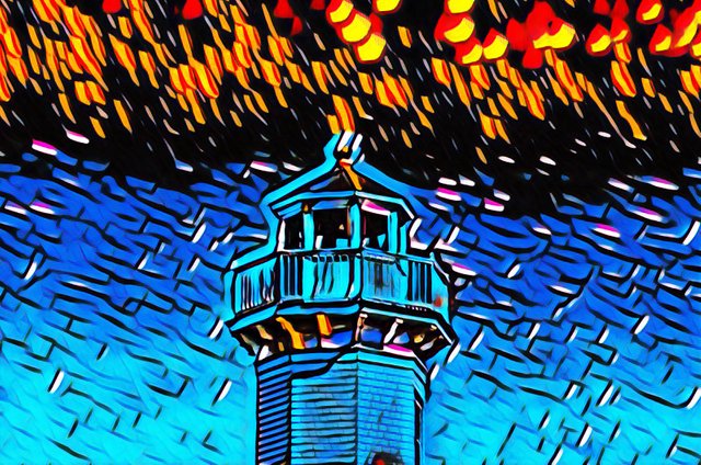
I also ran a version that was more of an over-the-top art interpretation, but that also was not really what I was looking for:

Just a little too "impressionistic" or just outright weird looking for my tastes, but I am still somewhat of a newcomer to image manipulation. My goal is to try to come up with something I find aesthetically pleasing, rather than just plain odd.
These are all based on my own original photos, but the idea is to come up with something interesting and pretty enough to warrant going into our Zazzle store.
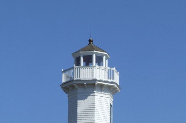
Just for reference, here's the original photo I was working with:

Definitely nice and clear, but not very interesting as a standalone.
Thanks for looking!

20210422
X-014